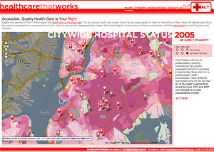
“A Google Map mash-up designed to visually illustrate the economic and racial disparities that exist in New York City's health care system. The website overlays data on NYC hospital closures between 1985 and 2007 onto an interactive city-wide map that can display either the racial or economic demographics of the Five Boroughs during three distinct time periods: 1985, 1995, and 2005. Using this tool, visitors can visually see how hospital closures disproportionately impact poor neighborhoods and communities of color (this is particularly vivid in Central Brooklyn). Text on the sidebars guides the user through each decade and demographic overlay, explaining the changing conditions of the city and the impact that closures have on underserved communities.”