

mapping
March in April
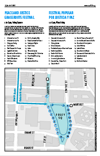
This Saturday, April 29, we take to the streets to end the war in Iraq, support immigrant rights and women’s rights, and to oppose war against Iran. I designed a broadsheet that the organizing coalition will distribute. It’s a two-color, tabloid-sized, eight-page booklet in English and Spanish with statements by the organizers, emergency contact info, and maps of the affinity group assembly areas, march route, and peace festival.
It was a challenge giving the different messages equal weight without flattening out the design. Because of the politics of the coalition, this was a big requirement. It was also my first chance to play with the City’s official NYCMAP data, which was fun. The cover image extends the Statue of Liberty image used in the existing flyers, but pushes it back to make it a little more ambient and less iconographic. It was a rush job and stepping back, some of the type treatment feels a little heavy-handed. But I’m otherwise pleased with it. We’ll see how it works on newsprint. Maybe the heaviness is appropriate.

Guerilla Wayfinding, 2
Wow! Three weeks ago I posted a modest proposal for a guerilla wayfinding campaign, painting compass stencils at the exits of subway stations for disoriented commuters.
Today at the 8th Avenue L exit I found this:
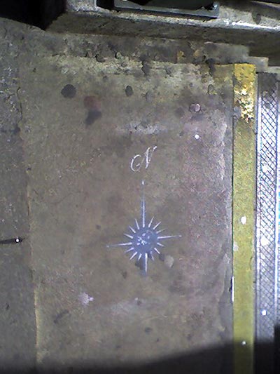
Here’s a hi-res photo someone posted to Flickr of the same compass at the Bleeker 6 exit. I found more at Astor Place and Union Square. Is someone reading this blog? And will they go all city?
Call for Entries: Critical Cartography and Anarchist Geography
 From Perspectives on Anarchist Theory:
“Perspectives on Anarchist Theory is looking for submissions of maps, cartograms, diagrams, and writing, for a special issue, guest edited by Lex Bhagat and Lize Mogel, on ‘Critical Cartography and Anarchist Geography.’
The map is a device of power. What happens when this device is purposely redirected, hacked mischievously or stolen outright?
This issue of Perspectives aims to carry forward the tremendous momentum which links art, activism, geography and other practices into the expanded “field” of radical geography and cartography. We are inspired by recent mapping projects that redirect the culturally understood authority of maps. Such projects have produced a new type of networked discourse, richly communicating information through image/text. These maps picture concentrations of power and global economic flows; reveal the hidden workings of the prison-industrial complex; uncover contestations of public space; overwrite political boundaries with local ecologies; generate walking tours of feminist social history; direct action against military recruiters or global financial institutions; and provide a funhouse mirror to the absurdity of electoral politics.”
The deadline for proposals has been extended a week to March 22. This should be good.
Guerilla Wayfinding
Last night, a friend from out of town commented on his disorientation when exiting subway stations in New York City. Which way is North? It always takes a minute or two (or more) to find a street sign, landmark, or other orienting information. In some cases it means walking a whole city block to find out you’re heading in the wrong direction. I’ve lived here for 15 years and I’m still disoriented at far-flung exits where the streets all have names and no numbers.
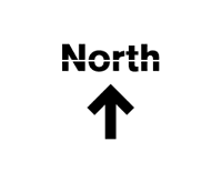
In midtown they have do little kiosks at street level with maps to nearby landmarks. But this seems like overkill for mostly mixed and residential neighborhoods. So how hard would it be for the MTA to paint a little direction indicator on the pavement near each subway exit?
Hell, how hard would it be to take matters into our own hands? To start a guerilla wayfinding campaign?
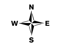
To that end, I’ve posted a few free stencils here. I’ve tried to keep it in the MTA style — with the exception of the compass rose. (But then who doesn’t love a compass rose?)
Click the thumbnails below to download a 20KB PDF.
Update 3/7/06: I’ve deprecated the uptown and downtown stencils, since it occurs to me that this could cause some confusion with the subway lines themselves often referred to uptown or downtown lines.
Update 3/28/06: Using their own fancy, two-color stencil, someone’s taken it on!.
Contained
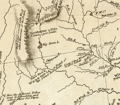
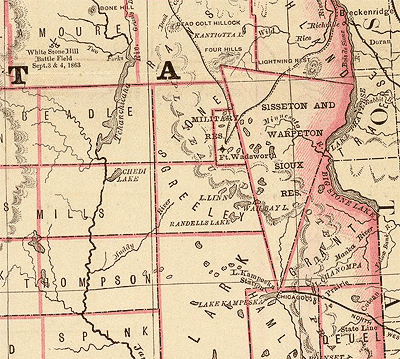
From an ITConversations recording of David Rumsey’s presentation at the Where 2.0 Conference, June 29, 2005:
“Land surveys in the 19th century began to help divide the country for settlement and political division by drawing patterns on the land. The notion of ‘land ownership’ invades the West with devastating effects on Native Americans....
Here we can see what happened with Indians in Lewis and Clark’s map of 1814. The Sisseton tribe and the Wahpeton tribe are ranging over large areas of land:
A Map of Lewis and Clark’s Track in 1804, Published 1814.
By 1879, they’ve signed a treaty. And now they’re represented by a polygon:
This is sort of the American Experience.Everything is rationalized, surveyed, contained.”
---
In this post I noted how ideology exists spatially. Rumsey’s example powerfully illustrates how notions and representations of spatiality are themselves ideological. With devastating real world consequences.
Historic Maps Online
While Google Print and the Open Content Alliance have recently been the subject of big headlines about their plans to digitize old books, the David Rumsey Map Collection already has 12,600 historic maps online:
“The collection focuses on rare 18th and 19th century North and South America maps and other cartographic materials. Historic maps of the World, Europe, Asia and Africa are also represented. Collection categories include antique atlas, globe, school geography, maritime chart, state, county, city, pocket, wall, childrens and manuscript maps.”
One can search, view, and juxtapose maps on the Web, as well as download high resolution images in MrSID format. The images are posted under a Creative Commons license. Read more from Rumsey on oreilly.net.
A Threat to Peace, Interactive
Click-and-drag, or click on a state or icon to zoom in. Click on the water, or use the right-click menu to zoom out.
Based on the poster produced by the NYC Independent Media Center.
Built using DIY Map, with a little help from google-latlong.
Green Map Turns Ten
Mentioned here last year, the Green Map project is an international network of autonomous, collective design projects, promoting local action and environmental resources around the world. They just celebrated their ten year anniversary.
Via email:
March 25, 2005 marks the 10th anniversary of Green Map System, a network of locally-led projects building healthier, more sustainable communities by charting the natural and cultural environment. In a decade, the global Green Map movement has spread to 45 countries, sparking public involvement and encouraging fresh perspectives on familiar landscapes. In nearly 300 diverse cities, towns and rural locales, we’re charting the good life, celebrating community and engaging the future.
 Collectively, Green Mapmakers have published 201 Green Maps — 60 are online and 3 million copies are in use, serving as guides to ecological living. Click GreenMap.org for an update on each map - these are beautiful portraits of place that ignite hope and caring for our beloved hometown environments.
Linking all projects are the Green Map Icons — the world’s only universal symbol set for maps — and a flexible framework for mapmaking. Practical, effective Green Mapmaking tools and resources are being created all the time, based on local experience. Our recent milestones include:
- Green Map Atlas
In 2004 Green Map System produced its first collection of mapmaking stories. Illustrating the origins, methods and local impacts of 10 projects in Asia and North America, the Green Map Atlas is a multimedia anthology — order the book or CD-ROM, or download it at GreenAtlas.org. Written for the public, it was conceived to catalyze action for community sustainability around the world — 100,000 English/Japanese readers have downloaded it already! - Lift-off in Taiwan
Taiwan’s Society of Wilderness has practiced Green Mapmaking since 2000, leading successful workshops across the country. Published in March 2005, their “Energetic Green Map Movement” book features 135 pages of in-depth methodology and colorfully illustrated vignettes on Taiwanese and international Green Maps (including sections of the Green Map Atlas), in Chinese. - Japan’s Networked Accomplishments
Some of the most inclusive Green Map projects are in Japan. Capturing this creative energy and fostering new developments, the GreenMap Japan network has just published a 40 page “Green Map Activity Guide” (English edition expected in August). Their national summer homework challenge in 2004 yielded expressive outcomes, dozens of which can be seen at GreenMap.jp (English Intro). - EXPO 2005 — Nature’s Wisdom
Today, 52 communities in Japan have projects underway. More than 16 of these are creating a citizens’ participation project for Aichi EXPO 2005, under the umbrella of GreenMap Aichi/Chubu Recycle. Opening today, EXPO’s Aichi Prefecture Pavilion features the debut of 30 diverse, local Green Maps. EXPO continues for 6 months, with international Green Maps featured in August. Find out more here. The impacts of this mega event will continue to be charted through 2010 by GreenMap Aichi! - Crossing the Divide
It’s not only in affluent regions that Green Mapmaking is thriving. Indonesia has 8 far-flung projects underway which have published 10 popular maps to date, and Jakarta’s story in the Green Map Atlas has been downloaded 20,000 times. Our 2004 Chinese Initiative has yielded the first 2 mainland projects underway in Beijing and Hangzhou. In the West, Mapa Verde Cuba is thriving as an education and social resource in 12 provinces across the island, plus they are collaborating on the tri-lingual Mapa Verde Americas Community Green Mapping Booklet, due out later this year. From Uruguay to Uganda, Netherlands to New Zealand, Green Mapmakers have honed their communication skills with this community media vehicle. - And at Home
Our New York global headquarters is a catalyst for new projects, a resource and outreach center, archive and connecting point; we also “seed” local youth projects and create new editions of NYC’s original Green Apple Map. Currently, we’re piloting a new mapping concept with our 5th city-wide edition, which will focus on Energy and aim to build the buzz for efficiency and renewables. Beyond the maps, we embrace the challenge of working globally every day with a wonderful, creative alliance dedicated to building sustainable communities. - Our 10th Anniversary Year
Celebrate this important milestone with us! Our 10th anniversary year starts today, so congratulate your local Mapmakers or send your thoughts (and support!) directly to Green Map System. A non-profit 501c3 organization since 2000, Green Map System welcomes your tax-deductible donation online or by mail (PO Box 249, New York, NY USA 10002-0249). Visit our online Store for Green Maps, Atlases, T-shirts and more. With your help, we will develop a new online system that will improve public access to Green Maps and foster collaboration throughout the movement. Your support will also help us build capacity globally and locally, as we prepare to gracefully expand our eco-cultural service for the next 10 years!