

org
Designism 2.0
On September 21, 2006 the Art Director’s Club convened a panel discussion on design and social change. They dubbed it “Designism.”
When I first heard about it, I was not optimistic. I’ve been disappointed before by how professional associations have addressed social design, and the MP3 sat on my desktop for a long, long time. After all, how radical could a professional association actually be when its bread-and-butter is mammon itself?
But after finally listening, I was very nicely surprised. The talk covered a nice, broad range of approaches to design for social change: from Milton Glaser’s big-table, middle-of-the-road approach to Jessica Helfland’s quiet collaborative engagement to James Victore’s more autonomous guerilla style.
But the best surprise of all was George Lois. I’d always loved his work. Those big, provocative Esquire covers are truly classic. But it was a special treat to learn of the progressive motivation behind them, that the man himself was an foul-mouthed, outspoken leftist — and a veteran to boot.
The event and podcast launched a number of bloggy responses and inspired a project or two.
A year later, when asked about a follow up event, Glaser responded: enough talk. This one should be a call to action. Designism 2.0 took place on December 13, 2007.
Sloganeering
A year ago, I received an email from “Tony:”
“I have looked all over the web, and just can’t find the simple themes that can be posted to the back of poster board or foam board and used at street vigils. I just need simple stuff for 11 by 17 AND 8 1/2 BY 11 COPYING.
Can you help? The power of one or two people in public holding simple antiwar protest messages is great. I just can’t find anything on the net that isn’t too artsy-fartsy, or too damn pacifist-wimpy.”
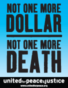
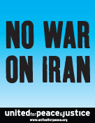
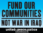
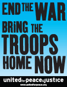
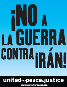
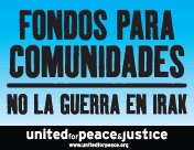
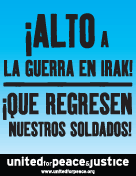
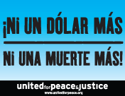
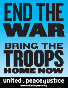
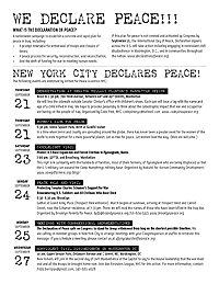
I smacked into this “artsy-fartsy” factor again a few weeks ago when United for Peace and Justice asked if I could turn out some poster designs on short notice. They sent their final copy and I set to thinking about how to represent things iconographically in a beautiful, compelling way. I rummaged through the usual toolbox (coffins, dollars, boots, ribbons, etc.) as well as play with color and typographic notes (big X’s, oversized punctuation, etc.) One slogan in particular raised an interesting problem: how to graphically represent “community” for marches in eleven very different cities.
Nevertheless, over the weekend’s iteration the org requested the gradual removal of all imagery, iconography, and embellishment. I was trying to do something graphically interesting to myself, but the group had a very specific use case in mind. The posters were not intended for pasting on the street, to attract passersby with flourish, humor, or imagery. They wanted something to be carried high and read from a distance, particularly when reproduced in photos, newspaper clippings, or seconds-long TV news highlights. As such, these were props to represent the march in memory as much as in person, to disappear and punch the message through network editing and newspaper cropping. The simpler and bolder the better.
With a little more time I would have refined these further, but here are the results below. Click on a thumbnail to download a printable PDF.
- home composting
- safe needle disposal cap
- low-cost wheelchair
- solar-powered water disinfection
- collaborative bridge design
- concrete canvas shelter
- battery free bicycle lights
- solar powered streetlamp
We provide print and web production for projects in impoverished areas with emphasis on rural issues, urban planning, bio, wind and solar energy, economic development, organic farming, energy conservation, microfinance, and sustainable building.
Our work includes presentation materials, identity, instructions, typography, illustration, signage, and web deployment.”
Understanding the Farm Bill
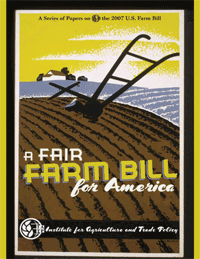
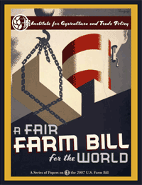
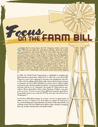
In response to this previous post, Matthew Foster sends this great link to a series of publications dissecting the 2007 Farm Bill. Check the right hand column of the page under “Understanding the Farm Bill.” Matthew is a graphic designer at the Institute for Agriculture and Trade Policy and has done a fantastic job. The bold WPA-inspired graphics and typography make me want to pick up these reports. They evoke an nostalgic image of the American farmer back before it was big Agribusiness. The reports provide overviews of the Farm Bill and its implications as well as IATP’s policy recommendations to make the Bill fairer for the U.S. and the world. A beautiful and compelling way to spread the word on an often overlooked and vitally central policy matter.
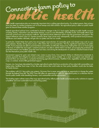
Yeah, my current blog design uses WPA imagery, too. What can I say. :-)
Designs on Democracy at the US Social Forum
Via email:
“What is the history of graphic communication in the social justice movement? What is our role now?
How can we effectively use graphic communication to get our messages out in a way that reaches the hearts and minds of our communities and society at large?
What choices do we make in representation in our designs? What images and language do we use? How do we help in creating a message of diversity and positivity?
Join Favianna Rodriguez of Tumis Design, and Nadia Khastagir and Sabiha Basrai of Design Action Collective in a colorful presentation and discussion of the pressing topics facing progressive visual communicators.
This workshop is for emerging and experienced graphic designers, communications specialists, students and artists who work with social justice organizing efforts.
Saturday, June 30, 2007 — please check schedule for exact time and place.”
The 2004 Designs for Democracy conference was fantastic. If you’re in Atlanta, don’t miss this workshop.
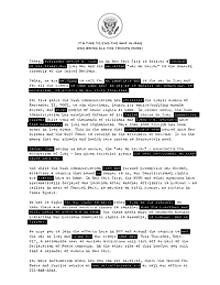
Redacted
Around 3,500 antiwar protesters rallied outside the United Nations in New York City today while President Bush delivered his speech inside. A decent turnout for a business hours on a weekday, and a very last minute call to action.
The organizers asked me to design a flyer to hand out at the march. I took it as an opportunity to do something a little different from a typical flyer. The goal here was not to grab the viewer and turn them out to the event, but to make something interesting for them to read while attending the event itself. The front is a statement by the organizers, the back lists upcoming events.
In the end UfPJ wanted something simpler — and something more like a typical flyer — which I delivered. But I like the way this version came out. The text is styled in the form of a redacted government document. It creates a parallel text that plays on themes of secrecy, coverup, and suppression of dissent, as well as seeing through the lies and reading what is erased.
 |  |
| Download 200 Kb PDF | |
 “HauteGREEN will showcase a collection of the best in sustainable contemporary design for the home. HauteGREEN will take place in Williamsburg, Brooklyn May 20-22, 2006, during the International Contemporary Furniture Fair.”
I was put off by the chicy angle (why does sustainability always seem to be a class privilege?) — but a member of o2, one of sponsoring organizations, explained that the initiative is intended to attract the interest of designers participating in and visiting the fair.