

org
Is Design Political?
 Jennie Winhall, Senior Design Stategist at the UK Design Council’s RED research unit, has posted an excellent essay that summarizes a number of ways design is, in fact, political.
The essay addresses branding and propaganda, product labeling, advertising, design by grassroots campaigns, how ideology shapes the physical construction of our public institutions, and how the shape of our built environment in turn shapes our choices and behaviors.
It’s a great call to action.
One oddity, though, is that for its talk of politics, the RED project seems to steer clear of... actual legislation.
For instance, the RED Health project takes on the raging diabetes epidemic and concludes with the design of a grassroots fitness program and an improved interface with the National Health Service. This is totally great and much needed. But only addresses half of the equation.
What about the ready availability of cheap, high calorie junk food and soda? At what point does the Government step in and regulate toxic substances that are poisoning the public? RED sidesteps the issue. As a government funded organization, are they not allowed to propose regulation of industry? Or is it the Design Council’s close relationship with UK industries? A core mission of the Council is to improve UK products and industries through better design.
Beyond better product labeling, why not designers urging a ban on advertising junk food to children? Perhaps a public campaign (with nice graphic campaign materials) challenging the content of junk food itself? For instance, the legality of trans fat? Or agricultural subsidies of corn and sugar that make sweeteners ultra-cheap for food manufacturers?
RED does some amazing and important work. They are one of the few design think tanks researching and promoting design in the public interest in a very high profile way. But the discreet focus on projects and products seems to miss opportunities to leverage its special relationship with Parliament and to shape the policy and industries that shape our world.
Swap-O-Rama-Rama
What is Swap-O-Rama-Rama?
“Swap-O-Rama-Rama is not your regular clothing swap. The event features an entire day of how-to workshops, on site thematic workstations and a gathering of skilled designers, artists and do-it-yourselfers brought together to share their knowledge.
Workshops are taught by local artists of all calibers and cover wide range of skill sets and material uses. The swap has offered technology based workshops including a demo by Mikey Sklar that demonstrated how to replace pockets with metallic fiber for the purpose of creating a wearable faraday cage to block RFID tag readers, and an exploration of a playable sonic fabric created from recycled cassette tape presented by Alyce Santoro. Swap workshops also introduce completely new textiles. Kate Sweater offered a how-to that transforms plastic grocery bags into a new textile for wallets, bags and shoes. Traditional crafts like embroidery, knitting, beading and appliqué can also be found. If guests want to be hands-on they can slide over to any number of do-it-yourself workstations. These include a sewing stations with several sewing machines run by knowledgeable clothing and costume designers; an iron-on station for downloading images off the web and transferring them directly onto clothing; silk screening, and decoration stations for working with beads, buttons, and a variety of accoutrements.
The core of the swap is the gigantic piles of free clothing sorted into categories: pants, shirts, skirts, sweaters etc. These piles are the collective total of each guest’s contribution of one bag of unwanted clothes. This contribution is required to attend the event. Once inside guests are encouraged to take home ‘as much clothing as you can carry.’... All left over clothing is donated to St. Martin DePorres Shelter in Brooklyn, New York.
Swap-O-Rama-Rama was created out of a recognition that consumerism needs to be unlearned.”
The next Swap-O-Rama-Rama is on Sunday, Feburary 12 at Galapagos in Williamsburg.
The associated performance art, fashion show, and venue position it in a rather white, hipster way — more thrift-store chic than alternative economy. But it sounds like some grassroots, DIY fun. Find out more at http://www.swaporamarama.org
Also of note, “Swap-O-Rama-Rama has received funding support from Black Rock Arts, a community resource for interactive arts that sprouted from the makers of the art festival and utopian experiment Burning Man.” Let 1,000 DIY art-happenings bloom!
Update: Because of snow, Swap-O-Rama-Rama has been rescheduled Monday (Presidents Day) February 20th 2pm to 7pm.
The Consumption of Space
 In November 2003, I blogged Edward Mazria’s analysis of the environmental impact of architecture in the U.S. Namely, that buildings are responsible for a whopping 46 percent of carbon dioxide production in the U.S.
Yesterday, Mazria and company launched a Web site to spread the word and promote a response. From the press release:
“www.architecture2030.org is part of an ongoing effort, initiated by architect Edward Mazria, to provide information and innovative solutions in the fields of architecture and planning, in an effort to address and reverse the destructive trend toward global climate change.
The website clearly illustrates, using the latest research, that the Building sector is currently responsible for about half of all U.S. and global emissions annually and that this sector’s emissions are increasing at an alarming rate. Architecture2030.org outlines the steps necessary to address this situation. As part of this effort, the website includes a variety of resources to help professionals, government officials, and those in the building sector, plan and design for a carbon-neutral future....
The website will report on the activities and progress in the building sector around the globe and critical information will be updated regularly.”
In particular, I liked the case studies.
Also of particular note is the organizing work of the American Institute of Architects, a professional association:
“The American Institute of Architects, representing 74,000 prefessionals, recently announced a bold initiative to reverse the environmental impact and greenhouse gas emissions of the U.S. building sector. The AIA... set a goal of reducing the fossil fuel consumption of buildings by 50 percent in four years, with additional 10-percent reductions every five years thereafter. The implications of this initiative are considerable and when implemented will transform the built environment in a way we have not seen since the time of the industrial revolution.”
Class Action
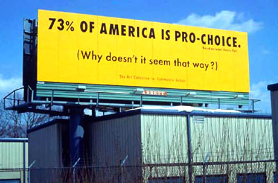
Class Action bills itself as “The Art Collective for Community Action.”
From classactioncollective.org:
“Class Action creates visual messages to advocate social change. Our goal is to influence the way public issues are understood, and motivate audiences to participate in civic dialogue. We work as a collective, authoring, producing and publishing our ideas & initiating projects to illuminate attitudes and conditions overlooked in mainstream media.
Our work originates outside of the studio, with a perception of something taking place in the world. Often beginning with the newspaper or newscast, we define an issue, research it, and craft a message that can lead to some real-world action or change. We work in the spirit of the phrase, ‘pro bono publico’, meaning ‘for the public good’. We endeavor not only to communicate our own position but also to inspire others to become active.
As graphic designers, we have the power to lend authority to messages that would normally be seen on the fringes of society. Through design, we gain access to the official channels of communication & the organizations, institutions, leaders and media that have great sway over social values and priorities. What we place in these channels is an attempt to challenge, influence and provoke.”
Class Action started as just that, in 1992 at the Yale School of Art. Several designers have been associated with the collective since then.
Check their list of public projects. Among them:
- T-shirts and an exhibition on AIDS awareness
- a talk show media kit and T-shirt on the “abortion pill” RU-486
- a poster challenging the gender bias of AIGA
- a billboard on domestic violence
- a public service announcement on teen pregnancy
- and posters on gun control
My personal favorite is this surreptitious pamphlet challenging the AIGA’s commitment to public engagement:
“Washington DC, 2002: The American Institute of Graphic Arts National Conference ‘Voice!’ promises a radically new focus on serious public issues. Yet the AIGA design competitions criteria continue to emphasize form over content. The satirical pamphlet, written and designed to conform to the identity of the conference materials, challenges the AIGA to recognize the purpose and social value of design.”
From the pamphlet:
“New Categories for 365: AIGA annual design competitions
The new competitions will reward design that best works toward:
- Establishing justice
- Insuring domestic tranquility
- Providing for the common defense
- Promoting the general welfare
- Securing the blessings of liberty
- Forming a more perfect union
By the end of voice we trust you will agree that these criteria and categories are what really matter.”
The common defense bit gets a bit murky in this perpetual “war on terror”, but I think the piece hits the right place at the right time. Within the context of the membership conference, it starts to move beyond public awareness into mobilization. Nice to see the Left seizing ‘American-ness,’ too.
I’ve argued here before about how the AIGA and competitions could be a force for change, so it’s nice to see AIGA members taking them to task, too — and nearly a month before I started this blog!
Here’s looking forward to more work — and to keeping the pressure on!
Architecture and Development
Via the National Design Awards I discovered the work of Sergio A. Palleroni:
“Sergio A. Palleroni, research fellow at the Center for Sustainable Development at the University of Texas, Austin, runs 10-week-long design/build studios around the world in marginalized communities. Participants learn to use hands-on construction and design skills, maximize locally available, recycled, and inexpensive materials, and implement lighting and energy systems that help to reduce energy costs and promote conservation. In turn, communities mobilize indigenous resources and develop long-term practices that sustain cultural identity, dignity, and stability.”
How rare to find a development program that actually seems to engage with the local community and context. Not just ‘humanitarian’ aid, but actual education and collaboration.
Add this to my growing list of architecture and development programs:
- Architecture for Humanity
- Architects Without Borders
- Association for Community Design
- Barefoot Architects
- DesignCorps
- Over the Rhine
- Habitat for Humanity
- Rural Studio
- Sustainable South Bronx
- Voluntary Architects Network
I’m sure there are others I’m leaving out. It’d be instructive to do a closer comparison of the methodologies, politics, and assumptions of various architecture-based anti-poverty programs.
Quite apart from Planner’s Network who work for more fundamental change.
Papers in the Dark
OurMoneyToo.org is a grassroots campaign to alter the design of U.S. currency to make denominations recognizable without purely visual cues:
“Can you tell the difference between a one dollar and a twenty dollar bill in the dark?
Blind people use money just like everyone else, but since American paper currency is all the same size and texture, blind people can’t tell the bills apart independently. We all deserve the personal security of knowing what’s in our wallets.
Even those with sight would benefit from making paper money accessible by feel
- It would simplify paying the bill and counting change in a dark restaurant
- It would make it safer to get out money for an upcoming toll while driving
- It would allow everyone to count money more discreetly in public
Please write or call your Congresspeople now! Our Contact Congress Tool makes this fast and easy.
...
OurMoneyToo.org is an independent volunteer organization committed to the dream of having currency that all Americans can use safely and independently. Our first job is to educate the public about the positive effects of being able to differentiate between bills without having to look at them. We hope that one day we all will be able to count the money in our wallets more discreetly, no matter who we are or where we are, without the fear of being cheated or robbed.
The U.S. Treasury Department doesn’t have to invent any special technology to make our currency more accessible. In fact, they’ve already done it in roughly 100 countries around the world, including Canada, Great Britain, and the countries of the European Union (see http://books.nap.edu/html/currency/appendixd.html). The American dollar is one of the most powerful currencies in the world. We are committed to making it safer and easier for everyone to use.
We are not affiliated with any other organization. We do not actively solicit donations.
...
In 2002, the American Council of the Blind (ACB) filed a lawsuit against the Treasury Department demanding that U.S. paper money contain features that will enable blind people to independently distinguish between denominations. The government is continuing to fight the suit, claiming that such modifications would be too expensive.
The Treasury protested that this would cost too much because it would require redesigning the currency — but in the meantime, they have spent millions of dollars to redesign nearly all of the denominations in circulation! As the Treasury continues to develop new bill designs with new anti-counterfeiting features, they should include accessibility features useful to blind people, people with dyslexia, and people who work with cash in low light.”
Making design usable by a differently-abled minority (old, young, tall, short, sighted, not, or otherwise physically different) often makes it more usable by all.
Collectives for Designers
My third piece for Communication Arts. I guess that makes me a contributer. This one ran in the September/October 2005 issue, the “Interactive Annual.”
I started taking notes for this a year and a half ago at Designs on Democracy. There’s plenty of advice around for designers starting corporations and for freelancers protecting themselves, but I couldn’t find anything on design collectives. So I wrote it myself.
Consider the Collective
More than business as usual
Some of our most venerable institutions started out as collectives. Before they were Push Pin Studios, they were a network of freelancers in a shared studio space. Before they were Pentagram, they were a partnership of three. In its twenty years, the French studio Grapus grew to encompass three collectives under the same roof.
Collectives, also known as “co-operatives,” “cooperatives” or “co-ops” are groups of individuals who join together to undertake an activity for their mutual benefit. Co-ops may be for-profit or not-for-profit, unionized or not, and legally incorporated or not — what’s different about a co-op is that it’s owned and operated by its members.
You may be familiar with a neighborhood food co-op or credit union. These are consumer co-ops which pool resources to offer discounted services to their members.
Graphic design collectives are “producer co-ops,” owned and operated by their employees. This is quite different from a firm with an employee stock ownership program. Co-op workers share in decision making and responsibility, as well as profits and losses.
Why form a cooperative? One argument is that organizations owned by the communities they serve are more accountable, and can emphasize service over profit. When employees govern their own workplace, they can design a happier, stable and more equitable work environment.
But there’s also the value of organizing according to one’s ideals. Though we are supposedly living in a democracy, most of us spend our days working for private tyrannies. Living and participating in a democracy should consist of more than just voting once a year. We should be able to participate in the decisions that affect our lives.
One member of a cooking collective sums it up: “We’ve tried not only to feed people well, but also to treat people well. Over the last 30 years our company has come to represent something bigger than we ever anticipated, and something better than the usual business.”