

photography

“Photos should be, very broadly, of union members in action. At work, in struggle...surprise us!”
I Heart Iraq
While the New York Times generally doesn’t publish pictures of U.S. casualties in its own reporting, it can publish them when the photos themselves are the story (particularly on a Saturday.) The commander of the U.S. Marines in Iraq is seeking to bar photographer Zoriah Miller from all U.S. military facilities around the world for publishing photos on his web site of U.S. Marines (oh, and Iraqi civilians) killed in a June 26, 2008 suicide attack in Garma, Iraq. “Disembedding” journalists and otherwise “managing” them for publishing unfavorable coverage is nothing new. The Committee to Protect Journalists has chronicled ongoing harassment and deaths of journalists in Iraq and BAGnewsNotes has done an excellent job of unpacking the photographs that do make it out.
Looking into Miller’s own portfolio site this image caught my attention:

It has a Banksy-like irony to it: juxtaposing tools of authoritarian force with the values they are rhetorically professed to deliver — and with a faint whiff of commercialism. The vehicle above is a Iraqi Soviet-model MT-LB multi-purpose armored personnel carrier, most likely tagged, I suspect, by a U.S. soldier. But paint that slogan on an U.S. Abrams, and it makes a good stencil idea. Click below to download a PDF.

Mission Accomplished
The May 2003 image of President Bush on the deck of the aircraft carrier in front of the “Mission Accomplished” banner is, I think, one of the more memorable images from the war in Iraq. Primarily, of course, because no weapons of mass destruction were ever found (our mission, right?), the war rages on and US and Iraqi lives continue to be lost. Every day.
But there’s another story behind the image and Bush’s statement about the end of “major combat operations in Iraq.”

Below, a quote from Philip Gourevitch in conversation with Errol Morris at the 2007 New Yorker festival:
“One of the legal fictions of this period, you may think that the May 1st declaration by the President on the aircraft carrier that major combat operations had ended was merely a campaign period photo op. But in fact, it’s a redefinition of the theater of war.
During a war, you’re fighting against an enemy power and if you capture their people they’re enemy POWs and there are all kinds of rules that apply, but they’re never going to be charged with a crime. They’re simply treated as enemy combatants, enemy assets that you’re neutralizing, you remove them to the rear and as soon as combat’s over you release them. And believe it or not, May 1 of 2003 a lot of them were released. And a lot of them were kept as ‘security detainees,’ this fictitious word for prisoners. It’s a euphemism.
And the reason they were able to keep them in Abu Ghraib was because, of course, you can’t have a combat zone in a non-combat zone. And you can’t have enemy prisoners of war to whom you apply prisoner of war doctrine in a place where there is no enemy power and where there is no alternate army. So you can’t say to whom they belong and so they must be ‘insurgents.’ Insurgents against what? There isn’t an Iraqi government. So it’s a very complicated legal status, and its these loopholes that are being exploited for simply rounding people up and tossing them in there.”
And Abu Ghraib is, of course, where some of those other memorable photos were taken.
The King Never Smiles
 Excerpt on photography and nationalism in Thailand, from The King Never Smiles: A Biography of Thalians’s Bhumobol Adulyadej by Paul M. Handley:
“At each juncture his power and influence increased, rooted in his silent charisma and prestige. Thais, who believe it is their land’s fortune, their karma, to be blessed with such a king, saw a man who worked tirelessly for them without reward or pleasure. His sacrifice was readily visible: while Thais are known for their gracious smiles and bawdy humor, and a what-will-be fatalism, King Bhumibol alone is serious, gray, and almost tormented by the weighty matters of his realm. Ever since the day his brother mysteriously died [in 1946, when Bhumibol ascended to the throne], he seemed never to be seen smiling, instead displaying an apparent penitential pleasurelessness in the trappings and burdens of the throne.
For Thais, this was a sign of his spiritual greatness. In Buddhist culture, either a smile or a frown would indicate attachment to worldly pleasures or desires. Bhumibol’s public visage was unfailingly one of kindly benevolence and impassivity. In his equanimity he resembled the greatest kings of the past, the dhammarajas of the 13th-century Sukhothai kingdom who were called Chao Phaendin, Lord of the Land, and Chao Cheevit, Lord of Life. Increasingly many Thais compared his noble sacrifice to the Buddha’s own.”
Photo from a 2006 subway mural in Bangkok, part of the King‘s 60th anniversary celebrations.
 By ignoring color, black-and-white photographs depict an abstract surreality — one that has become strongly associated with an iconic truthiness. In this RealAudio clip, NPR talks with Naitonal Geographic Society photographer Chris Rainier about Kodak’s black-and-white Tri-X film. Tri-X was a technical innovation that allowed faster shutter speeds so pictures could be taken without flash in a wider range of situations. “It became the film of choice for everything from fashion to combat photography.... It also has a sort of graininess to it that we all now, in the beginning in the 21st century... associate with many of the most historically important events over the last 50 years.” (via)
Wikipedia on Tri-X: “Since the advent of digital photography it has all but fallen out of use in newspaper journalism. Apart from possible use in educational establishments, it still remains reasonably popular in documentary journalism.”
The Conversation
An article of mine is running in the
Communication Arts August Photography Annual 2007. The dialog format is a bit different, so I’m curious to see how it’s received. It started out as a rebuttal to many things I’ve heard other, sometimes very prominent, designers say about why they eschew political engagement. Many of the points started as blog posts here. Thanks to Jamie, Adam, DK and Acacia for their feedback on the draft.
“The Conversation”
When should designers make a political commitment?
Late afternoon at a sunlit café on a high traffic street. Young faces stare intently at their laptops while the smell of roasted coffee and beat of a down tempo groove fill the air. Cups clatter on white modernist tables amidst laughter and the buzz of machines grinding beans. The coffee menu reads much like today’s headlines: East Timor, Guatemala, Ethiopia, Rwanda, Colombia.
Bells on the door jingle as Robin walks in. Sam looks up from a bright orange couch.
Sam: Hey! How’s it going? How are you?
Robin: Excellent. You? How’s business?
Sam: Really good, actually. An identity design we did just got a big award. So that’s nice. What’s new with you?
Robin: Things are good. Let’s see… A poster we did helped turn out nearly a hundred thousand people to that protest last week.
Sam: Whoa! How’d you get involved in that?
Robin: I just heard about the march and got in touch. It was a chance to do something for a cause, something the studio believes in. And, honestly, it was an interesting design challenge.
Sam: Sounds great. But do you ever feel conflicted? I mean, look at those posters about the genocide in Darfur. I’m all for rising to the challenge, but don’t these thing just take advantage of the cause by exploiting some tragedy as an excuse to make a clever design?
Haiti, 1919
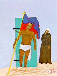 From Noam Chomsky, Year 501: The Tragedy of Haiti, 1993:
“The leader of the revolt [against the U.S. invasion], Charlemagne Péralte, was killed by Marines who sneaked into his camp at night in disguise. In an attempt at psywar that prefigured some of Colonel Edward Lansdale’s later exploits in the Philippines, the Marines circulated photos of his body in the hope of demoralizing the guerrillas. The tactic backfired, however; the photo resembled Christ on the cross, and became a nationalist symbol. Péralte took his place in the nationalist Pantheon alongside of Toussaint.”
The photograph was immortalized in 1948 by Philome Obin in his painting, Crucifixion de Charlemagne Péralte pour la Liberté.
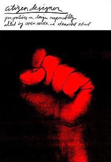
Citizen Designer: Perspectives on Design Responsibility
There are many things I’m looking for in a book on design responsibility: some historical perspective, some global perspective, a sense of urgency, a rigorous analysis of the relationships between design and society and the world we live in.
Sadly Citizen Designer: Perspectives on Design Responsibility is none of these things.
 The book is collection of essays and interviews edited by Steven Heller and Veronique Vienne, mostly, it seems, from the last 5 years and almost entirely from the United States.
Despite the title, there is almost nothing about civic design. Almost nothing about design that facilitates participation in public life. Nothing about consumer labeling, information mapping, civic wayfinding, or universal design and accessibility. Nothing about the role of design in the manufacture of consent, or how design shapes our assumptions about what is normative.
Still, though several of the essays fall flat, there are some tasty ideas to be found. The book is divided into four parts: “Social Responsibility,” “Profressional Responsibility,” “Artistic Responsibility,” and “Rants and Raves.”
Appropriation and cooption are themes that run through many of the essays. From the professional side (Don’t steal those proprietary fonts, Plagiarism is bad) to the cultural and political side. In his account of the young, hip “account planners” of the advertising industry and their use of anthropology, Tom Frank details the cooption of the rhetoric of democracy, resistance, revolution, authenticity, and individualism in the service of corporate marketing. The essay and Frank’s other work are highly recommended for design students packing their portfolios with zany and illegible self-expression.
In “Good Citizenship: Design as a Social and Political Force,” Katherine McCoy notes another kind of cooption:
“American designers consistently take European theories and strip them of their political content. Of the various strains of modernism, many of which were socially concerned or politically revolutionary, American design either chose those most devoid of political content or stripped the theories of their original political idealism.”
Indeed, several essays in the book reduce social responsibility to acts of personal salvation. Robbie Conal notes his guerilla street postering is a way of venting pent-up frustration. Gunnar Swanson’s winding essay on plagiarism ultimately settles on the fact that plagiarism is bad because it makes the “spiritual act” of designing into a “mechanical” one. The one essay on architecture is heavy on spirituality, theology, and the ethics of building. I would put all of these things into broader context. On architecture, for instance, I would have included an essay on building green, on design for public and alternative transportation, or an introduction to urban planning. Instead, discussion of affordable, accessible housing is relegated to a single mention in a footnote.
A couple of the essays locate the construction of apathy and a-politicism in design schools and design education. McCoy notes that “most introductory graphic design courses are based on abstract formal exercises inherited from the Bauhaus and the classic Basel school projects.” Design is taught as a matter of forms, color, and spacing in a visual laboratory sealed off from the world at large. The question, then, is what would a progressive design curriculum look like? How does one teach political awareness?
One exercise is given by Anne Bush. Her students are asked to study similarities and differences between intended meaning and response. “The ultimate goal for students is to recognize that meaning is always the result of a range of cultural and social negotiations and the designer is not the sole determinant, but rather a participant in these dialogues.”
Bush cites an analysis by her student Erica Wong. A poster campaign developed by the Mexican government to promote health and nutrition was interpreted entirely differently by its intended audience. The poster features a single black and white photo of a boy in traditional dress, smiling under banner type.
“The photography becomes attempts to capture indigenous culture as a kind of romantic and static essence. It becomes a kind of visual anthropology that says more about the conceptions of its makers than the reality of its intended audience. Wong, discovered through interviews with the local communities that many people misunderstood the intention entirely. For citizens bound by a strong sense of community and family, the boy in the image appeared abandoned. The people of the villages couldn’t understand why he had been left alone. They also couldn’t reconcile this sense of isolation with the posed quality of the photograph. If he was alone, why was he smiling for the camera? The synthetic, portrait-like framing combined with the celebratory dress (normally saved for special occasions) further confused the reading. Many said they initially overlooked the poster, because they thought it was an advertisement for tourism, since similar portrait images of traditional culture (usually in black and white) were a common visual theme in the marketing of Mexican heritage. Wong reminds us, however, that although depicting indigenous culture in black and white is a common representational practice it reinforces nostalgic ways of seeing and continues to locate indigenous culture in a perpetual past. Moreover, it differs greatly from the sense of color and activity that is a part of everyday reality in rural Mexican communities. For the local population, then, the poster not only mirrored the imagery of travel and promotion, but, unfortunately, also served to reinforce regional fears of government encroachment and the dissolution of traditional ways of life.”
Another running theme among several essays is the ethical relationship between design and big business. How should good designers respond to bad corporations?
Ad man Chris Riley tries to distinguish between the “business idea” and the “business model.” The abstract idea of selling a great product or relationship to a customer is opposed to the sometimes harful ways this is actually implemented. “Business” has lost its way, says he. “Business exists to serve human needs and desires, not capital requirements.” Businesses focused on maximizing return on investment “have become disconnected from their customers, employees, and shareholders.”
Another essay provides a hard look at “cause related marketing,” “a creative strategy that ties a company and its products to a social issue or cause with the goal of improving a weak public image and boosting sales, while providing benefits to a worthwhile charity.” Examples include corporations like Ben & Jerry’s, the Body Shop, McDonald’s, Reebok, Denny’s, and Chevron that sell their public works to improve their brand image, and in many cases as a way of fending off negative publicity. The skepticism of the article is welcome, citing investigations the reveal the spotty truth behind the wholesome claims of Ben & Jerry’s and the Body Shop. But the author does seem to have an axe to grind: comparing Ben & Jerry’s charitable donations to net sales instead of net profits is misleading.
Neither article suggests a way forward. Perhaps because both essays neglect a simple structural point: the corporate structure itself limits legal and financial liability and public corporations are designed to maximize shareholder return. How does one integrate social responsibility into this? Of the companies cited, Ben & Jerry’s maintains the most advanced corporate code of conduct, but it is apparently not enough to hold them to their word.
One model on the environmenal front is corporate Germany. With the largest economy in Europe, Germany has increasingly progressive laws on the use of recycled materials, waste reduction, and the use sustainable energy sources. Susan S. Szenasy paraphrases one of her industrial design students, “We have to look at the full life-cycle costs of materials, from resource harvesting to processing to manufacturing to distribution to use and recycling, or better yet, working to engineer materials for nontoxic degradation.” Ultimately, it’s up to us organize, to move our governments to tighten the rules under which corporations operate, or to develop another alternative. Designers, who know all about the materials they use, could play an important part in such campaigns.
Victor Margolin’s answer to the evils of big capitalism is to go small. His essay hails the rise of the design/entrepreneur, a kind of small producer facilitated computer aided design, the internationalization of manufacturing, and the ability to produce small custom batches for discreet markets. The examples of sustainable products developed by designer/entrepreneurs and associated community design workshops in developing countries are rightly celebrated. And, it’s conceivable that a smaller operation would do less damage and would put more control of the conditions of manufacturing into the hands of the individual designer/entrepreneur. But small scale manufacturing that takes advantage of manufacturing where environmental and labor protections are lacking... is still taking advantage of those conditions. A smaller sweatshop is still a sweatshop.
Yet even when the essays fail, they often raise important questions.
The essay “Healing with Design” abuses the language of science, making wild logical leaps to justify its new age theory of “vibrational medicine.” A fact check with a physics grad student could have saved some paper here. The essay, however, makes we wonder just how much of the effects of color are cultural and how much are biological? On that note, some notes on the cultural connotations of color environments and their responsible use would also be useful, for instance for designers working in one culture whose designs will be seen in another, say, on the Web.
David Vogler’s list of examples of irresponsible design is mostly absurd. To pick one example, The New York Times’s use of color printing is irresponsible... because it rejects a history of black and white printing? Of the Times’s serious ethical lapses, I would not list color printing as one of them. But, the exercise of developing an “index of irresponsibility” is a useful one. What criteria would one use? What patterns emerge? Why? And what should be done?
The J.D. Biersdorfer’s breezy essay on responsible Web design touches on some general issues of usability as responsibility towards one’s user (“Deception is another irresponsible practice.”) But Don Norman, in his excellent interview, makes the deeper case for usability testing and the incorporation of user feedback into the design process. Again design schools are fingered for their failure to teach this.
“Designers learn about aesthetics. They seldom learn about human psychology.... Humans are fallible. Learn that. Cherish that.... Design for people as they are, not as you would have them be. Design for inefficient users. Design for creative, imaginative people who will do things with your design that you never have dreamed of, things both good and horrid. Design for people who are tired and stressed, cranky and irritable, sloppy and inattentive. In other words, design for real people.”
This makes me wonder why the issue of design standards is wholly ignored. More designers should be aware of accessibility standards like section 508, that make Web pages easier to read for persons with different visual abilities, and coding standards set by the World Wide Web Consortium that govern the layout properties of HTML — not to mention the consensus based process by which those standards are set. Other design standards such as our national signage system or the ubiquitous nutrition facts label also deserve comment as an important area where design can contribute to society.
Several critical essays take on “culture jamming.” Little acts of civil disobedience are all well and good, but I’m not much convinced of the revolutionary potential of culture jamming. Several essays happily point out the apparent contradiction that the profiled culture jamming activists are also well employed by the advertising industry. And this actually does not strike me as a contradiction — both advertising and culture jamming occupy the same media space and market place. How exactly are Shawn Wolfe’s and Shepard Fairey’s “brands without a product” examples of responsible design? As a criticism of consumerism, the ironic slogan “OBEY” does not encourage much skepticism.
I would have dropped Jeffrey Keedy’s abusive rant on culture jamming, for Tom Keefer’s analysis of why the Adbusters school of action is a political dead end. His three main reasons:
“Their privileging of resistance in the individual act of consumption over the collective organization of production, their view of revolution as consisting of a purely subjective and highly individualized ‘mindshift’, and their insistence that the ‘revolution’ will be made on behalf of the masses by a small group of ‘culture jammers’.”
A more interesting use of corporate imagery for a broader social movement is detailed in Teal Triggs’s essay on the May Day actions in London, 2001. Activists chose the imagery of Parker Brother’s Monopoly board game as the overarching image framework for a host of autonomous direct action events planned around the city. Rather than trying to ironically subvert the symbols of the game, activists used imagery and narrative to give a visual consistency to promotion of their activities: posters of modified property deeds announced the sites of protests, or were modified with slogans like “homes not hotels.” “Get out of jail free” cards were circulated with legal information and tips on what to do if arrested. The board layout itself was used to publicize a critical mass bike ride around London.
The metaphor of the game, monopoly capitalism, was used as the narrative link between work on the environment, animal rights, fair housing, etc. and the overarching criticism of the roots of the various ills in capitalism itself. As the May Day Monopoly Guide states, the protestors vowed to bring “the whole game to an end.”
One of the best essays is on role of law in protecting and promoting brands. Like “free trade” of goods, the “free trade” of corporate brands does not just happen, nor is it an absence of rules and smaller government. It is engineered, legislated, and protected by government and international treaties. In fact “free trade” is often extremely protectionist — open your markets to us while we raise the barriers for you. For example, in August 2001 the International Trademark Association suggested revisions to legislation creating the Free Trade Areas of the Americas.
“INTA argues that signs and symbols belonging to indigenous peoples, local communities, and African-Americans should not be entitled to any form of intellectual property protection. Quoting their report:
“[INTA] has also expressed concerns regarding proposed protection for the words and symbols of New Zealand’s indigenous people, the Maori.... The terms ‘indigenous’ or ‘afro-American’ communities would require careful definition, and would be subject to greater potential controversy. The term ‘local community’ is such a broad and indefinite term that is has the potential to allow almost any city, village, or group to claim rights in signs that may have been used commercially for years, by others.”
David Reinfurt’s chapter on “Open Source Design” confuses Open Source with Free Software. (He links to the GNU Web site of the Free Software Foundation... which has an essay or two on the difference between Free Software and Open Source.) Furthermore, Reinfurt’s examples of “open source design” are not very open source. In one project, the public can submit contact sheets of tourist photos as long as they include the letters B, E, R, L, I, and N, in that order. In another, the facade of the former East German housing ministry that changes it’s facade as its windows are open and closed. These are interactive, but not open source. But more importantly, the author/designer depoliticizes the issue. The Free Software movement is not just blossoming because it’s cool to share and collaborate, or that sharing and collaboration produces better software. It is also a movement to preserve and extend the freedom to do so, and an attempt to prevent our cultural output from being wholly privatized. One of Richard Stallman’s essays would have been a better choice to explain Free Software, though for non-software or documentation projects, a look at the Creative Commons licenses might be more appropriate.
If this review focuses heavily on what the book is not, it’s because I am disappointed with what is here. For instance, several essays refer to the First Things First manifesto, to William Morris, and the Bauhaus. I would love to have some of these primary documents bound in a single volume. This, however, is not that volume.
Heller writes in his introduction, “Our goal in editing this book is not to offer dogmatic degrees or sanctimonious screeds but to address the concern that the design field, like society as a whole is built on the foundation of... well, you fill in the blank.”
Is this fear of domga what chases the rigor away?
Susan S. Szenasy writes of the lessons of her design ethics class: “Design, as Gropius saw it (as Morris did before him), has a significant contribution to make in the reshaping of institutions as well as our lives.”
I believe this is true. And is just as critical as ever. Though while some essays in Citizen Designer are provacative, the book is hardly the call to action it should have been.
Citizen Designer: Perspectives on Design Responsibility is published by Allworth press. It lists for $19.95.
Call for Submissions: Sappi Ideas The Matter
“Ideas that Matter is an initiative by [paper company] Sappi that provides funding to support creative design for social good. Your talent and skills could benefit the many institutions working for change: non-profit organisations that are involved in scientific, environmental, educational, cultural or relief programmes.
Sappi is ready to award financial grants of up to €50,000 to pay your out-of-pocket expenses and the full implementation of a print campaign. This includes the cost of the photography, illustration, films, paper, printing, mailing, etc...
Select the non-profit organisation that would benefit from your ideas and ask them to agree to your ideas and application for a grant. Then prepare your creative print campaign proposal and submit it to Sappi. Remember your campaign must exploit the effectiveness of ideas on paper, maximising the potential of posters, direct mail, brochures or print advertising - or something new. Of course, you can submit more than one application if you have more than one idea.”
Check some of the previous winners. The org seems inclined (though not necessarily limited) to funding projects that promote charities that promote children’s rights and humanitarian health and development projects. Get your application here. Entries must be postmarked by May 31, 2003.
When picking a paper stock, you might also consider some of their fine woodfree products.
page 2 1