

information design
Food Pyramids
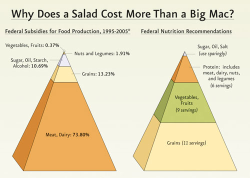
I missed this when it first hit the web, but wow, that’s a striking presentation.
The Physicians Committee for Responsible Medicine published this graphic during the 2007 debate on the US Farm Bill.
Capitalism, Illustrated
The folks at cognitivemedia took 10 minutes of David Harvey’s marxist analysis of the financial crisis and created this entertaining information visualization. Harvey’s full lecture is worth watching, too.
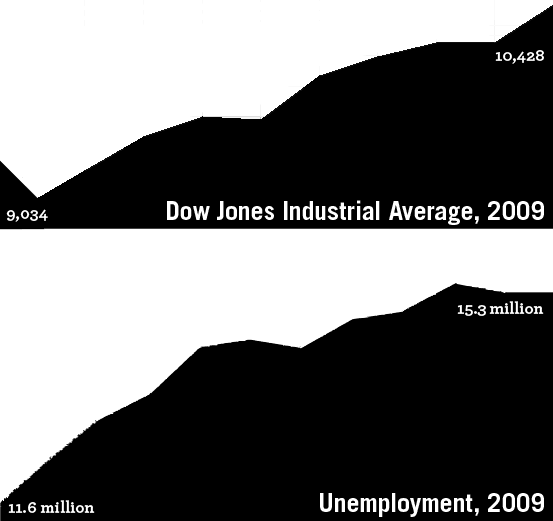
Job Loss to Recovery. The Obama administration has posted an infographic to bolster claims that a year after its signing, the Recovery Act is working wonders. I get the point, but the y-axis label is confusing: wouldn’t negative job loss be the same as job creation? Regardless, I had a different picture of the recovery.
Tracking the Recovery
Political Power of Data Visualization
Breezy, enjoyable 20 minute talk on competing infographics in the US health care debate, as well as a few graphical tricks and traps.
Legible London.  A new pedestrian wayfinding system to help people walk around the Capital. See also:
Bristol Legible City, Southampton Legible City, Legible Dublin, and Connect Sheffield
A new pedestrian wayfinding system to help people walk around the Capital. See also:
Bristol Legible City, Southampton Legible City, Legible Dublin, and Connect Sheffield
A new pedestrian wayfinding system to help people walk around the Capital. See also:
Bristol Legible City, Southampton Legible City, Legible Dublin, and Connect SheffieldTenants Rights Cards. 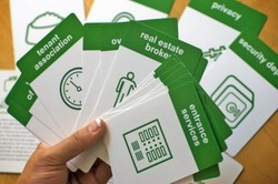 Candy Chang designed this set of flash cards on tenants’ rights with the grassroots organization Tenants & Neighbors and published the deck with a grant from Sappi. The set of thirty cards translates New York State’s official Tenants Rights Guide document into fun, digestible topic briefs on issues like security deposits, subletting, privacy and discrimination. Timely, too.
(Previously: pedagogical playing cards.)
Candy Chang designed this set of flash cards on tenants’ rights with the grassroots organization Tenants & Neighbors and published the deck with a grant from Sappi. The set of thirty cards translates New York State’s official Tenants Rights Guide document into fun, digestible topic briefs on issues like security deposits, subletting, privacy and discrimination. Timely, too.(Previously: pedagogical playing cards.)
Graphic Symbols for Disaster Response. A standard set of symbols for mapping and other graphic coordination between Federal, State, and local agencies in the event of a disaster, natural or otherwise. A work in progress by the Federal Geographic Data Committee’s Homeland Security Working Group. Download for free as TrueType fonts.

Visualizing Public Policy.  The Center for Urban Pedagogy has announced a call for designers for the next round of Making Policy Public. This year’s fold-out poster designs will cover policy briefs on:
The Center for Urban Pedagogy has announced a call for designers for the next round of Making Policy Public. This year’s fold-out poster designs will cover policy briefs on:- Preserving public parks and historically safe spaces for LGBTQ teens in the context of rapid privatization of public space.
- Enabling public housing residents to become active participants in critical decisions about the developments where they live.
- Educating the public about the redistricting process and reforms that can make it less subject to political manipulation.
- Helping youth and their families navigate the juvenile justice system.
- Visualizing market forces along the tomato supply chain that give rise to sweatshop working conditions in the Florida tomato industry.
Mappare il potere. Come usare il design per arrivare a ciò che si desidera. My article Mapping Power in Italian at SocialDesignZine. Ciao!