information design
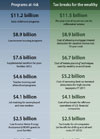
A unionized public employee, a tea party member, and a CEO

are sitting at a table. In the middle of the table is a plate with a dozen cookies on it. The CEO reaches across and takes 11 cookies, looks at the tea party member and says, “Watch out for that union guy. He wants a piece of your cookie.”
Saw this making the rounds on Facebook and other forums — so much so, that I was unable to track down the source. It glosses over a bit, but does a good job telling a powerful story in simple, visual terms. A nice bit of information design!
Google Earth and the Middle East
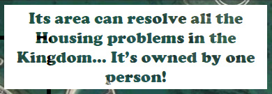
Ogle Earth runs down a brief list of ways Google Earth and the availability of satellite imagery in recent years have fueled class resentment and conflict in Bahrain, Iran, Iraq, Israel, Saudi Arabia, Sudan, Syria, Tunisia, and Yemen.
Leading the list are dramatic visualizations comparing the overcrowded living conditions of the Shiite majority in Bahrain with the palaces, estates, and private islands of the ruling families. After the country’s ISPs were ordered to block access to Google Earth’s imagery in 2006, this PDF of annotated screencaps illustrating the spatial inequities circulated widely by email.
Egypt Infographics
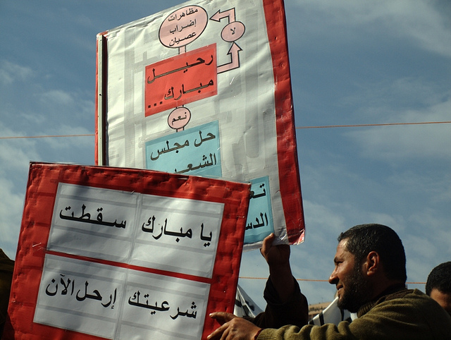
A protester breaks down the algorithm: “Mubarak leaves. Yes: Parliament dissolves. No: Protests, disobedience. strikes.”
One of the Creative Commons photos posted to the Flickr stream of Al Jazeera English.
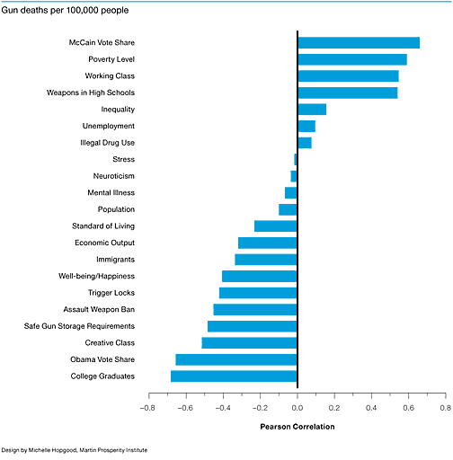
I’d love to see if a finer-grained city or census tract correlation bear out these findings, as well as other factors like, say, the scale of gun ownership.
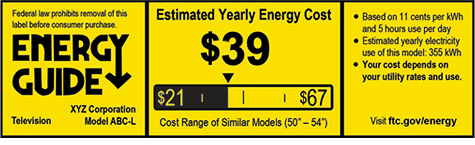
I heard the design process was quite contentious at the FTC before settling on the familiar motif. The yellow EnergyGuide label has been used since the 1970’s for washing machines, refrigerators, and other large appliances sold in the US but never before for electronics. By making long term costs visible at the point of purchase, this humble bit of information design has saved an enormous amount of resources over the last 30+ years. It’s also a nice nudge to manufacturers who know the information will be public.
Influencing Behavior through Design
“All design influences our behaviour, but as designers we don’t always consciously consider the power this gives us to help people, (and, sometimes, to manipulate them).”
Dan Lockton has posted a fantastic resource, Design with Intent. Formerly known as Architecture of Control, this book of cards features 101 design patterns for influencing behavior through form, feedback, and interface. The techniques span media from architecture and product design, to signage, interaction and graphic design and influence users by making choices easy, difficult, confusing or fun in sometimes subtle or provocative ways. The cards are organized by mode as follows:
You can download the complete set here. It’s a great primer on interaction design in the real world and a useful lens for looking at the politics of access and usability and the quiet frameworks of design and power that shape our daily lives.
 “Do you want a salad with that?” A powerful NY Times infographic on how shifting the default parameters of a space can motivate changes in behavior, in this case quietly altering lunch line layout and interaction to nudge kids into making healthier lunch choices. The graphic does a good job of calling out key data, and the data is astonishing, but lacks citation or context so here’s an article and a longer report by the authors which covers the same material in more depth.
Information Design for Advocacy: Beirut Workshops
Civil society in Lebanon is blossoming. The number of registered NGOs has increased dramatically in recent years and as advocacy campaigns become more sophisticated, there is a growing appetite for learning new techniques for conveying ones messages. I was invited by the US State Department Speaker Specialist Program to work with the Social Media Exchange (SMEX) in Beirut to conduct a week of workshops for local and international NGO staff on visual thinking and information design for advocacy.
Building on my work and my 2008 booklet Visualizing Information for Advocacy: An Introduction to Information Design, I devised three day-long workshops which were announced as follows:
Continue reading "Information Design for Advocacy: Beirut Workshops" »
Visualising Women’s Rights in the Arab World
I don’t usually blog about events, but I like how the model here approaches something of an incubator:
“A three day hands-on workshop (5 - 8 December 2010, in Jordan), for activists and NGOs in the Arab region, working on women’s rights, to explore how visual techniques can strengthen campaigning. The workshop will give participants the skills to plan and strategise visual campaigns, think about how to use information effectively and gain hands-on skills to develop a campaign using information design, mapping and animation/imaging techniques....
We invite applications for those working on women’s rights issues, in particular violence against women, the impact and role of women in political and violent conflict and women’s participation and leadership in public life. We also welcome communications specialists, designers, artists, illustrators, or technologists working with mapping techniques or data who can support women’s rights activists. 35 to 40 applicants will be selected to attend the launch workshop in Jordan in December. Participants will have to bring with them a campaign idea which will be developed over the course of three days. Of these, 10 campaigns will be provided with small-scale follow up support and mentoring to implement the visualisation element of their campaign in early 2011.”
They also have a project blog highlighting examples of visualisations. Applications to attend the workshop are due October 14, 2010.