

public space
Più design può
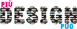 Nearly a year ago, SocialDesignZine (SDZ) published a blog item about design and the city that found its way to the folks in the Provincial Office of Florence. They were intrigued. So what would you like to do about it? they asked. Send us a proposal.
Gianni Sinni and Andrea Rauch, the team behind SDZ proposed a modest conference: a few critics, a few practitioners discussing design for democracy, society and the city. Then silence for eight months.
Finally, two months before the proposed date, funds were approved and the SDZ team swung into action. Both studios engaged their staff: the hall booked, website designed, print materials designed and produced, travel coordinated, and on May 22 and 23 they hosted Più Design Può, more design can. Attendance was free of charge and over 200 students and designers turned up to hear the lineup of Italian and international speakers. No one from the Office of Florence attended.1
The intersections and gaps between designers, the state, and the public ran throughout the discussions. Renewed attention to public utility graphics in the 1970s helped public offices use design in a more consistent way. Design, they realized, characterizes the relationships between citizens and public administration. Now the emphasis has been turning to how cities can facilitate citizen-to-citizen communication in an accessible, inclusive and sustainable way, to promote and enable participation in both social life and public affairs.
Via Just Seeds I found this condescending story in the LA Times. But it’s interesting nonetheless: “Baret, who like his fellow insurgents is a veteran defendant, had refused to pay the $58 fine. His lawyer argued that his actions were less destructive than the 57,000 giant signs that fill the train stations of France.... ‘The advertising budget in France is $39 billion a year.... That’s equivalent to the entire education budget in France.... Our movement goes a lot further than a simple symbolic gesture. And that’s what we want the public to understand.’”
This two-pronged attack on aggressive advertising, fighting with both graffiti and law, seems to be a growing pattern, a combination of legal and extra-legal civil disobedience (with a dash of spectacle) in the battle over what constitutes public space.
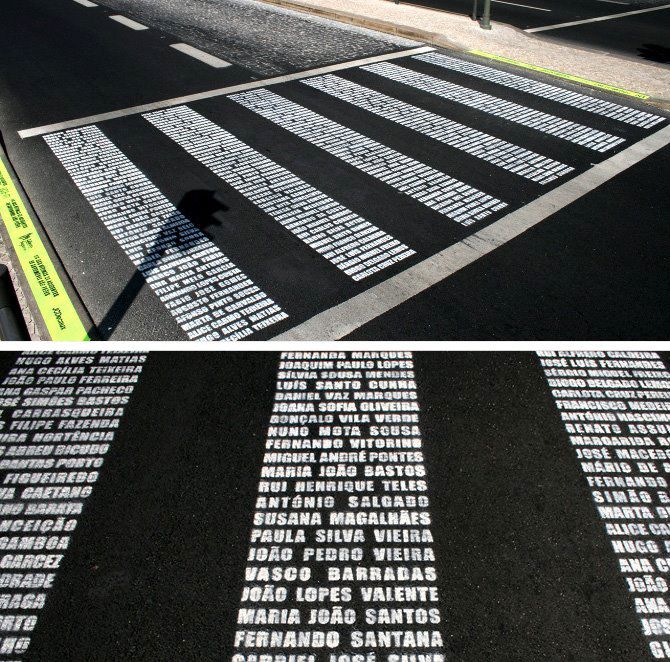
Crosswalk Memorial
This YouTube video documents pedestrian advocates in Lisbon, Portugal replacing the white “zebra” stripes in a crosswalk with the stenciled names of 137 pedestrians killed by cars. On the curb, the tagline reads: “1/4 das vítimas de acidentes de automóvel são peões.” 1/4 of the victims of automoboile accidents are pedestrians.
The typographic crosswalks were installed in May 2007 at four locations by the ad agency DraftFCB Lisbon for the advocacy group Associação de Cidadãos Auto-Mobilizados with support from Liberty Insurance and JC Decaux. The action generated a bit of media attention to the issue during “Safe Street Week.” (via)
 Curated by the Canadian Centre for Architecture, a list of 99 creative, public interventions for civic improvement. See, for instance, Illicit Stencil Saves Cyclists and Reclaim Vacant Lot with What City’s Got. ( via ag, gi)
The Vision Thing
An article of mine is running in the Design Issues column of the January/February 2008
Communication Arts. It started out as a piece about design education outside of traditional design schools, but then turned into something more — about grassroots engagement with public space and the power of design to envision change. Thanks Nicolas, Kim, Chris, David, and DK for their insight.
The Vision Thing
Seeing and creating change through design
It’s is not just in design schools. It’s not just in mentorship programs at top shelf firms. Design and education meet in the streets.
Most graphic design education points to a career as a design professional. But the same tools we use to undertake user research, solve problems, and satisfy clients can be used by young people to voice their opinions and meet the needs of their neighborhoods and communities.
The stories below are shining examples of design as populism. The designers of these projects – amateurs and professionals – have moved beyond a passive relationship to the world, beyond the daily pattern of serving clients, responding to assignments, and deadlines.
By taking it outside, they are asserting a positive vision and owning the spaces they live in – and in the process are making these places better for us all.
Human Traffic
Memorials shape our collective memory. They are a tangible, public stake against forgetting, a manifesto to the present and a reminder of the past as a warning for the future. Put forth by loved ones after a tragedy, grassroots memorials are at once both personal and public – often filling a void where government-funded memorials leave off. Some are subtle collections of flowers and personal items, occupying quiet corners of common space. Others scream out for attention. Rendered three-stories tall on the side of a building, the memorial mural on Butler Street and Third Avenue in Brooklyn is hard to ignore.
The design is a tribute to 28 pedestrians killed by cars between 1995 and 2007 in the streets of Brooklyn’s Gowanus neighborhood. The mural depicts three young boys, fifth-graders Victor Flores and Juan Estrada, and 4-year-old James Rice. All three were killed by cars speeding around corners – Rice was struck down just a block from the spot where the mural now stands. The driver who hit Rice got a ticket for failure to yield. Represented as towering figures painted in ghostly blue, the boys hold up redesigned streetsigns with traffic-related symbols urging respect for pedestrians. The three boys are accompanied by a blank silhouette holding up an unambiguous red stop sign declaring: “Not one more death.” The effect is chilling.
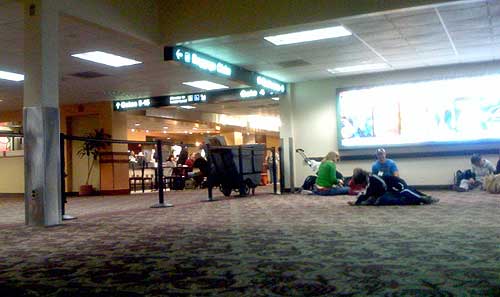
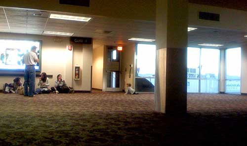
Open Terminal
Gate 4 in Terminal 2 of Sky Harbor International Airport in Phoenix, AZ is not meant to be used.
Behind the black stanchions, the roughly 50 x 50 foot space has no TV, no gift stand, no seats; just a row of outlets, a few windows, and a single column supporting the mostly uninterrupted, open space. Which of course makes it a perfect space for kids to wrestle and run, for strollers to park, and for bloggers to plugin their laptops and cellphones and lounge on the floor for a few restful minutes. It’s just a big, empty playroom — and a breath of fresh air, particularly after standing in line for an hour, when your departure gate is crammed, and you’re about to spend the next 5½ hours of your life hunched over your knees in steerage.
I suppose it only works because the space was relatively uncrowded — the black ropes keeping most out, but having no affect on those who toddle right under them, or the rest whose craving for free electricty overrides the risk of a stern talking to. The space probably would not have worked if this were an actual functioning departure gate. I suppose all the rigid rows of plastic seats are a good way of making sure luggage and bodies don’t collide.
But it seems like a fine idea — a sort of indoor, public park. I wish more places had uninterrupted, unstructured, uncommercialized open space. More airports should do this.
 “In the last year alone, the most innovative display of activism has sprung from the Streetpanthers, a band of thirtysomethings who under cover of night prowl the streets of Athens slapping the vehicles of egregious parking violators with Day-Glo orange stickers depicting a donkey in a car above the message, ‘I park wherever I want.’ More than 250,000 stickers have been distributed nationwide since the group’s Web site began operation (www.streetpanthers.gr) in July.”