

standards
 “Here in the US, fruit often comes with stickers on it, sometimes telling you where it’s from and/or what it is. There’s also a number, but I never paid attention to that. But on p. 72 [of April’s Food & Wine] I spotted this interesting bit of information:
‘[T]he sticker labels on fruit: The numbers tell you how the fruit was grown. Conventionally grown fruit has four digits; organically grown fruit has five and starts with a nine; genetically engineered has five numbers and starts with an eight.’”(via)
Prescriptions
Jakob Nielson notes this urgent usability upgrade in his January 23, 2006 email newsletter:
“Kudos to the U.S. Food and Drug Administration for a rare example of a government agency employing usability guidelines to save lives. The FDA has changed the rules for the “prescribing information” which is the leaflet that goes into medication packages. Now, the leaflets will place the information that patients and doctors need first, in a highlights section. Not exactly a new idea in usability, but in the past, these leaflets were dominated by useless warnings that served no practical use for the vast majority of readers; the first several pages of stuff didn’t do any good except act as a defense against predatory trial lawyers.
The new FDA rules state that, ‘Overwarning, just like underwarning, can similarly have a negative effect on patient safety.’ Exactly: if you bury useful info in masses of useless info, then users won’t see the truly important warnings.
Poor usability of drug information = dead patients.
The FDA has finally recognized the need to save lives by fighting back against the lawyers and writing drug info for users instead of courts. The new regulations explicitly prohibit several types of law suits where trial lawyers have harassed the medical system into making the prescribing information harder to understand.”
The rule had been under consideration by the FDA for more than five years — and is the first major change to drug labels in 25 years! For a more information, see the FDA press release or the NY Times article, New Drug Label Rule Is Intended to Reduce Medical Errors. New rules also affect drug advertising on TV and in print.
It’s the Politics, 2
The LA Times ran a great editorial last week in response to Bush’s State of the Union address. It chided him for hyping research, spending, and technology over policy and implementation.
“By and large, it isn’t a lack of technology that keeps the nation so dependent on oil. It’s the lack of will to use it.
Engineers have produced a basket of new technologies for making cars burn less gasoline, yet fuel standards for passenger cars in this country haven’t changed in more than two decades, and fuel economy has barely budged. Brazil has shown the way to energy independence by powering cars with ethanol made from sugar. This country, meanwhile, continues to pour billions of dollars in subsidies into producing ethanol less efficiently from corn. Advances in solar energy have made it less expensive and more reliable, yet only California is making a significant bid to exploit the power of the sun....
Technologies that could make the U.S. more energy independent sit on the shelf while the automotive industry dithers about raising the price of a car by a couple of thousand dollars (money that could largely be recouped in savings on gasoline) to raise gas mileage by about 20 miles per gallon. Bush also talked about investing in zero-emissions coal plants. Yet, after a former EPA administrator said the technology existed to reduce mercury pollution at coal-fired plants by 90% within a few years, the Bush administration issued far weaker regulations.
The energy legislation passed last year provides individual homeowners with tax incentives to install solar energy units, but it does nothing to lure builders into solar, which would have a far greater effect.
How about importing ethanol from Brazil to put more fuel-efficient cars on the road now? That would mean dropping tariffs and ending protectionism for U.S. corn growers.”
I tried to make a similar point here a few months ago, though was not as eloquent.
It’s the Politics, Stupid
I’m still new to the literature of sustainable design, but I find again and again that much of the writing consistently ignores the political, addressing the social only peripherally, usually in the analysis but not in the response. Instead the authors pursue solutions based on individual design and purchasing choices or through technological fixes — creating cool new materials or processes — hoping the market will sort things out once the ‘good’ is cheaper than the ‘bad.’
Is this a matter of expedience? Cynicism? Organizing to set standards or pass legislation is messy and slow and often involves other people.
And yet so many materials and processes already exist around us. Why they are not used more pervasively is, I think, a political problem.
The same technologies are generally available in the U.S. as the E.U. And there’s no doubt the E.U. is light-years ahead of us down the path towards sustainability.
And yet, even among those pursuing “market” oriented solutions, folks seem focused on making new, better, cheaper things rather than intervening in the market to, say, make the polluting more expensive. The former approach ignores the huge subsidies and political weight of industries invested in the old ways of doing things.
Still, if one wanted to pursue a market-based solution, why not require the Federal Government to purchase such products — say, requiring all government printing use a percentage of recycled paper. This would create an enormous demand for ecological goods and ultimately lower the prices of such.
But folks seem to focus on individual choice rather than industrial requirement, ignoring the power of the State altogether. Yeah, cleaner technology is cool and good, but I’m not convinced we we can just invent ourselves out of, say, deforestation without shaping the force of law.
And how to pressure the State? Building a movement is hard. Grassroots organizing is slow. And battling clients every day certainly makes me want to focus on making things instead of dealing with other people. But something’s got to give.
Words in Print
Just when you’re pounded by clients and far too busy to think about updating your blog, Print magazine publishes a nice little write-up pointing readers your way:
“Most designers agree, even insist, that design is more than clever imagery selling goods and services — it also influences how societies function. Social Design Notes, a remarkably informed and highly useful blog edited by John Emerson, explores design’s sociopolitical power and inspiration. A New York activist and designer who oversaw Web sites for Amnesty International USA and Human Rights Watch, Emerson launched his blog is 2002 as a ‘bridge between design activism — to push designers to think about acting in the public interest and to help activists see how design can facilitate their campaigns.’ Emerson explores how design is used to support and challenge the status quo, posting one historical note about the ‘Black Panther Coloring Book’ created by the FBI during the civil-right movement, and another about South Africa’s use of the comic book to prepare its citizens for their first election. Emerson also discusses the built environment, praising former New York mayor Rudolph Giuliani for having championed design to improve the lives of the disabled. And Social Design Notes’ Resource page contains tools — such as free stock photos — designed to convert readers into true reformers.”
The July/August 2005 issue also has a several excellent articles on sustainable design, and is worth checking out for this alone.
But it makes you wonder — why doesn’t the magazine itself use recycled paper? Despite the “In Print” column which touts the magazine’s “early environmental outlook,” this is not addressed. So, do they care about sustainability or not? I know design magazines are hardly a lucrative venture, but the article “Fiber Optimistic” on page 57 points out that cost differences between recycled paper and not are nowadays “negligible.”
But then why not take it a step further. If toxic printing processes and non-recycled paper are harmful to the environment, why not consider sustainability as a criteria for your annual design competition?
Imagine what a massive force the AIGA could be if they required printed entries to their annual showcase use recycled paper.
Would this punish designers for the choices of their clients? Perhaps, but then why shouldn’t judging the beauty of a product take into account the nature of physical object itself? If designers care about competitions, why shoudn’t they push their clients that much harder? Why don’t all design competitions consider sustainability as a criteria? Does this impose some kind of “political” viewpoint? One could argue that not requiring this broadcasts a political viewpoint just as clearly.
Would the AIGA’s dues paying members revolt? Certainly some, but as the issue of Print notes (p. 11):
“This year the AIGA formed a national task force to develop policies and programs for the organization in support of sustainability. Following a poll revealing the environment to be the profession’s most pressing concern, the Worldstudio Foundation and the AIGA, through their ‘Design Ignites Change’ collaboration addressing social issues on a local level, made sustainability the focus of their first project.”
Hell, the AIGA’s last national conference was largely devoted to discussion of sustainability.
So at what point does sustainable design cease to be a “special issue”? When does it become incorporated as a fundamental part of what we do? And when do our design institutions take a stand and show some leadership? When do we start demanding it?
Is this all unreasonable? I would point out that it’s already happened once before. The American Institute of Architects, another national design association, went through a very similar internal debate years ago and came out embracing the green.
...
Update July 18, 2005 — Print responds:
“It’s true, Print does not currently use recycled paper, but we are looking into doing so as soon as our current supply of paper is fully depleted. It has been an economic issue in the past, but we are hoping to persuade our publishers to spend a little extra on this aspect of responsibility.”
Election Design: Models for Improvement
While the push for verified, electronic voting rages on, in 2004 printed ballots and the ghost of the 2000 butterfly design still flutter through many districts. Activists, designers, and usability professionals are still working to redesign the process.
 In November 2002, I blogged about Design for Democracy, a project to bring graphic designers into the election design process. The project started as a class exercise at the University of Illinois, and is now a registered non-profit corporation backed by the AIGA.
Slate and the Chicago Tribune have both published articles about the effort.
Now, with a grant from Sappi, the Design for Democracy is publishing their findings and process, hoping to inspire action around the country.
From the archives of the AIGA somewhat-monthly newsletter, in the summer of 2003:
“Sappi Fine Papers has announced a major grant to Design for Democracy, AIGA’s initiative to improve the quality of election experience, in order to publish a book of graphic standards, with visual examples, to assist local officials in understanding the opportunities for clear communication. Marcia Lausen, former AIGA Chicago chapter president and design team leader for Design for Democracy, will be the principal author.
Marcia and Ric Grefé, AIGA executive director, presented concepts of election design to state election officials from all fifty states and selected secretaries of state in Portland, Maine in late July. A number of officials expressed an interest in contacting local chapters about how they could work with local designers. Marcia and Ric will send out a follow up letter to all the attendees encouraging them to become involved with a list of chapter presidents. If you are contacted, we can discuss different ways in which we have found it to be productive to work with state officials and will provide all chapters with copies of the templates of work done to date. The most recent states to seek AIGA assistance are Texas and Michigan.”
And from the March 2004 AGIA Communique:
“‘Election Design: Models for Improvement’ is a new, comprehensive graphic design system for improving the quality, legibility and effectiveness of election materials. In November 2000, a group of design professionals, educators and students began a dedicated effort to improve the voting experience. Organized as a program of “AIGA Design for Democracy,” this team worked in association with the University of Illinois at Chicago and directly for election officials in Cook County, Illinois and the State of Oregon. Project teams developed prototypes for improved ballot design, election administration, poll worker training and recruitment, voter registration, polling place signage, vote-by-mail, absentee voting, provisional voting and voter education and outreach.
This publication documents the resulting design system. It includes detailed information, guidelines, visual examples and templates that can be adapted for use by all states and counties. AIGA price: $100. Shipping charges $3 within U.S.A. Place your advance order.
It’s a great idea, but the $100 price tag is astonishing. That’s a big ticket for a grassroots advocacy manual. While the price might not bother AIGA members, it would certainly shut out many grassroots groups working on voting rights. What happened to all that Sappi money? Is the design of the book itself what makes printing so expensive?
Allergic Reactions
Next week the House of Representatives will vote On the evening of July 21, the House of Representatives approved a law requiring new package design standards that may save lives.
From The New York Times, July 10, 2004:
 “Each year, some 30,000 Americans are rushed to emergency rooms because of severe allergic reactions to food. Roughly 200 people die yearly from such reactions. Sound public health legislation passed by the Senate, and heading for House action before the Congressional recess, aims to lessen that toll by requiring that food labels clearly and accurately disclose the presence of the eight most common allergens in various additives: peanuts, eggs, milk, soy, tree nuts, fish, shellfish and wheat.
The bipartisan measure fills a hazardous gap in Food and Drug Administration rules, which do not require that these allergens in spices, flavorings, coloring and other additives be listed on labels even though ingesting the slightest amount can be fatal for some people. And the allergens that are listed on a label are frequently identified only by their formal names instead of in everyday English — as ‘whey’ instead of ‘milk product,’ for example.
The food industry adopted voluntary guidelines to try to fend off legislation. But although some companies now list allergens in clear terms, others still don’t. The government needs to make compliance universal.
First introduced four years ago by Representative Nita Lowey, Democrat of New York, and championed in the Senate by Edward Kennedy, a Massachusetts Democrat, and Judd Gregg, a New Hampshire Republican, the measure also has important backing from the Bush administration. Its expected passage by the House this week, and subsequent signing by the president, will give food manufacturers until 2006 to refashion their labels to list allergens more clearly. It will also give Americans an all too rare example in this election year of bipartisan cooperation to serve the public good.”
The FDA publicly recognized fatal food allergies in 1994, and in 1996 acknowledged the need to label foods containing allergenic substances. However, they were unable to require the labeling because
“Section 403(i) of the [Food, Drug, and Cosmetic Act] provides that spices, flavorings, and colorings may be declared collectively without naming each one. Secondly, FDA regulations (21 CFR 101.100(a)(3)) exempt from ingredient declaration incidental additives, such as processing aids, that are present in a food at insignificant levels and that do not have a technical or functional effect in the finished food.”
The new bill is the result of grassroots pressure and several medical and academic studies on the effects of allergens and interpretations of commercial food labeling.
This study on label interpretation is even cited in the text of House bill.
The Center for Science in the Public Interest also takes some credit, remarking that:
“A major impetus for the legislation was a 2001 article in CSPI’s Nutrition Action Healthletter that publicized a study by the Food and Drug Administration showing that about 25 percent of candy, ice cream, and baked goods from plants in Minnesota and Wisconsin had products with undeclared egg or peanut ingredients.”
I note that the CSPI’s influential document was in part a repackaging, redesign, and republishing of information already available from the FDA.
The Food Allergen Labeling and Consumer Protection Act (FALCPA, or S. 741) was approved by the House Energy and Commerce Committee on June 24, 2004. It was passed by the U.S. Senate on March 8, 2004. The bill now goes to President Bush for his signature.
The new allergen info is likely to be added to the Nutrition Facts label.
Updated July 21, 2004
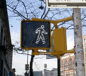
Crosswalk Usability

Everyone knows that New Yorkers pay attention to crosswalk signals... right?
So if you live in New York City, you may or may not have noticed that all the old crosswalk signals are gone. Instead of the spelling out WALK and DON’T WALK in type, the new signals use pictograms of a big red hand and walking person in a dotted outline of bright LED’s.
The new signal displays fit into the old, existing signal housing. And, by switching from incandescent bulbs to light-emitting diodes, the City notes, the new signals will both last longer and use less energy.
This piece in the New Yorker provides some hard numbers:
“The city is changing all eighty-five-thousand signs, at a cost of $28.2 million. The job started in 2000, in Queens; by February [2004] the [job] should be complete....
The idea is that the new ones, which rely on dozens of light-emitting diodes, or LEDs, will last six times longer than the old ones, which relied on two bulbs, and will save two million dollars a year in maintenance and electricity costs....
The brighter signs should be more visible to persons with partial sight. But, the author notes, the signals do have detractors:
“Among them many children, who sense that there is something patronizing about the hieroglyphs....
‘First of all, they’re really bright,’ Jacob said. ‘They hurt my eyes, even from, like, a block away. They make my eyes water. And, also, the first thing my sister could read was Walk/Don’t Walk.’ The three of them came to a corner: across the street, an upraised hand. They took a look, then crossed anyway. ‘The old one is just more original,’ Jacob went on. ‘Almost every other place has the Man and the Hand. Whenever I go anywhere else, it’s the Man and the Hand. Italy, France—they always have that. It’s un-unique. So I don’t really like it. Actually, most of my friends don’t like it.’”
The NYC page also claims that switching to “internationally recognized symbols” will make the signs “easily recognized by non-English speaking pedestrians.” I applaud the recognition and accomodation of non-English speakers in such a massive, city-wide initiative, but while the symbols may be “internationally recognized” in Western Europe, an open palm has different meanings in different cultures. For instance:
- In Japan an open palm in front of one’s face means “I don’t know,” “I don’t understand,” or “I am undeserving,” [source]
- In Greece, “extending the arm and hand (palm open) as if pushing something away from you is an age-old form of insult. In wars, Greeks would humiliate their prisoners by rubbing mud or fecal matter into their faces.” [source]
- And in Nigeria, pushing the palm of the hand forward with fingers spread is a vulgar gesture. [source]
 With closs-cropped hair and boot-cut pants, the figure in white resembles other symbols used around here to indicate “male.”
The NYC page doesn’t mention it, but new crosswalk symbols are nationally mandated in the Manual of Uniform Control Devices published by the U.S. Department of Transportation. The Manual sets forth detailed design standards for traffic signage around the United States.
Recently, in San Francisco I discovered another variation I’d never seen before. In addition to the white man and red hand, the signals there feature a red countdown indicating the number of seconds remaining to cross the street. It turns out the countdown option was added to the Manual in 2000, and is slowly gaining popularity across the country. I was struck by the simple brilliance of it. The additional information is much more useful than the simple flashing hand or DON’T WALK. The latter always seemed to start flashing when one was halfway across the road. This calls to mind the scene from Rain Main when the austistic character stops walking in the middle of the road.
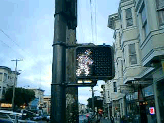
But that, apparently, is exactly when it is supposed to start flashing. The period of the countdown, flashing hand, and flashing DON’T WALK is known as the “pedestrian clearance interval”, the time for pedestrians to finish crossing, not to start crossing.
Local studies around the U.S. are finding that the countdown signals come at a price. While the countdown reduces the number of pedestrians who start running when the flashing DON’T WALK signal appears, the countdown seems to be interpreted to mean that it is OK to cross the street if there are enough seconds on the clock. Pedestrians are more likely to start crossing the street during the countdown than during the flashing DON’T WALK. This is contrary to the intent of the designers, and of the law.
Significant data has not yet been gathered on the countdown signal’s effect on the overall number of pedestrian fatalities.
Popular Delusions and The Madness of Cows
Since we know exactly how mad cow disease is spread, it should be pretty easy to identify which meat to buy just by finding out how the cows are raised. Free range? Grass fed? Organic? It’s all labeled there on the package, right?
You might be surprised to find out just what falls into the gap between “Grass Fed” and “100% Grass Fed.”
 In steps the Consumers Union to provide the story behind the cypher:
“Consumers Union (CU), the independent nonprofit publisher of Consumer Reports magazine, is providing consumers with important information about which meat labels can and cannot help consumers wanting to reduce their the risk from mad cow disease.
Mad cow disease is known to pass from one animal to another through the use of animal by-products in animal feed. Certain labels indicate that animal by-products are not used in the feed that produced the meat. Therefore, meat carrying these labels is very low risk in terms of mad cow disease.
The information is posted at eco-labels.org which lists the the most helpful labels (“Organic” and “Biodynamic”) somewhat helpful labels (like “100% Grass Fed”), and labels that should not be relied upon to reduce the risk of exposure to mad cow disease (like “Free Range”).
In addition to meat labes, the site lists terms and labels from other food, household, and personal care products, and clearly states which terms do or do not have official definitions and organizations who verify compliance.
From eco-labels.org:
“CU launched www.eco-labels.org in the spring of 2001 to help educate consumers about these labels. Consumers Union believes that the best eco-labels are seals or logos indicating that an independent organization has verified that a product meets a set of meaningful and consistent standards for environmental protection and/or social justice....
The purpose of this site is to provide information to consumers regarding eco-labels, products that carry eco-labels, the organizations that produce eco-labels, and government and private standards for ‘green’ products. Our goal is to help consumers make more informed choices in the marketplace, and participate more effectively as citizens in important decisions that affect the environment.”