

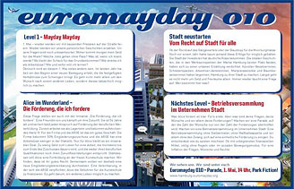
1 May 2010
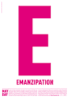
MayDay Posters
“What does International Workers’ Day mean for the self-employed — for the designer or any other highly flexible working person today? Or someone unemployed? How does someone self-employed go on strike? How do you fight for better working conditions?”
In much of the globe, workers of the world celebrate the first of May with demonstrations, parades, and parties led by community groups, unions, and left wing political organizations.
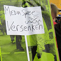
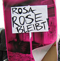
Once a celebration of Spring and a commemoration of attacks on workers, EuroMayDay is a modern reinvention of the May Day tradition. The first MayDay Parade was held in Milan in 2001 and has since spread across Europe. In 2006, it grew into EuroMayday, a day of protests and actions to fight “precarization” of workers and discrimination against migrants in Europe and beyond. New forms of Precarity are a result of shifts in the modern workplace from permanent employment to temp work, freelance, and other instruments of “flexible labor.” This has resulted in an existence for workers without predictability or security, affecting both material and psychological welfare.
Hundreds of activists and volunteers over the years have come together to organize the MayDay events. Since 2007, the design studio bildwechsel / image-shift has joined them, producing a series of beautiful and provocative MayDay posters. To celebrate MayDay (and the anniversary of this blog) I asked the studio partners about their MayDay poster designs from the last 4 years.
Founded in Berlin in 1999, bildwechsel is a political and socially engaged design studio dedicated to cultural, social and political graphic design and communications. Its clients include theaters, museums, activist groups, artists, curators, and other cultural and political institutions.
The studio’s MayDay posters address the contradictions of modern capitalism which can be found in the fields of work and everyday life. There is also a sense of humor and gentle absurdity to them. The posters (and other related designs) are also participatory and collaborative — you place the stickers, you fill in the blank, you wear the mask, you rearrange the order. But they are also participatory within an urban environment, not just inviting the viewer to remake the image of poster, but by extension the image of the city itself.
I edited and condensed the notes here from interviews and email with the studio partners.
bildwechsel was also careful to credit the role of invisible work in the conception, production, and distribution of the posters: “We productively depend on all the other people, friends, activists who make this happen — through this we become a part of the whole thing. Besides the collaboration, it is also always a social thing. We are privileged with the part we do in this. The things we do come out of wider discourses — we are not the geniuses. All of these posters have been conceptualized and produced in collaboration between the studio, friends, people of the MayDay groups… they are the results of long days (and sometime nights) of work, thousands of e-mails, discussions over beers, conflicts and the back-and-forth of process.”
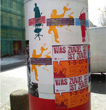
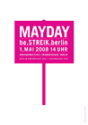
2007
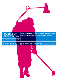
In English: “Take back your life! Super-friendly, super-creative, super-flexible, super-assiduous... But WTF?”
bildwechsel: Like strikes or sabotage, old fashioned images and iconography of working class resistance (fists, flags, etc.) do not necessarily apply to the new precarity. When the organizers approached us to design the posters, they had ideas like a freelancer pouring coffee into their laptop or a bike messenger who cuts his bike chain. But ideas of strikes and sabotage do not apply to self-employed, flexible freelance workers like us: “My laptop costs €1000! I can’t strike because I’m my own boss — and slave at the same time!”
So we try to find images which circulate between work and daily life, and to use images that are not stereotypes. We are talking about the penetration of the market and capitalist culture and so on into every sphere of life. And when one is highly identified with one’s own work, self-determination and self-exploitation are often very close. So one question behind MayDay was, and still is, how to organize with others for our rights. The unions don’t have an answers to these new market/labor settings and logics.
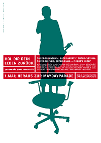
We tried to produce images that raised these questions in a poetic way. The first poster looks at the relations between intellectual work and manual labor (table lamp vs broom,) between home office and public service and so on. The second poster of the person standing on her office chair with the wrench is a call to change perspective. [Try it. Stop reading this now and climb your chair and look at your room — and your life from a different perspective.]
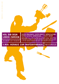
The 3rd poster is basically a modernized version of the fighting worker. It doesn’t say much more than “I/we fight back,” even though it is a woman and is fighting with kitchen implements. We actually had quite a fight with the MayDay activists on this point. As long as its not clear why, we feel it is difficult for people fight for their rights. As such, we prefer to operate with questions more than with exclamations marks, slogans, and stereotypical images. In any case, this poster was a compromise that came out of that collaboration.
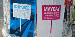
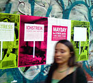
2008
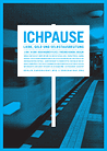
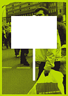
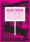
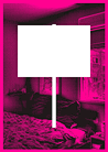
bildwechsel: This series of 7 posters (3+3+1) is raises the question of how to strike or pause in our working conditions in a situation of precarity. For instance for freelancers, but also in general, it does not automatically relate to the workplace.
The idea came out of anger: how can we go on strike besides getting sick, drinking all night or just burning out? We felt that it was not enough to just share the drama of daily life work stress with our friends or partners in private settings. We wanted to put these questions into the streets, to inscribe them into the public discourses. Stress, burnout, job related illness… these are not just private issues.
The political picket sign is superimposed on background images of daily life, both public (the subway) and private (the bedroom,) playing on the contradiction between of the picket sign (classical demonstration and expression of demands) and daily life (bed, street, transportation.)
This is played against by the absurdity of the poster with an empty picket sign. The empty sign opens up the possibility of writing one’s own claims, questions, and anger… but also puts forth the idea that politics is not a “ready made product” but a participatory process.
The 3 words below try to raise more questions about the contradictions of living in a market culture. For instance, the question about “solidarity:” how does this work together with career and competition? Even though both happen all the time?
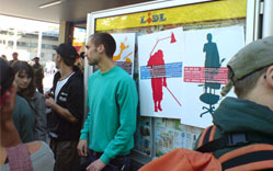
See larger images of the posters and English translation of the poster text. See more photos of the posters on the streets.
2009
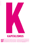
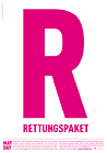

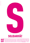

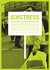
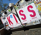
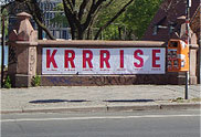
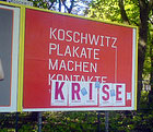
bildwechsel: The purpose of this year’s posters was bring the financial crises symbolically into the streets — and to raise further and deeper questions. At the time (and even today) the word “crises” (KRISE) ran through every newspaper and discourse and we wanted to deconstruct this in a symbolic, didactic, and playful way.
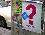
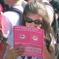
The studio designed 6 posters: 5 letter posters, and a question mark spelling out “KRISE?” This year, the flyposterers were brought into the design process as well. (Though actually, flyposterers always design, too. They shape the public space.) Around 9,000 posters were printed and distributed and wheat-pasting volunteers could arrange the 5 letter posters and question mark in any order they chose. This become a city-wide game of Scrabble! Through this game, the word KRISE could become a KISS, a cock-a-doodle-doo (KIKERIKI) or cake (KEKS.)
Each letter (and the question mark) was accompanied by a corresponding text on themes taken from critics of capitalism. These raise questions about post-colonial issues, participatory political forms, solidarity, and what’s now! See larger poster images and English translation here.
The posters could be further customized with the addition of a blue sticker. See more photos of the posters on the streets.
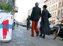
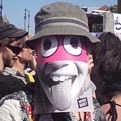
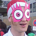
The studio also produced flyers with information about the event (the call) on the back. These could then be cut up to become a customized mask. More photos here of the mask in action.
2010
This year bildwechsel / image-shift shifted its focus to events in the city of Hamburg. The organizers of EuroMayDay Hamburg are a small group of friends, not a bigger coalition like the Berlin MayDay organizers, are a very creative in themselves, and seemed like good folks to work with — at an interesting time. In recent years, Hamburg has become the site of both gentrification and resistance. First a bit of background:
Hamburg is a smaller city than Berlin and one of the richest cities in Germany (one with the highest density of Porsche drivers!) But it also has an active harbor and a deep tradition of working class rebellion, political and cultural movements.
In 2009, a widely viewed documentary film Empire St. Pauli told the story of a working class neighborhood by the river and its gentrification. The film documented the neighborhood and its residents, the changes taking place and what it means for Hamburg to become a neo-liberal city where everything is privatized and thrown under the logic of the market.
St. Pauli was also the site of Hafenstraße, a famous squat in the late 80s and early 90s. These houses became a big leftist cultural center with dancers, artists, and film makers living and working there, and became a big symbol for the left.
In 2009, a group of artists, students and designers squatted another small neighborhood, Gängeviertel. This group of 12 houses has since become the focal point of a large, widely-supported movement. As a result of the movement and the attention it generated, city officials tried to embrace it and use it to market the city: “Hamburg, City of Talent!” Artists were pissed about being used in such a way and wrote a manifesto (English here.) The document resonated internationally and the manifesto was discussed in the Hamburg senate. Suddenly everyone was on the side of the artists — Greens, Liberal Democrats, Conservatives. It prompted public discussion about “What is this city about?” and triggered a small social movement under the “label” the “Right to the City” under which other anti-gentrification projects and political groups have rallied. These are not just radical leftists, but left-leaning cultural workers: students, artists, etc.
As a result of the activity around Gängeviertel, the has city bought back the 12 houses from the private investor who owned them. And, though still in negotiation, most likely the artists will be able to stay. At the same time, city officials have changed the parameters of how city property can be sold. Whereas the highest price used to win, now social and ecological factors must be taken into consideration as well. (In another location in Hamburg, a huge, empty shopping center was recently taken over.
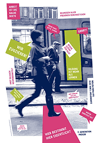
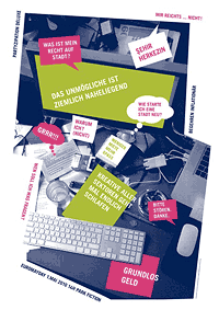
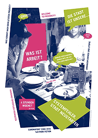
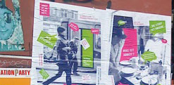
Against this background, bildwechsel / image-shift visited to Hamburg to develop posters for this year’s MayDay activities. Working with friends, the organizers, studio partners Pierre and Sandy developed three big posters. These are not posters in the classical sense, as they have no reading hierarchy, but are more fragmented with more open questions that reflect discourses around the Right to the City that have emerged in the last few years. The images in the posters relate to 3 different spaces: work, public space, and private space. The speech bubbles are a combination of “surrealist” and concrete claims and questions: “4 hour week,” “For whom/what are you working?”, “Rich parents for all,” “What is my right to the city?” See larger poster images and English text here.
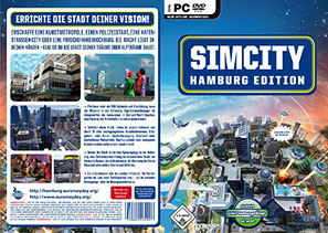
In addition to the three posters, the studio designed a smaller poster riffing on the graphics of Sim City. The text reads: “Erect a city to your vision. Create an art utopia, a police state, a harbor-street squat city, or a porsche driver capital. The power lies in your hand. Whether you build the city of your dreams or your nightmares.” (German text here.)
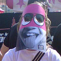
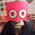
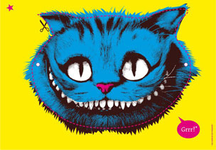
The MayDay group and the studio also created masks with the Cat from Alice in Wonderland. These refer to a famous Hamburg native named Alice, a person on social welfare who has been fighting for arts education funding. The masks have information on one side and the cat face on the other, so demonstrators can cut through the eyes of the mask and look literally (and figuratively) through the flyer.
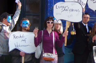
In the days leading up to MayDay, the Alice masks were already being used in a “rent action” in Hamburg.
Read more about the grin of precarity, the Right to the City, or visit bildwechsel / image-shift’s website.
![]() 1 May 2010, 10:18 AM | LINK | Filed in
cities, posters, public space
1 May 2010, 10:18 AM | LINK | Filed in
cities, posters, public space
Read more items related by tag: