

aiga
Motion and Movement
In that last blog item I’d written a line disdaining “media that dazzles instead of informs.”
I’ve been thinking about the AIGA MOVE conference, a two day affair on motion graphics design. It was painfully hip — lots of twenty-something, white guys with bad 70’s hair talking about their animated films, music videos, and electric art happenings. The reigning criteria seemed “Funny, Weird, or Cool.” The most useful and informative session was the only one on narrative — an odd number for an event billing itself on “stories in motion.”
But I struck out the line. It read as if I was saying these are mutually exclusive, which, of course, they are not. For a designer, I tend to be awfully suspicious of style — particularly of work that privileges style over clarity. But one musn’t forget the heart in the struggle for hearts and minds.
Favianna reminds me so:
“As a political poster artist, it is important for me to remind myself of ways to develop art that speaks to a mass base of people, so that my the art becomes something functional and not something to be purchased and sold. My posters don’t belong in galleries, they belong in schools, in the streets. Art in this country is commodified and transformed into something for commercial consumption. Our role as artists is to use our art to transform and inform a radical consciousness and to move the people.”
Design Ignites Change
From the American Institute of Graphics Arts:
“AIGA and Worldstudio Foundation will collaborate on a number of projects in 2005.
 ‘Design Ignites Change,’ a new joint initiative of AIGA and Worldstudio Foundation is an annual program in which members of the design community across the country work individually or in teams to create together some kind of visual artifact that will have broad visibility in our communities; that will be seen as a way to emphasize the value of design by doing something valuable to the community; and that will stimulate thought, dialog and action.
The goal is to showcase the projects in a traveling exhibition with a companion book or publication that will demonstrate the impact they had in their respective communities.
We are currently seeking designers’ input on what the program should address through a short online questionnaire.
Please take just a few minutes to share your thoughts before Friday, February 11.
While project parameters are still in development, certain criteria will be important, whatever final form the program may take: the program will be nationwide, annual, should include nonprofessionals and/or young people and program themes should be topical, current and politically nonpartisan.”
While it’s great that the AIGA is compiling a collection of graphic work for social change, it’s a shame that it’s so isolated from the rest of their work. For instance, there wasn’t much at all on social change in the results of their annual competition. Just think what an engine for progress the AIGA could be if they required (or even just awarded bonus points) for printed entries submitted recycled paper, printed with non-toxic, sustainable practices.
These types of things also tend to recognize work that other designers like rather than what works best for the client or issue. But if the resulting publication inspired a designer or student or two to take on a project in the public interest, that’d be a fine thing indeed.
And while the AIGA is a 501(c)(3) non-profit corporation and can’t endorse candidates or lobby too much, the whole “politically non-partisan” thing seems increasingly like a firm vote of approval for the status quo and its consequences. Now more than ever.
In any case, it’s hopefully a full first step towards a broader embracing and encouraging design in the public interest. And it’s nice that they are open for comments. Go tell ‘em what you think.
Guns, Butter, and Ballots
An article of mine is running in January/February 2005 issue of Communication Arts.
If any of you were wondering what all that Nixon bit on the Federal Design Assembly was about, it was background research for this.
Guns, Butter and Ballots
Citizens take charge by designing for better government
What did the President know and when did he know it? In April 2004, the White House declassified one of the President’s daily intelligence briefs issued just a month before September 11, 2001. The brief specifically states that Al-Qaeda and Bin Laden were planning attacks on the United States with hijacked airplanes.
Graphic designer Greg Storey was horrified. Not just because the information was all right there, but by the design. It’s no wonder the information could be ignored. The document is an uninflected, grey mash of sans serif type. Might thousands have been saved if the information design had been better?
“Nothing in the text is emphasized, making it difficult to scan,” Storey noted on his Weblog. “It would be much better if keywords, names and places were in bold and/or in a different color. Make it so that within seconds the President can see how serious of a threat it is.” Mouse in hand, Storey created a redesigned brief of his own (below right), adding a larger headline, highlighted key terms and, most prominently, a large colored number indicating the level of the threat.
Though no one in government ever contacted Storey, readers of Storey’s blog clamored for a document template they could use themselves. He dutifully responded. (Visit http://airbagindustries.com/archives/002868.php.) “My intentions were nothing more than to rant about what I saw to be a problem with how our government works day to day,” he wrote. “I thought I would spend a few minutes in front of Photoshop to see what I could come up with.”
Alas, President Bush does not actually read the daily briefs, the Director of Intelligence summarizes them to him out loud. Nonetheless, Storey’s redesign is a dramatic example of how information design might affect the government and the public.
But the truth is, graphic designers across the country are already hard at work collaborating with local, state and national government officials to harness the power of design in the public interest. Their work affects the lives of millions of Americans by improving public safety, promoting public health and facilitating democracy on a massive scale — often at the initiative of the designers themselves.
That government agencies use graphic design is nothing new. From posters to packaging, identity and, of course, forms, the federal government is one of the largest purchasers of design services in the world. But much of this work is less than inspiring — even obscure or downright misleading. For a variety of reasons, government designers may be stifled by bureaucrats and lawyers. And sometimes it seems like the lawyers and bureaucrats do the designing themselves.
The late 1960s and 1970s, however, saw a number of seminal graphic design projects sponsored by the U.S. Government. To name just a few: Vignelli Associates’s graphic standards for National Park Service publications; Danne & Blackburn’s NASA “worm” logo; and Chermayeff & Geismar’s logos for the Park Service, Environmental Protection Agency and U.S. Bicentennial.
Continuing a wave of public art initiatives at the time, Richard Nixon even asked Congress to triple the budget of the National Endowment for the Arts and created the Federal Design Improvement Program to help upgrade government architecture and graphics.
But by the end of the 1970s, faced with an energy crisis and an economic recession, the new leadership shifted the government’s priorities. By the 1980s, a backlash raged against public arts funding. Budgets were cut and interest in public design projects waned.
Still, during this period, two masterpieces of modern infor- mation design were developed, both of which have had a demonstrable impact on public safety.
Burkey Belser’s company usually designs communications materials for law firms and other services companies. But in 1978, he was asked to design the EnergyGuide label for the Federal Trade Commission. The frustrated regulators had become desperate after a top-shelf New York design firm had failed — and submitted a hefty bill in the process. The EnergyGuide that Belser designed is a bright yellow informational sticker that must be displayed by retailers on all major appliances (like air conditioners, refrigerators and washing machines). The Guide shows the estimated yearly operating cost and energy consumption on a scale from least to most efficient. Consumers actually used it to consider not just purchase price, but cost over the life of the appliance. The success of the label convinced government regulators that you could modify consumer behavior through clear, friendly information design, gently pushing them towards more environmentally friendly, if slightly more expensive, purchases. Multiplied by millions of refrigerators, the energy savings have been enormous.
Belser’s 1994 redesign of the Nutrition Facts label also attempts to influence consumer decisions. But the label, the most widely reproduced graphic in the world, very nearly had no designer at all.
In 1991, Congress mandated that the science behind the label be revisited. Originally developed in the 1960s, the previous label was based on a culture of famine during the Great Depression and two World Wars. Hunger was an epidemic. Food was scarce and the country lacked an interstate highway system to move fresh fruits and vegetables to market. The government’s priority in the first label design was to fend off malnutrition, rickets and scurvy, and so the label highlighted essential vitamins and minerals. In 1991, Congress realized we were living in a different culture — a culture of plenty...and of fat. They tasked the Food and Drug Administration (FDA) to develop a new labeling scheme to fend off an epidemic of obesity.
The Center for Food Safety and Applied Nutrition at the FDA was well equipped with top scientists, nutritionists and epidemiologists, but lacked experience in public communication. The Center had hired another big New York design firm, but was dissatisfied with the results. And so they prepared to go it alone.
Sharon Natanblut had a background in marketing and public relations, and had just started at the FDA as advisor to the Commissioner for strategic initiatives. When she found out that the scientists were designing the label themselves, she intervened. “The scientists saw graphic design as a trivial thing,” she recalls. “They thought more information is better. But ultimately, it is the design that helps you understand it.”
Natanblut knew Belser from his work on the EnergyGuide and knew he could communicate with both scientists and government officials, and would ensure that the design reflected the goals of the project.
Belser offered to do the job for free (though was able to charge for some expenses.) “If ever there was a call for pro-bono work,” says Natanblut, “this was it.” Belser comments, “Designers should really take on public projects as a part of citizenship. That’s why we did it. How often do you get a chance to affect so many people? Anyway, I didn’t want to mess with the government procurement process at the time.”
Belser and his staff put in countless hours and, after designing 30 variations, learned there is no such thing as a universal symbol. They found that literacy is more complex than they had imagined. The label had to be accessible to both poor and fluent readers. They found that poor readers stumbled over commas, dashes and semicolons, and that graphs, icons, pie charts are more sophisticated than they’d thought, requiring a relatively high degree of visual literacy. In focus groups and in public comment, designs that used these elements were slaughtered.
Eventually Belser and his team developed the current layout. The generic and anonymous looking design is anything but. The placement and grouping of information and the use of boldface create a visual hierarchy. To combat increasing obesity, the new design highlights calories, fat and cholesterol. And the resulting label is used by health-conscious shoppers to count calories and monitor their cholesterol intake. As former FDA Commissioner David A. Kessler recalled, “The nutrition facts label has within the space of a few years become a standard that many Americans use to make basic decisions about their diet and nutrition.”
The apparent lack of “marketing devices” is also misleading. The space is branded with a kind of “look of truth” — neutral, scientific, institutional and authoritative.
Nonetheless, obesity continues to rise at a dangerous rate — fast becoming the number one cause of death in the United States. In response, Belser is currently working with concerned advisors to government to further modify the design.
One might argue that it’s not the government’s place to interfere with people’s behavior or engage in “social engineering.” Belser responds, “I don’t think that there’s any government, corporation, or anybody that is not trying to influence somebody else. We have a Constitution and body of laws that say certain areas are off limits...But what the government is willing to do, and what, I believe, has a perfect right to do is to manage issues of public health and safety.”
Citizen action
The Nutrition Facts and EnergyGuide labels show the reach of government sponsored information design. Recently, however, the design process seems to be shifting.
Whether designers are tired of commercialism or were awakened by the 2000 butterfly ballot fiasco, there seems to be increasing interest in civic engagement. As portrayed in the 2000 reissue of the First Things First Manifesto and the AIGA’s recent Voice conference, designers are increasingly thinking about social responsibility and looking for ways to get involved.
In fact, several recent government design projects have been driven from the bottom up rather than the top down. Redesigns of the 2000 census, voting materials, New York City’s ubiquitous choking victim poster and the 1040 tax form were all initiated by designers themselves. In some cases starting out as class projects.
Election Design: Models for Improvement
While the push for verified, electronic voting rages on, in 2004 printed ballots and the ghost of the 2000 butterfly design still flutter through many districts. Activists, designers, and usability professionals are still working to redesign the process.
 In November 2002, I blogged about Design for Democracy, a project to bring graphic designers into the election design process. The project started as a class exercise at the University of Illinois, and is now a registered non-profit corporation backed by the AIGA.
Slate and the Chicago Tribune have both published articles about the effort.
Now, with a grant from Sappi, the Design for Democracy is publishing their findings and process, hoping to inspire action around the country.
From the archives of the AIGA somewhat-monthly newsletter, in the summer of 2003:
“Sappi Fine Papers has announced a major grant to Design for Democracy, AIGA’s initiative to improve the quality of election experience, in order to publish a book of graphic standards, with visual examples, to assist local officials in understanding the opportunities for clear communication. Marcia Lausen, former AIGA Chicago chapter president and design team leader for Design for Democracy, will be the principal author.
Marcia and Ric Grefé, AIGA executive director, presented concepts of election design to state election officials from all fifty states and selected secretaries of state in Portland, Maine in late July. A number of officials expressed an interest in contacting local chapters about how they could work with local designers. Marcia and Ric will send out a follow up letter to all the attendees encouraging them to become involved with a list of chapter presidents. If you are contacted, we can discuss different ways in which we have found it to be productive to work with state officials and will provide all chapters with copies of the templates of work done to date. The most recent states to seek AIGA assistance are Texas and Michigan.”
And from the March 2004 AGIA Communique:
“‘Election Design: Models for Improvement’ is a new, comprehensive graphic design system for improving the quality, legibility and effectiveness of election materials. In November 2000, a group of design professionals, educators and students began a dedicated effort to improve the voting experience. Organized as a program of “AIGA Design for Democracy,” this team worked in association with the University of Illinois at Chicago and directly for election officials in Cook County, Illinois and the State of Oregon. Project teams developed prototypes for improved ballot design, election administration, poll worker training and recruitment, voter registration, polling place signage, vote-by-mail, absentee voting, provisional voting and voter education and outreach.
This publication documents the resulting design system. It includes detailed information, guidelines, visual examples and templates that can be adapted for use by all states and counties. AIGA price: $100. Shipping charges $3 within U.S.A. Place your advance order.
It’s a great idea, but the $100 price tag is astonishing. That’s a big ticket for a grassroots advocacy manual. While the price might not bother AIGA members, it would certainly shut out many grassroots groups working on voting rights. What happened to all that Sappi money? Is the design of the book itself what makes printing so expensive?
Contesting Power
In recent months, there have been several open calls to designers to help stir up the electorate.
Designs On The White House
![]() “Designs On The White House is a grassroots fund-raising organization in support of the John Kerry 2004 Presidential campaign. We aim to mobilize the creative community through an online design contest, judged by designers, celebrities, and activists. Winning designs will be available for resale on T-shirts and other products, and all proceeds after expenses will benefit the John Kerry Presidential campaign. Designs on the White House Organization (DOTWHO) is an independent political committee and is not authorized by any candidate or candidate’s committee.
“Designs On The White House is a grassroots fund-raising organization in support of the John Kerry 2004 Presidential campaign. We aim to mobilize the creative community through an online design contest, judged by designers, celebrities, and activists. Winning designs will be available for resale on T-shirts and other products, and all proceeds after expenses will benefit the John Kerry Presidential campaign. Designs on the White House Organization (DOTWHO) is an independent political committee and is not authorized by any candidate or candidate’s committee.
The Categories
- Best Pro-Kerry Shirt (positive spin, no mention of Bush)
- Best Anti-Bush Shirt (negative spin, must mention Bush)
- Best Issue Shirt - Domestic
- Best Issue Shirt - Foreign
- Funniest Shirt
- Best Retro Shirt
- Best Get Out The Vote Shirt
- Most stylish / Most likely to be featured on Queer Eye
Each design will be entered in only one category.”
Anyone with a valid email address can register with the site and cast their votes on the contributed designs.
The site also features blogs about the DOTWH campaign and the Kerry campaign. A recent entry encourages non-designers with design or slogan ideas to post them.
The deadline for entries is May 22, 2004.
Let Down By Labour
![]() “Want to see your film on national television? Want your poster idea on High Street billboards? Want to tell everyone how labour have let you down? We can make it happen for you.
“Want to see your film on national television? Want your poster idea on High Street billboards? Want to tell everyone how labour have let you down? We can make it happen for you.
‘Labour isn’t Working’ fast became one of the most famous posters in advertising history. Imagine if you had been able to have a crack at that brief? Just as in 1979 when Labour wasn’t working, today swathes of the population feel let down by Labour.”
The final date for submissions was April 23, 2004.
“We have received a massive response from the people of Great Britain and we would like to thank all of you for your contributions. We will be displaying the best ideas in a gallery so that everyone can see how let down by Labour the British people feel. The large number of submissions we have received means that it will take some time for us to sort through the ideas. But as soon as they are ready to be unveiled to the public we will be presenting a selection of them here. Once again thank you for your support.”
And from the comments of VoxPop:
One thing CCO isn’t shouting from the rooftops is that they opened this competition to the "creative industries" (i.e. trendy spec-wearing ripped jeans fans) the week before they opened it to the public.
Also, there’s absolutely no guarantee that they’ll use any of the entries.
Honestly, this scheme could not have been met by more incredulous stares had it been announced on April 1st - Saatchi coming up with a scheme whereby members of the public do his job for him? Shurely shome mishtake.”
Blogged here previously, that famous poster also turns out to be a fake.
AIGA Get Out the Vote
 From the AIGA Atlanta Web site:
“AIGA will again mount a campaign to demonstrate the power of design in the public arena by encouraging designers to contribute to a coordinated get-out-the-vote campaign for national elections in the fall of 2004. The objective is to demonstrate the value of design to the public, public officials and business by providing a clear call to action for an activity that is important to everyone.
The campaign will have two elements to it. The first will be a selection of designers who will be asked to create nonpartisan calls to action that will bear a national AIGA campaign identity. AIGA’s national coordinator will select six designers and each AIGA chapter will be encouraged to select a designer to develop a design, for a potential total of 53 different designs.
The second element will be an open gallery of member designs that will be posted on the website and available for local printing, specifically by our members and also available to any visitor to the website. Any member will be entitled to post a design in the open gallery. This will become the largest gallery of available designs in support of this critical civic function. Some of the unsolicited submissions may be selected to be included among the collection of posters that AIGA will print and will distribute to all chapters for posting locally.
After careful consideration of the success of the previous campaign, this year we are proposing a slightly smaller-scaled window card format rather than posters, since the potential for actual posting in public places increases substantially if the designs are of a scale that can be placed in small shop windows and on public bulletin boards (places where a larger poster would not be posted). The scale also allows for printing out on local color printers as well as commercial printing. Our intention is to demonstrate the strength of our communication design, regardless of the production values of the print. This is in the spirit of civic postings since Revolutionary times....
The purpose of this campaign is to encourage voter turnout. There is no single message, although the intent is a call to action, motivating people to register and to turn out to vote. The visuals and the text of the message must be nonpartisan—we are supporting the basic democratic premise of citizen participation, not a partisan position on candidates or issues. Messages or images that are likely to offend substantial numbers of citizens will not be selected nor included on the site, since they would be counter to our intention of developing messages that encourage voter participation through effective use of images, text and ideas.”
The deadline for submissions was April 1, 2004. You can view or download the posters here.
I also note that the designs must include the AIGA logo:
“All posters must incorporate the required branded band (this will be embedded in the supplied template). The band will include the AIGA logo and the tagline ‘Good design makes choices clear’ along with sponsor information.”
No RNC Poster Collective
 “No RNC Poster Collective is a small collective of friends with experience in graphic design and independent media. We came together with the goal of facilitating visual resistance for the anti-RNC activities in NYC this summer. We want to make protest beautiful and connect artists with organizations working against the RNC.
Our goal for the project is to create a visual blitz in New York City against Bush and the Convention, and to blend art with politics in the finest New York style.
We are putting together in a free book of posters relating to the Republican National Convention in New York City, August 29th -September 4th. We are mass producing these posters on newsprint for distribution across New York City and the country in bookstores, apartment windows, picket signs and pasted up on the street.
We are looking for artists who can make posters with themes anywhere in the range from anti-Republican to anti-RNC-being-held-in-NYC to anti-Bush to antiwar to anything else you think is relevant. The plan is to have some posters about specific marches and actions and others that communicate a general anti-RNC message.
We are printing the posters in early June so that we can circulate them all summer. Submissions should be in black and white. Dimensions are 14" x 21" (that’s 15" x 22" with a half inch border). Deadline for submissions is May 30th. If you are at all interested, please e-mail us at: [email protected].
In mid-June, we’ll head to the printers with the best designs we get, and then set up a distribution network to get thousands of them up on the streets, in storefronts, in apartment windows, on picket signs.... everywhere there’s room.
We’re also setting up an online gallery to display all the great work that people are sending in. In addition to that, we’re working on a gallery show-style event where we can show everything together, which will hopefully also act as a small fundraiser for the project.
We’ll also be doing stickers, stencils, pins, and more over the course of the summer, so please keep in touch if you have other designs or ideas.
Also, one of our goals in starting this project was to hook up artists with organizations — if you think you might be interested in designing a poster for a specific group or event, let us know, it’d definitely help. Info on all the events and groups is here: http://rncnotwelcome.org/logistics.html. Check it out and see if anything leaps out at you.
We hold regular meetings in Brooklyn every Wednesday night, which people are welcome to come to — e-mail us if you have any interest. We’re currently working on fundraising and other logistics,
We’re working closely with the fantastic folks at Arts in Action, who are planning all sorts of fun, creative, and challenging work in the city this summer. Check them out at http://www.thechangeyouwanttosee.org for more info on what they’re up to.”
The budgetary and printing limitations will also give the No RNC posters a consistent, low-tech aesthetic despite the variety of designs and designers.
You can view the final posters here.
...
Though the projects follow much the same format, the politics differ considerably. And though each is an open call for entries, distributed primarily through email and the Web, each seems to target participants much like the organizers themselves, though each in the end aspires to influence a broader public.
Designs On The White House is a grassroots initiative endorsing a major political party. They are rallying a younger crowd seeking to inject a sense of style and hipness into the stodgy, elitist political machine.
Let Down By Labour is a top-down initiative, probably financed by the political party. As noted by the commentor, they seem to be looking for free labor, particularly from other advertising professionals.
The AIGA, a national professional association of dues-paying designers, while explicitly non-partisan, is encouraging participation in the electoral process. The competition was only open to members, and is as much about promoting the AIGA and the public value of design as it is about getting out the vote.
The No RNC Poster Collective, an a grassroots, open, volunteer collective is explicitly partisan, and while challenging the Republican convention, is tied to the protest and civil disobedience to take place around the convention. They are accepting contributions from anyone.
Judging for Let Down By Labour is secret and closed. The judges are unknown. Judging for the AIGA and Designs on the White House are via celebrity panelists, though Designs on the White House does open some voting to the public through the Web. Judging for the No RNC Poster Collective project is open, though one has to physically travel to Brooklyn.
The motivation pitched by each also varies: Let Down By Labour promotes pure self-interest and the prospect of fame for oneself; The AIGA sells the high ideals of civic engagement; Designs on the White House pitches the fun of it; while the No RNC Poster Collective provides a place to focus one’s outrage.
I also note how the choice of media plays into the politics.
Designs On The White House focuses on T-shirt design, seem to implicitly target an audience in their 20’s and 30’s that would wear cheeky political T-Shirts. T-shirts with the winning designs will be put on sale for anyone to purhcase.
Let Down By Labour focuses on advertising, specifically national television and billboards, expensive media generally only accessible to wealthy corporations, advertising agencies, and the big political parties themselves. While this might seem to be an opportunity to the grassroots to gain access, it is still corporate spaces purchase by corporations in the service of a conservative, corporatist party.
The AIGA Get Out the Vote initiative and the No RNC Poster Collective both focus on poster design. Both will have open distribution via the Web, and printed posters will be distributed on an ad-hoc basis. The AIGA posters will probably have perennial use for future election campaigns, though the RNC posters are specifically located towards the convention in New York City, the walls and public surfaces of the City, setting the stage for the massive civil disobedience.
Crosswalk Usability
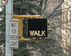
Everyone knows that New Yorkers pay attention to crosswalk signals... right?
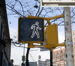
So if you live in New York City, you may or may not have noticed that all the old crosswalk signals are gone. Instead of the spelling out WALK and DON’T WALK in type, the new signals use pictograms of a big red hand and walking person in a dotted outline of bright LED’s.
The new signal displays fit into the old, existing signal housing. And, by switching from incandescent bulbs to light-emitting diodes, the City notes, the new signals will both last longer and use less energy.
This piece in the New Yorker provides some hard numbers:
“The city is changing all eighty-five-thousand signs, at a cost of $28.2 million. The job started in 2000, in Queens; by February [2004] the [job] should be complete....
The idea is that the new ones, which rely on dozens of light-emitting diodes, or LEDs, will last six times longer than the old ones, which relied on two bulbs, and will save two million dollars a year in maintenance and electricity costs....
The brighter signs should be more visible to persons with partial sight. But, the author notes, the signals do have detractors:
“Among them many children, who sense that there is something patronizing about the hieroglyphs....
‘First of all, they’re really bright,’ Jacob said. ‘They hurt my eyes, even from, like, a block away. They make my eyes water. And, also, the first thing my sister could read was Walk/Don’t Walk.’ The three of them came to a corner: across the street, an upraised hand. They took a look, then crossed anyway. ‘The old one is just more original,’ Jacob went on. ‘Almost every other place has the Man and the Hand. Whenever I go anywhere else, it’s the Man and the Hand. Italy, France—they always have that. It’s un-unique. So I don’t really like it. Actually, most of my friends don’t like it.’”
The NYC page also claims that switching to “internationally recognized symbols” will make the signs “easily recognized by non-English speaking pedestrians.” I applaud the recognition and accomodation of non-English speakers in such a massive, city-wide initiative, but while the symbols may be “internationally recognized” in Western Europe, an open palm has different meanings in different cultures. For instance:
- In Japan an open palm in front of one’s face means “I don’t know,” “I don’t understand,” or “I am undeserving,” [source]
- In Greece, “extending the arm and hand (palm open) as if pushing something away from you is an age-old form of insult. In wars, Greeks would humiliate their prisoners by rubbing mud or fecal matter into their faces.” [source]
- And in Nigeria, pushing the palm of the hand forward with fingers spread is a vulgar gesture. [source]
 With closs-cropped hair and boot-cut pants, the figure in white resembles other symbols used around here to indicate “male.”
The NYC page doesn’t mention it, but new crosswalk symbols are nationally mandated in the Manual of Uniform Control Devices published by the U.S. Department of Transportation. The Manual sets forth detailed design standards for traffic signage around the United States.
Recently, in San Francisco I discovered another variation I’d never seen before. In addition to the white man and red hand, the signals there feature a red countdown indicating the number of seconds remaining to cross the street. It turns out the countdown option was added to the Manual in 2000, and is slowly gaining popularity across the country. I was struck by the simple brilliance of it. The additional information is much more useful than the simple flashing hand or DON’T WALK. The latter always seemed to start flashing when one was halfway across the road. This calls to mind the scene from Rain Main when the austistic character stops walking in the middle of the road.
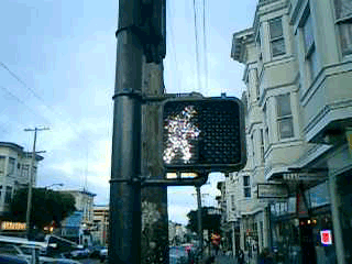
But that, apparently, is exactly when it is supposed to start flashing. The period of the countdown, flashing hand, and flashing DON’T WALK is known as the “pedestrian clearance interval”, the time for pedestrians to finish crossing, not to start crossing.
Local studies around the U.S. are finding that the countdown signals come at a price. While the countdown reduces the number of pedestrians who start running when the flashing DON’T WALK signal appears, the countdown seems to be interpreted to mean that it is OK to cross the street if there are enough seconds on the clock. Pedestrians are more likely to start crossing the street during the countdown than during the flashing DON’T WALK. This is contrary to the intent of the designers, and of the law.
Significant data has not yet been gathered on the countdown signal’s effect on the overall number of pedestrian fatalities.
Design Insurgency
With reference to this discussion, I’ve posted this condensed translation of the lecture notes presented by graphic designer Neville Brody and historian Stuart Ewen at the AIGA conference in San Antonio, September 1989. It appeared in the January/February 1990 issue of Print.
Design Insurgency
In its enthusiastic youth, design was invested with vision. Awestruck by futurism, swept by currents of modernity, design, it was claimed, could communicate new ideas about society, light the way to new and democratic ways of seeing.
Designers took part in great public debates over the fate of civilization. Design, they believed, could transform reality; it could help to deliver humanity from the social inequities of the past and give rise to a utopian future. Without such commitments — we were warned — design would merely lay a gloss across the face of barbarism.
These hopes have gone unrealized; the gloss is everywhere. Design is shackled by historical amnesia. The sense of social vision that once inspired it is but a dim memory. Obedient to the orders of corporate clients, designers are cogs in the wheels of commerce. They serve as pastry chefs in glorified soup kitchens, doling out mass-produced visual gruel.
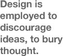 Design has little recollection that it once saw its role as one of creative communication; of exploding false outlooks and turning the world upside down. Instead, design is employed to discourage ideas, to bury thought. Design has become just a profession, an instruments of commercial guile, of calculated deceptions.
Empires were first based on a trade in raw goods; populations were dominated by the sword.
Empires were then built on manufactured goods; populations were disciplined by the clock.
Today’s empire is an Empire of Images; populations are led by their line of sight.
Design and Typography are the ways by which invisible goods are made visible.
In the rush for gold, design groups serve as armies of occupation in the battle for our minds; shock troops for the triumph of the superficial.
The impulse to mask the terms of social experience — or to offer images as a surrogate for experience — is reiterated again and again across the consumer culture.
Consumer society is mentally and culturally programmed to accept image manipulation. The packaging of abbreviated ideas jeopardizes actual thinking... critical thinking... common sense. Human subjectivity is cultivated as a resource for economic exploitation.
Life issues — social, material, environmental, spiritual — disappear from consideration amid a blur of disembodied representations. Within the dazzle of the spectacle, the real problems, needs and hopes of millions are made invisible.
In their lives, in the vernacular regions of popular expressions, people struggle to break through the din... to be seen... to be heard.
The trajectory of design follows the logic of an economy constructed of thin air. The manufacture of goods has given way to the manufacture of information. A “symbolic economy” — inflated by finance, credit and a global trade in abstract value — diminishes the notion of production for use. As one more negotiable currency, design decorates the acceleration toward catastrophe, transforming it into a persuasive conception of beauty before our eyes.
Design is propelled by the priorities of commercial gain. Wherever one turns, the capture of the eye is the preferred strategy of merchandising. All information is distorted by the means by which it is made appealing. “Good design” is defined as that which sells. Packaging overwhelms content. Our vistas are cluttered with images, yet — more and more — there is the unsettling realization that nothing is there.
In the uninterrupted flutter of changing appearances that characterizes the consumer culture, almost every form of representation bears a tenuous connection to matter, assuming — with increasing rapidity — the character of expendable currency.
One hundred thirty years ago, Oliver Wendell Holmes prophesied a culture of bodiless images about to take hold. “Every conceivable object of Nature and Art,” he wrote, “will soon scale off its surface for us. Men,” he predicted, “will hunt all curious beautiful grand objects, as they hunt cattle in South America, for their skills, and leave the carcasses [behind] as of little worth.”
This describes the practices of today’s style industries. Design is now the hunter. Fuelled by an economy predicated on planned obsolescence, design — like all commercial media — consumes every vision in its path. To create the impression of progress, of change, and of an “ever-evolving new,” predators of style prowl the terrains of human expression and creativity, desperately seeking surfaces to appropriate and sell.
The terrain of vernacular expression becomes contested ground; commercial colonizers and local populations struggle over the locus of meaning.
Design hijacks and recycles culture. Style is ripped from any source, and turns up in a place where it is least expected. Colliding world views are translated into design, images to be purchased. All faces are seen; few are given voice.
 Design no longer envisions, it advertises. Design no longer informs or educates, it blindly promotes the accumulation of wealth and power; it aestheticizers corporate greed and commercially motivated waste. Design is something to be used up. Its primary significance is that it will lose significance.
Whatever the “skin,” or its origin, its meaning is compromised — or lost — when it enters the realm of the style market. Within an ever-shifting tableau of design, all images send the same message: consume, use up, replace.
How a distributed message is communicated determines how it will be received, and how a message is received determines its form and structure.
Conforming to the logic of disposability, the most fundamental truth underlying an image is that it will soon cease to exist. While changes is design depict a charade of progress, the cultural garbage grows deeper and deeper. The perpetual waste of goods, the destruction of the earth’s environment, become acceptable norms. A trust in the promise of “the good life” requires an ever growing leap of faith.
Design is a hungry animal that constantly needs feeding, but it is using up its sources of reference. Culture is not a bottomless pit that can be endlessly ransacked. Design is in fact now eating itself through the last resort of self-reference.
Content can be dangerous. It can undermine the design message, the message that:
- packaging is all important;
- the image of the content is the content;
- there are no “goods anymore... only advertisements.”
We are no longer expected to read; only to recognize... respond... buy. Interpretation is stifled. Ideas are muted. Meaning gives way to presentation. Presentation creates a need; promises a fulfillment; closes the deal. Those that evoke the desire promise us the means of satisfaction. Packaging is the tool of a seduction.
Packaging seduces through a process of codification. Information and culture are delivered pre-codified, pre-digested, pre-packaged, ready-to-wear. Little is left to the imagination. Imagination is dangerous. It can imagine things not for sale. All power to the imagination!
At the heart of design lies an ethic of deliberate swindling. Images without bottom offer us fantasies of freedom: the freedom to be lifted out of the dreariness of necessity; the freedom to be who and what we wish; the dream of wholeness. According to the endless chain of visual ideas, satisfaction can be purchased across a retail counter... or from a catalog. Shopping replaces citizenship in the practice of democracy, and buying becomes the only remaining means of expression.
In the Empire of Image, typography, too, vies on the battleground of perception, seeking to shape and limit the vistas of possibility.
In the beginning there was the Word. In the end there was Typography. Words contain the power to persuade. Commercial uses of typography have hyper extended this eloquence. At the summit of this power stands the corporate logo: the ultimate exercise of typographical authority.
It is not the words we use, but how we display them. The initial message of written communication is its type style. The choice of typeface, weight, size and position dictates the emotional response to any piece of information or disinformation. Typography commands our attention. It lays claim to Truth. It propels the word past the barrier of reason... massaging, tantalizing, or alarming the psyche.
If you approach design purely as a solution to a problem, all you can ever hope to communicate is the problem itself.
In the world of advertising and design, a toxic society is daily rendered desirable. Tear it up!
The need for art and imagination to break free from the market has never been greater. It is a matter of survival. What is critically needed is a fresh approach to visual communication — a design insurgency — freed from the fetters of the “bottom line.”
Somehow, we must find a route towards the idea that design can be a meaningful response to people’s needs; more than an answer derived from a marketing question, more than a recycled skin.
Designers must assess the consequences of their work. The practice of design must be motivated by ongoing social concern. Designers must move beyond their drawing tables, step outside their Macs, reconnect their concerns to contours of popular experience and aspiration and establish a means for dialog.
Design today is approached as if selecting from a supermarket shelf. This reduces any element used to the meaningless, and leads to a state of pure ornament and gesture. Decoration is not a substitute for a good idea, and most design today works in the belief that the more you add, the better it is.
 Against the deluge of commercial icons, we must nurture voices of resistance, reopen the question of who has a say.
We are still using a typographic language that was created for a different society with different thoughts and ideals which it needed to communicate in a different way to ourselves.
We must find new languages; and rethink the world according to the needs of individual human communities. The dominance of surface over substance must be overcome. There needs to be a reconciliation of image and meaning.... A design insurgency.
Typography and design can be removed from the confidence games of consumer engineers, and become part of an organic process: affirming free thought, free expression, new social relations.
This can not be left to the wiles of “experts” or “specialists.” As long as design is defined as a profession — an insulated commercial priesthood — the public will be seen as little more than fodder for the market.
The requirements of community, the preservation of human and material resources, the liberating powers of education — not indoctrination — should stand at the center of the design process, guide its development.
True education must encourage social criticism, vision, creative self-expression, questioning, dangerous ideas... even subversion, where necessary.
If — like reading, writing, arithmetic — social and environmental awareness, visual literacy and critical design were elevated and encouraged in schools from an early age, more and more children would begin to master the means of visual communication.
Such education can then be carried on into the arenas and practices of everyday life.
On that day, people will move beyond consuming images. In the ensuing visual dialog, more voices will be heard, alternative possibilities will be acknowledged. The realm of public expression will step beyond the boundaries of commercial inducement, representing, and responding to, social, environmental and spiritual needs.
A democracy of expression will begin to nullify the power of packaged illusions.
Many of these themes appear a decade later in the 2000 re-issue of the First Things First Manifesto, an update to the 1964 declaration. The emphasis on individual, creative resistance reminds me of Adbusters, which began publishing the same year this speech was delivered. A compendium of Brody’s graphic design, The Graphic Language of Neville Brody was published a year earlier in 1988, as was Stuart Ewen’s work of cultural criticism All Consuming Images.
It’s interesting to compare the ideas expressed here with the work currently displayed on one author’s Web site. Plenty of exhuberent and expressive work, but I can’t find much social criticism or design in the public interest.
Grapus
“An offspring of the May ‘68 student revolt, Grapus design collective was founded in 1970 by Pierre Bernard, Gerard Paris-Clavel and Francois Miehe. They were joined in 1974-5 by Jean-Paul Bachollet and Alex Jordan; with Miehe’s departure in 1978, the main core was set.
All members of the French Communist Party (PCF), they concentrated their early efforts on the new society visions of the Left, producing cultural and political posters for experimental theatre groups, progressive town councils, the PCF itself, the CGT (Communist trade union), educational causes and social institutions. At the same time, they rejected the commercial advertising sphere....
For 20 years they provided inspiration to graphic design students all over the world, with their idealistic principles (of brining culture to politics, and politics to culture), and their highly distinctive form of image-making: an accessible and unpredictable mixture of child-like scrawl, bright colors, sensual forms and high-spirited visual pranks.
Throughout their history, Grapus remained Communists and idealists and continued to operated collectively: all work left the studio signed ‘Grapus’ even when their studio numbers had grown to around 20, operating in three separate collectives. They finally disbanded in January 1991, splitting into three independent design groups.”
From Liz McQuiston, Graphic Agitation: Social and Political Graphics since the Sixties, Phaidon, p. 56.
This article on the AIGA NY Web site emphasizes role of “the artistic” at the expense of “the political” in the breakup of the organization. Instead, I read it as the group wrestling with their relationship to the State and the establishment. Grapus member Pierre Bernard, on his design for the Louvre:
“‘I didn’t want to support the cliché that the Louvre was a place of order, reverence, and boredom,’ says fifty-six-year-old Bernard, ‘At the same time, I wanted to claim the wealth of the museum as the property of the French people, not the property of a cultural elite.’
Although he is a former member of the Communist party, this is not strident leftist rhetoric. Bernard’s approach to graphic design is more artistically than politically driven....
The Louvre assignment was a turning point in Bernard’s career. His fellow designers at Grapus believed the collective should turn down the job. ‘We used to argue all the time about who we should work for,’ he says. ‘Unlike other members of the group who only wanted to design for political causes, I believed that graphic communication could be an instrument of social change when applied to cultural institutions and so, in 1991, I went my way and formed the ACG, short for Atelier de Creation Graphique.’”
The piece further attributes the the downfall of the collective to the adoption of social design by the mainstream:
“The 1980’s were a time of cultural euphoria in socialist France. Jack Lang, minister of culture, supported a wide range of avant-garde art projects, and graphic expression was one of them. Every socialist city, town and village had to have its logo. All the government agencies felt compelled to acquire a graphic identity. And the Georges Pompidou Center had just mounted an exhibition called Images d’utilite publique (Images for Public Use) that defined, for the first time, the role of graphic design in modern democracies. Most important for French Designers, a coherent graphic design theory was beginning to emerge. But instead of helping Grapus mainstream its revolutionary message, this sudden surge of public interest in graphic design challenged their very raison d’etre. No longer in the opposition, the members of the collective felt that they were betraying their subversive mission. Like the [Situationist International], who disappeared as a group in the confusion of the student uprising they had fostered, Grapus dissolved when it’s confrontational ideology was successfully co-opted by the cultural establishment....
Today, the members of the Grapus collective are practicing their craft, each on their own terms. None have sold out. Paris Clavel designs award-winning, leftist posters under the Ne pas plier monkier (a pun on the "Do Not Fold" warning on mailing envelopes containing graphic material, the name suggests an inflexible state of mind), Miche teaches at the Ecole de Arts Décoratifs. Alex Jordan, who had joined Grapus in 1976, formed Nous travaillons ensemble (We Work Together), another design collective known for it’s social involvement. Fokke Draaijer and Dirk Debage, two Dutch graphic designers who stayed on with Pierre Bernard to form ACG, also eventually left to create their own studios.”
See also Hundreds of Grapus Posters Online!
Nutrition Facts Facts
Says @issue: The Journal of Business and Design:
 “Less than a century ago, food labels barely identified what was inside a box. Consumers had to trust the manufacturer to use only healthy ingredients—not always a safe bet. In 1924, the Federal Food and Drug Act gave the U.S. Food and Drug Administration (FDA) authority to clamp down on bogus health claims and misleading labels. The FDA also tried to make manufacturers more accountable by requiring them to list their names and addresses on the packaging. By 1973, packaged food makers were also required to supply nutritional values listing the amount of vitamins and minerals inside, but the manner in which this information was presented was often inconsistent and incomplete. The Nutrition Labeling and Education Act of 1990 finally called for a major overhaul of food labels. The FDA and U.S. Department of Agriculture set out uniform guidelines for the new labels. Launched in 1994, Nutrition Facts offers a plethora of health-relevant information.”
Brand design firm Greenfield/Belser, best known for their law firm marketing material, designed the new nutrition facts label. Reknown designer Massimo Vignelli lauded the label design in the July 1996 AIGA Journal. Praising the clarity of the information architecutre, its visual integrity, and flexibility of the design on packages of all shapes and sizes, he writes, “The label is a clean testimonial of 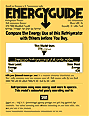 civilization, a statement of social responsibility, and a masterpiece of graphic design. Not a small achievement in today’s graphic landscape.” He does not point out that the generic, anonymous design and apparent lack of “marketing devices” actually brands the space and its information as neutral, scientific, institutional, and authoritative.
Greenfield/Belser’s Web site describes other forays into design in the public interest as well:
“In 1999, we applied a variation of that label design, Drug Facts, to all over-the-counter drugs. Years earlier, we designed the Energy Guide that appears on all major appliances.”
Vote Redesign
Ballot design changes everything. How much was lost because of a bad interface? Since the 2000 election, the American Institute of Graphic Artists has lobbied Chicago on the redesign of a local ballot, and the U.S. Government to include communication design criteria in any election reform bill. See also Disenfranchised by Design, an essay written in 1998.
page 2 1