education
Updates
Recent happenings on old blog posts:
|
More Public Schools: In March 2009, I wrote about The Public School a website where people propose, discuss, and coordinate free, offline classes taught by volunteers. The project has since expanded from Los Angeles to 6 more cities including New York, Paris, and San Juan. And still more coming soon! I taught a class on Mapping as Activism last month and had a great time. |

|
|
Listener Supported: In December 2008, I wrote about Spot.us, a site for crowd-funded news where anyone can pitch and help pay a journalist to produce a local story. Last week, Public Radio Exchange announced they will pick up the software to launch StoryMarket to bring the model to public radio. |

|
|
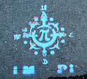
Guerilla Wayfinding in NYC: In March 2006, I proposed a compass rose stencil at the exits of New York City subway stations. Shortly after, stencils started appearing! A year later, City officials decided to implement a few test marks of their own, and I found out the idea had been proposed back in 1992. Now it’s 2010 and new compass stencils have popped up at downtown subway exits. |

|
|
The Trouble with Hippos: In February 2006, I wrote about the Hippo Water Roller, a rugged, round water container designed to be transport water on tough rural roads. Last year, Alissa Walker reported on some of the obstacles the project encountered with extended use, and when trying to scale up production. |

|
|
Public Designer: My first article for Communication Arts ran in February 2005 on citizens designing for better government. It included several examples orchestrated by Sylvia Harris. This month the AIGA published a great interview with her that’s worth checking out. Harris is a public designer if ever there was. |

|
|
Get the E out of NYC: In 2004, I wrote about New York City’s trial collection of electronic waste for recycling. On May 29, 2010, New York State decided it’s illegal to throw away your electronic waste in the regular trash. Governor Patterson just signed a producer responsibility law requiring manufacturers to pay for collection and recycling of e-waste from consumers (including individuals, schools, municipalities, small businesses and non-profits.) |

|
Non-Profit Design

How does one make design for social change sustainable and scalable? To build a replicable model and an enduring momentum?
As someone who’s worked with non-profits for many years, I’ve occasionally thought about perhaps starting one of my own as a way of institutionalizing some of my activism and work, ideas, research and outreach.
You might be surprised to learn that the largest charity in the world is not run by Bill and Melinda Gates, but is one that promotes and supports innovation in the field of architectural and interior design. That’s the Stichting INGKA Foundation, the Dutch Foundation that owns IKEA.
I have more modest ambitions and checking out the prior art, I found there’s no shortage of design-driven non-profit organizations. A search on GuideStar, a database of non-profit organizations, turns up over 5,000 search results matching the term “design.” In my survey of design-centric non-profit organizations here are some I thought were notable. This list is not exhaustive (for instance, it does not include some amazing educational institutions, museums, or documentary projects) and the examples here are all US-based, but take a look.
Designism 4.0

The Art Directors Club hosted Designism 4.0 this Wednesday night in their New York City gallery. This was the fourth annual event on design and social change there, and after last year’s ambitious program was cut short by the Vice-Presidential debate this year’s program was significantly streamlined — four slideshows, a roundtable, and one big question: how to do good work and still eat.
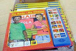
 “Books of Hope partnered with the South African Depression and Anxiety Group, to design and produce interactive, multilingual Speaking Books that can be seen, read, heard and understood by the reader regardless of their reading ability.
The Speaking Book combines the latest sound chip technology featuring a sound track read by well-known local celebrities in the local language, with a durable laminated hard backed book, to take the reader on a step-by-step guide to wellness. Books of Hope has successfully created an effective means to present complex health care issues by adapting to the culture, skills and needs of communities while encouraging them to build self confidence with a simple action plan.”
Design Students for Change
Unsatisfied with their given curricula, design students around the US are demanding a focus on design for social change — and making it happen. Here are a few recent events:
- In April 2008, students in the Social Change + Activism group at Harvard Graduate School of Design organized FuturePresent (PDF) a symposium on diversity in design professions.
- In November 2008, students at Brown and RISD organized the multi-disciplinary conference A Better World by Design to look at how designer, engineers, and entrepreneurs are making change.
- What the *#&! is Social Design? is an exhibition organized by two graduate design students from the Academy of Art University in San Francisco. It opens this Thursday, March 12.
 “Worldstudio, together with the Adobe Foundation’s signature program Adobe Youth Voices, today announced Design Ignites Change, a program that encourages talented high school and college students to use the power of design to address social issues in their local communities through substantive public projects. Students are encouraged to develop projects that will stimulate thought, dialogue, action and ultimately change.... A major component of the initiative is a mentoring program where college and university students, educators and creative professionals, work with underserved high school students to develop actual projects that will benefit their own communities while giving them a voice around important social issues.”
The Vision Thing
An article of mine is running in the Design Issues column of the January/February 2008
Communication Arts. It started out as a piece about design education outside of traditional design schools, but then turned into something more — about grassroots engagement with public space and the power of design to envision change. Thanks Nicolas, Kim, Chris, David, and DK for their insight.
The Vision Thing
Seeing and creating change through design
It’s is not just in design schools. It’s not just in mentorship programs at top shelf firms. Design and education meet in the streets.
Most graphic design education points to a career as a design professional. But the same tools we use to undertake user research, solve problems, and satisfy clients can be used by young people to voice their opinions and meet the needs of their neighborhoods and communities.
The stories below are shining examples of design as populism. The designers of these projects – amateurs and professionals – have moved beyond a passive relationship to the world, beyond the daily pattern of serving clients, responding to assignments, and deadlines.
By taking it outside, they are asserting a positive vision and owning the spaces they live in – and in the process are making these places better for us all.
Human Traffic
Memorials shape our collective memory. They are a tangible, public stake against forgetting, a manifesto to the present and a reminder of the past as a warning for the future. Put forth by loved ones after a tragedy, grassroots memorials are at once both personal and public – often filling a void where government-funded memorials leave off. Some are subtle collections of flowers and personal items, occupying quiet corners of common space. Others scream out for attention. Rendered three-stories tall on the side of a building, the memorial mural on Butler Street and Third Avenue in Brooklyn is hard to ignore.
The design is a tribute to 28 pedestrians killed by cars between 1995 and 2007 in the streets of Brooklyn’s Gowanus neighborhood. The mural depicts three young boys, fifth-graders Victor Flores and Juan Estrada, and 4-year-old James Rice. All three were killed by cars speeding around corners – Rice was struck down just a block from the spot where the mural now stands. The driver who hit Rice got a ticket for failure to yield. Represented as towering figures painted in ghostly blue, the boys hold up redesigned streetsigns with traffic-related symbols urging respect for pedestrians. The three boys are accompanied by a blank silhouette holding up an unambiguous red stop sign declaring: “Not one more death.” The effect is chilling.
page 2 1

