

29 January 2008
The Vision Thing
An article of mine is running in the Design Issues column of the January/February 2008
Communication Arts. It started out as a piece about design education outside of traditional design schools, but then turned into something more — about grassroots engagement with public space and the power of design to envision change. Thanks Nicolas, Kim, Chris, David, and DK for their insight.
The Vision Thing
Seeing and creating change through design
It’s is not just in design schools. It’s not just in mentorship programs at top shelf firms. Design and education meet in the streets.
Most graphic design education points to a career as a design professional. But the same tools we use to undertake user research, solve problems, and satisfy clients can be used by young people to voice their opinions and meet the needs of their neighborhoods and communities.
The stories below are shining examples of design as populism. The designers of these projects – amateurs and professionals – have moved beyond a passive relationship to the world, beyond the daily pattern of serving clients, responding to assignments, and deadlines.
By taking it outside, they are asserting a positive vision and owning the spaces they live in – and in the process are making these places better for us all.
Human Traffic
Memorials shape our collective memory. They are a tangible, public stake against forgetting, a manifesto to the present and a reminder of the past as a warning for the future. Put forth by loved ones after a tragedy, grassroots memorials are at once both personal and public – often filling a void where government-funded memorials leave off. Some are subtle collections of flowers and personal items, occupying quiet corners of common space. Others scream out for attention. Rendered three-stories tall on the side of a building, the memorial mural on Butler Street and Third Avenue in Brooklyn is hard to ignore.
The design is a tribute to 28 pedestrians killed by cars between 1995 and 2007 in the streets of Brooklyn’s Gowanus neighborhood. The mural depicts three young boys, fifth-graders Victor Flores and Juan Estrada, and 4-year-old James Rice. All three were killed by cars speeding around corners – Rice was struck down just a block from the spot where the mural now stands. The driver who hit Rice got a ticket for failure to yield. Represented as towering figures painted in ghostly blue, the boys hold up redesigned streetsigns with traffic-related symbols urging respect for pedestrians. The three boys are accompanied by a blank silhouette holding up an unambiguous red stop sign declaring: “Not one more death.” The effect is chilling.
The mural was initiated by Transportation Alternatives, a non-profit group founded in 1973 to promote bicycling, walking, and public transit for safer streets. TA approached the Groundswell Community Mural Project, a group that matches communities with artists and grassroots organizations to create large-scale visuals that foster social change. In this case, the purpose of the mural was threefold – symbolically, to remember the children; practically, to slow traffic and reduce further collisions; and politically, as a platform for public advocacy.
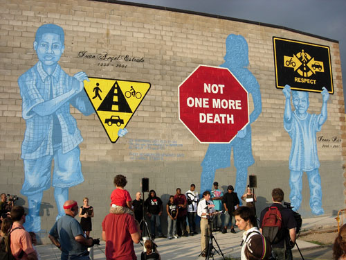
Photo courtesy Visual Resistance
In the summer of 2007, Groundswell pulled together a team that included artists Christopher Cardinale and Nicole Schulman and a group of neighborhood teenagers. The 11 young men and women all hailed from housing projects in the Gowanus neighborhood, recruited from afterschool programs, through tenant associations, and at a summer job fair for area teens.
The project involved three weeks of research and three weeks of painting. In this case, research meant gathering information about traffic and transportation issues and about the history of accidents in the area, a mixed-use neighborhood zoned for industrial and residential use near an elevated highway. Guided by the artists, the teens conceived of the mural imagery, planned, prepped, and painted it.
Traffic engineers prefer the term “crashes” to “accidents” recognizing that these are failures of infrastructure and design, not random chance. And the New York City Department of Transportation (DoT) has been vigorously criticized for its apparent bias towards keeping traffic moving more than keeping pedestrians safe. This criticism reached a fever pitch in 1997 when community outrage over pedestrian deaths led to protests and early morning street-blockades. As a result, the DoT held public meetings and developed a plan for improving pedestrian safety.
However, ten years later, when James Rice was killed, the plan still had not been implemented. The 2007 mural does not directly criticize city officials, but the message is clear: had the DoT kept the promises it made in 1997 the boys might be alive today. This time, the message was heard.
It was a hard summer for the artists and teens who slogged through the physically exhausting effort, painting in extreme heat on the south-facing scaffolding. But the effort has paid off – both in its reception by the community and its effect on public policy. One hundred and fifty local residents turned out for the mural’s unveiling. They were joined by a State Senator, a State Assembly Member, Police Department officials, representatives from the Brooklyn District Attorney’s office and the Department of Transportation. This time the DoT has backed its words with cash. At the unveiling, Senior Policy Advisor Jon Orcutt announced that the first phase of construction in the Downtown Brooklyn Traffic Calming Project will begin in Spring 2008. The city has designated $5 million to build 101 improvements at 43 intersections. For the DoT to make such a pledge at a community event is unprecedented.
From a design point of view, the power of this project comes not only from the compelling subject matter—the deaths of children and other pedestrians—but also its clever and multilayered design. The scale of the image is not only eye-catching, it is functional. Drivers will often slow down when triggered by a visual stimuli, say a school, bike, or unusual sign. As such, the mural itself acts as a “visual speed bump.” And while speaking eloquently of the responsibilities of the DoT, the mural sensitively addresses other constituencies; for instance, though the mural is about traffic fatalities, it does not blame cars or drivers. The neighborhood where the mural is located is full of car-related businesses such as automobile glass and auto body repair shops, so the designers took this into account. In their research, the teens found that local drivers, cyclists, and pedestrians all expressed concerns about each other. Instead of taking an oppositional stance, the Gowanus mural puts forward a positive vision: it encourages mutual respect from all and the safe sharing of streets.
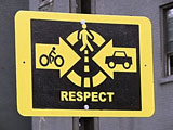
The teenagers also erected alternative street signs that were installed around the area urging respect and awareness. At the unveiling, activists set up traffic calming devices of their own, moving barriers and planters to narrow traffic lanes and slow down traffic. One part guerilla action, the purpose was twofold – both to calm traffic and to make a point: these improvements are so simple that kids can do them. For years, pedestrian advocates have encouraged the Department of Transportation to try out a variety of temporary measures with cheap materials, testing changes before investing in permanent and expensive infrastructure. The Gowanus teens brought this message to life.
Affected residents and transportation officials weren’t the only ones to notice the team’s work. Throughout the summer, guests at the Comfort Inn down the block were often seen taking pictures of the mural during the painting process, and no doubt taking stories back with them to their own neighborhoods. Now completed, images of the mural have circulated on the Internet via blogs and photo sharing websites, spreading the images and news of its success – and perhaps inspiring others.
Post History
When artist Josh MacPhee moved to Chicago in 1997, he was astonished by the ads and posters in the city. The barrage of corporate images inspired him to create a visual campaign of his own. “It was striking how everything was a directive,” says MacPhee, “[the ads and posters] all expected the audience to buy something or go somewhere. I wanted to put something on the street that was a little more generous than that.” MacPhee set out to challenge the imagery in his neighborhood’s public space by putting up something more meaningful to the lives and struggles of its residents.
He designed a portrait of Malcolm X, printed up 1,200 copies, and hit the streets to wheatpaste them. Within minutes, people began to gather around asking MacPhee for posters for their kids and friends. The popularity of the poster sparked the idea for a continuing series of posters– a set of portraits to celebrate individuals, groups, and events of significance in the struggle for social justice and freedom. The “Celebrate People’s History” series was born. Soon people were ordering prints and signing up for poster subscriptions.
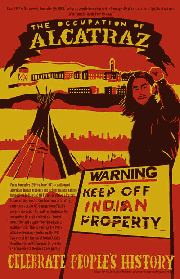
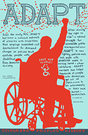
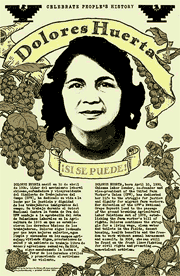
Three posters from the Celebrate People’s History series. Although not created by professional designers, the posters are an example of the power of type, color, and design to evoke a story.
Since then, MacPhee and a team of volunteer designers have published more than 44 images that recognize individuals, organizations, and events outside the usual mainstream history books. Now distributed by the Just Seeds collective, poster subjects have included: Paul Robeson, a singer, actor, writer, and civil rights activist; ADAPT, a national network of activists with disabilities engaged in non-violent civil disobedience demanding changes to policies that exclude people with disabilities from American society; and the Mothers of East Los Angeles, a community group that has successfully fought construction of a prison and a toxic waste incinerator in East L.A.
An unintended consequence of the project was the posters’ popularity among teachers. It turns out, there are few visual materials for teachers about social history, and even fewer at a price teachers can afford. The posters are sold cheaply on the web and in progressive bookstores around the country. Requests pour in not only from history teachers, but also from teachers of American Studies, Government, Sociology, and Art. The posters help teachers design the visual environment of their classrooms to pique the curiosity and hungry minds of their students.
Because the posters are self-published on a shoestring budget, the palette of each is limited to two colors on a colored paper. This constraint gives the posters in the series, designed by a variety of artists, a unified look and feel. Students respond positively to the look – a sophisticated, urban aesthetic. Each image is accompanied with a brief block of text.
Political posters often express outrage about what is wrong. Their tone is “anti.” MacPhee and his team have found that it’s also necessary to celebrate victories, to give a sense of what one is “for.” Such a positive vision creates hope and inspiration. The posters depict regular working class people struggling for justice. Focusing on social struggles in the real world, the posters also form a bridge between the lived world of young people and their classroom life.
No longer limited to Chicago, the posters are now distributed to a network of wheatpasters in cities around the world, bringing people’s history to a variety of communities. Contributing artist Nicolas Lampert notes, “For artists it’s a difficult assignment - which person do you celebrate? How do you best communicate with images and words in a single space? What factors do you focus on?” A single poster may go through many iterations. Lampert, who teaches art in Milwaukee, has used the exercise in his classes, asking students to pick their own figure from history and design a poster. The posters depict movements that are local, that connect with communities and feature every-day people. These are not professional designers, but are harnessing the power of design in their own way. It’s an empowering message: you make the poster, you get to control your design and your history.
Living Classroom
In cities around the world, the town square is the heart of the community. It pulses with conversation, music, and celebration. Not just the geographic center, a well designed square nourishes social life. And when the square is neglected, public life is diminished. With this in mind, the students at Edcouch-Elsa High School set out to redesign the park at the center of their town.
Edcouch-Elsa is a poor, rural community on the southern tip of Texas, 20 miles from the border with Mexico. A teeming railroad town at the turn of the century, today it boasts a population of 8,000 with a poverty rate hovering around 46 percent – one of the highest in the state. Mario Leal park is about the size of a city block, around half a mile from the center of town. Over time it had become run down, littered with rotting equipment and broken glass. In 2003, a group of high school students who were learning about social justice and community change found a cause in their own back yard.
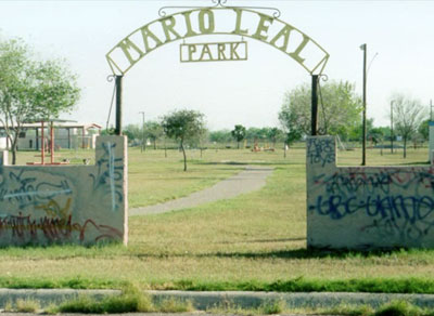
An entrance to the park, showing some of the neglect and disrepair.
The students undertook the project through the Llano Grande Center for Research and Development, a non-profit inside their high school. Founded by teachers, students, and community members to redefine how students were prepared for college, the program grounds students in the community as leaders and generators of change.
As with most design projects, first came the discovery phase. The students talked to members of the community and learned about the broader tradition of town plazas. 96 percent of the town’s residents are Latino and research looked to Mexico, where the zócalo, or town square, is also the heart of the city. The students talked to elderly residents about their memories of the park and learned that it used to be the center for 5k runs, community festivals, concerts, and softball tournaments. Students went to the park and interviewed its current users. They talked to people from all different age groups about what they wanted out of the park (better lighting, access to bathrooms, a nicer playground, a skate park.) They collected memorabilia, historic photographs, and documented their interviews, eventually compiling a report of their findings and producing a short video to document the social history and physical deterioration of the park.
Inspired by the students’ work and vision, the Llano Grande Center arranged a presentation before the City Council. Backed up by their findings and video documentation, the students made their case for a redesign of the park. The Council was impressed. They promised to match $10,000 in student-raised funds for the renovation of the park and commissioned a student advisory committee on the project. Unfortunately, little came of the officials’ promises.
However, the project didn’t end there. In 2006, the students presented their video to a group of educators, one of whom connected them to the City of Neighborhoods program at the Cooper-Hewitt National Museum of Design in New York. Run by the Cooper-Hewitt’s education department, the project encourages civic engagement by teaching problem solving through the lens of design. City of Neighborhoods works with teachers and students across the country, fostering projects in Birmingham, Long Beach, Brooklyn, and in the 9th ward in New Orleans. Two Edcouch-Elsa students were invited to participate in the Cooper-Hewitt “I [heart] Design” conference in New York where the students learned about “the capacity of design to influence, provoke and inspire.”
Reinvigorated, the student teams in Texas began to develop their own designs for the square. A local architect held workshops with them where they looked at traditional Mexican architecture and landscaping with native plants. With designs in hand, the students were ready to face the City Council once again and were determined to see their vision realized.
The intrepid teenagers again went before the Council, this time to present and defend their designs. When questioned by a council member about a brightly colored play ground, the students were ready. Why not use black and yellow, the colors of the successful high school sports team? We did research, the student replied, young children respond to primary colors. The council was impressed, as were the students – in this poor community, where many students’ parents are migrant farm workers, making their voices heard was a profound experience.
The town applied for and won a $500,000 matching grant from the Texas Parks and Wildlife Department. In turn, the Council told the students, whatever you raise, we will match. Unfortunately, because of the city’s poor fiscal situation, the council was ultimately unable to match the state grant, but it has committed to working with the students’ design and has hired an engineer to help make it happen.
Being teenagers, a number of students included skate parks in their redesign plans – but they didn’t stop there. The students researched and found the Tony Hawk Foundation, which funds the construction of skate parks. The students visited a skate shop in the next town over and interviewed the owner about what was required to sustain the park and shop. Armed with this data, the students applied for a grant to implement their plan.
The project is still ongoing, but for teenagers who had never before had a stake in politics, it was an eye opening experience. The students now have first-hand experience of the civic process — and how to influence it.
Taking It Public
Design offers a different way of reading the visual environment, navigating culture, and understanding the systems that shape our world. Designers know all about the manufacture of desire and dissatisfaction, selling images and ideas. Design education puts these tools in the hands of students and creates openings for greater self-expression. This is not just expression of emotion and style, but self-expression in a fuller, richer sense – as an expression of values and of one’s own power.
Taken to the public sphere, design skills become transformative. A common theme in the stories above is the relationship between ordinary folks and public space. In each case, artists, designers, and students are intervening to shape the visual and built environment to benefit their communities. Design is a powerful means of expressing a vision for what change might look like. Taking it public makes it possible for others to see, respond, and even participate.
Sadly, it’s all too easy for communities lacking financial resources to become politically marginalized. But by engaging friends, family, and neighbors, designers and artists become community workers facilitating connections, dreams, and, ultimately, the political power to realize those dreams. For teenagers, winning a favorable response to their designs and public recognition of their ideas is a positive reinforcement for personal growth. As the students of Edcouch-Elsa High School note in their documentary video, “This project is more than just about renovating a public park, it’s about creating hope.” By taking design to the streets, the students got a lesson in civic activism and learned that they have the power to direct public policy, to inspire their communities, and to shape the public space we share. They learned that engaging and creative design applies to issues that matter not only to boardroom elites, but to everyday people – and can make the world a little bit better. Maybe there’s a lesson there for professional designers as well.