housing
Exeunt
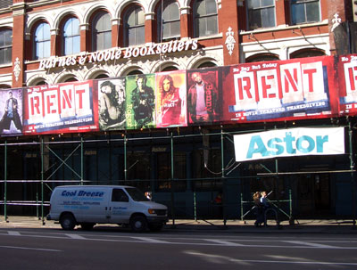
How bitter to see ads for RENT plastered on the Barnes & Noble at Astor Place. You know, the one across from the new glass tower of luxury condos atop the Chase Bank?
The summer I moved to NYC marked the third anniversary of the Tompkins Square Riot, captured obliquely in the play. Freshmen were warned not venture east of Avenue A after dark. Now you can’t get a table there without a reservation.
Gentrification, squatters, art, AIDS, drugs, poverty, homelessness, riots, gender bending, love and death in the East Village — now a major Hollywood motion picture. Coming soon to the East Village.
A Change for Plan

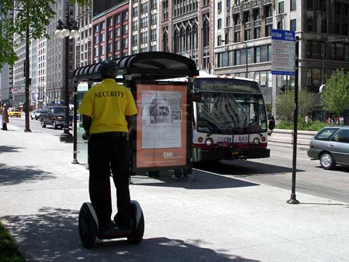
On May 27, a group of concerned citizens hijacked a million dollar Leo Burnett ad campaign designed for the Chicago Housing Authority, turning it into a scathing critique of Chicago’s public housing policy and privatization practices.
They created and changed out over a dozen large format bus shelter ads (5 in downtown Chicago in broad daylight!), put up thousands of ads on the trains, printed a newspaper of information and reproductions of the flipped ads, and created a mock Web site for the Chicago Housing Authority in the style of the official site.

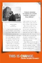

See the old ads, download the new ads, and find out more about the campaign at ChicagoHousingAuthority.net:
“In late 2004, the Chicago Housing Authority (CHA) initiated a public relations campaign to put a new face on their Plan for Transformation, a plan that drastically reshapes the state of public housing in Chicago.
This PR campaign, authored by the advertising giant Leo Burnett, fused Chicago Housing Authority's acronym ‘CHA’ with the word ‘change’, resulting in a new brand identity: CHAnge. There are undoubtedly big changes happening with public housing in Chicago, including massive organizational restructuring within CHA and the tearing down of all high-rise public housing buildings.
Unfortunately, the priorities of CHA haven’t changed at all, and public housing residents are still at the bottom of the list. While the CHAnge campaign has attempted to put a ‘resident empowerment’ spin on the Plan for Transformation, in reality the majority of public housing residents have been adversely affected by the massive restructuring. If you are a single working mother displaced by a home demolition, waiting over 6 months for a voucher to relocate as your children are shifted from school to school, CHAnge feels a lot more like CHAos....
The Plan for Transformation is a $1.6 billion blueprint that includes the demolition of 14,000 public housing units and the displacement of over 20,000 people. Not unlike the ‘urban renewal’ master plans of previous decades, the Plan For Transformation has linked motives. It is pushing poor people out of the now-coveted inner city neighborhoods and increasing the exchange value of existing public land through privatization. Developers such as Dan McLean are making millions building on the land adjacent to former CHA high-rises and getting huge city tax credits to subsidize their development. In addition, the city is making money by selling or leasing former CHA public land to private developers. In this way, large amounts of our city’s housing budget are being transferred into private hands. CHA CEO Terry Peterson was personally implicated in this when he was caught giving CHA bids to contractors like the Habitat Group in exchange for political contributions.”
Keep On Truckin’
Reader Kristin from Minneapolis writes:
 “Yesterday I joined a picket line for a local laborers’ union that is on strike against the Minneapolis Public Housing Authority and I saw one of our newest tools: the local Teamsters have a huge semi truck trailer that they drive up and park near picket lines. This one was brightly lit with labor support banners and some Xmas lights. Absolutely necessary this close to solstice when at 7 a.m. the city is still pitch dark.
Back during the Hormel strike in the ‘80s, labor supporters ‘used’ trucks at picket lines, but they were the kind that would ‘suddenly’ break down in front of the plant gates and take a while to be used. This is a new twist on that idea, I think.
A quick search on the web netted me this image from Denver.”
Support Our Tropes
Those little yellow magnets seem to be everywhere. Not quite posters, it’s a regular grassroots movement of car signage, marking the public space in the bumper-to-bumper gaps between the private. (And what better place to support a war for oil?)
The NY Times has a brief story on the origins of the current magnet ribbon, while Design Observer digs up a broader history of the yellow ribbon symbol.
Since the civil war, the ribbon has been used to welcome home loved ones who had been away at war or in prison. The popular 1973 song was loosely based on the story of a soldier returning home from the Civil War. It was a number one hit in April 1973, at the height of the Vietnam War — a time when many veterans ambled to a less than friendly welcome.
But the meaning of the yellow ribbon has shifted over time. Do the current ribbons encourage support of those broken and maimed veterans showing up at homeless shelters? I presume not. I read the symbol as more than just a welcome home, but sign of “loyalty,” not just a show of concern for U.S. soldiers at war, but to admonish those who are not sufficiently supportive — for instance, who oppose the war.
Which is why I’m inclined towards the more specific version produced by United for Peace and Justice:
And the more oppositional styling of the duct tape version:
See also previous posts on freeway posters, orange, red, and blue ribbons.
Free as in Voice Mail
Here’s a happy story of humanitarian gadgetry. From CNN:
Free voice mail helps the homeless
“The nonprofit Community Voice Mail project provides homeless people with a way for potential employers, social service agencies and relatives to contact them. It also enables them to apply for a job without having to tell a prospective employer they are living on the streets....
Hilary Terlouw, a 45-year-old woman from Bellingham, Washington, said she was living in an abandoned trailer with no electricity when she learned about Community Voice Mail three summers ago. She lives in subsidized low-income housing and has a service dog and even a computer, she said.
‘It just saved my life,’ said Terlouw, who battles mental illnesses and physical disabilities. ‘It really did. If I didn’t have a telephone number to have doctors’ offices or clinics call me back, I don’t know what I would have done. I was truly at the end of my rope at that time.’...
Larry Sykes, Community Voice Mail director at The Stewpot, which hopes to offer more than 2,500 voice mail lines in Dallas within three years, [notes] ‘Unless they tell somebody they’re eating at The Stewpot or sleeping under a bridge, nobody knows it.’”
If You Build It
jude sent me this link a while back. The page is part of a Frontline documentary on the life and death of “maverick humanitarian aid expert” Fred Cuny:
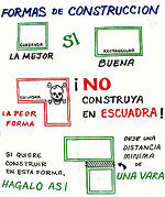
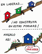
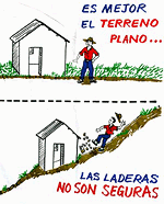
“These ‘Housing Pictographs’ are another example of how Fred Cuny was always looking for ways to use a calamity as a catalyst to improve people’s lives.
After Guatemala’s 1976 earthquake, Cuny went to the devastated central highlands to see what he could do. Working with two organizations, OxFam (U.K.) and World Neighbors, he posed a key question to both the NGO staff and the peasants whose adobe homes had been reduced to rubble:
‘How do you make safe a poor person’s house in the rural countryside?’
Fred set out to improve the design and construction of the local housing as it was about to be rebuilt. Mary McKay, the head of the World Neighbor’s Housing Education Office in Guatemala, explained to FRONTLINE how the new building program worked. The ideas were all Fred’s, she said, but ‘the local builders took those ideas and figured out what you actually did when you are out there with a hammer in your hand. Fred wasn’t a mason or a carpenter,’ but he could talk with those who were, and he loved doing that ‘especially with the guys in the sandals who really did the work.’
Cuny would draw pictures which a World Neighbor’s staff member then turned into artwork. The drawings then were silk-screened onto the backs of empty flour sacks, stitched together, rolled up and put on the back of a master carpenter’s moped. The skilled craftsmen, who had worked with Fred in developing these new building techniques, would then drive from village to village throughout the region using the ‘flip charts’ to spread the word.
Although many of those master carpenters were later killed or fled Guatemala as a result of the government’s crack down on people they thought might challenge their authority, many of the houses using Fred Cuny’s techniques are still standing. Guatemala has not yet suffered another earthquake the magnitude of the 1976 quake.”
The project sounds like a great example of design in the public interest, a low-tech, simple way to improve people’s lives for years to come — and a small note of hope within the brutality of the U.S.-backed military dictatorship.
But that last sentence is chilling. Particularly, within the context of the page’s patronizing tone.
Were the carpenters targeted because of their work with Cuny and the World Neighbors NGO?
One friend who works on Guatemala tells me:
“Often local ‘authorities’ (including non-elected community leaders) used the conflict as an excuse to settle scores. So maybe [the carpenters] were gaining too much authority in the community, and then were taken out by local thugs who may have been connected to the government, but were acting on their own in this. Or not. Hard to tell.”
Another tells me:
“One category of people who were killed are those who worked with foreigners.”
From here it’s hard to know exactly why the carpenters were killed, but it seems possibile that they were indeed a casualty of the naivete of humanitarian intervention that attempts to remain neutral or indifferent to the complexity of local political relationships and history.
A Place to Live, Breathe, and Work
The Center for the Study of Political Graphics has posted three new online exhibitions of posters from their archives. The collections are organized thematically, around a dozen posters per theme, spanning several decades, countries, and struggles.
Notice the tiny “next” links at the bottom of some of the pages. They’re very easy to miss.
Earth, Wind & Solar
International Ecology Posters
From the site:
 “Global Warming. Arsenic in drinking water. Pesticide Poisoning. Environmental Racism. Nuclear Waste Disposal. Irradiated and Genetically Modified Food. The list is endless. Where pollution is concerned, the world is a global village where no continent, country, or neighborhood is safe. Multinational corporations’ insatiable need for new markets and greater profits consistently overrides environmental concerns, and few governments oppose them. But these posters convey an increasing sense of urgency, as international artists continue to use the power of graphics to organize a frontline of defense against rapidly escalating pollution.”
The posters are organized as follows:
- Early Environmental Awareness
- Global Warming
- Water Pollution
- Air Pollution
- Deforestation
- Pesticides And G.M.O.s
- Nuclear Power And Waste
- Environmental Disasters
- Environmental Racism
- Martyrs
- Green Alternatives
- Visions For The Future
We Shall Not Be Moved
International Graphics on Gentrification and Homelessness
From the site:
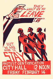 “A missed paycheck, a health crisis, or an unpaid bill are all that separate many people from homelessness. As America’s income gap widens, renters worry if they can ever buy homes of their own—or keep their rentals through retirement. The lack of affordable housing is not just a U.S. problem. We Shall Not Be Moved uses domestic and international posters to show that homelessness and gentrification are major issues throughout the world—and from the U.S. to Europe to Australia, posters remain the resisters’ tools of choice. Posters announce demonstrations to oppose demolitions, support squatters’ rights to move into abandoned buildings, and organize tenants’ unions. They document victories, defeats, and ongoing confrontations. Posters both record these struggles, and are central to them. They show that victory does not happen overnight—it can take years—but it is possible to fight city hall and the developers and win.”
The posters are organized as follows:
- Introduction
- Development & Speculation
- Homelessness & Poverty
- Organizing Resistance
- War & Displacement
- Conclusion
Solidarity Forever!
Graphics of the International Labor Movement
From the site:
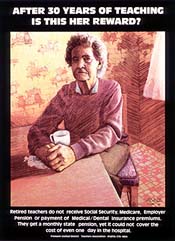 “Organized labor has consistently produced more political graphics than any other domestic movement for social change. Labor posters are often produced in the midst of a strike or boycott and convey the urgency of the times. Others are commemoratives, marking the anniversary of a victory or a martyred labor leader. They remind viewers of a too often hidden history, rally against dangerous conditions in the workplace, and warn that such injustices still occur. Although many of the posters are historical, the issues are not. The eight-hour day is no longer sacrosanct. More and more children are entering the workforce. Pesticides threaten farm workers and consumers. Sweatshops are proliferating domestically and internationally. These graphic expressions of international solidarity are a powerful combination of art and politics, crossing borders of time and place.”
The posters are organized as follows:
Stencil Graf, San Francisco
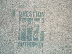
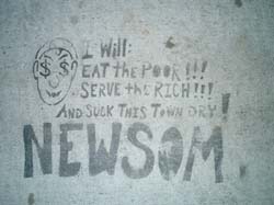
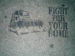
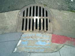
Some political stencil graffiti I spotted this weekend on the sidewalks of San Francisco and Oakland. Click an image below for a larger version.
That’s Mayor Gavin Newsom to you.
Most buildings built before June 1979 are rent controlled. However, housing prices are so high that some landlords are willing to destroy their buildings to build new ones that can rent at the city’s incredible market price.
“PROTECT THE BAY / DON’T DUMP”
There’s lots more at http://www.stencilarchive.org/.
Designing Supportive Housing, 2
I’ve been taking a break from blogging to wrap up a few projects, but here’s a quick follow-up to a previous item from June on supportive housing:
 “Common Ground Community and The Architectural League of New York’s First Step Housing design competition ended this week with five entries sharing top honors.
Competitors were asked to design a prototypical individualized dwelling unit and the layout of 19 such units on a typical floor of The Andrews � Common Ground’s lodging house on the Bowery - which will shortly be renovated to house the First Step Housing Program. First Step will offer private, safe, clean and affordable short-term accommodations to individuals who are transitioning to housing, facing homelessness, or who have rejected or failed in other programs.”
Designing for the Dispossessed
From The New York Times, August 28, 2003:
“Designing for the Dispossessed
by Alastair Gordon
At age 29, Cameron Sinclair was among the youngest speakers at the International Design Conference in Aspen, Colo., last week. He nonetheless brought a full auditorium to its feet Thursday morning with a review of his work with Architecture for Humanity, a nonprofit organization he started from his Manhattan studio apartment with a scattering of volunteers and a shoestring budget.
Over the last four years, Mr. Sinclair’s group has helped generate programs and designs for disaster relief in 20 countries, including Afghanistan, Kosovo and South Africa.
Mr. Sinclair’s talk, peppered with well-rehearsed lines (‘All I ask is that they design like they give a damn’) was tailor-made for a design conference that took global concerns with safety as its theme.
‘He has been a mainstay and hero of the conference,’ said Paola Antonelli, a curator at the Museum of Modern Art in New York and a chairwoman of the conference. ‘He’s asking architects to take a risk and forget about immediate profits.’
Mr. Sinclair’s appearance alongside more established design figures is evidence of a shift, particularly among students and younger designers, toward social responsibility.
‘Would someone like me have been invited to speak here five years ago?’ Mr. Sinclair said. ‘Probably not. But a lot of younger architects don’t want to design doorknobs in boutique hotels anymore. They want to be engaged, they want to help find solutions to critical problems.’
Of course, Mr. Sinclair is not the only one generating designs for relief. The Rural Studio, based in Auburn, Ala., has helped provide housing for the rural poor since 1993, and Shelter for Life, a volunteer group based in Oshkosh, Wis., has built houses in Afghanistan. But through persistence, personal charm and a marriage to a journalist who writes press releases and grant proposals, Mr. Sinclair has managed to make himself the center of a global network of designers, engineers and relief groups.
Mr. Sinclair and his wife, Kate Stohr, 29, have gone a long way with limited means. He was laid off from his job as a project architect at Gensler a year ago, and has devoted himself to Architecture for Humanity full time ever since. ‘Here we are doing health programs around the world,’ he said. ‘And we can’t afford health insurance for ourselves.’
Four days after 9/11, the United Nations High Commission for Refugees called Mr. Sinclair, he said, to tell him he was on a list of people that could be asked to help with the coming relief effort in Afghanistan. ‘I told them I hope it’s a long list,’ he said, ‘because I’m a 28-year-old alone in my apartment.’ (He put them in contact with architects and engineers in Pakistan and other neighboring countries.)
During the 1960’s and early 70’s, young architects as a rule felt almost obliged to address issues like affordable housing and community planning. But by the time Mr. Cameron arrived at the Bartlett School of Architecture in London in the late 1990’s, these concerns had given way to a preoccupation with signature design and theory.
‘I was the black sheep of my class,’ said Mr. Sinclair, who designed housing for the homeless as his thesis project. ‘My fellow students were more interested in getting into Wallpaper magazine.’
He does not feel like a black sheep anymore. In the past two months, more than 120 people have applied to work for him as unpaid interns, most of whom had to be turned away.
‘A lot of my generation is disillusioned,’ Mr. Sinclair said.
‘You finish school, start with a big firm, and become a CAD monkey working in a little cubicle,’ he added, referring to computer-animated design. ‘You’re told that only one out of a hundred will make it as a name architect. That’s depressing.’
Mr. Sinclair, who was raised in London, showed his organizational knack two years ago when he founded the ‘Uncoordinated Soccer League’ in New York for unathletic designers, a dozen of whom ended up volunteering for his group.
In 1999, with a budget of just $700, Mr. Cameron held a competition to design transitional housing for refugees returning to Kosovo. He received nearly 300 entries from 30 countries, including a modern yurt built around a central column by the Oakland-based firm Basak Altan Design. ‘Refugee shelter is usually a last-minute, ad hoc affair with little in the way of advance planning,’ Mr. Sinclair said. His goal was to provide shelters where refugees could live for years while rebuilding homes.
The jury, which included the architects Tod Williams, Billie Tsien and Steven Holl, picked 10 winners. Five prototypes were built, including a structure made of paper by Shigeru Ban of Tokyo and a shipping container lined with plywood by the Australian architect Sean Godsell.
Gans & Jelacic, a firm in New York, built a prototype of their entry, a triangular structure that pops up from a container with the help of a standard car jack.
I-Beam Design, another New York firm, designed a shelter made from wooden shipping pallets. ‘We were looking for a simple solution and realized that supplies sent to disaster areas are often shipped on these pallets,’ said Azin Valy of I-Beam. ‘We wanted a universal system that a child could put together.’
Ms. Valy and her partner, Suzan Wines, built a prototype in an abandoned lot in the South Bronx. Within weeks, a homeless man had moved in; and a week after that, the city had torn it down.
For all his persuasive ways, Mr. Sinclair has so far failed to actually build anything in Kosovo. He is among the first to acknowledge the failure. ‘We architects enjoy a pat on the back, but unless you build it, it’s just an idea,’ he said.
However thoughtful they may be, designs intended for developing countries often fail to consider local conditions. Muslim countries, for example, typically require separate facilities for men and women. Steel shipping containers, used in several submissions, may, in fact, be unsuitable in tropical climates. And structures that are hard to assemble are of limited use when recipients are largely women, children and older men.
‘It’s important that architects consult with the beneficiaries, which seems obvious, but this doesn’t always occur,’ said Erin Mooney, deputy director of a project on displaced people for the Brookings Institution and Johns Hopkins University.
Gans & Jelacic were one of the few who went into the field. Deborah Gans attended the Refugee Studies Center at Oxford University while her partner, Matthew Jelacic, visited refugee camps in Bosnia. There, tents outside Sarajevo had collapsed under snowfall.
Mr. Sinclair and Ms. Stohr married while organizing the Kosovo competition, and they left shortly afterward for a monthlong honeymoon in South Africa. ‘The honeymoon lasted two days,’ Mr. Sinclair said. While his wife began reporting an article on a rape epidemic in South Africa, later published in The Pittsburgh Post-Gazette, Mr. Sinclair met with urban planners and visited shantytowns.
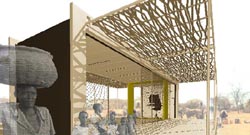 Two and a half years later, in May of 2002, Mr. Sinclair staged a competition for mobile medical clinics that could be used to treat AIDS in Africa. He received more than 530 submissions from 51 countries. (An exhibition of entries is touring five countries, ending with South Africa.)
The proposal that won first place, by jury, is a self-sufficient clinic with a satellite dish, solar power and a water collection system. The clinic, designed by Khras Architects of Denmark, would be made from a lightweight metal skeleton with natural materials added for local texture.
‘Instead of one solution we wanted to come up with a system,’ said Mads Hansen, a member of the Khras team. ‘In Africa, especially in remote areas, you don’t just get a spare part from down the road.’
Mr. Sinclair is trying to raise $20,000 to send four finalists to meet with doctors and relief workers in South Africa before building prototypes.
‘Architects pride themselves on having a vision of the future, but in this case they’re not rising to the crisis,’ said Rodney Harber, an architect in Durban, South Africa, who has worked on AIDS-related projects for 10 years. ‘Cameron has made a real contribution. His competitions and Web site have helped to stimulate a global dialog.’
Mr. Sinclair and Ms. Stohr see their role over the next few years as advocates, shepherding their various projects to completion. ‘I’m hoping to one day watch the sun set in Africa while we sit on the porch of our mobile health clinic,’ Ms. Stohr said.”
Some interesting ideas in the mix. In 2002, I visited the church / community center built of cardboard tubes that Shigeru Ban constructed in Kobe after the horrible earthquake of 1995. It was still standing and very much in use.
The winning clinic is designed so it can be locally built, run, and maintained. The design criteria for the mobile clinic are as follows:
- The unit should adequately house, transport and be easily operable by a small team of medical professionals (2 to 5). Storage of equipment and medical supplies should be taken into consideration.
- The clinic should be cost-effective. If possible it should be built using sustainable materials and construction techniques. Designers can make use of either advanced or simple technologies and should look to take advantage of local materials, construction techniques and labor.
- The unit should be mobile and durable enough to be transported through widely diverse areas of Sub-Saharan Africa. Topography and terrain should be taken into account. Ease of maintenance and repair are essential.
- Entrants should take into consideration the tasks performed within the clinic. Although the unit will primarily be used for the prevention, testing and treatment of the virus and associated infections, it must also be a place where health care professionals can teach and disseminate information.
- In addition to HIV/AIDS, many other deadly but treatable diseases afflict the African continent, chief among them tuberculosis and malaria. The ideal design will take into account the varying health care needs of the population and should be easily adapted to treat these other diseases and conditions.
- One of the major obstacles is the stigma surrounding the disease and this should be taken into strong consideration when designing. If a clinic arrives into a remote area for the first time, think how it will be received into the community.
- Finally, the ideal design will also create opportunities for economic growth. Many of the regions deeply affected by HIV/AIDS have suffered economically to the point of reverse development. In addition to becoming a highly dispersed health care distribution network, designers are encouraged to pursue ways of providing complimentary or secondary services in addition to health care via the same mobile unit.
It’s great to see the power a couple of individuals can have to promote the design in the public interest.
Still, it’s unfortunate that it is so apolitical. Better treatment and a few more rural health clinics is a good thing, but clinic design does not address public health policy, or the economic, social, and cultural factors propelling the AIDS epidemic. There are plenty of clinics in the West, and yet the epidemic continues. I wonder if the Africa clinics will be used for to test those Western AIDS vaccines, too.
I also wonder if participation in the competitions will radicalize the architects in their own countries. With members in 75 countries around the world, such a network could, for instance, join the movement to keep international pressure on the WTO to change drug patent rules that keep cheap drugs out of the hands those who need them. Those architects around the world could push their countries to forgive foreign debt in Africa. With debt relief, governments in Africa could fund their own health programs rather than spending their budgets on interest payments, and relying on still more loans and donations to support such public health initiatives.... loans from international lending agencies that in many cases require the dismantlement of public health programs.


