

mapping
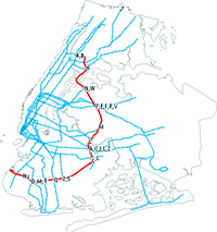 “In its 1996 Third Regional Plan, the Regional Plan Association describes a rapid transit line in Brooklyn, Queens, and the Bronx that could be built almost entirely on pre-existing rail rights of way and would connect with at least twenty existing subway lines. The so-called “Triboro RX” (“TRX” for short) presents a unique opportunity to provide mobility and accessibility to New Yorkers living or working within these three boroughs, at a fraction of the cost of most transit projects of similar size. In my part-time internship at the RPA, which ends today, the lion’s share of the work I have done has focused on fleshing out the idea of this line.” And he did it with mostly open source tools: GPL mapping and GIS software, GPS to digital camera sync, Google Map maship, population and commuter demand modeling... Mike’s data sources and results are up on his TRX wiki.
Map Junk
On Vertederos Localizados Por Los Internautas, the Spanish newspaper La Voz de Galicia invites readers to send in photos and descriptions of illegal garbage dumps. Photos and descriptions are plotted on an interactive map of the country. The intent seems to be embarrassing officials into cleaning it up.
Built by coder Jim Nachlin and friends, the Garbage Scout plots some of the things New Yorkers are throwing out, so that others may claim them. (Many of the shelves in my apartment were inherited from the street.) Sadly, the experiment only lasted a year, though I hear the code may be GPL’d soon.
It’s interesting to me that two maps with the same interaction and functionality and with similar focus can have such different approaches — one top down, the other bottom up.