mapping
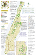

See the PDF online or send for a free printed map.
Ghost Bikes
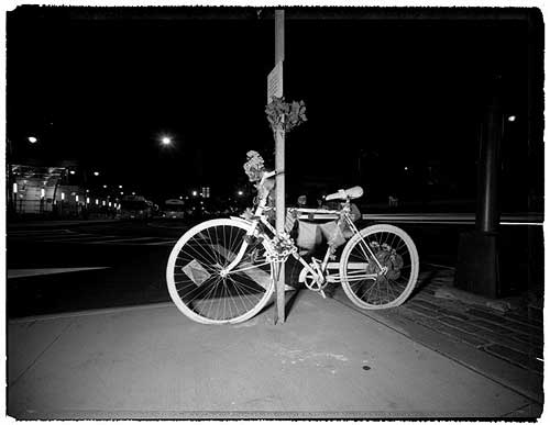
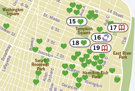
Last week, the New York Times ran a sober photo essay on the ghost bikes that Visual Resistance and Time’s Up! have been installing around New York City since June 2005. The bikes are public interventions, a grassroots action in the spirit of graffiti memorial walls. The bikes are painted white and chained near the site where a cyclist was killed by an automobile, along with a plaque with their name and the date they were killed. Several are plotted on this map.
The bikes were inspired by a similar project in St. Louis, and have since appeared in cities across the U.S. and the U.K.
A 2005 report on bicycle fatalities from the New York City police, parks, health, and transportation departments reports that between 1996 and 2005, 225 bicyclists were killed in crashes with motor vehicles. Between 1996 and 2003, 3,462 NYC bicyclists were seriously injured in crashes.While the annual number of serious injuries has decreased, deaths remained steady during the 10-year period.
The statistics show a failure of urban design and policy — 89% of crashes occurred at or near intersections, 92% of bicyclist fatalities resulted from crashes with motor vehicles — as well as the absence of personal equipment: 97% of the bicyclists who died were not wearing a helmet. 74% of the fatal crashes involved a head injury.
While it’s clear that helmets save lives, something else is broken in NYC: of the 3,964 transportation-related deaths in New York City between 1996 and 2005, only 6% were cyclists. Almost half the deaths (49%) were pedestrians.
Mapping the “War on Terror,” 3

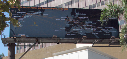
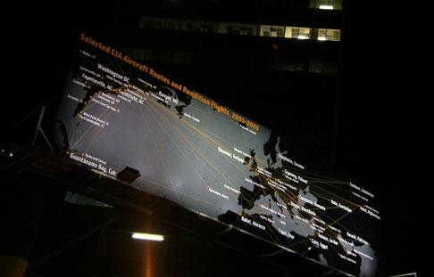
A billboard I designed is up on display in Los Angeles. It’s part of a series of public art installations about the war, and will be on view until October 8, 2006.
The image is a map of Selected CIA Aircraft Routes and Rendition Flights 2001-2006, some of which transported prisoners to foreign countries to be interrogated and tortured. After years of silence and denial, the administration publicly acknowledged the flights in the last few weeks.
I worked with artist and geographer Trevor Paglen who provided the data. Trevor spent several years tracking down the flight information, and has a book out this month on his investigations, Torture Taxi: On the Trail of the CIA’s Rendition Flights. See this interview with him on Democracy Now! with co-author, journalist A.C. Thompson.
The billboard is located at 6150 Wilshire Boulevard, near South Fairfax Ave, between Beverly Hills and West Hollywood. Here’s a Google Map.
Clockshop, a public arts organization in Los Angeles, funded the display. You can read more about the project at http://clockshop.org/here.php
A few images, below:
Mapping the “War on Terror,” 2
The Privatization of War: Colombia as Laboratory and Iraq as Large-Scale Application is a mapping project by artist Lize Mogel and writer Dario Azzellini, on display at the Gwangju Bienniale in South Korea.
The 50 foot long mural diagrams the relationships between the United States and private military contractors and their activities in Colombia and Iraq. These corporations are less accountable to Congress and the public, and provide “products” and services including:
“risk advisory, training of local forces, armed site security, cash transport, intelligence services, workplace and building security, war zone security needs, weapons procurement, personnel and budget vetting, armed support, air support, logistical support, maritime security, cyber security, weapons destruction, prisons, surveillance, psychological warfare, propaganda tactics, covert operations, close protection and investigations.” [source]
Read more about the project and see a larger image of the map here.
Mapping the “War on Terror,” 1
The NYC Guide to War Profiteers
First blogged here in August 2004, the NYC Guide to War Profiteers has fallen off the Web. The site of the March 27 Coalition that quckly came together in 2003 has since lapsed into the hands of domain squatters.
A friend recently inquired about the map, so I scanned my hard copy and am posting it here.
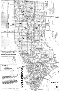 Front, 787 Kb PNG, 150 dpi |
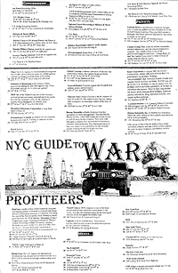 Back, 681 Kb PNG, 150 dpi |
The map was assembled by the “mutual support network” and rushed to press just before the invasion of Iraq in March 2003.
The map has a low-tech, DIY aesthetic, designed to be reproduced by photocopy on the front and back of a standard sheet paper. The icons are composed of cut paper, arranged on a found map. The map was available at progressive bookstores around town, and was distributed at organizing meetings for various protest events.
The list of weapons makers, media companies, and military recruiters helped locate the discussion around the March 27, 2003 direct action. Rockefeller Center ultimately was chosen for its proximity to several points on the map.
Three years later, the map has not lost its relevance.


