memory
 A brief look at non-profit ads and political graffiti depicting President Bush over the last 8 years. See also Bush Billboards and GWB in international advertisements. I hope the next time we see this guy’s mug it’ll be on the witness stand.
Code is Wall
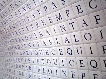
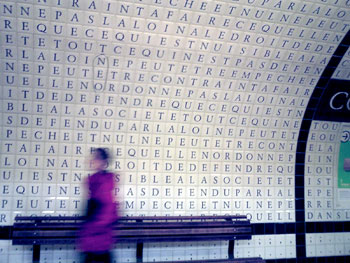
In the Concorde station of the Paris Métro, the tunnel for line 12 is decorated with tiles spelling out the text of the Déclaration des Droits de l’Homme et du Citoyen, the Declaration of the Rights of Man and Citizen, a foundational document of the French Revolution. See more photos on Flickr or this panorama.
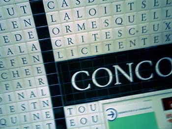
This works in so many ways: as a beautiful display of public typography; as a visualization of the correspondence between human rights and public transit, between policy and infrastructure, between theory, practice, and everyday life. In its deadpan presentation, there’s also something of a memorial to it which seems appropriate given its proximity to Place de la Concorde, previously Place de la Révolution, the site of the guillotine.
Not to mention a passing resemblance to The Matrix.

 Graphic artist, organizer and member of the Student Nonviolent Coordinating Committee, he popularized the image of the clenched-fist as a symbol for the New Left. He died Monday, November 24, 2008. More at Art for a Change, NY Times and The Rag Blog.
The Erased
From January until June 2008, Slovenia holds the EU presidency. It’s an opportune time to spotlight the country’s own human rights record.
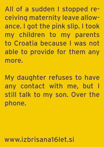
On the February 26, 1992, six months after Slovenia declared independence from Yugoslavia, the Ministry of the Interior erased 18,305 legal inhabitants from the Permanent Population Register. With a stroke of the pen, 18,305 individuals became stateless “residents without status,” unable to work legally, losing their drivers licenses, passports and other legal papers. Many were permanent residents of Slovenia who had emigrated elsewhere in Yugoslavia. Some were married to citizens or other residents and had raised families in the country. Suddenly thousands of breadwinners were unable to earn an income. Some were deported, some unable to leave the country — trapped in poverty and bureaucratic limbo. See some of their stories here.
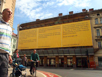
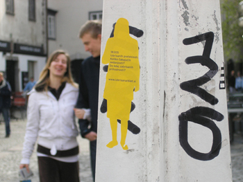
Marc at Osocio sends word about a public, citywide campaign in Slovenia’s capital city Ljubljana to shine a light on The Erased and their ongoing plight. The design studio Poper has postered the town in partnership with Amnesty International Slovenia, the Peace Institute and the city government, rendering the stories of The Erased throughout the city. The campaign’s goal is to raise awareness of the issue, the State’s arbitrary response and blatant disregard of Constitutional Court rulings.
Listen to the last segment of this CBC podcast for more on the issue or read this FAQ on the campaign’s web site: http://www.izbrisan16let.si
Torch Relay
Democracy Now, April 10, 2008:
Amy Goodman: I was shocked in reading last night the history of the Olympic torch relay — you know, the torch itself going back to ancient Greece — but the relay to be Nazi Olympics, 1936.
Minky Worden: There’s a wonderful book, a new academic book called Nazi Games, which gives a concise history of this. But the torch relay itself is essentially a PR invention of the Nazi era. And the point of it was to run the torch through parts of Europe that Germany that the Nazis hoped to take over, including the Sudetenland.
 By ignoring color, black-and-white photographs depict an abstract surreality — one that has become strongly associated with an iconic truthiness. In this RealAudio clip, NPR talks with Naitonal Geographic Society photographer Chris Rainier about Kodak’s black-and-white Tri-X film. Tri-X was a technical innovation that allowed faster shutter speeds so pictures could be taken without flash in a wider range of situations. “It became the film of choice for everything from fashion to combat photography.... It also has a sort of graininess to it that we all now, in the beginning in the 21st century... associate with many of the most historically important events over the last 50 years.” (via)
Wikipedia on Tri-X: “Since the advent of digital photography it has all but fallen out of use in newspaper journalism. Apart from possible use in educational establishments, it still remains reasonably popular in documentary journalism.”
Sloganeering
A year ago, I received an email from “Tony:”
“I have looked all over the web, and just can’t find the simple themes that can be posted to the back of poster board or foam board and used at street vigils. I just need simple stuff for 11 by 17 AND 8 1/2 BY 11 COPYING.
Can you help? The power of one or two people in public holding simple antiwar protest messages is great. I just can’t find anything on the net that isn’t too artsy-fartsy, or too damn pacifist-wimpy.”
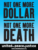
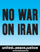
I smacked into this “artsy-fartsy” factor again a few weeks ago when United for Peace and Justice asked if I could turn out some poster designs on short notice. They sent their final copy and I set to thinking about how to represent things iconographically in a beautiful, compelling way. I rummaged through the usual toolbox (coffins, dollars, boots, ribbons, etc.) as well as play with color and typographic notes (big X’s, oversized punctuation, etc.) One slogan in particular raised an interesting problem: how to graphically represent “community” for marches in eleven very different cities.
Nevertheless, over the weekend’s iteration the org requested the gradual removal of all imagery, iconography, and embellishment. I was trying to do something graphically interesting to myself, but the group had a very specific use case in mind. The posters were not intended for pasting on the street, to attract passersby with flourish, humor, or imagery. They wanted something to be carried high and read from a distance, particularly when reproduced in photos, newspaper clippings, or seconds-long TV news highlights. As such, these were props to represent the march in memory as much as in person, to disappear and punch the message through network editing and newspaper cropping. The simpler and bolder the better.
With a little more time I would have refined these further, but here are the results below. Click on a thumbnail to download a printable PDF.
