

nationalism
Torch Relay
Democracy Now, April 10, 2008:
Amy Goodman: I was shocked in reading last night the history of the Olympic torch relay — you know, the torch itself going back to ancient Greece — but the relay to be Nazi Olympics, 1936.
Minky Worden: There’s a wonderful book, a new academic book called Nazi Games, which gives a concise history of this. But the torch relay itself is essentially a PR invention of the Nazi era. And the point of it was to run the torch through parts of Europe that Germany that the Nazis hoped to take over, including the Sudetenland.
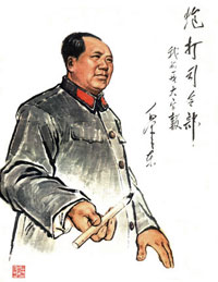 “During the twentieth century, the social and political uses of calligraphy have been radically changed. Calligraphy is no longer an art associated primarily with the traditional scholarly elite. Not only has calligraphy been employed as a tool of revolution, but it has become a popular amateur art practiced by people of all walks of life, and artists have found ways to use it to challenge traditions rather than perpetuate them.…
Even if block-like calligraphy had revolutionary overtones, Mao and other leading revolutionaries wrote in styles much closer to traditional calligraphy. Moreover, even after most people took up writing with pencils and ball-point pens, leading party members continued to do calligraphy with traditional brushes. They would give away pieces of their calligraphy and allowed their calligraphy to be widely displayed.… Mao Zedong’s calligraphy was more widely displayed than that of any other leader.”
Type and Nation, 3
This has faded from the NPR site, so here it is for posterity. From NPR: Talk of the Nation, July 3, 2003:
LYNN NEARY, host: When most Americans think of the paper version of the Declaration of Independence, they think of the document kept by the National Archives written in calligraphy and signed by the Founding Fathers. It’s faded and fragile, and for some people not as symbolic of democratic principles as other lesser known works. Here to talk about that is Thomas Starr. He’s a professor of graphic design at Northeastern University. We reached him at his home in Boston.
Thanks for being with us, Professor Starr.
Professor THOMAS STARR (Northeastern University): Thank you, Lynn.
NEARY: All right. Now, Professor Starr, most Americans are familiar with the calligraphy version of the Declaration of Independence, but tell us about the documents that predate it.
Prof. STARR: Well, we really have to start on July 2nd. That was the day that Congress voted in favor of independence, after which it took up editing the Declaration text. That editing took some time. It took two days, and it was quite heavy. Congress deleted about one-third of it and made 39 changes in addition. So on July 4th, when that manuscript was finished, in its form it was taken not to a calligrapher but to a typographer. And that typographer was John Dunlop. He was Congress’ official printer. And I would say he had the most important overnight printing job in history. He set the text in type, so he assembled it for the first time in its complete form, and ran his presses overnight, delivering to Congress on the 5th. So these were then delivered to the 13 colonies, where they were republished and disseminated further. These were the prints that the colonists saw. So the published Dunlop prints are really what did the declaring. And when you think of July Fourth, I mean, it’s a holiday in which the date is emphasized more than any other. And so what it actually celebrates is this day of typesetting and printing.
NEARY: When did the calligraphy document then come along?
Prof. STARR: Well, the calligraphy didn’t actually get ordered by Congress until July 19th. And what’s interesting is by then we know that the Dunlop Declarations had spread so far that they had been republished in 24 newspapers from Maryland to New Hampshire. And, you know, in 1776 Congress still traditionally formed its most important documents in calligraphy. It was a tradition left over from monarchy. But it had to use typography to communicate with the people. Typography really is the medium of democracy. So the calligraphic version now in the National Archives was finished only on August 2nd, so it really can’t be the version we’re commemorating when we think of the Fourth. And the type, for many reasons, is a more democratic version of the Declaration.
Type and Empire, 3
From Reuters via CNN:
20 fined for using letters W and Q
Tuesday, October 25, 2005; Posted: 8:05 a.m. EDT (12:05 GMT)
“DIYARBAKIR, Turkey (Reuters) — A Turkish court has fined 20 people for using the letters Q and W on placards at a Kurdish new year celebration, under a law that bans use of characters not in the Turkish alphabet, rights campaigners said.
The court in the southeastern city of Siirt fined each of the 20 people 100 new lira ($75.53) for holding up the placards, written in Kurdish, at the event last year. The letters Q and W do not exist in the Turkish alphabet.
Under pressure from the European Union, Turkey has improved language and human rights for its Kurdish minority, but the EU says implementation has been patchy and loopholes remain.
The 1928 Law on the Adoption and Application of Turkish Letters changed the Turkish alphabet from the Arabic script to a modified Latin script and required all signs, advertising, newspapers and official documents to only use Turkish letters.”
Somehow the suppression of letterforms (and language) still has not washed away the Kurdish culture or the push for autonomy. And, what about those letters E and U?
More on the switch of writing systems later.
Dimensions of Mind
“You’re traveling through another dimension, a dimension not only of sight and sound but of mind; a journey into a wondrous land whose boundaries are that of imagination.”
 Yesterday sat in on an a lecture on theories of the nation and nationalism. The nation is an imagined community, geography a matter of representations, and both of these are fraught with assumptions.
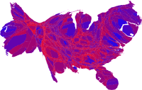
But looking at all the electoral maps and cartograms of the last election one can see the reverse is true as well. The Map Room has cataloged links to several maps: 1, 2, 3, 4.
I’ve read several accounts for the patterns on the map. One can examine north vs. south, heartland vs. fringe, urban vs. rural, plotting various demographics along the way.
Even if one assumes that a few million votes were stolen, a more general insight is unspoken — perhaps because it is a given? Despite increasing consolidated and homogenous media and increasingly pervasive Internet access, ideology exists spatially.
Type and Nation, 2
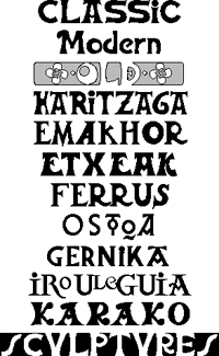
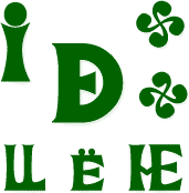
“Euskara - which means Basque in the Basque language - refers to all kinds of characters you can find in the Basque country. Indeed each of the seven French and Spanish Basque provinces has its own geographic and cultural characteristics. For instance, those who live on the seaside - itsasoan - differ from those who live in the mountain - itsasmendi. These differences can also be felt from one valley to the other.”
Modern Basque nationalism emerged at the end of the 19th century, marked by the formation of the Basque Nationalist Party in 1895. Part of the political and cultural program of the Party was a revival of a unified Basque language. And related to this was the celebration of a distinct Basque typography.
 In 1888, Louis Colas, a schoolteacher from Baiona, begin his travels across the Basque countryside on muleback on documenting ancient Basque monuments. Colas published his research in a large, heavy volume which cost him a fortune. It initially attracted few readers.
The volume, though:
“is a genuine encyclopedia with more than 500 rough sketches and about 30 photos, tracing monuments and works since lost or destroyed. Unfortunately today, too few originals - some of them in a poor state - can be consulted as unquestioned references to the matter.” [source]
The Basques inherited their method of representing the sounds of language by literal symbols from the Romans.
“At that time, the Basque engravers knew very little about the Roman ironworks technique; their rough tools couldn’t carve deep characters like in the sculptures coming from Rome. So, instead of carving deeply, they scraped the stone around the characters which thus stuck out, creating a new technique. This explains why the Basque letters can hardly resist the passing of time: five-century-old engravings have been rubbed out, for the most part.
Moreover, very few people — such as old families of engravers — could write as well as engrave: such a treasure was to be kept secret. This explains the variety in the Basque characters. Not only did the children inherit the technique from their parents, but they also inherited the family mistakes: sometimes in a village, you may find the same misprints on the old houses fronts. The most powerful family in a valley also caught hold of all the written works. Still today, there are shapes in the carved stone which can be found only in some valleys; and it is the same for the ‘pelote Basque’, the rules of which varied according to the valleys which were the (mass) media of the time!” [source]
Later influence of the continental Celts was felt in particular on capital letters A, S, and N, and in the rare lowercase letters b, p, q, and o.
 Despite this influence and other printing fashions, the Roman influence predominates. There is hardly any Basque written work using cursive script. This results in part from the link between Latin and Christianity: almost all early written works in Basque were religious in content.
The Basque nationalist movement was banned and forced underground in 1923 by the Spanish military dictatorship of Miquel Primo de Reviera, but flourished after proclamation of the Second Republic in 1931 and the lifting of the ban.
Despite military uprisings that divided the Basques, following a large scale campaign for Basque autonomy and a plebiscite in 1932, the Government of the Republic granted autonomy to the Guipuzcoa and Vizcaya regions. The first Aberri Eguna was held on Easter Sunday, March 25, 1932 celebrating the Basque homeland, culture and language, and Catholicism.
In the 1930’s printers and foundries lavished much attention on Mr. Colas’s book which encouraged Euskara’s revival.
“Euskara consists of large-footed, big-eyed, Roman-styled characters. (See Some Different Basque Letters). You should not use them for a whole text because it would give a sensation of thickness: they were used on mortuary epitaphs and fronts of houses, mostly. The general pattern is rather heavy but the ten existing lowercases makes it look lighter: it seems funny that hardly any lowercase can be found in Euskara, although typically Basque letters can be found (for example, the interpenetrated DE).”
Today Euskara can be found throughout the Basque country on signage, television, newspapers, and packaging.
“Among the various Euskara characters used in offset printing, the LetraSet transfer-types are very well spread, whereas only Spanish printers have still got lead characters. Neuhaus in Hendaye is a worth-mentioning firm: their local roadsigns, printed in Basque characters, help promote tourism. Lately, a young editor from Biarritz has tried to use the Basque culture characters [for computer printing].”
But given its current status as a kind of cultural brand for consumption by tourists and others external to the Basque community, does it still retain a nationalist connotation to the community itself? Or has it become depoliticized, commodified, and folkloric?
Thierry Arsaut designed the fonts displayed above.
Type and Nation, 1
From Paul Shaw, “Fascism on the Facade,” in Print, May/June 2004:
 “Tourists may be unaware that Fascist architecture — fountains, monuments, public works, buildings — pervades Rome. Non-Italian guidebooks deliberately ignore these structures, and their modernism makes them seem boringly familiar — even at the most ponderous and grandiose — to anyone visiting from another large city. However, there is one thing above all else that separates Fascist architecture from modern architecture: the conspicuous presence of lettering.
Lettering, inscribed and in relief, had always been an integral part of Western architecture until the Modernists, in their drive for purity and functionality, threw it out along with ornaments, and other decorative motifs. In Italy, lettering survived and flourished in Fascist architecture because it served to advertise the regime’s aims and accomplishments.
While the Nazis settled the centuries-old fraktur oder antiqua (blackletter versus roman) debate in favor of the former, the Fascists never had an official policy regarding letterforms. ‘The idea of an “art of the State” was rejected not only by Mussolini and his minister Giuseppe Bottai, but also by all the official representatives of the regime,’ wrote Rossana Bossaglia in Ritratto di un’Idea (2002). Instead, beginning in 1926, the regime spoke of Fascist art as work that interpreted and represented the spirit of the Fascist movement. But no precise style was defined until the late 1930s. Often overlooked and mistaken for lettering of other periods, the visual language of the Fascists still permeates many of Rome’s most historic buildings.”
Green or Black?
“Do you want green tea or black tea?”
In Uzbekistan, tea is the drink of hospitality. Community is all about hanging out in the choyhona (teahouse), talking and drinking tea while sitting on topchan, a kind of raised platform bed with a pad to sit on and a small table in the middle. (Thus, choyhona is also the name of a popular Internet chat network.)
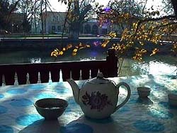 So which tea do you choose?1 The question seems simple, but the answer is fraught with political significance, identifying you as sympathetic to either ethnic Russians or ethnic Uzbeks.
One of the legacies of the Soviet occupation in Central Asia is a population of ethnic Russians living there. Born in Central Asia and raised under Soviet culture, when the USSR fell and the borders rolled back, these ethnic Russians remained. This piece in Slate describes the predicament.
“Clara was a Soviet. Today, she must search for a new vocabulary to define her identity. She has no ties to the land of her ancestors and is neither Kazakh nor Russian.
This search for identity is mirrored in millions of ex-Soviet people of all ethnic groups. One of the more interesting cultural shifts in post-Soviet Central Asia is the status and identity of ethnic Russians. During Soviet rule, the Russians comprised more than half of the population in Kazakhstan, exiled by Stalin during the 1950s and ’60s mass migration under the ‘Virgin Lands’ campaign, when Russians were encouraged to cultivate northern Kazakhstan’s pastures.
So where does this leave ethnic Russians with no ties to the new but living in the place of their birth? Rootless.”
Ethnic Russians used to be identified with the power elite, but are no longer. Since Central Asian independence they are in some ways second-class citizens. Political leaders now promote a form of nationalism using ideas of ethnic authenticity — for instance, promoting local languages and literature supressed under Communism, or in the most extreme example, the President of Turkmenistan has banned all “non-Turkmen” cultural institutions.
In this climate, signs that might otherwise seem insignificant become significant cultural markers.
In Uzbekistan, conventional wisdom holds that Russians drink black tea and Uzbeks drink green tea. When with one group or another, drinking the appropriate tea identifies one as part of the “in group.” The sign, though, can be waved by anyone — an ethnic Russian among Uzbeks may choose green tea to signify that he or she is down with the group.
Ironically, the political leaders pushing the nationalism are often themselves the products of Soviet education and the Soviet system. They speak fluent Russian... and though they’d never admit it, might even prefer black tea.
1 Choosing neither will win you a stern lecture on the important health benefits of tea.
Type and Empire, 2
 I don’t ascribe much significance to the names of typefaces. The style names are not what determine the meanings of letterforms.
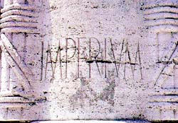
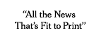
But this was just so rich. From The New York Times’ note on last fall’s typographic overhaul:
“The [New York] Times’s text typeface, for news and editorials, remains Imperial, designed in the 1950’s by Edwin W. Shaar and adopted by the newspaper in 1967.”
The shape of the News, the shapes of Truth are inscribed in Empire.