7 October 2004
Type and Nation, 1
From Paul Shaw, “Fascism on the Facade,” in Print, May/June 2004:
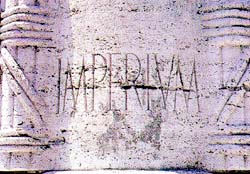
 “Tourists may be unaware that Fascist architecture — fountains, monuments, public works, buildings — pervades Rome. Non-Italian guidebooks deliberately ignore these structures, and their modernism makes them seem boringly familiar — even at the most ponderous and grandiose — to anyone visiting from another large city. However, there is one thing above all else that separates Fascist architecture from modern architecture: the conspicuous presence of lettering.
Lettering, inscribed and in relief, had always been an integral part of Western architecture until the Modernists, in their drive for purity and functionality, threw it out along with ornaments, and other decorative motifs. In Italy, lettering survived and flourished in Fascist architecture because it served to advertise the regime’s aims and accomplishments.
While the Nazis settled the centuries-old fraktur oder antiqua (blackletter versus roman) debate in favor of the former, the Fascists never had an official policy regarding letterforms. ‘The idea of an “art of the State” was rejected not only by Mussolini and his minister Giuseppe Bottai, but also by all the official representatives of the regime,’ wrote Rossana Bossaglia in Ritratto di un’Idea (2002). Instead, beginning in 1926, the regime spoke of Fascist art as work that interpreted and represented the spirit of the Fascist movement. But no precise style was defined until the late 1930s. Often overlooked and mistaken for lettering of other periods, the visual language of the Fascists still permeates many of Rome’s most historic buildings.”
![]() 7 October 2004, 9:03 AM | LINK | Filed in
nationalism, typography
7 October 2004, 9:03 AM | LINK | Filed in
nationalism, typography
Read more items related by tag:

