parody
’Til You Drop
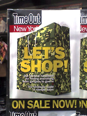
Now on newsstands across NYC is the cover of this week’s Time Out New York, an events and listings rag. The camouflage shopping bag is intended to evoke martial metaphors: tactical tips for your bargain hunting strategy inside.
But it struck me as quite an elegant, visual link between War and The Market!
Beware of the God
Like the U.S., Australia has a growing problem of fundamentalists in politics.
In response, graphic designer, artist, and activist Deborah Kelly has undertaken a large scale public art project in the streets (skies and train stations) of Sydney. From bewareofthegod.com:
“This site intends to be a resource of diverse material documenting, analyzing, and musing upon the impacts and aspirations of religious literalists in the public sphere. It is being produced in Australia, in 2005, so that is its first focus. However, you will also find here information, ideas and reportage from other places, because even though context is everything, a global phenomenon is also something.”
The project incorporates multiple media, including:
A 30 second film shown every ten minutes on 42 billboard screens in Sydney train stations, viewable in miniature here [Quicktime 874 Kb]
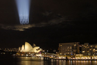
Projections onto clouds over Sydney Harbor:
Distribution of 40,000 free postcard/stickers (you can mail or peel the front off and stick to your door.)

And essays and analysis posted on the project Web site. On the site is an open call for further cultural and analytical material.
The effort is backed by the Museum of Contemporary Art in Sydney as part of their biennial Contemporary Australian Art show, this year called Interesting Times.
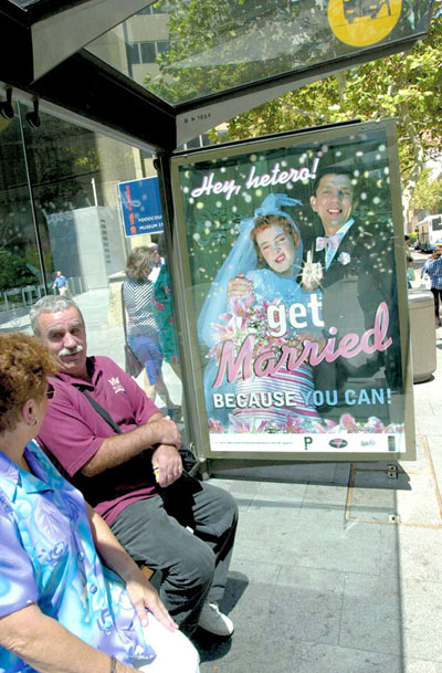
Related projects from Kelly include a series of posters designed with Tina Fiveash satirizing the right wing regime of “compulsory heterosexuality”.
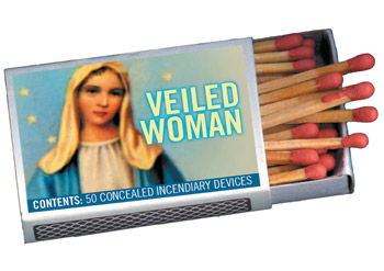
And a series of illustrated matchboxes satirizing the Christian right push in Australia to have muslim women and girls banned from wearing hijab “because they might be hiding bombs.” Kelly and friends made thousands of satirical matchboxes and left them lying around.
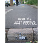
Kelly is also involved in a collective challenging the rhetoric of politicians calling refugees ‘boat people.’ See more at http://www.boat-people.org/
Though not aligned with a specific organizing campaign, I think such cultural work is important in the battle for hearts and minds.
A Change for Plan

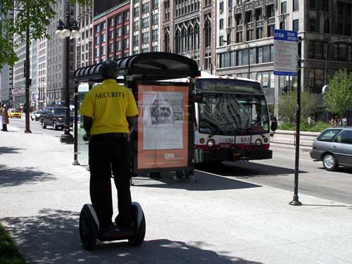
On May 27, a group of concerned citizens hijacked a million dollar Leo Burnett ad campaign designed for the Chicago Housing Authority, turning it into a scathing critique of Chicago’s public housing policy and privatization practices.
They created and changed out over a dozen large format bus shelter ads (5 in downtown Chicago in broad daylight!), put up thousands of ads on the trains, printed a newspaper of information and reproductions of the flipped ads, and created a mock Web site for the Chicago Housing Authority in the style of the official site.
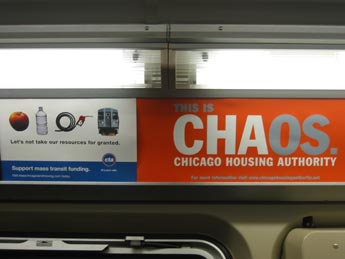
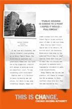

See the old ads, download the new ads, and find out more about the campaign at ChicagoHousingAuthority.net:
“In late 2004, the Chicago Housing Authority (CHA) initiated a public relations campaign to put a new face on their Plan for Transformation, a plan that drastically reshapes the state of public housing in Chicago.
This PR campaign, authored by the advertising giant Leo Burnett, fused Chicago Housing Authority's acronym ‘CHA’ with the word ‘change’, resulting in a new brand identity: CHAnge. There are undoubtedly big changes happening with public housing in Chicago, including massive organizational restructuring within CHA and the tearing down of all high-rise public housing buildings.
Unfortunately, the priorities of CHA haven’t changed at all, and public housing residents are still at the bottom of the list. While the CHAnge campaign has attempted to put a ‘resident empowerment’ spin on the Plan for Transformation, in reality the majority of public housing residents have been adversely affected by the massive restructuring. If you are a single working mother displaced by a home demolition, waiting over 6 months for a voucher to relocate as your children are shifted from school to school, CHAnge feels a lot more like CHAos....
The Plan for Transformation is a $1.6 billion blueprint that includes the demolition of 14,000 public housing units and the displacement of over 20,000 people. Not unlike the ‘urban renewal’ master plans of previous decades, the Plan For Transformation has linked motives. It is pushing poor people out of the now-coveted inner city neighborhoods and increasing the exchange value of existing public land through privatization. Developers such as Dan McLean are making millions building on the land adjacent to former CHA high-rises and getting huge city tax credits to subsidize their development. In addition, the city is making money by selling or leasing former CHA public land to private developers. In this way, large amounts of our city’s housing budget are being transferred into private hands. CHA CEO Terry Peterson was personally implicated in this when he was caught giving CHA bids to contractors like the Habitat Group in exchange for political contributions.”
Olympia
It’s true, the emperor has no clothes.
Via Ananova:
Nude Bush painting ‘unsuitable’
“A painting of President Bush in the nude has been taken down from a Washington DC museum.
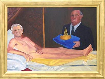
Artist Kayti Didriksen painted Man of Leisure, King George, which was on display at the City Museum.
It is painted in the style of Edouard Manet’s Olympia but Didriksen’s version shows a nude Bush on a chaise lounge.
Vice President Dick Cheney stands nearby, holding a cushion with a crown and a miniature oil rig on it.
The painting was part of a show called Funky Furniture that was set up in the museum last week.
But the show, including the Bush painting, was abruptly shut down after some of the artists’ themes were considered unsuitable.
Myra Peabody Gossens, a public relations consultant for the museum, said the exhibit was not what had been expected.
‘The museum is not an art museum,’ she explained. ‘It gets mostly groups of children, with teachers trying to tell them something about history.’”
The BBC has more:
“The exhibit also featured a decorated church pew with pictures and words accusing Ronald Reagan of ignoring the Aids crisis, and a table decorated with drug paraphernalia with a quote from former Washington mayor Marlon Barry, who was jailed for drug possession.
Art-O-Matic, a local artists’ group which organised the display, said it was now looking for another home for the exhibit.
‘About a dozen people may have seen it,’ board member Jim Tretick said.
‘The exhibit wasn’t completely mounted. It was taken down the next day when the museum was closed.’”
Thanks Jamie!
B is for Bribes, Boycotts, and Boxing
 Host Country Bribes |
 Stadium Built with Slave Labor |
 Drowing in Advertising |
One of the best, and funniest, critiques of the Olympics I’ve seen this season is in the form of a font. The font is a collection of ‘real’ pictograms, lampooning the icons used by Olympics organizers to indicate sporting events without language.
Designed by Jonathan Barnbook and Marcus McCallion, the pictograms follow the style of the hugely influential sign system developed by Otl Aicher for the 1972 Munich Olympics.
View the complete font or download a copy here.
Via a comment at Design Observer
The Republicans are Coming...
Save the Date: Sunday, August 29, 2004.
Spread the Word: Download this graphic as a 176 Kb PDF, or a
100 px or
50 px square Web button.
Buy a T-Shirt: At http://www.cafepress.com/nornc/
Find Out More: Visit counterconvention.org, rncnotwelcome.org, or unitedforpeace.org.
Your Tax Dollars at Work
SUSTAIN is an acronym for “Stop U.S. Tax-Funded Aid to Israel Now.” They are:
“a group of women and men who have come together in cities across the country by our responsibility and concern as U.S. taxpayers. We understand that our tax-dollars fund Israeli violations of Palestinian national and human righ.”
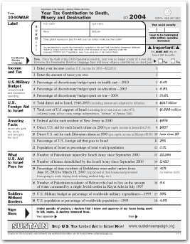
They publish the 1040WAR Form, a one-page fact-sheet handout that parodies the IRS’s 1040EZ income tax form and provides information about U.S. support for Israel. Download the PDF. Sources for the information on the form are available here.


