Shoots & Leaves
While one may be tempted to use all manner of exclamatory marks to further amplify the message of one's posters, proper punctuation almost always enhances clarity. Consider the difference in the following:
No War on Iran!
Versus
No! War on Iran!
Or even
No! War! On Iran!
Understanding the Farm Bill
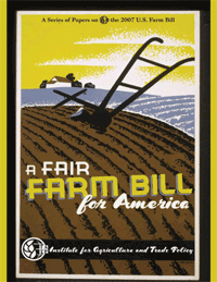
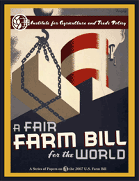
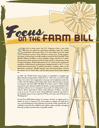
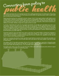
In response to this previous post, Matthew Foster sends this great link to a series of publications dissecting the 2007 Farm Bill. Check the right hand column of the page under “Understanding the Farm Bill.” Matthew is a graphic designer at the Institute for Agriculture and Trade Policy and has done a fantastic job. The bold WPA-inspired graphics and typography make me want to pick up these reports. They evoke an nostalgic image of the American farmer back before it was big Agribusiness. The reports provide overviews of the Farm Bill and its implications as well as IATP’s policy recommendations to make the Bill fairer for the U.S. and the world. A beautiful and compelling way to spread the word on an often overlooked and vitally central policy matter.
Yeah, my current blog design uses WPA imagery, too. What can I say. :-)
Redacted
Around 3,500 antiwar protesters rallied outside the United Nations in New York City today while President Bush delivered his speech inside. A decent turnout for a business hours on a weekday, and a very last minute call to action.
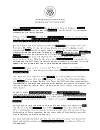
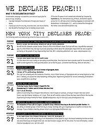
The organizers asked me to design a flyer to hand out at the march. I took it as an opportunity to do something a little different from a typical flyer. The goal here was not to grab the viewer and turn them out to the event, but to make something interesting for them to read while attending the event itself. The front is a statement by the organizers, the back lists upcoming events.
In the end UfPJ wanted something simpler — and something more like a typical flyer — which I delivered. But I like the way this version came out. The text is styled in the form of a redacted government document. It creates a parallel text that plays on themes of secrecy, coverup, and suppression of dissent, as well as seeing through the lies and reading what is erased.
 |  |
| Download 200 Kb PDF | |
March in April
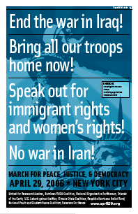
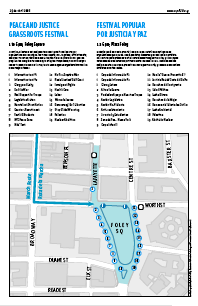
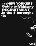
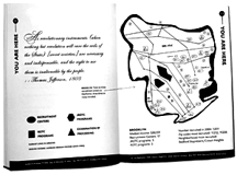
This Saturday, April 29, we take to the streets to end the war in Iraq, support immigrant rights and women’s rights, and to oppose war against Iran. I designed a broadsheet that the organizing coalition will distribute. It’s a two-color, tabloid-sized, eight-page booklet in English and Spanish with statements by the organizers, emergency contact info, and maps of the affinity group assembly areas, march route, and peace festival.
It was a challenge giving the different messages equal weight without flattening out the design. Because of the politics of the coalition, this was a big requirement. It was also my first chance to play with the City’s official NYCMAP data, which was fun. The cover image extends the Statue of Liberty image used in the existing flyers, but pushes it back to make it a little more ambient and less iconographic. It was a rush job and stepping back, some of the type treatment feels a little heavy-handed. But I’m otherwise pleased with it. We’ll see how it works on newsprint. Maybe the heaviness is appropriate.
’Til You Drop
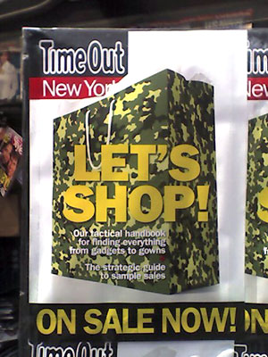
Now on newsstands across NYC is the cover of this week’s Time Out New York, an events and listings rag. The camouflage shopping bag is intended to evoke martial metaphors: tactical tips for your bargain hunting strategy inside.
But it struck me as quite an elegant, visual link between War and The Market!
