

Underground Networks
 On the power of posters, pamphlets, and petitions in the time of globalization.
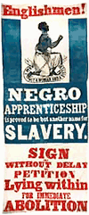
From “Sailing the Black Atlantic,” by Adam Hochschild, a review of Making the Black Atlantic. Britain and the African Diaspora, in The Times Literary Supplement, October 6, 2000:
“By requiring a complex skein of transport, trade, credit and insurance ties that connected Europe, Africa and the Americas, slavery and the slave trade were the core of the eighteenth century’s version of globalization.
In turn, one might call the black diaspora the era’s Internet. As Walvin points out, it was an information network. Word of the dramatic blossoming of abolitionism in England, for instance, was eagerly carried back across the Atlantic by black sailors, and by black domestics brought back and forth across the ocean by their West Indian masters. Slaves waiting on plantation dinner tables in Jamaica or Barbados listened hard when their owners cursed the do-gooders in Parliament, or the Quakers, who organized a huge boycott of slave-grown sugar. News from each side of the Atlantic affected the other. Reports of hundreds of abolitionist petitions flooding Parliament helped spark some of the revolts among impatient slaves in the Caribbean. The first major uprising, in the French colony of Saint Domingue (later Haiti) in the 1790s, provoked a backlash in Britain against the abolitionists, but a later one, in Jamaica in 1831-2, was crucial in hastening emancipation.”
To Your Health!

“Exchanged”
Yuri Matrosovich has a collection of 34 anti-alcohol posters from Russia on his Web site. The posters date from the early 1980’s, mostly from a ‘propaganda pack’ one could get when one joined a special anti-alcohol society. In those years, he writes, one was pushed to be a member.
In 1985, Mikhail Gorbachev launched a massive anti-alcohol campaign in the Soviet Union. The goal was not just to reduce alcohol consumption by the population, but to sharply decrease state production and sale of alcoholic beverages, to suppress the production of illicit alcohol, and ultimately, to raise worker productivity and buttress the economy.
Though the campaign fizzled out by 1988 and is generally derided today, this study charts the impact on both alcohol consumption and overall mortality in the Soviet Union.
Annual per capita alcohol consumption dropped from 14.2 liters in 1984 to 10.5 liters in 1986. Overall mortality declined from 1161.6 deaths per 100,000 population in 1984 to 1054.0 in 1986.
This was also during the social upheaval brought on by Gorbachev’s reforms, aka perestroika. Following this, in the period of the “market reforms” both alcohol consumption and overall mortality increased sharply. By 1997, per capita consumption had returned to the initial level of the early 1980’s.
The authors of the study estimate that 1.22 million people were spared between 1986 and 1991, 11.4% of the number of deaths expected without the anti-alcohol campaign.
Two more of my favorites:
|
“The Reason — Drunkenness!” |
“Alcohol — Enemy of Production” |


Ballot Design, 1880
From the Gotham Gazette:
“The concept of gathering signatures on petitions dates back to the late 19th century. It was supposed to help eliminate the political parties’ control of the ballot, according to Douglas Kellner, a commissioner at the Board of Elections. (See timeline of New York election law )
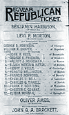 Before that, there were no printed ballots in New York. Voters simply went to the polls and wrote down the candidates of their choice. To instruct voters on who was running, political parties printed up a slate of candidates, which the voters could take with them to the polls.
This system had many problems, one of which was that political parties often printed counterfeit lists of candidates to deceive supporters of the opposition. "A counterfeit ticket would list a few of the party’s prominent candidates - just enough to fool the unwary - with the rest of the names coming from a rival slate," said Kellner.
To clear up the process, the government began in 1880 to print a uniform ballot that would be presented to voters to fill out at the polls on Election Day. Political parties were allowed to nominate their candidates to be listed on the ballot. But in addition, candidates not selected by the party could get on the ballot anyway if they could submit enough signatures from voters.
To ensure that the signatures were valid, a series of rules were put in place - many of which are still used today.
Ironically, these rules set up over a century ago to assure a more open, honest and democratic process of elections have become just the opposite — a powerful tool for political parties and incumbents to maintain their advantage. To these New York politicos, the best elections are those in which there is only one candidate left on the ballot for voters to choose.
Many incumbents, backed by their political party, have teams of lawyers who will go over a challenger’s signatures, line by line, looking for minor mistakes like missing zip codes, misspellings, and voters who have signed petitions not knowing whether they live in the district or not.
In the past, candidates have been knocked off the ballot for such infractions as writing the abbreviation ‘St.’ instead of ‘Street’ or forgetting to staple a cover sheet.
If the person gathering the signatures - called a petitioner - makes a mistake such as forgetting to write the borough on the bottom of the page, all of the signatures that he collected can be thrown out. If enough signatures are declared invalid, a candidate is eliminated.”
No Gay Marriage in the Netherlands
In July, the Vatican called on Roman Catholics around the world to oppose the legalisation of marriages between same-sex couples. In response to the Vatican’s campaign, Dutch gay rights organisations have published manual on how to revoke the legal ban on same-sex marriage in your country.
From AFP:
“The 60-page step-by-step booklet, published in Dutch and English, gives a historic overview of the 16-year lobbying process that eventually led the Dutch government to allow gays and lesbians to tie the knot as of April 1, 2001.
It calls on gays all over the world to challenge discriminatory laws and fight for equal rights through the courts.
In a sense it is a how-to manual for gays abroad campaigning for the right to same-sex unions says Henk Krol, editor in chief of the Gaykrant gay weekly, who created the booklet together with gay rights organisation COC Netherlands [the civil rights group that organized the successful lobby.]...
The manual is [also] intended to help authorities abroad see how they can change legislation, [Amsterdam mayor Job] Cohen added.
The booklet will be sent to foreign gay organisations and will be available online through the Gaykrant and COC websites.
For gays seeking advice on the possibility of marriage in the Netherlands Krol offers some practical tips in the preface to the booklet.
‘A foreigner living with a Dutch man or woman can marry. Two foreigners living permanently in the Netherlands also have this possibility,’ he writes.
For Europeans living in the European Union it could be possible to claim access to the Dutch institution of civil marriage through the European courts, the text suggests....
The manual is called ‘No gay marriage in the Netherlands’.
Dutch gay rights organisations insist that gay marriage does not exist here because under Dutch law it is the same civil union as is entered into by heterosexual couples. There is no special arrangement for same sex unions.
According to the latest statistics, more than 4,300 same sex couples chose to tie the knot in a civil marriage by 2002.”
The text is not yet available online, though the manual is for sale here.
Citizen Designer: Perspectives on Design Responsibility
There are many things I’m looking for in a book on design responsibility: some historical perspective, some global perspective, a sense of urgency, a rigorous analysis of the relationships between design and society and the world we live in.
Sadly Citizen Designer: Perspectives on Design Responsibility is none of these things.
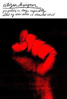 The book is collection of essays and interviews edited by Steven Heller and Veronique Vienne, mostly, it seems, from the last 5 years and almost entirely from the United States.
Despite the title, there is almost nothing about civic design. Almost nothing about design that facilitates participation in public life. Nothing about consumer labeling, information mapping, civic wayfinding, or universal design and accessibility. Nothing about the role of design in the manufacture of consent, or how design shapes our assumptions about what is normative.
Still, though several of the essays fall flat, there are some tasty ideas to be found. The book is divided into four parts: “Social Responsibility,” “Profressional Responsibility,” “Artistic Responsibility,” and “Rants and Raves.”
Appropriation and cooption are themes that run through many of the essays. From the professional side (Don’t steal those proprietary fonts, Plagiarism is bad) to the cultural and political side. In his account of the young, hip “account planners” of the advertising industry and their use of anthropology, Tom Frank details the cooption of the rhetoric of democracy, resistance, revolution, authenticity, and individualism in the service of corporate marketing. The essay and Frank’s other work are highly recommended for design students packing their portfolios with zany and illegible self-expression.
In “Good Citizenship: Design as a Social and Political Force,” Katherine McCoy notes another kind of cooption:
“American designers consistently take European theories and strip them of their political content. Of the various strains of modernism, many of which were socially concerned or politically revolutionary, American design either chose those most devoid of political content or stripped the theories of their original political idealism.”
Indeed, several essays in the book reduce social responsibility to acts of personal salvation. Robbie Conal notes his guerilla street postering is a way of venting pent-up frustration. Gunnar Swanson’s winding essay on plagiarism ultimately settles on the fact that plagiarism is bad because it makes the “spiritual act” of designing into a “mechanical” one. The one essay on architecture is heavy on spirituality, theology, and the ethics of building. I would put all of these things into broader context. On architecture, for instance, I would have included an essay on building green, on design for public and alternative transportation, or an introduction to urban planning. Instead, discussion of affordable, accessible housing is relegated to a single mention in a footnote.
A couple of the essays locate the construction of apathy and a-politicism in design schools and design education. McCoy notes that “most introductory graphic design courses are based on abstract formal exercises inherited from the Bauhaus and the classic Basel school projects.” Design is taught as a matter of forms, color, and spacing in a visual laboratory sealed off from the world at large. The question, then, is what would a progressive design curriculum look like? How does one teach political awareness?
One exercise is given by Anne Bush. Her students are asked to study similarities and differences between intended meaning and response. “The ultimate goal for students is to recognize that meaning is always the result of a range of cultural and social negotiations and the designer is not the sole determinant, but rather a participant in these dialogues.”
Bush cites an analysis by her student Erica Wong. A poster campaign developed by the Mexican government to promote health and nutrition was interpreted entirely differently by its intended audience. The poster features a single black and white photo of a boy in traditional dress, smiling under banner type.
“The photography becomes attempts to capture indigenous culture as a kind of romantic and static essence. It becomes a kind of visual anthropology that says more about the conceptions of its makers than the reality of its intended audience. Wong, discovered through interviews with the local communities that many people misunderstood the intention entirely. For citizens bound by a strong sense of community and family, the boy in the image appeared abandoned. The people of the villages couldn’t understand why he had been left alone. They also couldn’t reconcile this sense of isolation with the posed quality of the photograph. If he was alone, why was he smiling for the camera? The synthetic, portrait-like framing combined with the celebratory dress (normally saved for special occasions) further confused the reading. Many said they initially overlooked the poster, because they thought it was an advertisement for tourism, since similar portrait images of traditional culture (usually in black and white) were a common visual theme in the marketing of Mexican heritage. Wong reminds us, however, that although depicting indigenous culture in black and white is a common representational practice it reinforces nostalgic ways of seeing and continues to locate indigenous culture in a perpetual past. Moreover, it differs greatly from the sense of color and activity that is a part of everyday reality in rural Mexican communities. For the local population, then, the poster not only mirrored the imagery of travel and promotion, but, unfortunately, also served to reinforce regional fears of government encroachment and the dissolution of traditional ways of life.”
Another running theme among several essays is the ethical relationship between design and big business. How should good designers respond to bad corporations?
Ad man Chris Riley tries to distinguish between the “business idea” and the “business model.” The abstract idea of selling a great product or relationship to a customer is opposed to the sometimes harful ways this is actually implemented. “Business” has lost its way, says he. “Business exists to serve human needs and desires, not capital requirements.” Businesses focused on maximizing return on investment “have become disconnected from their customers, employees, and shareholders.”
Another essay provides a hard look at “cause related marketing,” “a creative strategy that ties a company and its products to a social issue or cause with the goal of improving a weak public image and boosting sales, while providing benefits to a worthwhile charity.” Examples include corporations like Ben & Jerry’s, the Body Shop, McDonald’s, Reebok, Denny’s, and Chevron that sell their public works to improve their brand image, and in many cases as a way of fending off negative publicity. The skepticism of the article is welcome, citing investigations the reveal the spotty truth behind the wholesome claims of Ben & Jerry’s and the Body Shop. But the author does seem to have an axe to grind: comparing Ben & Jerry’s charitable donations to net sales instead of net profits is misleading.
Neither article suggests a way forward. Perhaps because both essays neglect a simple structural point: the corporate structure itself limits legal and financial liability and public corporations are designed to maximize shareholder return. How does one integrate social responsibility into this? Of the companies cited, Ben & Jerry’s maintains the most advanced corporate code of conduct, but it is apparently not enough to hold them to their word.
One model on the environmenal front is corporate Germany. With the largest economy in Europe, Germany has increasingly progressive laws on the use of recycled materials, waste reduction, and the use sustainable energy sources. Susan S. Szenasy paraphrases one of her industrial design students, “We have to look at the full life-cycle costs of materials, from resource harvesting to processing to manufacturing to distribution to use and recycling, or better yet, working to engineer materials for nontoxic degradation.” Ultimately, it’s up to us organize, to move our governments to tighten the rules under which corporations operate, or to develop another alternative. Designers, who know all about the materials they use, could play an important part in such campaigns.
Victor Margolin’s answer to the evils of big capitalism is to go small. His essay hails the rise of the design/entrepreneur, a kind of small producer facilitated computer aided design, the internationalization of manufacturing, and the ability to produce small custom batches for discreet markets. The examples of sustainable products developed by designer/entrepreneurs and associated community design workshops in developing countries are rightly celebrated. And, it’s conceivable that a smaller operation would do less damage and would put more control of the conditions of manufacturing into the hands of the individual designer/entrepreneur. But small scale manufacturing that takes advantage of manufacturing where environmental and labor protections are lacking... is still taking advantage of those conditions. A smaller sweatshop is still a sweatshop.
Yet even when the essays fail, they often raise important questions.
The essay “Healing with Design” abuses the language of science, making wild logical leaps to justify its new age theory of “vibrational medicine.” A fact check with a physics grad student could have saved some paper here. The essay, however, makes we wonder just how much of the effects of color are cultural and how much are biological? On that note, some notes on the cultural connotations of color environments and their responsible use would also be useful, for instance for designers working in one culture whose designs will be seen in another, say, on the Web.
David Vogler’s list of examples of irresponsible design is mostly absurd. To pick one example, The New York Times’s use of color printing is irresponsible... because it rejects a history of black and white printing? Of the Times’s serious ethical lapses, I would not list color printing as one of them. But, the exercise of developing an “index of irresponsibility” is a useful one. What criteria would one use? What patterns emerge? Why? And what should be done?
The J.D. Biersdorfer’s breezy essay on responsible Web design touches on some general issues of usability as responsibility towards one’s user (“Deception is another irresponsible practice.”) But Don Norman, in his excellent interview, makes the deeper case for usability testing and the incorporation of user feedback into the design process. Again design schools are fingered for their failure to teach this.
“Designers learn about aesthetics. They seldom learn about human psychology.... Humans are fallible. Learn that. Cherish that.... Design for people as they are, not as you would have them be. Design for inefficient users. Design for creative, imaginative people who will do things with your design that you never have dreamed of, things both good and horrid. Design for people who are tired and stressed, cranky and irritable, sloppy and inattentive. In other words, design for real people.”
This makes me wonder why the issue of design standards is wholly ignored. More designers should be aware of accessibility standards like section 508, that make Web pages easier to read for persons with different visual abilities, and coding standards set by the World Wide Web Consortium that govern the layout properties of HTML — not to mention the consensus based process by which those standards are set. Other design standards such as our national signage system or the ubiquitous nutrition facts label also deserve comment as an important area where design can contribute to society.
Several critical essays take on “culture jamming.” Little acts of civil disobedience are all well and good, but I’m not much convinced of the revolutionary potential of culture jamming. Several essays happily point out the apparent contradiction that the profiled culture jamming activists are also well employed by the advertising industry. And this actually does not strike me as a contradiction — both advertising and culture jamming occupy the same media space and market place. How exactly are Shawn Wolfe’s and Shepard Fairey’s “brands without a product” examples of responsible design? As a criticism of consumerism, the ironic slogan “OBEY” does not encourage much skepticism.
I would have dropped Jeffrey Keedy’s abusive rant on culture jamming, for Tom Keefer’s analysis of why the Adbusters school of action is a political dead end. His three main reasons:
“Their privileging of resistance in the individual act of consumption over the collective organization of production, their view of revolution as consisting of a purely subjective and highly individualized ‘mindshift’, and their insistence that the ‘revolution’ will be made on behalf of the masses by a small group of ‘culture jammers’.”
A more interesting use of corporate imagery for a broader social movement is detailed in Teal Triggs’s essay on the May Day actions in London, 2001. Activists chose the imagery of Parker Brother’s Monopoly board game as the overarching image framework for a host of autonomous direct action events planned around the city. Rather than trying to ironically subvert the symbols of the game, activists used imagery and narrative to give a visual consistency to promotion of their activities: posters of modified property deeds announced the sites of protests, or were modified with slogans like “homes not hotels.” “Get out of jail free” cards were circulated with legal information and tips on what to do if arrested. The board layout itself was used to publicize a critical mass bike ride around London.
The metaphor of the game, monopoly capitalism, was used as the narrative link between work on the environment, animal rights, fair housing, etc. and the overarching criticism of the roots of the various ills in capitalism itself. As the May Day Monopoly Guide states, the protestors vowed to bring “the whole game to an end.”
One of the best essays is on role of law in protecting and promoting brands. Like “free trade” of goods, the “free trade” of corporate brands does not just happen, nor is it an absence of rules and smaller government. It is engineered, legislated, and protected by government and international treaties. In fact “free trade” is often extremely protectionist — open your markets to us while we raise the barriers for you. For example, in August 2001 the International Trademark Association suggested revisions to legislation creating the Free Trade Areas of the Americas.
“INTA argues that signs and symbols belonging to indigenous peoples, local communities, and African-Americans should not be entitled to any form of intellectual property protection. Quoting their report:
“[INTA] has also expressed concerns regarding proposed protection for the words and symbols of New Zealand’s indigenous people, the Maori.... The terms ‘indigenous’ or ‘afro-American’ communities would require careful definition, and would be subject to greater potential controversy. The term ‘local community’ is such a broad and indefinite term that is has the potential to allow almost any city, village, or group to claim rights in signs that may have been used commercially for years, by others.”
David Reinfurt’s chapter on “Open Source Design” confuses Open Source with Free Software. (He links to the GNU Web site of the Free Software Foundation... which has an essay or two on the difference between Free Software and Open Source.) Furthermore, Reinfurt’s examples of “open source design” are not very open source. In one project, the public can submit contact sheets of tourist photos as long as they include the letters B, E, R, L, I, and N, in that order. In another, the facade of the former East German housing ministry that changes it’s facade as its windows are open and closed. These are interactive, but not open source. But more importantly, the author/designer depoliticizes the issue. The Free Software movement is not just blossoming because it’s cool to share and collaborate, or that sharing and collaboration produces better software. It is also a movement to preserve and extend the freedom to do so, and an attempt to prevent our cultural output from being wholly privatized. One of Richard Stallman’s essays would have been a better choice to explain Free Software, though for non-software or documentation projects, a look at the Creative Commons licenses might be more appropriate.
If this review focuses heavily on what the book is not, it’s because I am disappointed with what is here. For instance, several essays refer to the First Things First manifesto, to William Morris, and the Bauhaus. I would love to have some of these primary documents bound in a single volume. This, however, is not that volume.
Heller writes in his introduction, “Our goal in editing this book is not to offer dogmatic degrees or sanctimonious screeds but to address the concern that the design field, like society as a whole is built on the foundation of... well, you fill in the blank.”
Is this fear of domga what chases the rigor away?
Susan S. Szenasy writes of the lessons of her design ethics class: “Design, as Gropius saw it (as Morris did before him), has a significant contribution to make in the reshaping of institutions as well as our lives.”
I believe this is true. And is just as critical as ever. Though while some essays in Citizen Designer are provacative, the book is hardly the call to action it should have been.
Citizen Designer: Perspectives on Design Responsibility is published by Allworth press. It lists for $19.95.
Publish or Perish
“How an Atheist Helps Protect Islamists in Turkey,” The New York Times, November 26, 2002:
“In 1995, [Turkish publisher Sanar] Yurdatapan’s activism took the turn that came to define it: It began when Yasar Kemal, one of Turkey’s most famous writers, was charged under antiterrorism laws for writing an article against the war in Kurdish areas.
In protest, 1,080 well-known people signed their names [as co-publishers] in a book that republished Mr. Kemal’s article and nine other banned articles. They then demanded that they all be prosecuted because it was also a crime to reprint banned articles.
Mr. Yurdatapan’s orchestration of the book put the Turkish state in an awkward position, having to suspend sentences or change the laws to avoid arresting everyone. In 1999, however, he received a two-month sentence....
With little money and a tenuous legal status — his group, Initiative for Freedom of Expression, exists only on the law’s margins — Mr. Yurdatapan keeps up his work: 4 books and over 40 pamphlets have been published.
In 2000, he took up the case of Islamic activists, including the nation’s only Islamist prime minister, Necmettin Erbakan, who has been banned from political life since the army’s ouster of his government in 1997 and whose party was victorious in the recent elections.”
The February 3, 2000 Kurdish Observer reports that Sanar, a civilian, was sentenced by a military court to two months in prison for “making publication to lose people’s enthusiasm for the military service.”
Sanar became well-known as a composer, songwriter, and advocate for free expression in the 1970’s. From Human Rights Watch:
“Sanar Yurdatapan was stripped of his citizenship by the military junta that seized power in Turkey in 1980. He lived in exile from 1980 until 1992. The military handed back power to a civilian government in 1984, but they have kept public discussion of certain issues off limits, particularly criticism of state institutions (especially the military) and the role of ethnicity or religion in politics.”
He has also worked on prison conditions, the right to conscientious objection to military service, and exposed the Turkish military’s massacre of Kurds. The Times again:
“[In the summer of 2002], as part of its bid to join the European Union, Turkey passed several laws easing freedom of expression. Mr. Yurdatapan says the atmosphere is improving, though not enough for him to end his work.”
More publishing than design, the 1995 action is such an elegant act of civil disobedience, a grand mockery of Turkish censorship law.
United Farm Workers Logo
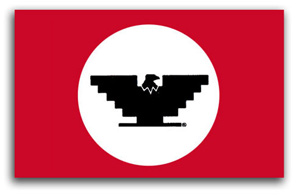
From Just Another Poster? Chicano Graphic Art in California:
In 1962, Cesar Chávez and his cousin Manuel conceived of the U.F.W. logo as a way to ‘get some color into the movement, to give people something they could identify with.’ they chose the Aztec eagle on the Mexican flag as the logo’s main symbol and created a stylized version of it that was easy to reproduce. The U.F.W. logo became a highly recognizable icon in the union’s boycott efforts, legislative, proposition campaigns, and a victorious symbol of its successful contract negotiations.
The symbol and flag were unveiled at the first mass meeting of the newly formed union.
From Aztlannet:
 The evolution of Chicano poster art began in 1965 with the production of graphic images to support the organizing and boycotting efforts of the United Farm Workers. The U.F.W. logo — a black stylized eagle with wings shaped like an inverted Aztec pyramid — became a key symbol of the Chicano movement. It appeared prominently on all official U.F.W. graphics, and its inclusion on unrelated posters made by Chicano artists signaled support for the union. Posters also were utilized to promote other Chicano political causes, such as the 1968 Coors beer boycott in protest of the company’s discriminatory hiring practices.
Call for Submissions: Sappi Ideas The Matter
“Ideas that Matter is an initiative by [paper company] Sappi that provides funding to support creative design for social good. Your talent and skills could benefit the many institutions working for change: non-profit organisations that are involved in scientific, environmental, educational, cultural or relief programmes.
Sappi is ready to award financial grants of up to €50,000 to pay your out-of-pocket expenses and the full implementation of a print campaign. This includes the cost of the photography, illustration, films, paper, printing, mailing, etc...
Select the non-profit organisation that would benefit from your ideas and ask them to agree to your ideas and application for a grant. Then prepare your creative print campaign proposal and submit it to Sappi. Remember your campaign must exploit the effectiveness of ideas on paper, maximising the potential of posters, direct mail, brochures or print advertising - or something new. Of course, you can submit more than one application if you have more than one idea.”
Check some of the previous winners. The org seems inclined (though not necessarily limited) to funding projects that promote charities that promote children’s rights and humanitarian health and development projects. Get your application here. Entries must be postmarked by May 31, 2003.
When picking a paper stock, you might also consider some of their fine woodfree products.
Design Against the War
Over a year ago I attended a lecture on design at the Cooper Union. The speaker projected a series of slides illustrating his minimalist design philosophy. One of the images was of the B-2 bomber. I was shocked and disturbed that a design philosophy would fail to take into account social, political, and economic contexts. Particularly of an object which, when used as intended, delivers massive death and destruction.
It prompted me to dig deeper into design and the public interest. And to start this Web log.
On evening of April 16, I arranged a panel discussion at Cooper titled “Design in the Public Interest / Design Against the War.” I invited three panelists to speak about their work as designers involved in the anti-war movement.
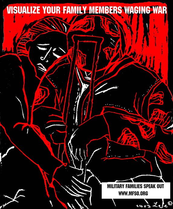 First up was Lee Gough, a printmaker, anti-war activist, and graphic artist based in Brooklyn, NY. She showed a series of prints from a portfolio-in-progress on the Iraq invasion and the war at home, called “The War Went Well.” Some of the images have been used in posters on the Web site Who Dies for Bush Lies“ and for Military Families Speak Out, an organization of people who are opposed to war in Iraq and who have relatives or loved ones in the military.
One image “Fight the War at Home” was inspired by a subway ride home from lower manhattan on September 11. Even as the towers had just been destroyed, there were still, as there had been for many years, homeless persons on the subway appealing to cityfolk to remember them, and to give. The image is a graphic reminder that some have been under domestic attack in our country for a long time, and that funds for the war on poverty pale in comparison to our “defense” budget. Another image, “Visualize Your Family Members Waging War” depicts a despondent soldier with a crutch being embraced by a woman. Lee’s expressive linocut style brings a gravity to the subject matter.
Lee commented on the challenges of choosing one’s message, for instance, noting the different context of “Bring the Troops Home” for troops that have been drafted vs. those who enlisted voluntarily.
One member of the audience raised the question of why U.S. flags and “being American” were the province of the pro-war movement, when large numbers of U.S. citizens were opposed to the war. I noted that I’d seen many anti-war demonstrators holding up flags and patriotism at rallies. On the Web, Who Dies for Bush Lies? effectively tackles effect of the war on U.S. soldiers and U.S. civilians, in addition to Iraqi soldiers and civilians. The danger was raised, though, of the rhetorical trap: the argument over who is “more American” can go back and forth forever, and quickly turning attention away from the crisis at hand.
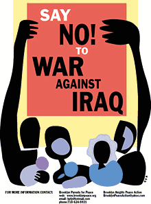 Nancy Doniger has worked as an illustrator for almost 20 years, producing art work for newspapers, magazines, books, posters and T-shirts for both for-profit clients and not-for-profit groups. She is currently a member of Brooklyn Parents for Peace, for whom she created the “Say No to War Against Iraq” poster.
She also helped organize a community/family oriented workshop that gave kids and parents an opportunity to make anti-war art for protest marches. Adults and kids made signs and worked with a puppeteer to create a large paper mache dove, and lots of little doves held aloft on cardboard tubes.
Nancy showed some earlier examples of her work, including a forceful image against the FTAA, a stark two-color poster for a conference on the conflict in Israel and Palestine, and a bright, celebratory “Welcome Back to Brooklyn” poster.
She also showed a couple of iterations of the “Say No to War” poster. One implied the damage of war with flames, but the final version ultimately centered on the mass mobilization. She noted that, in contrast to other illustrations, her work on this piece progressed from representation to geometric abstraction to make the poster more inclusive, using large blocks of color instead of specific depictions of race and gender. She is currently working on a “Hate Free Zone” poster.
Nancy noted the effect of the “Say No to War” poster on her block. The block appeared to be a very pro-war, where “the flags are quick to come out.” But over time, the “Say No to War” poster began to appear in windows and doorways. I certainly noticed it up and down the block where my step-sister lives.
Nancy is also involved in upcoming anti-war event “WEARNICA.” Sponsored by Brooklyn Parents for Peace, on May 3, 2003 a group of artists will present original anti-war art executed on the backs of white cotton dress shirts. The shirts will be worn in public spaces around New York and the world. The event was conceived by Works on Shirts Project whose inspiration for the event came after Colin Powell insisted upon covering the tapestry of Picasso’s Guernica during his warmongering speech to the General Assembly of the United Nations on February 5, 2003.
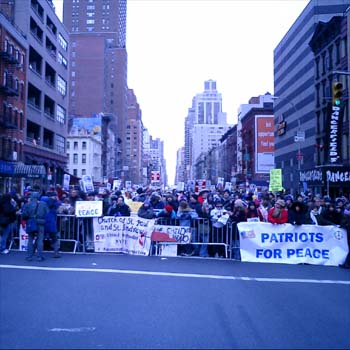
L.A. Kauffman is a staff organizer for United for Peace and Justice and designer of materials to promote the February 15 and March 22 marches in New York City. Her sticker and poster designs United for Peace and Justice can been seen on the streets across the New York City.
Leslie arrived at design through her work as editor of a progressive journal. She was inspired by the bold, clear graphics of Gran Fury and ACT-UP, and the use of those graphics on the street and at demonstrations, stage managing the events to push its imagery into the mainstream media. She claims she can not draw, so uses clip art in her graphics. The image of the blue pennant flag and black group have become a ubiquitous the city streets.
The idea behind a worldwide day of anti-war marches came out of the European Social Forum held in Florence this past November. At the Forum, the date February 15 was chosen as a date for anti-war demonstrations “in every capital.” What transpired was unexpected and unprecedented.
United for Peace and Justice had only just formed in the November of 2002, but it wasn’t January the group started working on the February 15 march. 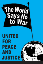 “The World Says No” was the headline of the February 15 flyer design, accompanied by a list of cities taking part in the event. As news of the event travelled across the Internet, marches were planned in more and more cities. Leslie held up various versions of her February 15 design with more and more cities added. Ultimately, marches were held in 793 cities around the world on February 15. Of particular note is virtual absence of communication or coordination between the participating cities.
Leslie spoke of the focused purpose of the posters produced for the event: not to educated, but to mobilize. The flyers lack all superfluous text or argument, just the headline, time and place. The posters and stickers were not trying to change people’s minds, instead to reach out to people who were already against the war but had not yet taken action.
In addition to sticker and flyers, palm cards cut from 1/4 page xerox copies on blue paper were popular and successful. They are both cheaper and more effective — easier to stuff in your pocket, less burdensome on the counter tops of sympathetic shopkeepers.
For the February 15 march, 200,000 stickers were distributed in 5 weeks. For the March 22 march, 200,000 stickers were distributed in 3 weeks. Astonishing numbers, posted around town by a continual flow of volunteers through the office. It’s also a useful bench mark: this is how many it takes to spread the message. A month later, I’m still finding remnants of UPfJ stickers on walls and phone booths. Leslie noted the effect of thousands of little acts of civil disobedience for the spirit of protestors, slowly bolstering a spirit of resistance around in the City and specifically, against the police department ban on marching past the U.N. on February 15.
In total, 1.1 Million pieces of literature distributed. Almost all of the printed materials were bilingual: English on one side, Spanish on the other. However, materials were also produced in Korean, Spanish, French, Creole, and Chinese. Quite a few donations for all these production expenses came online via paypal.
The question was raised about the environmental impact of producing all those printed materials. Her response: it’s also better for the environment if the war is prevented.
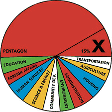 Other examples of design projects were raised by members of the audience: a “Do Not Bomb Iraq” sticker to replace the “Do Not Lean On Doors” sticker in NYC subway cars; colorful logos, charts and imagery designed by Stefan Sagmeister for “Move Our Money,” a campaign to reallocate 15% of the U.S. military budget for education; and flyers handed out to tourists at ground zero with a graphic representation of the number of teachers aides that will be cut from City’s budget. The image leaves it to the viewer to make to the connection to the military expense of a war in Iraq.
Many spoke of the importance of New Yorkers being seen as against the war. September 11 was an attack on New York, and the war is being waged in our name. Others spoke of the urgency of independent media, and the challenge of reaching out beyond “preaching to the converted.”
Overall, I was struck by how spontaneous the designers’ actions were. In almost every case, the designers simply stepped forward and got involved: signs made for a rally were eagerly snapped up; hundreds of thousands of stickers eagerly taken and distributed; and, “Say No to War” posters popped up on an otherwise apparently pro-war street. It seems that one doesn’t necessarily have to change everyone’s minds. There are more “converted” than you think. They just don’t have the graphic materials to display yet.
About 50 people came to the event, a decent turnout despite the announcement from the Pentagon the previous day that “the major fighting” in Iraq was over... and the fact that I’d scheduled the event on the first night of Passover. (Such a Jew am I.) The arc of the event could have used a better closing at the end, as well as a better transition between panelists. I also noted the lack of diversity in the audience. I think next time, I should hold it at different time and place. I’m also quite pleased with the invite design. Peel off the event description and you’re left with an anti-war sticker. Many thanks to Photobition for helping hammer this out in time.
One purpose of the event was to connect artists, designers, and activists. I’m disappointed more Cooper students didn’t show, but after the event quite a few people milled around having these intense little conversations until I kicked everyone out to close the room and return the lights. And quite a few people asked me what was next. Perhaps the start of a new Committee to Unsell the War?
I Do Not Consent to this Search
Some pocket reference for troubled times:
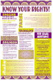 “Know Your Rights,” pamphlets and posters from the National Lawyer’s Guild on your rights of political protest intended to assist people who have already independently decided to engage in civil disobedience. Available in English, Spanish, Arabic, Farsi, Punjabi, and Portugeuse.
- “Know Your Rights: What to Do If You’re Stopped by the Police, the FBI, the INS or the Customs Service” is published by the ACLU in English, Arabic, Spanish, Punjabi, Hindi, Urdu, Farsi, and Somali.
- From the Just Law Collective, legal handbooks for protestors, legal observers, and those on trial for political protest.
- From the Asian American Legal Defense and Education Fund, a small pamphlet on your rights and “special registration” with the INS for men who live in the U.S., are not citizens, and are of North Korean, Indonesian, Bangladeshi and Pakistani origin. In English, Korean, Indonesian.
- At May Day Books I picked up a free copy of “Fight the Man and Get Away Safely,” street tactics and pointers on how to safely survive situations created by police violence and confrontation, once such a situation has occurred. The online version is less designed than the paper one, but the text is all there.
- From the Black Cross Health Collective, comes “First Aid for Radicals and Activists”, how to prepare, what to wear, what not to do, and notes on medical care if arrested or assaulted by police. Also check out their training guide for an introduction to health care at protests, and the gear list for a first aid kit for the streets.
If you know of other useful pamphlets on street tactics and the law, please .