

April 2007
First Responders
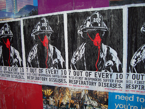
Funny to see police and firefighters making their case with street posters (and with such an ‘oppositional’ style) — considering its the police who enforce the vandalism laws. I guess the streets are it when you feel the government has abandoned you.
Helvetica
On Friday, I caught a screening Helvetica, the film at the New School.
The film is a breezy valentine to type, typography, graphic design, and designers. The editing puts a nice leisurely pace to it, and I thought the sound design, which could have been disastrous in other hands, was suitably sensitive. It’s not a bad first film.
It consists mostly of two types of shots: interviews with bold-face name designers and scenes of type on the street — interspersed with occasional animated renderings of famous posters. The designers talk about the type, its use and origin, and their relationship to it, love or hate. It certainly helps to know who the players are, though most of the personalities sparkle through regardless.
On top of the brief historical survey, the broader question raised by the film seems to be, “How does this typeface come to dominate our visual environment? How did it come to be seen as so ‘neutral’?”
The answer provided by the parade of talking heads is of mostly a matter of taste, period fashion, and eventually a response to the momentum of a critical mass of usage.
But a look at counter-examples might have been illustrative: why does Gil Sans dominate in the UK? Why does a more condensed gothic sans seem so popular in France? I think a clue is in the usage by the state and the power of its projection. This is alluded to by many shots of the Helvetica-like sans serif on New York City subway signage, and by Paula Scher’s association between the powers that use Helvetica and the powers behind the Viet Nam war.
But mentioned only in passing is, I think, the most important point: bundling. Before desktop publishing, the font was widely available for linotype, as presstype, and for other printing methods. But now the font (and its twisted cousin Arial) comes pre-installed on every new computer sold. The film never really investigates why or how this came to be, or the consequences of it. It’s just assumed that Helvetica was a sufficiently “classic” and popular face. I think this is another case of designers ignoring systemic and structural forces. Its power is invisible, and well, what’s “normal” is just taken for granted. Further evidence of this systemic short sightedness is the fact that of the 21 designers interviewed on screen, nineteen are white men and two are white women.