mapping

Ooh, sparkly new Los Angeles geodata portal! Much data, so map: http://geohub.lacity.org. More about it here.
Los Angeles Geohub home page
Twitter  8 February 2016 | LINK | Filed in
Arriving in Berlin: a collaborative map of resources, made by refugees for refugees in English, Ararbic, and Farsi.
Twitter  30 October 2015 | LINK | Filed in ,

Protests in 2014

A week ago I tweeted a link to a stunning collection of dramatic photos from protests around the world in 2014. It was an amazing year: Ayotzinapa, Bangkok, Catalonia, Euromaidan, Ferguson, Hong Kong, Taksim…

But it bugged me that such a list omits the many protests in 2014 that were less spectacular or photogenic, but just as vital to the participants.

So for your consideration, a heatmap of protests across the world in 2014:

Protest in 2014

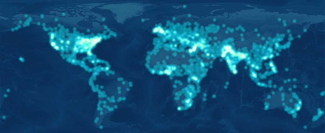
I drew the data from the GDELT project, which monitors media around the world and logs people, places, organizations, and events into an open database. Doubtless, many actions did not receive the media hit necessary to make it into the dataset, but the map gives a better sense of the breadth of activity this year.

2015 should be interesting.

Happy new year!

>  31 December 2014 | LINK | Filed in ,
“The cake map showed wastewater plants in M&Ms & why the sludge barge is needed. Then they ate the cake. It was delicious.”
Counter Cartographies with Lize Mogel
Twitter  16 May 2013 | LINK | Filed in , ,
Call for critical #infographics on neoliberal policy and the urban #geography of capital, materials, and migration: http://t.co/1wBbaxaS
Twitter  20 August 2012 | LINK | Filed in ,
Being an Account of #Typography, #Nationalism, and #Geography in Modern Europe: http://bigthink.com/strange-maps/…
Twitter  13 August 2012 | LINK | Filed in , ,
RT @kataaron: If we can predict that 5 children a yr will be killed on a specific corner it's no longer an accident - DGEI #amc2012 #rsrchrebel
Twitter  1 July 2012 | LINK | Filed in ,
"The #map you make today will be seen differently tomorrow." #NYCArc cc @NYCArcuser
Twitter  22 June 2012 | LINK | Filed in
Income inequality, as seen from space. Satellite Trees Follow the green for some real world data visualization: satellite photos of urban trees reveal the geography of income inequality.

One could test the thesis in NYC with the OASIS data.
>  24 May 2012 | LINK | Filed in ,


page 8 7 6 5 4 3 2 1 Older »