

election
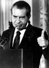
Richard Nixon, Art Director
“There should be no doubt that the federal government has an appropriate role to play in encouraging better design.” [source]
— President Nixon in his “Federal Design Improvement Message,” delivered at the first Federal Design Assembly in 1973, The Design Necessity.
The 1970’s saw a number of seminal graphic design projects sponsored by the U.S. government: Massimo Vignelli’s graphic standards for the National Park Service; Danne & Blackburn’s NASA “worm” logo; and Chermayeff and Geismar’s logos for the Park Service, Environmental Protection Agency, the National Aquarium, and U.S. Bicentennial, as well as traveling exhibits for the Smithsonian and Library of Congress.
Trying to find out why, I found this:
184 Memorandum About the Federal Government and the Arts. May 26, 1971
“To the Heads of Departments and Agencies:
 Americans in all walks of life are becoming increasingly aware of the importance of the arts as a key factor in the quality of the Nation’s life, and of their individual lives—whether in terms of the availability of great cultural resources, the accessibility of exhibits and performances, or simply the aesthetic enjoyment of good design.
As you know, direct Federal assistance to the arts is being sharply increased, and I have asked the Congress for full funding of the budget authorizations for the National Endowments for the Arts and the Humanities for fiscal 1972 — which would roughly double their present funding levels, and raise them to more than three times what they were just two years ago. But the Endowment programs are by no means the only Federal programs that affect, employ or contribute to the arts. In architecture, graphics, school programs, and many other activities, Federal agencies are daily involved deeply with the arts in one form or another.
It is my urgent desire that the growing partnership between Government and the arts continue to be developed to the benefit of both, and more particularly to the benefit of the people of America.
To contribute to this development, I ask each of you to direct your attention to two questions: first, how, as a part of its various programs, your agency can most vigorously assist the arts and artists; second, and perhaps more important, how the arts and artists can be of help to your agency and to its programs.
By focusing consciously, creatively and in a concerted way on these two questions, I believe that we all can find that the arts have a great deal more to contribute to what we in government are seeking to accomplish—and that this will be good for the arts and good for the country.
I am asking Nancy Hanks, Chairman of the National Endowment for the Arts, to coordinate responses on this, and I would appreciate your letting her know by September 20, what ideas and suggestions you may have, and also what new actions your agency may already be taking toward this same objective.”
— President Richard M. Nixon
More, from a Chronology of the NEA (1.9Mb PDF):
“President Nixon, acting on the responses to the 1971 survey of Federal agencies and executive departments and on the advice of the National Council on the Arts, announces government initiatives in design. The Arts Endowment is the lead agency for the Federal Design Improvement Program, to help upgrade Federal architecture, design and graphics.”
Republicans funding the arts? Astonishing! After all, in the 80’s it was Reagan and Co. who cut arts funding and waged their culture war against “indecent” public art.
So then why? Was it a public relations move? If it was, it would not have been very necessary. Despite public opposition to the war in Southeast Asia, Nixon was comfortably in the lead heading into the 1972 election — an election he won won by a landslide. The Pentagon papers were published a month after the memo in June 1971. And the Watergate burglary took place a year later in June 1972.
What’s the deal?
See this related post from February 2004 about public arts funding in the 1960’s and 70’s.
Election Design: Models for Improvement
While the push for verified, electronic voting rages on, in 2004 printed ballots and the ghost of the 2000 butterfly design still flutter through many districts. Activists, designers, and usability professionals are still working to redesign the process.
 In November 2002, I blogged about Design for Democracy, a project to bring graphic designers into the election design process. The project started as a class exercise at the University of Illinois, and is now a registered non-profit corporation backed by the AIGA.
Slate and the Chicago Tribune have both published articles about the effort.
Now, with a grant from Sappi, the Design for Democracy is publishing their findings and process, hoping to inspire action around the country.
From the archives of the AIGA somewhat-monthly newsletter, in the summer of 2003:
“Sappi Fine Papers has announced a major grant to Design for Democracy, AIGA’s initiative to improve the quality of election experience, in order to publish a book of graphic standards, with visual examples, to assist local officials in understanding the opportunities for clear communication. Marcia Lausen, former AIGA Chicago chapter president and design team leader for Design for Democracy, will be the principal author.
Marcia and Ric Grefé, AIGA executive director, presented concepts of election design to state election officials from all fifty states and selected secretaries of state in Portland, Maine in late July. A number of officials expressed an interest in contacting local chapters about how they could work with local designers. Marcia and Ric will send out a follow up letter to all the attendees encouraging them to become involved with a list of chapter presidents. If you are contacted, we can discuss different ways in which we have found it to be productive to work with state officials and will provide all chapters with copies of the templates of work done to date. The most recent states to seek AIGA assistance are Texas and Michigan.”
And from the March 2004 AGIA Communique:
“‘Election Design: Models for Improvement’ is a new, comprehensive graphic design system for improving the quality, legibility and effectiveness of election materials. In November 2000, a group of design professionals, educators and students began a dedicated effort to improve the voting experience. Organized as a program of “AIGA Design for Democracy,” this team worked in association with the University of Illinois at Chicago and directly for election officials in Cook County, Illinois and the State of Oregon. Project teams developed prototypes for improved ballot design, election administration, poll worker training and recruitment, voter registration, polling place signage, vote-by-mail, absentee voting, provisional voting and voter education and outreach.
This publication documents the resulting design system. It includes detailed information, guidelines, visual examples and templates that can be adapted for use by all states and counties. AIGA price: $100. Shipping charges $3 within U.S.A. Place your advance order.
It’s a great idea, but the $100 price tag is astonishing. That’s a big ticket for a grassroots advocacy manual. While the price might not bother AIGA members, it would certainly shut out many grassroots groups working on voting rights. What happened to all that Sappi money? Is the design of the book itself what makes printing so expensive?
Allergic Reactions
Next week the House of Representatives will vote On the evening of July 21, the House of Representatives approved a law requiring new package design standards that may save lives.
From The New York Times, July 10, 2004:
 “Each year, some 30,000 Americans are rushed to emergency rooms because of severe allergic reactions to food. Roughly 200 people die yearly from such reactions. Sound public health legislation passed by the Senate, and heading for House action before the Congressional recess, aims to lessen that toll by requiring that food labels clearly and accurately disclose the presence of the eight most common allergens in various additives: peanuts, eggs, milk, soy, tree nuts, fish, shellfish and wheat.
The bipartisan measure fills a hazardous gap in Food and Drug Administration rules, which do not require that these allergens in spices, flavorings, coloring and other additives be listed on labels even though ingesting the slightest amount can be fatal for some people. And the allergens that are listed on a label are frequently identified only by their formal names instead of in everyday English — as ‘whey’ instead of ‘milk product,’ for example.
The food industry adopted voluntary guidelines to try to fend off legislation. But although some companies now list allergens in clear terms, others still don’t. The government needs to make compliance universal.
First introduced four years ago by Representative Nita Lowey, Democrat of New York, and championed in the Senate by Edward Kennedy, a Massachusetts Democrat, and Judd Gregg, a New Hampshire Republican, the measure also has important backing from the Bush administration. Its expected passage by the House this week, and subsequent signing by the president, will give food manufacturers until 2006 to refashion their labels to list allergens more clearly. It will also give Americans an all too rare example in this election year of bipartisan cooperation to serve the public good.”
The FDA publicly recognized fatal food allergies in 1994, and in 1996 acknowledged the need to label foods containing allergenic substances. However, they were unable to require the labeling because
“Section 403(i) of the [Food, Drug, and Cosmetic Act] provides that spices, flavorings, and colorings may be declared collectively without naming each one. Secondly, FDA regulations (21 CFR 101.100(a)(3)) exempt from ingredient declaration incidental additives, such as processing aids, that are present in a food at insignificant levels and that do not have a technical or functional effect in the finished food.”
The new bill is the result of grassroots pressure and several medical and academic studies on the effects of allergens and interpretations of commercial food labeling.
This study on label interpretation is even cited in the text of House bill.
The Center for Science in the Public Interest also takes some credit, remarking that:
“A major impetus for the legislation was a 2001 article in CSPI’s Nutrition Action Healthletter that publicized a study by the Food and Drug Administration showing that about 25 percent of candy, ice cream, and baked goods from plants in Minnesota and Wisconsin had products with undeclared egg or peanut ingredients.”
I note that the CSPI’s influential document was in part a repackaging, redesign, and republishing of information already available from the FDA.
The Food Allergen Labeling and Consumer Protection Act (FALCPA, or S. 741) was approved by the House Energy and Commerce Committee on June 24, 2004. It was passed by the U.S. Senate on March 8, 2004. The bill now goes to President Bush for his signature.
The new allergen info is likely to be added to the Nutrition Facts label.
Updated July 21, 2004
Voters Unmoved by Presidential Campaign Ads
From AdAge, May 24, 2004, “Consumers Largely Unmoved by Presidential Campaign Ads”:
“More than half the consumers queried in a new Advertising Age poll conducted by Lightspeed International Research said the blitz of presidential campaign ads had not influenced them and in total, 92% said the ads had not swayed them to change their prospective votes....
 The online poll, conducted among 1,653 respondents nationally who have seen ads for both candidates, also breaks out eight battleground states. In those states, which are carrying the bulk of the presidential hopefuls’ advertising, both candidates’ ads are viewed as even less persuasive....
The majority, 60%, of national respondents said Mr. Bush’s ads aren’t focusing on issues they care about, and even more, 69%, said Mr. Kerry’s ads don’t address issues they care about....
To no one’s surprise, two out of three respondents — regardless of state or party — view political ads for the presidential race overall as too negative. And that could work against the candidates, as one-third of respondents said a candidate’s negative ads — rather than sway them to vote for that candidate — may actually influence them to avoid voting for them.
Oddly, while ads from the Bush campaign have mostly attacked Mr. Kerry, who has been running mainly biographical spots, poll respondents saw the challenger’s ads as more negative than Mr. Bush’s. A full 61% of those surveyed said Mr. Kerry’s ads were more negative in the national sample vs. 54% for Mr. Bush.
 The reason may be that Democratic groups such as Media Fund and MoveOn.org have been running anti-Bush attack ads and the comments about the negative Kerry ads apparently reflect those ads rather than those from the campaign itself. In fact, among the general population, respondents were equally split on whether they could distinguish ads between candidates or public interest groups. (Respondents in Florida and Ohio were more likely to be able to distinguish the two.)
In some battleground states, however, the results ran counter to the national results. In Michigan and Minnesota, more people found Mr. Bush’s ads negative than they did Mr. Kerry’s.
Even though the election is a little over five months away, already 55% of respondents believe there is too much political advertising.
They are also largely unimpressed with the largesse. Half of respondents on a national basis said Mr. Bush’s ads don’t clearly state his position; Mr. Kerry fared worse, with 70% responding that his ads don’t clearly do so.”
From the data, it seems voters are craving more information and less rhetoric. And might MoveOn’s celebrated Bush in 30 Seconds ads be doing more harm than good? (Though, might Ad Industry professionals have something against ads produced by “amateurs”?) I wonder how these figures compare with past presidential elections.
Still even 8% of several million is several thousand voters who might tip a another close election. But then we also that know what users say is not always what users do.
The article does not elaborate on the methodology or link to an example of the online poll. I’m wonder how the poll addresses ads that put forward a substantive critque of the candidates — in other words “negative” ads that do address issues.
But really, “voters” as “consumers”? Wow.
Contesting Power
In recent months, there have been several open calls to designers to help stir up the electorate.
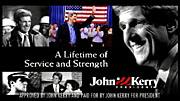
Designs On The White House
![]() “Designs On The White House is a grassroots fund-raising organization in support of the John Kerry 2004 Presidential campaign. We aim to mobilize the creative community through an online design contest, judged by designers, celebrities, and activists. Winning designs will be available for resale on T-shirts and other products, and all proceeds after expenses will benefit the John Kerry Presidential campaign. Designs on the White House Organization (DOTWHO) is an independent political committee and is not authorized by any candidate or candidate’s committee.
“Designs On The White House is a grassroots fund-raising organization in support of the John Kerry 2004 Presidential campaign. We aim to mobilize the creative community through an online design contest, judged by designers, celebrities, and activists. Winning designs will be available for resale on T-shirts and other products, and all proceeds after expenses will benefit the John Kerry Presidential campaign. Designs on the White House Organization (DOTWHO) is an independent political committee and is not authorized by any candidate or candidate’s committee.
The Categories
- Best Pro-Kerry Shirt (positive spin, no mention of Bush)
- Best Anti-Bush Shirt (negative spin, must mention Bush)
- Best Issue Shirt - Domestic
- Best Issue Shirt - Foreign
- Funniest Shirt
- Best Retro Shirt
- Best Get Out The Vote Shirt
- Most stylish / Most likely to be featured on Queer Eye
Each design will be entered in only one category.”
Anyone with a valid email address can register with the site and cast their votes on the contributed designs.
The site also features blogs about the DOTWH campaign and the Kerry campaign. A recent entry encourages non-designers with design or slogan ideas to post them.
The deadline for entries is May 22, 2004.
Let Down By Labour
![]() “Want to see your film on national television? Want your poster idea on High Street billboards? Want to tell everyone how labour have let you down? We can make it happen for you.
“Want to see your film on national television? Want your poster idea on High Street billboards? Want to tell everyone how labour have let you down? We can make it happen for you.
‘Labour isn’t Working’ fast became one of the most famous posters in advertising history. Imagine if you had been able to have a crack at that brief? Just as in 1979 when Labour wasn’t working, today swathes of the population feel let down by Labour.”
The final date for submissions was April 23, 2004.
“We have received a massive response from the people of Great Britain and we would like to thank all of you for your contributions. We will be displaying the best ideas in a gallery so that everyone can see how let down by Labour the British people feel. The large number of submissions we have received means that it will take some time for us to sort through the ideas. But as soon as they are ready to be unveiled to the public we will be presenting a selection of them here. Once again thank you for your support.”
And from the comments of VoxPop:
One thing CCO isn’t shouting from the rooftops is that they opened this competition to the "creative industries" (i.e. trendy spec-wearing ripped jeans fans) the week before they opened it to the public.
Also, there’s absolutely no guarantee that they’ll use any of the entries.
Honestly, this scheme could not have been met by more incredulous stares had it been announced on April 1st - Saatchi coming up with a scheme whereby members of the public do his job for him? Shurely shome mishtake.”
Blogged here previously, that famous poster also turns out to be a fake.
AIGA Get Out the Vote
 From the AIGA Atlanta Web site:
“AIGA will again mount a campaign to demonstrate the power of design in the public arena by encouraging designers to contribute to a coordinated get-out-the-vote campaign for national elections in the fall of 2004. The objective is to demonstrate the value of design to the public, public officials and business by providing a clear call to action for an activity that is important to everyone.
The campaign will have two elements to it. The first will be a selection of designers who will be asked to create nonpartisan calls to action that will bear a national AIGA campaign identity. AIGA’s national coordinator will select six designers and each AIGA chapter will be encouraged to select a designer to develop a design, for a potential total of 53 different designs.
The second element will be an open gallery of member designs that will be posted on the website and available for local printing, specifically by our members and also available to any visitor to the website. Any member will be entitled to post a design in the open gallery. This will become the largest gallery of available designs in support of this critical civic function. Some of the unsolicited submissions may be selected to be included among the collection of posters that AIGA will print and will distribute to all chapters for posting locally.
After careful consideration of the success of the previous campaign, this year we are proposing a slightly smaller-scaled window card format rather than posters, since the potential for actual posting in public places increases substantially if the designs are of a scale that can be placed in small shop windows and on public bulletin boards (places where a larger poster would not be posted). The scale also allows for printing out on local color printers as well as commercial printing. Our intention is to demonstrate the strength of our communication design, regardless of the production values of the print. This is in the spirit of civic postings since Revolutionary times....
The purpose of this campaign is to encourage voter turnout. There is no single message, although the intent is a call to action, motivating people to register and to turn out to vote. The visuals and the text of the message must be nonpartisan—we are supporting the basic democratic premise of citizen participation, not a partisan position on candidates or issues. Messages or images that are likely to offend substantial numbers of citizens will not be selected nor included on the site, since they would be counter to our intention of developing messages that encourage voter participation through effective use of images, text and ideas.”
The deadline for submissions was April 1, 2004. You can view or download the posters here.
I also note that the designs must include the AIGA logo:
“All posters must incorporate the required branded band (this will be embedded in the supplied template). The band will include the AIGA logo and the tagline ‘Good design makes choices clear’ along with sponsor information.”
No RNC Poster Collective
 “No RNC Poster Collective is a small collective of friends with experience in graphic design and independent media. We came together with the goal of facilitating visual resistance for the anti-RNC activities in NYC this summer. We want to make protest beautiful and connect artists with organizations working against the RNC.
Our goal for the project is to create a visual blitz in New York City against Bush and the Convention, and to blend art with politics in the finest New York style.
We are putting together in a free book of posters relating to the Republican National Convention in New York City, August 29th -September 4th. We are mass producing these posters on newsprint for distribution across New York City and the country in bookstores, apartment windows, picket signs and pasted up on the street.
We are looking for artists who can make posters with themes anywhere in the range from anti-Republican to anti-RNC-being-held-in-NYC to anti-Bush to antiwar to anything else you think is relevant. The plan is to have some posters about specific marches and actions and others that communicate a general anti-RNC message.
We are printing the posters in early June so that we can circulate them all summer. Submissions should be in black and white. Dimensions are 14" x 21" (that’s 15" x 22" with a half inch border). Deadline for submissions is May 30th. If you are at all interested, please e-mail us at: [email protected].
In mid-June, we’ll head to the printers with the best designs we get, and then set up a distribution network to get thousands of them up on the streets, in storefronts, in apartment windows, on picket signs.... everywhere there’s room.
We’re also setting up an online gallery to display all the great work that people are sending in. In addition to that, we’re working on a gallery show-style event where we can show everything together, which will hopefully also act as a small fundraiser for the project.
We’ll also be doing stickers, stencils, pins, and more over the course of the summer, so please keep in touch if you have other designs or ideas.
Also, one of our goals in starting this project was to hook up artists with organizations — if you think you might be interested in designing a poster for a specific group or event, let us know, it’d definitely help. Info on all the events and groups is here: http://rncnotwelcome.org/logistics.html. Check it out and see if anything leaps out at you.
We hold regular meetings in Brooklyn every Wednesday night, which people are welcome to come to — e-mail us if you have any interest. We’re currently working on fundraising and other logistics,
We’re working closely with the fantastic folks at Arts in Action, who are planning all sorts of fun, creative, and challenging work in the city this summer. Check them out at http://www.thechangeyouwanttosee.org for more info on what they’re up to.”
The budgetary and printing limitations will also give the No RNC posters a consistent, low-tech aesthetic despite the variety of designs and designers.
You can view the final posters here.
...
Though the projects follow much the same format, the politics differ considerably. And though each is an open call for entries, distributed primarily through email and the Web, each seems to target participants much like the organizers themselves, though each in the end aspires to influence a broader public.
Designs On The White House is a grassroots initiative endorsing a major political party. They are rallying a younger crowd seeking to inject a sense of style and hipness into the stodgy, elitist political machine.
Let Down By Labour is a top-down initiative, probably financed by the political party. As noted by the commentor, they seem to be looking for free labor, particularly from other advertising professionals.
The AIGA, a national professional association of dues-paying designers, while explicitly non-partisan, is encouraging participation in the electoral process. The competition was only open to members, and is as much about promoting the AIGA and the public value of design as it is about getting out the vote.
The No RNC Poster Collective, an a grassroots, open, volunteer collective is explicitly partisan, and while challenging the Republican convention, is tied to the protest and civil disobedience to take place around the convention. They are accepting contributions from anyone.
Judging for Let Down By Labour is secret and closed. The judges are unknown. Judging for the AIGA and Designs on the White House are via celebrity panelists, though Designs on the White House does open some voting to the public through the Web. Judging for the No RNC Poster Collective project is open, though one has to physically travel to Brooklyn.
The motivation pitched by each also varies: Let Down By Labour promotes pure self-interest and the prospect of fame for oneself; The AIGA sells the high ideals of civic engagement; Designs on the White House pitches the fun of it; while the No RNC Poster Collective provides a place to focus one’s outrage.
I also note how the choice of media plays into the politics.
Designs On The White House focuses on T-shirt design, seem to implicitly target an audience in their 20’s and 30’s that would wear cheeky political T-Shirts. T-shirts with the winning designs will be put on sale for anyone to purhcase.
Let Down By Labour focuses on advertising, specifically national television and billboards, expensive media generally only accessible to wealthy corporations, advertising agencies, and the big political parties themselves. While this might seem to be an opportunity to the grassroots to gain access, it is still corporate spaces purchase by corporations in the service of a conservative, corporatist party.
The AIGA Get Out the Vote initiative and the No RNC Poster Collective both focus on poster design. Both will have open distribution via the Web, and printed posters will be distributed on an ad-hoc basis. The AIGA posters will probably have perennial use for future election campaigns, though the RNC posters are specifically located towards the convention in New York City, the walls and public surfaces of the City, setting the stage for the massive civil disobedience.
Design against Corruption
Let’s say the president of your country is corrupt. Let’s just say.
 The legislature is corrupt. The court system, police, and military are all corrupt. The city officials? The big businesses? They’re corrupt, too.
They misuse their power. They thrive on favoritism and get rich on kickbacks while the rest the country slowly starves. What do you do?
Replacing one individual with another doesn’t change the broader system or take away any of the incentives for corruption.
So how do you reduce corruption throughout a given system?
Transparency International is a network of independent national chapters that work to curb “both the supply and demand of corruption.”
Some of the strategies they use are described in their annual Corruption Fighters’ Tool Kit. The manual is just one of the ways the TI chapters share ideas with each other and offer their experience to the world at large. In addition to the hard work of organizing and building coalitions, many of the corruption-reducing strategies incorporate graphic and interactive design. Some of them include:
- Awareness Raising - TI Korea produced posters, videos, and CD-ROMs to disseminate information about the effects of corruption and local initiatives against it. TI Morocco indexed, cataloged, and analyzed incidents of corruption that appeared in the media, published their findings and will soon make this database accessible online. As part of its campaign to promote access to information in Romania and the Federal Republic of Yugoslavia, TI Romania produced and actively updated a Web site on the issue, printed a pocket guide to inform citizens about their rights, and designed posters and flyers with their Serbian partner organization to promote the idea of free access to public information and raise public awareness about the project. The posters were printed in Romanian and Serbian and distributed through an international network of NGOs and local government offices.
 Monitoring Election Campaigns - TI Chile developed and distributed a report card to tabulate the quantity, subject, and context of media coverage devoted to each candidate. They distributed their analysis and data on CD-ROM.
- Opening Processes - Activists in Lebanon determined that construction was the most corrupt sector in the country and designed a manual on how to acquire a construction permit, “one of the most difficult bureaucratic transactions in the Lebanese administration.” In response to the government’s lack of reliable information on the process of public procurement, TI Ecuador created an Web site to inform the public (and the private sector), make government forms available, display past and current bidding processes, and host a forum for discussion and analysis.
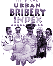
- Implementing Diagnostics - TI chapters in Bangladesh, Kenya, and Japan developed surveys and metrics for corruption in government and the private sector that they then published locally. TI Lithuania created a database of institutional and geographic aspects of corruption and published a “Map of Corruption” as a foundation for future campaign work.
Recall Design
On September 15, 2003, the Ninth Circuit Court of Appeals reversed a lower court ruling and ordered the California gubernatorial recall election postponed.
Whitney Quesenbery, Director of Outreach, of the Usability Professionals’ Association Voting and Usability project has posted some selected excerpts from the text of the decision relating to design, voting systems, effectiveness, and usability:
“In this case, Plaintiffs allege that the fundamental right to have votes counted in the special recall election is infringed because the pre-scored punchcard voting systems used in some California counties are intractably afflicted with technologic dyscalculia. They claim that the propensity for error in these voting systems is at least two and a half times greater than for any other voting technology used in California. The effect is not trivial....
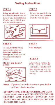 These counties [using the old machines] comprise 44% of the total electorate. They include the most populous county in the State and the county in which the state capitol is located.
Plaintiffs tendered evidence showing that 40,000 voters who cast ballots in these counties would not have their votes counted because of technological defects in the pre-scored punchcard voting system. It is perhaps ironic that the sitting governor could well cast a vote on his own recall that would not be tallied. Many candidates seeking to replace him would face a similar risk. Plaintiffs also allege that the affected counties contain a significantly higher percentage of minority voters than the other counties, causing a disproportionate disenfranchisement of minority voters....
Plaintiffs argue that the use of defective voting systems creates a substantial risk that votes will not be counted. In addition, they claim that the use of defective voting systems in some counties and the employment of far more accurate voting systems in other counties denies equal protection of the laws by impermissibly diluting voting strength of the voters in counties using defective voting systems. In short, the weight given to votes in non-punchcard counties is greater than the weight given to votes in punchcard counties because a higher proportion of the votes from punchcard counties are thrown out. Thus, the effect of using punchcard voting systems in some, but not all, counties, is to discriminate on the basis of geographic residence....
No voting system is foolproof, of course, and the Constitution does not demand the use of the best available technology. However, what the Constitution does require is equal treatment of votes cast in a manner that comports with the Equal Protection Clause. Like the Supreme Court in Bush, “[t]he question before [us] is not whether local entities, in the exercise of their expertise, may develop different systems for implementing elections.” 531 U.S. at 109. Rather, like the Supreme Court in Bush, we face a situation in which the United States Constitution requires “some assurance that the rudimentary requirements of equal treatment and fundamental fairness are satisfied.”...
Independent research confirms the error difference between pre-scored punchcard systems and others in use. The July 2001 Report of the Caltech-MIT Voting Technology Project (“Caltech-MIT Report”) studied the residual vote rates of different voting systems from 1988-2000 in the entire country, and found that punchcards lose significantly more votes than optically scanned paper ballots.
The district court discounted the impact of voting systems on the special election, relying in part on the Secretary of State’s attestation that he would “be undertaking extensive voter education efforts that could have the effect of lowering the residual rate in the upcoming election.” However, Plaintiffs effectively countered this unsupported assertion with statistical evidence showing that voter education was ineffective in counteracting the error rates inherent in the use of prescored punchcard voting systems....
Further, as we shall discuss later, the Secretary of State has already missed statutory deadlines for submitting educational information to voters concerning the initiatives on the ballot....
The State has an interest in holding a fair election - one trusted by the candidates and the voters to yield an accurate and unbiased result. The high error rate associated with the decertified machines to be used by 44 percent of the voters in October would undermine the public’s confidence in the outcome of the election. The margin of victory could well be less than the margin of error in the use of punchcard technology. This would not be the case in an election held in March 2004, when all the obsolete machines will have been totally withdrawn from use. Avoiding an election that promises to dilute the votes of any particular community - let alone communities with a disproportionately high concentration of minority voters - firmly promotes the public interest in a fair election....
There are also some unique pragmatic problems associated with this election that may be alleviated by a short postponement. For example, because of the short timetable established for this election, approximately a quarter of California’s polling places - 5,000 of 20,000 - will not be ready for use and voters will be forced to vote at a different polling place. This has the potential of creating substantial voter confusion on election day. Further, the sheer number of gubernatorial candidates — there are currently 135 names on the October 2003 ballot — will make operation of the plastic guide substantially more cumbersome to use, potentially compounding the inherent problems in its use....
In addition to the public interest factors we have discussed, we would be remiss if we did not observe that this is a critical time in our nation’s history when we are attempting to persuade the people of other nations of the value of free and open elections. Thus, we are especially mindful of the need to demonstrate our commitment to elections held fairly, free of chaos, with each citizen assured that his or her vote will be counted, and with each vote entitled to equal weight. A short postponement of the election will accomplish those aims and reinforce our national commitment to democracy....
A desire for speed is not a general excuse for ignoring equal protection guarantees.”
Ballot Design, 1880
From the Gotham Gazette:
“The concept of gathering signatures on petitions dates back to the late 19th century. It was supposed to help eliminate the political parties’ control of the ballot, according to Douglas Kellner, a commissioner at the Board of Elections. (See timeline of New York election law )
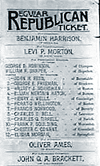 Before that, there were no printed ballots in New York. Voters simply went to the polls and wrote down the candidates of their choice. To instruct voters on who was running, political parties printed up a slate of candidates, which the voters could take with them to the polls.
This system had many problems, one of which was that political parties often printed counterfeit lists of candidates to deceive supporters of the opposition. "A counterfeit ticket would list a few of the party’s prominent candidates - just enough to fool the unwary - with the rest of the names coming from a rival slate," said Kellner.
To clear up the process, the government began in 1880 to print a uniform ballot that would be presented to voters to fill out at the polls on Election Day. Political parties were allowed to nominate their candidates to be listed on the ballot. But in addition, candidates not selected by the party could get on the ballot anyway if they could submit enough signatures from voters.
To ensure that the signatures were valid, a series of rules were put in place - many of which are still used today.
Ironically, these rules set up over a century ago to assure a more open, honest and democratic process of elections have become just the opposite — a powerful tool for political parties and incumbents to maintain their advantage. To these New York politicos, the best elections are those in which there is only one candidate left on the ballot for voters to choose.
Many incumbents, backed by their political party, have teams of lawyers who will go over a challenger’s signatures, line by line, looking for minor mistakes like missing zip codes, misspellings, and voters who have signed petitions not knowing whether they live in the district or not.
In the past, candidates have been knocked off the ballot for such infractions as writing the abbreviation ‘St.’ instead of ‘Street’ or forgetting to staple a cover sheet.
If the person gathering the signatures - called a petitioner - makes a mistake such as forgetting to write the borough on the bottom of the page, all of the signatures that he collected can be thrown out. If enough signatures are declared invalid, a candidate is eliminated.”
A Game of Hearts
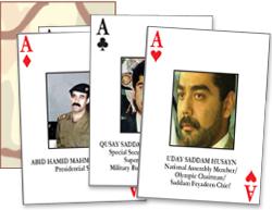 On April 11, 2003 the U.S. military released their list of most-wanted senior Iraqi government in the form of a deck of playing cards.
The cards were designed by staff of the Defense Intelligence Agency and the 3401st and 3418th Military Intelligence Detachments. One of the designers, Sergeant Scott Boehmler, 27, an Army reservist from Hazleton, Pennsylvania reports, “We understood what guys like to do on their downtime. This is an effective way of getting these images in the soldiers’ minds.”
Images can be downloaded from the Department of Defense Web site in HTML or PDF.
Production of the cards was widely covered in the U.S. mainstream media and treated as a significant event in the war. Subsequent reports of the arrest of Iraqi officials frequently refer to the list, even noting when an arrested official is not on the list. The reports are occasionally illustrated with an image of said official’s playing card.
The decks have also become enormously popular with the public. Web sites have sold hundreds of thousands of decks. As of May, one company reported $1.5 million in sales. It’s one thing to sell a war to the public. It’s whole other matter for them to buy it themselves in droves. I’ve even seen street vendors in NYC selling the decks alongside the knockoff sun glasses and watches and received a couple of unsolicited email messages offering the decks for sale.
U.S. military personnel are the world’s largest consumers of playing cards, according to Cincinnati-based United States Playing Card Company, the world’s largest playing card manufacturer. According to Time (May 12, 2003) the extreme popularity of the most-wanted cards prompted the distributor to reissue cards created for the military in earlier wars. During World War II “spotter decks” were produced for troops to distinguish between Allied and enemy aircraft. During the Vietnam War “decks containing only the ace of spades were passed out to U.S. troops, who would display a card on their helmets to scare away the Viet Cong — supposedly superstitious about the card, which fortune tellers considered a harbinger of suffering and death.”
The cards have inspired a genre of spinoffs.
GreatUSAflags.com has followed up with U.S. Military Heroes playing cards “honoring America’s servicemen and women involved in Operation Iraqi Freedom.” The deck also features images of aircraft, ships, submarines, aircraft carriers, vehicles and missiles deployed in battle.
On April 25, global justice group, the “Trade Regulation Organization,” released their U.S. Regime Change cards [image, PDF 6MB]. The group, “estimating that the U.S. governing regime is no longer consistent with world peace or prosperity, hopes that the playing cards will show the way to regime change and, eventually, large-scale war crimes proceedings.”
On May 1, Greenpeace International released a deck of “most wanted” cards depicting the nuclear powers of the world. [PDF, 96K] “This deck is designed to help delegates to the Non-proliferation Treaty meeting recognise owners of weapons of mass destruction. Packed with nuclear weapons of mass destruction facts. Fun for the whole family.” Says Tom Clements, senior campaigner with Greenpeace, “It ties the anti-war message together with the disarmament message.”
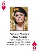 On May 7, the conservative Web site NewsMax announced the Deck of Weasels [image] which features images of anti-war celebrities and politicians includes Michael Moore, Tim Robbins, Jacques Chirac, Barbara Streisand, Teddy Kennedy, Kofi Annan, Vicente Fox, Jean Chretien,
 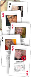 Senator Ted Kennedy and Robert Byrd. Each card features a quote by the celeb opposing the U.S. invasion of Iraq. Each of the photographs has been altered so each figure wears the beret of Saddam Hussein’s Republican Guard.
On May 15, the Ruckus Society released America’s War Profiteers, a deck of cards identifying 53 individuals and institutions in the oil, military, government, media, and policy sectors. “The groups’ aim is to expose, ‘The links among corporations, institutions, and government officials that profit from endless war.’” The site also features a good set of links to articles and campaign pages.
On May 23, Nitestar Productions released “The Deck of Republican Chickenhawks,” depicting the 54 Republican officials, congressmen, politicians and pundits who avoided serving their country through connections, deferments, or other excuses.” Needless to say, many of the officials vigorously supported the U.S. war on Iraq. The deck was inspired by a list maintained by the New Hampshire Gazette of Republican politicians and pundits who have never served in armed combat.
Still other decks reported in the May 18 Washington Post:
“Republicans in the Texas legislature had cards made depicting the state’s ‘most-wanted Democrats’ — the lawmakers who fled to Oklahoma to scuttle a vote on a bitterly contested Republican redistricting plan....
Inspired by the Pentagon’s cards, Frances Gomez, 23, decided to print up card sets featuring her top 55 Cuban villains. But just before the printing order was sent out, Gomez tweaked her plan in hopes of really sticking it to Fidel Castro. She decided to make the cards look like dominoes, the real king of the board games in Little Havana and just about anywhere else that Cubans gather.
So, instead of being the ace of spades — the card reserved for Saddam Hussein in the Pentagon’s deck — Fidel is the Double Nine, the domino tile that no player wants to hold at the end of a game. Gomez needed help from Cuban American groups in Miami to compile her list. She was born in the United States and says, like many Cuban Americans her age, that she knew little about the details behind the deep animosity felt toward Castro and his allies by older generations that fled the island nation.
‘It’s important to learn who these people are,’ Gomez said.”
In addition to the playing cards are recent political trading cards.
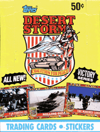 In 1991, trading card publisher Topps (coordinating with the Pentagon and Navy Department) published 3 sets of Desert Storm Trading Cards. In 2001, they published a series of Operation Enduring Freedom Trading Cards.
An article in the Guardian notes:
“90 glossy cards featuring US political and military leaders, the patriotic response to the September 11 attacks, and military hardware.... The series also features a photograph of flowers laid outside the US embassy in Pakistan in the aftermath of the September 11 atrocities. No corresponding card shows the subsequent angry demonstrations against the US bombing campaign.... Topps would not directly respond to charges that the cards promoted an unquestioning view of the war to children.”
Kingsley Barham, publisher of marijuana trading cards that cover hemp history, politics, types, and uses, developed a set of trading cards about the September 11 attacks, Heroes of the World Trade Center. Despite approval from families of victims whose portraits are on the cards, the cards were met with outrage by politicians and the media. The New York City mayor Michael Bloomberg urged lawyers to find ways to prevent the sale of the cards.
 Satire decks of the U.S. “war on terrorism” include American Crusade 2001+, Unofficial Iraqi Freedom Action Cards, and the images of Playing the Hitler Card, a small collection of cards with images of dictators and links to pages were they have recently been compared to Hitler.
In September, 2002 Slate published the Flash animation Corporate Scandal Trading Cards, “the fastest guide to America’s top 10 business crackups” with names and photos of CEO’s along with some statistics and a brief description of the crimes and frauds of WorldCom, Enron, Global Crossing, Adelphia, Tyco, ImClone, Halliburton, Harken, Qwest, and Andersen Consulting.
In April 2000, Texans for Public Justice produced a set of Bush League trading cards. The 20 cards feature statistics and a profile of a Bush “Pioneer” who has raised at least $100,000 for Bush’s presidential election. The profiles are drawn from TPJ’s investigation into the 212 announced Bush “Pioneers.”
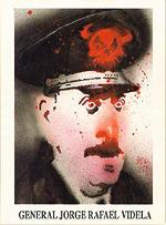 On the heels of their 1989 comic book “Brought to Light: Thirty Years of Drug Smuggling, Arms Deals, & Covert Action,” in 1990 Eclipse published the original Friendly Dictator Trading Cards. The hallucinogenic artwork of Bill Sienkiewicz illustrates “three dozen of America’s most embarrassing ‘friends’, a cunning crew of tyrants and corrupt puppet-presidents who have been rewarded handsomely for their loyalty to U.S. interests.” Other political trading card sets published by Eclipse include “Drug Wars,” “The Iran Contra Scandal,” and “Rotten to the Core - New York Political Scandal,” and “Coup D’etat,” which presents theories pertaining to the assassination of President John F. Kennedy.
Douglas Rushkoff’s 1994 book Media Virus quotes journalist and Eclipse editor Catherine Yronwode:
“Our trading cards are designed so they read like Hypercard stacks. Each cross-references to other cards... They all connect, and you can rearrange them in chains of interconnectivity. Or chronologically. You can find out who someone’s boss was, how different people moved around, that this guy was in Vietnam at the same time as this guy, and then that they were both in Nicaragua at the same time, too.”
Eclipse’s “Crime and Punishment” and “True Crime” cards, which present information about serial killers and gangsters, prompted the Board of Supervisors of Nassau County to pass Local Law 11-1992 which made it illegal to disseminate “indecent crime material to minors.” From the Friendly Dictators site:
“In 1997... a U.S. federal appeals court struck down a Nassau County, New York law banning the sale of trading cards depicting ‘any heinous crime". The court found for Eclipse who had challenged the law on First Amendment grounds - cf: Eclipse Enterprises, Inc. v. Gulotta (U.S. Federal Court of Appeal, 2nd Circuit, December 1997). The expense of this court case seems to have bankrupted them - at any rate, for whatever reason, Eclipse appears to have folded. There are no web entries for the company, no listing in any of the Publishing Indexes I’ve been able to find, and all its products are out of print, as far as the big web booksellers are concerned.”
Details of the case and proceedings can be found here.
Techniques of Electronic Advocacy
This entry has been updated and incorporated into An Introduction to Activism on the Internet.
I’ve been searching for a list of excellent examples of Internet activism. I couldn’t find one, so I made my own.
I’ve structured much of this list around categories outlined by Sasha Costanza-Chock in “Mapping the Repertoire of Electronic Contention,” in Representing Resistance: Media, Civil Disobedience and the Global Justice Movement, eds. Andrew Opel and Donnalyn Pompper. Greenwood, in press. Unless otherwise indicated, the quoted text below has been taken from him.
Though I’ve added some of my own commentary, this is not intended to be a full analysis of the campaigns and organizations mentioned. I disagree with the politics of many of the examples listed, but think there is something to be learned from each of the them.