publishing
Branding for Nonprofits
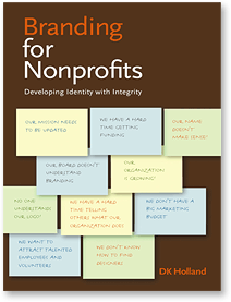 Branding for Nonprofits: Developing Identity with Integrity is just out from Allworth Press.
From the press release:
“In her new book, Branding for Nonprofits: Developing Identity with Integrity, DK Holland demystifies the branding and design process for nonprofits large and small and shows how you can use both to enhance the effectiveness of your organization. She discusses how brands are developed, how to find and work with good designers and other professionals who can work within your budget, and where to find funding for all of this.
The book is filled with real case studies that reveal situations in which nonprofits have successfully created branding opportunities out of dilemmas and rebranded to create distinctive and clear identities for themselves. ‘Brands are not just about logos (a typical misconception),’ says Holland, ‘the brand goes beyond tangible design elements to the core of the organization — to something more abstract and far-reaching.’ Branding works as an expression of the authentic values of an organization, it creates expectations, and makes promises to its primary audiences or and to the people they wish to attract. Throughout, this guide offers practical, creative approaches to help improve your brand and, in the process, become a more focused an effective organization. Along with branding resources and numerous illustrations, a handy brand glossary defines terms that might be unfamiliar to those facing the challenge of rebranding.”
Contextual Advertising, Redux
 Reader Ravenmn writes:
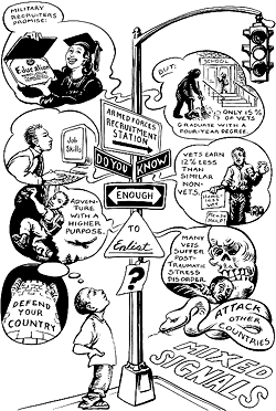
“Your item about the bad ad placement in Germany reminds me of an experience I had as a typesetter at the Minnesota Daily, the student newspaper of the University of Minnesota. In April of 1980, nobody noticed that the Army Helicopter Pilot Training ROTC ad was running on the same page as the story of the failed helicopter rescue attempt Jimmy Carter sent to Iran during the hostage crisis, complete with photo of mangled helicopters in the desert. ROTC got a couple of free ads out of it, if I recall correctly.”
I found the photo on http://remember.gov, the Web site White House Commission on Remembrance, your official source for state-sponsored memory.
Contextual Advertising Gone Bad
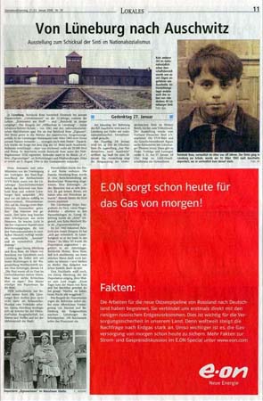
A week before today’s 61st anniversary of the liberation of Auschwitz by the Red Army, Landeszeitung Lüneburg, a local newspaper in Germany, ran an article about the deportation of a Sinti boy from Lüneburg to Auschwitz.
The article was accompanied by a large red ad from one of the biggest energy companies in Germany bearing the tagline (roughly translated): “E.ON provides today for the gas of tomorrow!”
Click for a larger version.
The paper later published an apology to the author, readers, and energy company for the ad placement, claiming they had not checked the content of the ad.
Roger, Roger
There is a new bilingual design magazine here in Germany. We already have at least four design magazines (depending on what you deem design), but ROGER matches or surpasses most of them. And ROGER is certainly the only German design magazine the rest of the world should care about, because it is the only one that cares.
While reading design magazines and design news sources online I am often appalled by the lack of social responsibility, critical reflection, and political wisdom. People hail works of designers even if the client earns his money from, say, exploitation in the global south, undemocratic regimes, or the arms trade — as long as the aesthetic value of the design work is somewhat recognizable. Not being a designer myself, but often in need of design services, I have met and worked with many designers who share the same impression. I love well designed websites or magazines — indeed I collect them. And there is a new item in my collection: the third issue of ROGER with “International Angst” as the main topic. It combines both design and responsibility.
ROGER tackles design related questions with a holistic and interdisciplinary approach. It closes the gap between your usual design magazine and political types like Adbusters and Consumerevolution. It is the closest yet to a “social design magazine.”
The current issue focuses on the “culture of fear” discussing its effects on society and on designers developing products to match customer demands in a market driven by irrational necessities. The issue features a range of articles addressing the premise from different angles. Whether it is a report from the International Design Action Day (IDAD) or a background article on the reasons for setting up Esuvee.com, a site warning about the dangers of Sports Utility Vehicles, or an interview with the curator of MoMA’s SAFE exhibition, it is always clear that the topic is more than just design. ROGER shows design can be more than aesthetics or selling products. True design is about shaping, shaping our society or future ones. No wonder a feature article on Buckminster Fuller introduces the idea of design science. The magazine itself sounds a little like a scientific project too, to prove that designers can indeed take responsibility.
ROGER is published by the KISD Club, an association of students from the Köln International School of Design. Because the magazine is bilingual, in both English and German, some articles are a little short and the pages, a little crowded. ROGER’s motto “Design People Questions” is also more ambitious than it appears at first. So much more that the magazine sometimes fails to meet its own ambitions. The article about a Chinese design fair called TIC 100 doesn’t really distuinguish between mainland China and Taiwan. It also forgets to mention the conflict between Taiwan and the Chinese government, a bloody regime that does not hesitate to jail reporters or kill students.
Still, the Editorial of the second issue, which is partly available online, expresses more than I can paraphrase:
“Design tends to be misunderstood and the self-presentations of the primadonnas contribute to this.... It would be better to reorganize those living and consuming circumstances that have become completely absurd and yet serve as a desirable example everywhere.... Luckily, some designers are already conscious of their responsibility.”
Find out more at http://roger.kisd.de/
Up in Smoke
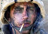
Back in November 2004, a portrait of a U.S. Marine in Iraq rapidly became an icon of weary, insouciant toughness and cool that so many love in their cinematic heros.
 Patrick J. McDonnell wrote in the Los Angeles Times:
A smoke break creates icon of the war; now groupies seek out the weary Marine
“Miller is the young man whose gritty, war-hardened portrait, shot by Luis Sinco, a Los Angeles Times photographer, appeared Wednesday in more than 100 U.S. newspapers, including The Seattle Times. In the full-frame photo, taken after more than 12 hours of nearly nonstop deadly combat, Miller’s camouflage war paint is smudged. He sports a bloody nick on his nose. His helmet and chin strap frame a weary expression that seems to convey the timeless fatigue of battle. And there is the cigarette, of course, drooping from the right side of his mouth in a jaunty manner that Humphrey Bogart would have approved of. Wispy smoke drifts off to his left.
The image has quickly moved into the realm of the iconic.
More than 100 newspapers printed it, although it took the New York Post to sum it up in a front-page headline: ‘Marlboro Men Kick Butt in Fallujah.’ The fact that Miller’s name was not included in the caption material only seemed to enhance its punch....
The photo was taken on the afternoon after Charlie Company’s harrowing entry into Fallujah under intense enemy fire, in the cold and rain. Miller was on the roof of a home where he and his fellow First Platoon members had spent the day engaged in practically nonstop firefights, fending off snipers and attackers who rushed the building. No one had slept in more than 24 hours. All were physically and emotionally drained.”
See this previous post on Bag News Notes for further analysis of the Times article and photo.
See also Human Rights Watch‘s report on Charlie Company‘s earlier seige and occupation of Fallujah.
Today, however, we learn from Editor and Publisher that:
‘Marlboro Man’ in Iraq War Photo Suffers from PTSD
Back home, he got married in June, but on duty during the Hurricane Katrina relief effort, Miller suffered from symptoms of post-traumatic stress disorder (PTSD), and was granted an honorable discharge from the Marines in November....
Miller went into therapy, but knows he is not alone. ‘A lot of guys have had way worse incidents from being in Iraq,’ he said. ‘And I guess it just -- it troubled me due to the fact that their incidents may have been more severe, and they weren’t suffering from the same things I was. I just didn’t understand how it could affect me so dramatically and not affect some of these guys. But a lot of them deal with different ways.
‘The more and more I talk to [other guys], the more I found out there were a lot of Marines that are going through same or similar emotions. It’s tough to deal with. Being in Iraq is something no one wants to talk about.’”
SocialDesignZine Vol.UNO
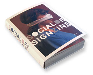
Just in time for the new year is this massive collection of social design notes from the Associazione Italiana Progettazione per la Comunicazione Visiva, the Italian Association for the Design of Visual Communication.
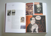
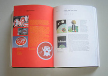
SocialDesignZine Vol.UNO collects two years of posts from the blog SocialDesignZine.The book weighs in at 464 pages with over 1100 color images.
In my broken translation:
“The book is an immense anthology on topics of visual communication and the social responsibility of the designer. An appeal for us to think about the future, this collection is a small contribution to the formation of an Italian design community.
Introduced with essays by Steven Heller, Mario Piazza, and Oliviero Toscani, the text draws from a wide range of sources collection (text, Web, video) that deepen the arguments over time. Many pages include a sidebar of selected user comments from the site itself. Also of use is the immense analytical index that allows one travel over the pages again. Articles are cross-indexed on repeated themes through the book. The book costs 30 Euros online plus shipping.”
The book grabs a few items and images from my own site, though is more tightly focused on graphics. In fact, the introduction cites this site as an inspiration! It’s thrilling to see how far they’ve run with the idea. I can’t wait to see what happens in volume 2.
Onwards!
Guernica, USA
John T. Unger writes in about his campaign:
“I thought you might be interested in helping spread the word about a call for participation. I’m looking for artists/activists who can help get billboard sized reproductions of Picasso’s Guernica installed in as many US locations as possible.”
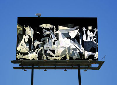
From his blog:
“Ideally, the work would stand without any text or headlines or additional commentary: if the painting is all that’s seen, it forces the viewer to make an interpretation instead of being told what to think. Being told what to think is exactly what got Americans in trouble in the first place, no?
In terms of how the project is carried out, I don’t really think it matters whether billboards are rented, plastered over in dark of night (see: BLF, the Billboard Liberation Front) or created just for this purpose. Obviously not everyone has the budget to actually rent billboard space, though it seems like this might be an option for funded activist groups. Now that most billboards are made to hold printed tarps rather than pasted up sheets of paper, it would certainly be easier and faster for guerrilla Guernicas to be painted on canvas and installed at whim. For those who do take the guerrilla approach, it might help to read this basic primer on how to appropriate billboards. Also check out the Wooster Collective for ideas and techniques.
I don’t think it matters whether the images are photos, stencils, handpainted, collaged or what. If the project really took off, part of the excitement would be seeing the results of many different people interpreting a well know work in their own way. I will happily publish any photos sent in by participants of the project.”
The project is, in part, a test of his idea of “open-sourcing art projects” to involve as many participants as possible.


