

state of the union
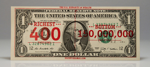
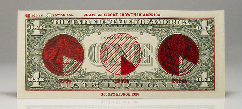
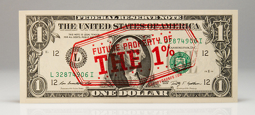
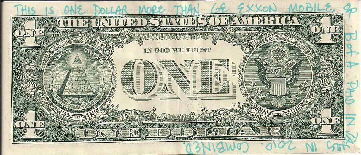
Follow the Money
The tents have been cleared from the park, but the currency of ideas still circulate. Occupy George is a lovely Occupy Wall Street intervention that visually describes disparities in U.S. wealth on a bit of the wealth itself. It’s infographics in your pocket!
Political Graffiti
All graffiti have their politics but some more explicitly call for public policy change. Here are a few interesting pieces I’ve run into in the last week. An effective mix of surprise and cheek.
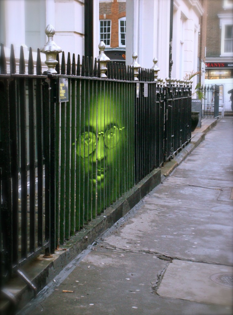
A portrait of Troy Davis wheatpasted to the sides of a fence in London for Amnesty International UK, protesting his then pending execution in Georgia. More »

Residents, environmentalists and officials want to tear down an obsolete dam near Ojai. After years of protest, a band of artists used creative tactics to call attention to the issue. The image appeared on the front page of the local paper the same day environmentalists, county officials, and the Army Corps of Engineers met to discuss the dam. More »
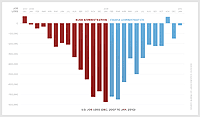
A nice bit of information design. (Via)
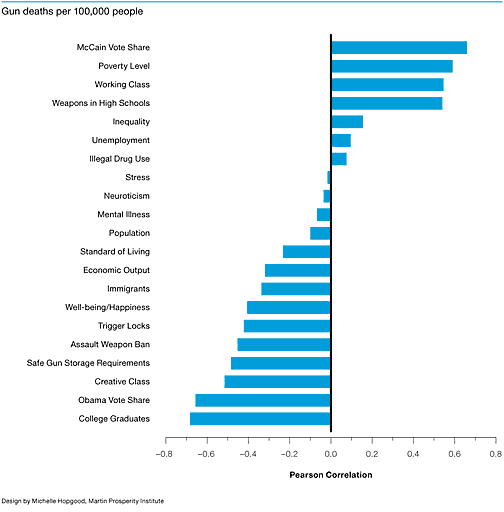
I’d love to see if a finer-grained city or census tract correlation bear out these findings, as well as other factors like, say, the scale of gun ownership.
Food Pyramids
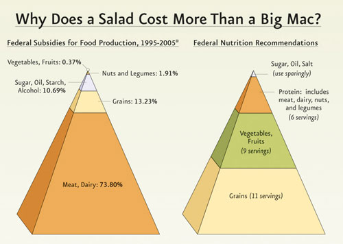
I missed this when it first hit the web, but wow, that’s a striking presentation.
The Physicians Committee for Responsible Medicine published this graphic during the 2007 debate on the US Farm Bill.
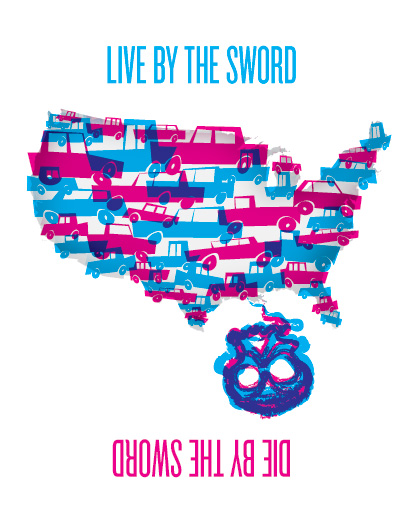
Auto
There are plenty of structural issues around the crisis in the Gulf, but this one was on my mind tonight. PDF version here.
Memorial Day
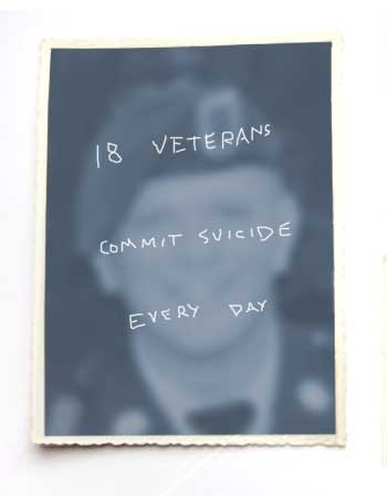
Source: http://www.armytimes.com/news/2010/04/military_veterans_suicide_042210w/
While there may not be so many “unknown soldiers” any more, it seems like there are more and more forgotten ones in our midst.
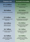
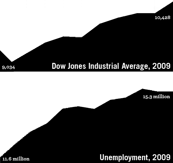
Tracking the Recovery
page 2 1