

17 February 2010
Job Loss to Recovery.
The Obama administration has posted an infographic to bolster claims that a year after its signing, the Recovery Act is working wonders. I get the point, but the y-axis label is confusing: wouldn’t negative job loss be the same as job creation? Regardless, I had a different picture of the recovery.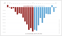
![]() 17 February 2010, 12:18 PM | LINK | Filed in
gov, information design, state of the union
17 February 2010, 12:18 PM | LINK | Filed in
gov, information design, state of the union
Read more items related by tag: