

March 2006
Guerilla Wayfinding, 2
Wow! Three weeks ago I posted a modest proposal for a guerilla wayfinding campaign, painting compass stencils at the exits of subway stations for disoriented commuters.
Today at the 8th Avenue L exit I found this:
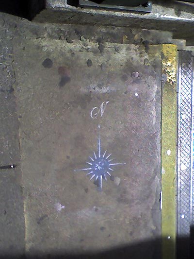
Here’s a hi-res photo someone posted to Flickr of the same compass at the Bleeker 6 exit. I found more at Astor Place and Union Square. Is someone reading this blog? And will they go all city?
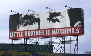
Flickr Riot
I’m late to the party on this, but as one of its co-founders notes in passing, the photo sharing site Flickr is fast becoming an easy way to find photos of major protest events in wired urban areas. See for instance, protests this week against the CPE in Paris or the election in Belarus. See also this December 2005 story on MoveOn’s use of Flickr or the 1,430 photos tagged “RNC.”
If Web 2.0 is made of people, an easy use is a kind of grassroots media. Though the corporate-owners of such Web frameworks are certainly willing to take down images that “may offend” or hand over the goods on users. (via)
 “HauteGREEN will showcase a collection of the best in sustainable contemporary design for the home. HauteGREEN will take place in Williamsburg, Brooklyn May 20-22, 2006, during the International Contemporary Furniture Fair.”
I was put off by the chicy angle (why does sustainability always seem to be a class privilege?) — but a member of o2, one of sponsoring organizations, explained that the initiative is intended to attract the interest of designers participating in and visiting the fair.
Coconets is the winner of the 2005 BBC World Challenge, which lists other interesting environmentally friendly inventions and business initiatives. (Sponsored by Shell Oil!)
Update 3/26: Evan responds:
“I know in India they have been turning coconut husks in to rope and other fibers for a few thousand years... It takes a Development Bank to take traditional products, ignore the history, and create them again as an amazing new revolutionary product!”
Guernica Stencils
Inspired by the call of Visual Resistance and John Unger, here’s an attempt at a few Guernica stencils:
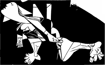
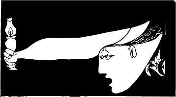
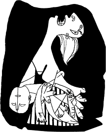
Click on an image above for a printer-friendly PDF.
They could probably be simplified further, but here’s a first go.
Free to download and distrbute!
(via)
Update: Houtlust is now Osocio.
 “BWI is an ‘intimate bureaucracy’ created to challenge our relationship to time and efficiency. BWI uses interruptive technology such as email, snail mail, and the telephone, as well as in-person visits to create invisible theatre that steals time from the realm of work and capital.”
Call for Entries: Critical Cartography and Anarchist Geography
 From Perspectives on Anarchist Theory:
“Perspectives on Anarchist Theory is looking for submissions of maps, cartograms, diagrams, and writing, for a special issue, guest edited by Lex Bhagat and Lize Mogel, on ‘Critical Cartography and Anarchist Geography.’
The map is a device of power. What happens when this device is purposely redirected, hacked mischievously or stolen outright?
This issue of Perspectives aims to carry forward the tremendous momentum which links art, activism, geography and other practices into the expanded “field” of radical geography and cartography. We are inspired by recent mapping projects that redirect the culturally understood authority of maps. Such projects have produced a new type of networked discourse, richly communicating information through image/text. These maps picture concentrations of power and global economic flows; reveal the hidden workings of the prison-industrial complex; uncover contestations of public space; overwrite political boundaries with local ecologies; generate walking tours of feminist social history; direct action against military recruiters or global financial institutions; and provide a funhouse mirror to the absurdity of electoral politics.”
The deadline for proposals has been extended a week to March 22. This should be good.
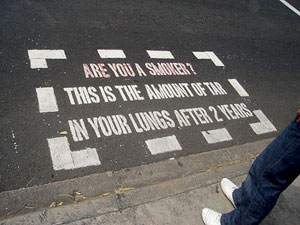
 “Here in the US, fruit often comes with stickers on it, sometimes telling you where it’s from and/or what it is. There’s also a number, but I never paid attention to that. But on p. 72 [of April’s Food & Wine] I spotted this interesting bit of information:
‘[T]he sticker labels on fruit: The numbers tell you how the fruit was grown. Conventionally grown fruit has four digits; organically grown fruit has five and starts with a nine; genetically engineered has five numbers and starts with an eight.’”(via)
Is Design Political?
 Jennie Winhall, Senior Design Stategist at the UK Design Council’s RED research unit, has posted an excellent essay that summarizes a number of ways design is, in fact, political.
The essay addresses branding and propaganda, product labeling, advertising, design by grassroots campaigns, how ideology shapes the physical construction of our public institutions, and how the shape of our built environment in turn shapes our choices and behaviors.
It’s a great call to action.
One oddity, though, is that for its talk of politics, the RED project seems to steer clear of... actual legislation.
For instance, the RED Health project takes on the raging diabetes epidemic and concludes with the design of a grassroots fitness program and an improved interface with the National Health Service. This is totally great and much needed. But only addresses half of the equation.
What about the ready availability of cheap, high calorie junk food and soda? At what point does the Government step in and regulate toxic substances that are poisoning the public? RED sidesteps the issue. As a government funded organization, are they not allowed to propose regulation of industry? Or is it the Design Council’s close relationship with UK industries? A core mission of the Council is to improve UK products and industries through better design.
Beyond better product labeling, why not designers urging a ban on advertising junk food to children? Perhaps a public campaign (with nice graphic campaign materials) challenging the content of junk food itself? For instance, the legality of trans fat? Or agricultural subsidies of corn and sugar that make sweeteners ultra-cheap for food manufacturers?
RED does some amazing and important work. They are one of the few design think tanks researching and promoting design in the public interest in a very high profile way. But the discreet focus on projects and products seems to miss opportunities to leverage its special relationship with Parliament and to shape the policy and industries that shape our world.
Branding for Nonprofits
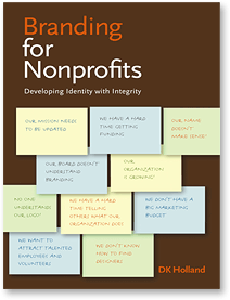 Branding for Nonprofits: Developing Identity with Integrity is just out from Allworth Press.
From the press release:
“In her new book, Branding for Nonprofits: Developing Identity with Integrity, DK Holland demystifies the branding and design process for nonprofits large and small and shows how you can use both to enhance the effectiveness of your organization. She discusses how brands are developed, how to find and work with good designers and other professionals who can work within your budget, and where to find funding for all of this.
The book is filled with real case studies that reveal situations in which nonprofits have successfully created branding opportunities out of dilemmas and rebranded to create distinctive and clear identities for themselves. ‘Brands are not just about logos (a typical misconception),’ says Holland, ‘the brand goes beyond tangible design elements to the core of the organization — to something more abstract and far-reaching.’ Branding works as an expression of the authentic values of an organization, it creates expectations, and makes promises to its primary audiences or and to the people they wish to attract. Throughout, this guide offers practical, creative approaches to help improve your brand and, in the process, become a more focused an effective organization. Along with branding resources and numerous illustrations, a handy brand glossary defines terms that might be unfamiliar to those facing the challenge of rebranding.”
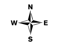
Guerilla Wayfinding
Last night, a friend from out of town commented on his disorientation when exiting subway stations in New York City. Which way is North? It always takes a minute or two (or more) to find a street sign, landmark, or other orienting information. In some cases it means walking a whole city block to find out you’re heading in the wrong direction. I’ve lived here for 15 years and I’m still disoriented at far-flung exits where the streets all have names and no numbers.
In midtown they have do little kiosks at street level with maps to nearby landmarks. But this seems like overkill for mostly mixed and residential neighborhoods. So how hard would it be for the MTA to paint a little direction indicator on the pavement near each subway exit?
Hell, how hard would it be to take matters into our own hands? To start a guerilla wayfinding campaign?
To that end, I’ve posted a few free stencils here. I’ve tried to keep it in the MTA style — with the exception of the compass rose. (But then who doesn’t love a compass rose?)
Click the thumbnails below to download a 20KB PDF.
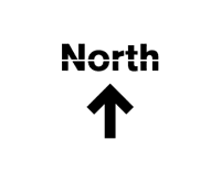
Update 3/7/06: I’ve deprecated the uptown and downtown stencils, since it occurs to me that this could cause some confusion with the subway lines themselves often referred to uptown or downtown lines.
Update 3/28/06: Using their own fancy, two-color stencil, someone’s taken it on!.
 “A persistent symbol of resistance and unity, the clenched fist (or raised fist) is part of the broader genre of ‘hand’ symbols that include the peace ‘V,’ the forward-thrust-fist, and the clasped hands. The clenched fist usually appears in full frontal display showing all fingers and is occasionally integrated with other images such as a peace symbol or tool.... Fists, in some form, were used in numerous political graphic genres, including the French and Soviet revolutions and the United States Communist Party. However, these all followed an iconographic convention. The fist was always part of something — holding a tool or other symbol, part of an arm or human figure, or shown in action (smashing, etc.). But graphic artists from the New Left changed that in 1968, with an entirely new treatment. This ‘new’ fist stood out with its stark simplicity, coupled with an popularly understood meaning of rebellion and militance.” (via)
