February 2003
Routing
“New York City averted a public transit strike recently, saving commuters and residents a metropolitan-size headache of getting around. But if it had come to that, the city was ready to help idle people find their way.
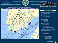
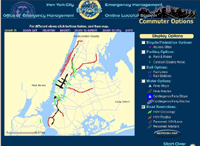
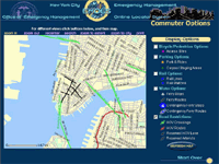
A week before the scheduled strike, the city’s Office of Emergency Management, the Department of Information Technology and Telecommunications, and Frankfort, Ky.-based PlanGraphics Inc. designed and developed an interactive online map that enabled users to view various alternative transportation options and vehicular restrictions.
The application, which took about a half-day to design and a week to develop, was activated from Friday evening, Dec. 13, to Monday noon, Dec. 16, the deadline for the strike, said Mike Wiley, a project manager for PlanGraphics in New York City. During that time, users viewed more than 70,000 custom maps with a peak of about 6,000 maps served up Sunday evening. Although the application was subsequently deactivated, it’s available should a similar situation occur in the future.
The system can highlight bicycle and pedestrian access sites, carpool staging areas, rail lines and stations, ferry stops and routes, including contingencies, as well as carpool-only routes and other road restrictions.
The application is based on the city’s Emergency Management Online Locator System, which allows New Yorkers to find hurricane evacuation routes or cooling centers during a heat wave.
PlanGraphics, which has a seven-year working relationship with the city, also helped develop an online map of the area around the World Trade Center shortly after the Sept. 11, 2001, terrorist attacks. Sometimes twice daily, the company or the city would update what areas were accessible by motor vehicles or pedestrians in the area and provide other information.
The company is also planning to update the city’s “My Neighborhood Statistics” application, which allows users to view 14 selected performance statistics about their community, such as air and noise complaints, structural fires, infant mortality, clean sidewalks, felonies and certified teachers. By the end of January, the system, which went live in September 2002, will show 80 different metrics.
The city also recently awarded PlanGraphics a three-year, $15.4 million contract to continue to develop and upgrade the city’s GIS data repository, and provide greater access as well as more customized applications for the public and city agencies.”
Other non-interactive maps were posted, but the site vanished from the Web as quickly as it was posted.
MapQuest has driving instructions, Staphangers .org used to have a working subway route finder, and the Department of Transportation has PDF of NYC bicycle routes, but I’ve not found anything that ties together NYC’s many transportation alternatives into one online application.
In a struggle that shook the City, the Transport Workers Union stood up to the Mayor’s intimidation and successfully fought cuts. They also pushed the City into developing the most comprehensive New York City route finder I’ve seen. The screen shots I found indicate that the target audience were those who work in lower Manhattan and Wall Street, but such a tool would be useful for everyone — and would indicate which neighborhoods are underserved. I hope they put it back online, with subway and bus info added.
Update, 9/12/2003: The lack of a integrated route finding system in NYC has prompted one New York City resident to build his own. It needs work, but integrates bus and subway connections quite nicely.
Joe President
Joe Lieberman for President satire site.
Saw this a couple of weeks ago. Had a surprisingly hard time finding it again just now, so decided to link it here.
A faithfully mocking copy of the official site. They really nail the design and chatty tone, though I find the humor a bit obvious and the criticism rather dull. There’s so much more damning information in his voting record alone.
The Peace Sign

First ceramic CND badge, early tin badge, and current badge
“One of the most widely known symbols in the world, in Britain it is recognised as standing for nuclear disarmament — and in particular as the logo of the Campaign for Nuclear Disarmament (CND). In the United States and much of the rest of the world it is known more broadly as the peace symbol. It was designed in 1958 by Gerald Holtom, a professional designer and artist and a graduate of the Royal College of Arts. He showed his preliminary sketches to a small group of people in the Peace News office in North London and to the Direct Action Committee Against Nuclear War, one of several smaller organisations that came together to set up CND.
The Direct Action Committee had already planned what was to be the first major anti-nuclear march, from London to Aldermaston, where British nuclear weapons were and still are manufactured. It was on that march, over the 1958 Easter weekend that the symbol first appeared in public. Five hundred cardboard lollipops on sticks were produced. Half were black on white and half white on green. Just as the church’s liturgical colours change over Easter, so the colours were to change, “from Winter to Spring, from Death to Life.” Black and white would be displayed on Good Friday and Saturday, green and white on Easter Sunday and Monday.
The first badges were made by Eric Austin of Kensington CND using white clay with the symbol painted black. Again there was a conscious symbolism. They were distributed with a note explaining that in the event of a nuclear war, these fired pottery badges would be among the few human artifacts to survive the nuclear inferno...
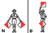 Gerald Holtom, a conscientious objector who had worked on a farm in Norfolk during the Second World War, explained that the symbol incorporated the semaphore letters N(uclear) and D(isarmament). He later wrote to Hugh Brock, editor of Peace News, explaining the genesis of his idea in greater, more personal depth:
‘I was in despair. Deep despair. I drew myself: the representative of an individual in despair, with hands palm outstretched outwards and downwards in the manner of Goya’s peasant before the firing squad. I formalised the drawing into a line and put a circle round it.’
Eric Austin added his own interpretation of the design:
‘the gesture of despair had long been associated with the death of Man and the circle with the unborn child.’
Gerald Holtom had originally considered using the Christian cross symbol within a circle as the motif for the march but various priests he had approached with the suggestion were not happy at the idea of using the cross on a protest march. Later, ironically, Christian CND were to use the symbol with the central stroke extended upwards to form the upright of a cross.
This adaptation of the design was only one of many subsequently invented by various groups within CND and for specific occasions — with a cross below as a women’s symbol, with a daffodil or a thistle incorporated by CND Cymru and Scottish CND, with little legs for a sponsored walk etc....
There have been claims that the symbol has older, occult or anti-Christian associations. In South Africa, under the apartheid regime, there was an official attempt to ban it. Various far-right and fundamentalist American groups have also spread the idea of Satanic associations or condemned it as a Communist sign....
Although specifically designed for the anti-nuclear movement it has quite deliberately never been copyrighted. No one has to pay or to seek permission before they use it. A symbol of freedom, it is free for all. This of course sometimes leads to its use, or misuse, in circumstances that CND and the peace movement find distasteful. It is also often exploited for commercial, advertising or generally fashion purposes. We can’t stop this happening and have no intention of copyrighting it. All we can do is to ask commercial users if they would like to make a donation. Any money received is used for CND’s peace education and information work.”
Night Letters
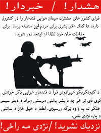
“The Partnership of Nations has secured the Qandahar Airport to ensure that Humanitarian Aid will reach the people of this area. For your own safety stay away.”
Leaflet War Rages in Afghan Countryside
“The war in Afghanistan is not just about bombing mountain hide-outs, it’s also about getting a message out. The result is a leaflet war that has littered the Afghan countryside with thousands of pieces of paper.
On one side are the United States and its allies, who use pamphlets with mugshots of fugitives and pictures of Taliban abuses to warn coalition enemies that there is no escape.
On the other side are the Taliban, al-Qaida and renegade rebel leader Gulbuddin Hekmatyar, whose much more prolific flyers warn foreign soldiers they are targets, or urge Islamic faithful to rise up against them in holy war.
The anti-American pamphlets are called ‘night letters,’ secretly circulated and strewn by the hundreds in towns, villages and countryside. Within the last few weeks, they turned up in the capital of Kabul for the first time.”
The AP story depicts much of the propaganda war centering on women’s bodies — U.S. forces shown searching a young girl vs. a member of the Taliban shown beating a woman.
However, of the U.S. flyers shown here, some are instructional — tune to this radio station, those yellow things are food packets — but most simply hawk moral platitudes and cash money rewards.
Psyops Comics IV: Viet Nam
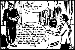
“Honey, what do they say in those leaflets?”
“They are the same as those wall posters, as well as the announcements on the radio yesterday. The two Communists Ba Luong and Hai Gon are presently hiding our village in order to collect taxes. I am determined to report to the Phoenix Operation Committee because I know their hiding place.”
We’ve seen the CIA use comics to fight the Sandinistas; the FBI to fight the Black Panther Party; and with the Comics Code Authority to portray the CIA, ethnic advancement agencies, and the economically privileged in a positive light for U.S. comics readers. The CIA also used comics during the Vietnam War as part of its psychological operations and counterinsurgency campaign.
The comic book, “Mr. Ba’s Family and the Phoenix Operation,” was prepared and disseminated by U.S. forces in South Viet Nam under Operation Phoenix. Operation Phoenix was designed to assassinate or imprison members and collaborators of the National Liberation Front, the united front that brought together Communists and non-Communists to liberate Viet Nam from foreign control.
“Phoenix offices were set up from Saigon down to the district level. Their functions were to: (1) collate intelligence about the ‘Vietcong Infrastructure’; (2) interrogate civilians picked up at random by military units carrying out sweeps through villages; (3) ‘neutralize’ targeted members of the NLF. This third task was often carried out by CIA-led Vietnamese organized into Provincial Reconnaissance Units.”
The comic the fictional story of “Mr. Ba,” who is conviced and eventually rewarded for informing the U.S. military about where the Viet Cong are hiding in his village.
Read more about the comic or See pages from the comic and an English translation. Note, the page and images load slowly.)
On July 19, 1971, William Colby, the CIA officer in charge of Operation Phoenix, testified before a Subcommittee of the House Committee on Government Operations, that between 1968 and May 1971, 20,587 alleged Vietcong sympathizers were executed as a result of the Phoenix Program. The government of South Vietnam credited Phoenix with 40,994 deaths. Vietnamese who were taken into custody were often tortured before being executed. U.S. military-intelligence officer, K. Barton Osborn testified that none of those ever held for questioning lived through the process. (New York Times, August 3, 1971, p. 10.)
The Memory Hole has posted a collection of CIA documents from the Phoenix Program online.


