wayfinding
Native Signs

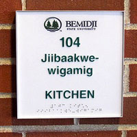
Signs in Bemidji, Minnesota used to read “No Indians Allowed.” Now local businesses increasingly announce their facilities in both English and Ojibwe.
Racism and social exclusion have a long history in the town, but as Tanya Lee writes, a 2005 proposal to voluntarily incorporate Ojibwe words on public signage is having a growing impact:
The idea came in part from Hawaii, where [Michael] Meuers had lived for a year in the 1960s. On the islands, he recalled, native language and culture are a part of everyday life for everyone, as the familiarity with words such as mahalo, luau, aloha, lei and hula prove. On restroom doors, the words men and women are displayed in English and in Hawaiian.
In 2005, a student at Red Lake High School, a school for Red Lake students run by the state of Minnesota, opened fire on the campus with a shotgun and a semiautomatic pistol, killing seven.
“The next day, I was talking to the city manager and noticed a Red Lake flag on a shelf,” Meuers said. “I was working for the tribe at that point and I suggested the city fly the flag. The Red Lake flag flew at half-staff outside City Hall for a week. I never heard so many positive comments about Bemidji. It was the people of the city saying, ‘Bemidji is crying for the Red Lake babies too.’ ”
This prompted Meuers to take his simple idea about the bathroom signs to Shared Visions, a community organization dedicated to addressing the issues of racial disparity and bias. Rachelle Houle served with Meuers on the Cultural Understanding and Respect Committee, and together they set the goal of placing restroom signs in both Ojibwe and English in 20 businesses within a year. Meuers volunteered to pay for the signs.…
“Michael and I both feel a change happening here,” Houle said. “For so long, the Ojibwe culture and people have not been respected here. This is a way of saying, ‘You are valuable.’ It’s a way of showing respect and making people welcome in Bemidji.”…
[Dr. Anton Treuer, professor of Ojibwe at Bemidji State University] says the university has received many calls and e-mails about how to replicate the [universty’s signage] program, and he believes it can serve as a template for other tribes. “We were taking our signs around town when we started,” Meuers said, “and now people are coming to us, not only from the U.S. but also from Canada.”
Routing
“New York City averted a public transit strike recently, saving commuters and residents a metropolitan-size headache of getting around. But if it had come to that, the city was ready to help idle people find their way.
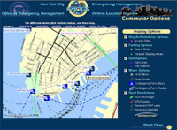
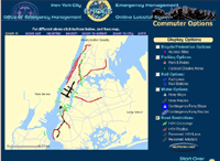
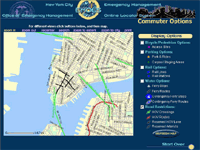
A week before the scheduled strike, the city’s Office of Emergency Management, the Department of Information Technology and Telecommunications, and Frankfort, Ky.-based PlanGraphics Inc. designed and developed an interactive online map that enabled users to view various alternative transportation options and vehicular restrictions.
The application, which took about a half-day to design and a week to develop, was activated from Friday evening, Dec. 13, to Monday noon, Dec. 16, the deadline for the strike, said Mike Wiley, a project manager for PlanGraphics in New York City. During that time, users viewed more than 70,000 custom maps with a peak of about 6,000 maps served up Sunday evening. Although the application was subsequently deactivated, it’s available should a similar situation occur in the future.
The system can highlight bicycle and pedestrian access sites, carpool staging areas, rail lines and stations, ferry stops and routes, including contingencies, as well as carpool-only routes and other road restrictions.
The application is based on the city’s Emergency Management Online Locator System, which allows New Yorkers to find hurricane evacuation routes or cooling centers during a heat wave.
PlanGraphics, which has a seven-year working relationship with the city, also helped develop an online map of the area around the World Trade Center shortly after the Sept. 11, 2001, terrorist attacks. Sometimes twice daily, the company or the city would update what areas were accessible by motor vehicles or pedestrians in the area and provide other information.
The company is also planning to update the city’s “My Neighborhood Statistics” application, which allows users to view 14 selected performance statistics about their community, such as air and noise complaints, structural fires, infant mortality, clean sidewalks, felonies and certified teachers. By the end of January, the system, which went live in September 2002, will show 80 different metrics.
The city also recently awarded PlanGraphics a three-year, $15.4 million contract to continue to develop and upgrade the city’s GIS data repository, and provide greater access as well as more customized applications for the public and city agencies.”
Other non-interactive maps were posted, but the site vanished from the Web as quickly as it was posted.
MapQuest has driving instructions, Staphangers .org used to have a working subway route finder, and the Department of Transportation has PDF of NYC bicycle routes, but I’ve not found anything that ties together NYC’s many transportation alternatives into one online application.
In a struggle that shook the City, the Transport Workers Union stood up to the Mayor’s intimidation and successfully fought cuts. They also pushed the City into developing the most comprehensive New York City route finder I’ve seen. The screen shots I found indicate that the target audience were those who work in lower Manhattan and Wall Street, but such a tool would be useful for everyone — and would indicate which neighborhoods are underserved. I hope they put it back online, with subway and bus info added.
Update, 9/12/2003: The lack of a integrated route finding system in NYC has prompted one New York City resident to build his own. It needs work, but integrates bus and subway connections quite nicely.
Which Way to Manhattan?
In 1999, Paul Mijksenaar was hired by the New York and New Jersey Port Authority to change the old and confusing wayfinding systems at the La Guardia, JFK, and Newark airports to more user-friendly systems. His Amsterdam-based firm, Bureau Mijksenaar, is responsible for the signs at Schiphol Airport in the Netherlands, which is consistently rated by travelers as the most well-organized airport in the world. Work for the Port Authority “will ultimately replace more than 5,000 dated and confusing ones, easing the way for some 90 million travelers each year.”
From The New York Times, June 7, 2001:
“His arrival in New York was precipitated by a survey for the Port Authority three years ago by J. D. Power & Associates, a marketing firm. It revealed that among the vast spectrum of bêtes noires at the three major New York airports, getting lost because of confusing directions was second only to unclean restrooms as the most irksome problem.
At Kennedy, for instance, there was no sign telling newcomers how to get to Manhattan. ‘No sign to Manhattan!’ Mr. Mijksenaar recalled. ‘Only to the Van Wyck Expressway! What is this Van Wyck? You didn’t see the word “Manhattan” until the Midtown Tunnel.’...
At the three airports, his mission is daunting: 17 separate terminals with some 300 directional signs each, including signs for garages, airport roads and parking lots. Most terminals are leased to individual airlines with competing agendas and graphics.
The old signs, dating from the early 70’s to late 80’s, almost always had white letters on dark backgrounds, and were indistinguishable from one another. ‘Most airport people don’t have the experience of clients,’ he said. ‘Their solution was to put up more signs and more signs and more signs. So it ended up being a contradictory mess.’...
The new designs are backlit and color-coded into three different modes that peg color contrast to urgency: black letters on bright yellow for “flying mode, the panic mode, the most nervous mode,” used to direct passengers to the gate and from the plane to their baggage; white letters on green for exits, the “the ‘I want to go home’ mode” (based on the color of American road signs); and yellow letters on dark gray, the “waiting mode, the time-to-kill mode,” directing travelers to the restrooms and shopping areas.
Eliminating jargon was [also] a major part of his New York mandate. He replaced the words ‘courtesy van,’ for instance, with ‘free hotel shuttle,’ ‘because that’s what it is,’ he said. ‘Long term’ and ‘short term’ parking were replaced with ‘daily’ and ‘hourly.’ Information areas are now marked with a double pictogram that combines the question mark typically used in the United States with the ‘i’ used in Europe, resulting in a rather existential new sign: ‘i?’...
Mr. Mijksenaar sometimes finds himself at odds with architects. ‘Architects fear visual clutter,’ he said. ‘So there will always be some tension. They think their buildings should speak for themselves. But how can you find a restroom that speaks for itself?’...
In 1963, while Mr. Mijksenaar was an art student at Gerrit Rietveld Academy in Amsterdam, the British highway authority introduced road signs that offered elegantly simple depictions of complex roundabouts. ‘It was a shock for me that road signs could be nice and good-looking,’ he said. ‘Most people think that road signs... are made by civil servants, not designers. That was a real eye-opener.’
Mr. Mijksenaar, now a professor at Delft University of Technology, designed the signs for Schiphol Airport in 1991. Other public spaces bearing his mark are the subways in Amsterdam and Rotterdam, and the Dutch railway, Nederlandse Spoorwegen. He is currently redesigning immigration identity forms, with pictograms that eliminate language barriers, and is studying the ‘tax form of the future’ for the Dutch government.”
Europeans may share familiarity with a common pictogram vocabulary, but as suggested above by the use of the two different symbols for ‘information,’ it remains to be seen how well the imigration form graphics will ‘eliminate language barriers.’ As with any language, systems of symbols must be learned.
Thanks to Stephanie for the heads up.
Design and Disaster
“The worst airport fire in German history occurred on April 11, 1996, when flames broke out in the busy Düsseldorf airport, quickly filling the terminal with acrid, toxic smoke. Travelers frantically looked for exit signs. In the ensuing chaos, 17 people died and 150 were injured. A spokesman for the Düsseldorf fire brigade, quoted in European news accounts, blamed the high number of casualties on passengers ‘ignoring’ emergency exit signs. For airport management, having the signage singled out as a contributor to the disaster underscored the importance of maintaining a clear communications system in a crowded, public space. Prior to the fire, signage at Düsseldorf had become a clutter of airline logos and retail and service ads, with directional signs lost in the cacophony.”
Traveler safety and ease of movement were key considerations, along with establishing a distinct identity for the airport. The design from MetaDesign pegged levels of the importance of information to the levels of color and contrast, designing for legibility during normal visbility as well as in a smokey environment. As for non-disaster usability? “Over the past year, the airport information counter reports a 50% drop in inquiries.” Sample pix: before and after. From @issue, volume 3, number 2.
Architecutral Navigation for the Visually Impaired
Sometimes it’s not enough to just add Braille to your signage.
“Coco Raynes Associates, Inc. developed The Raynes Rail to provide the missing link between the entrance of a building and the desired location. Continuous Braille messages and audio devices positioned at strategic locations provide the impaired traveler with a degree of independence previously unattainable in unknown surroundings.”
The concept is simple: a handrail that incorporates Braille messages. It has been installed in hospitals, hotels, and museums, both indoors and outdoors. The system is modular, so the Braille messages can easily be changed. The audio messages are activated by photosensors and permit multilingual applications.


