February 2006

Geometry, 2
Reader sum1 writes in response this post touting the Q-Drum. He notes a similar product also launched in South Africa called the Hippo Water Roller. While a 1997 Time article reports the Q-Drum’s launch in 1994, the Hippo Roller Web site cites a South African Bureau of Standards 1992 Design Award.
Both are rugged, round water containers designed to be rolled on tough rural roads. But while the Q-Drum is shaped like a tubular donut with a hollow inner core, the Hipporoller is notched at both ends for the attachment of a clip-on steel tube one can use to to pull or push.
Pushing the container in front of the user has the additional advantage of acting as a buffer against landmines.


Geometry
Q-Drum Rollable Water Bottle
“Water in adequate quantities is too heavy to carry. The burden of fetching water, invariably over long distances by cumbersome and far too often, unhygienic means, is all too evident in rural Africa.... The Q-Drum is a low cost rollable water container for developing countries. The idea of the Q-Drum originated in response to the needs of rural people for clean and potable water, as well as easing the burden of conveying it....
The Q-drum is user friendly and the unique longitudinal shaft permits the drum to be pulled using a rope run through the hole. There are no removable or breakable handles or axles, and the rope can be repaired on the spot or replaced by means available everywhere, such as a leather thong or a rope woven from plant material.”
More: http://www.qdrum.co.za
Watercone
The Watercone is a transparent, polycarbonite cone tuns salt water into potable water cheaply using the power of the sun. The system can produce one liter of clean drinking water a day. Salt water poured into the base evaporates and condenses onto the wall of the cone, trickling into a circular trough at the inner base of the cone. Then just unscrew the cap and turn the cone upside down to pour the potable water into a drinking device.
The cone is non-toxic, non-flammable and 100% recyclable. The black pan for the saltwater is made out of 100% recycled plastic.
More: http://www.watercone.com
Safe Bottle Lamp
“In his hospital alone they were seeing someone die from lamp burns three times a week and thousands of people horribly disfigured, their lives ruined by a preventable accident....
Lamp-burns, [Wijaya Godakumbura, a surgeon in Sri Lanka,] realized, are a disease of poverty. Only the very poor use makeshift lamps. And because they are very poor, no-one is much concerned to do anything to help them. Most of the victims are female and nearly a third are children. Yet, it seemed to him, the problem was preventable....
‘I decided the best design was based on a simple Marmite bottle – small and squat, with two flat sides – equipped with a safe screw-cap to hold the wick. That way, the bottle was more stable. The fuel does not spill if the bottle overturns. It cannot roll. It is strong enough not to break if dropped.’”
In these pages I’m usually down on depoliticized, product-based fixes for poverty. But then sometimes the impact of a simple change in form is astonishing.
Type and Nation, 3
This has faded from the NPR site, so here it is for posterity. From NPR: Talk of the Nation, July 3, 2003:
LYNN NEARY, host: When most Americans think of the paper version of the Declaration of Independence, they think of the document kept by the National Archives written in calligraphy and signed by the Founding Fathers. It’s faded and fragile, and for some people not as symbolic of democratic principles as other lesser known works. Here to talk about that is Thomas Starr. He’s a professor of graphic design at Northeastern University. We reached him at his home in Boston.
Thanks for being with us, Professor Starr.
Professor THOMAS STARR (Northeastern University): Thank you, Lynn.
NEARY: All right. Now, Professor Starr, most Americans are familiar with the calligraphy version of the Declaration of Independence, but tell us about the documents that predate it.
Prof. STARR: Well, we really have to start on July 2nd. That was the day that Congress voted in favor of independence, after which it took up editing the Declaration text. That editing took some time. It took two days, and it was quite heavy. Congress deleted about one-third of it and made 39 changes in addition. So on July 4th, when that manuscript was finished, in its form it was taken not to a calligrapher but to a typographer. And that typographer was John Dunlop. He was Congress’ official printer. And I would say he had the most important overnight printing job in history. He set the text in type, so he assembled it for the first time in its complete form, and ran his presses overnight, delivering to Congress on the 5th. So these were then delivered to the 13 colonies, where they were republished and disseminated further. These were the prints that the colonists saw. So the published Dunlop prints are really what did the declaring. And when you think of July Fourth, I mean, it’s a holiday in which the date is emphasized more than any other. And so what it actually celebrates is this day of typesetting and printing.
NEARY: When did the calligraphy document then come along?
Prof. STARR: Well, the calligraphy didn’t actually get ordered by Congress until July 19th. And what’s interesting is by then we know that the Dunlop Declarations had spread so far that they had been republished in 24 newspapers from Maryland to New Hampshire. And, you know, in 1776 Congress still traditionally formed its most important documents in calligraphy. It was a tradition left over from monarchy. But it had to use typography to communicate with the people. Typography really is the medium of democracy. So the calligraphic version now in the National Archives was finished only on August 2nd, so it really can’t be the version we’re commemorating when we think of the Fourth. And the type, for many reasons, is a more democratic version of the Declaration.
Workers of the World Play Ball, 2
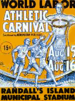 With regards to this post, reader ryan sent me this bit from NYU’s Robert F. Wagner Labor Archives about another labor-driven counter-olympics event. This one hosted by the Jewish Labor Committee in New York City as part of its anti-Nazi campaign:
“When the American Olympics Committee declined to heed widespread protests against United States participation in the Berlin Olympics of 1936, the [Jewish Labor Committee] held a World Labor Athletic Carnival (also known as the Counter-Olympics) at Randall’s Island in New York City during August 1936. Dozens of teams representing New York union locals competed, and the main events featured outstanding amateur athletes from across the country. Governor Herbert Lehman presented the prizes. The Carnival received extensive nationwide press coverage, and the JLC repeated the event in the summer of 1937.”
The site has a few images from the movement.
Workers of the World Play Ball
The International Institute of Social History in The Netherlands has a brief text, a few posters, and a couple of photos from the Labour Olympiads, an counterevent to the Olympics between World War I and II:
“In the twenties, the Olympic games got their counterpart within the labour movement. Labour Olympiads took place in Frankfurt, Vienna and Antwerp. Workers played soccer, practised gymnastics and ran for world peace instead of the national honour.
As a result of the struggle for the 8 hour working day, workers had time for sport. Already in the beginning of the 20th century workers participated in games with comrades in neighbouring countries. Massive labour sport unions were founded in Germany, Austria, Czechoslovakia, Belgium and France. They strove to educate workers both physically and spiritually.
The Labour Olympiads, organised by the Socialist Workers’ Sport International (SASI), fit well with these ideals. Against the normal Olympic games, marked as ‘a war between nations gained by sportive means’, stood the solidarity of comrades in sport. The labour sport unions disapproved of idols and records. At the labour games the anthem of the socialist international replaced the national anthem of the winning country. And only the red flag flew. Participation was more important than winning.”
Four Questions for Anarchist Art
by Josh MacPhee
From Perspectives in Anarchist Theory, Fall 2005.
 Anti-authoritarians have been extremely successful in using art and spectacle in recent years, whether to re-energize the protest movement in Seattle with both puppets and window smashing, or to fight dam construction in India with complex ceremonies and direct action theater. Historically, art has played an important role in revolutionary movements, and the Left has a long tradition of cultural resistance, particularly in the graphic arts. The graphics collective, Atelier Populaire played an integral role in the student-worker uprising in Paris in May 1968. Amilcar Cabral has written extensively on the central role of culture in the African liberation movements in the 60s and 70s.
Surprisingly most of this history seems lost to the Left itself, and we are far more likely to have a corporation mine our own visual history to create advertisements than to study and understand the history ourselves. Indeed, art and culture are rarely the focus of debate for anarchists and anti-authoritarians. As art has become increasingly rarefied in our society, and relegated to museums and expensive galleries, we have tended to spend decreasing amounts of time thinking about it. As a result, our definition of “Anarchist Art” is usually by default simply art created by an anarchist, whether it is a clip-art graphic, a heavy metal song, agit-prop street theater or an abstract painting.
Rather than being content with shallow, unconsidered or simply absent perspectives on art, I think it is extremely important that anarchists develop complex ideas about how art and culture operate in society, influence emotions and ideas, and are part of movements for social change.
Behind the Truck

Delivery truck today in NYC on 5th ave and 19th street.
Cut and Paint

Cut&Paint is a zine of stencil templates, ready to cut, ready to paint.
Volume two is in the works with a deadline for submissions on February 20, 2006. In addition to stencils, the issue will include a how-to section, photos of stencils on site, and articles on stenciling, public space, and politics. Check the submission criteria.
The first issue is nearly sold out of its run of 400 copies, so I helped the team post the stencils online. It’s a quick and basic site for now, but will evolve as we add more images. The first 41 stencils are up and ready for download at http://cutandpaint.org.
Prescriptions
Jakob Nielson notes this urgent usability upgrade in his January 23, 2006 email newsletter:
“Kudos to the U.S. Food and Drug Administration for a rare example of a government agency employing usability guidelines to save lives. The FDA has changed the rules for the “prescribing information” which is the leaflet that goes into medication packages. Now, the leaflets will place the information that patients and doctors need first, in a highlights section. Not exactly a new idea in usability, but in the past, these leaflets were dominated by useless warnings that served no practical use for the vast majority of readers; the first several pages of stuff didn’t do any good except act as a defense against predatory trial lawyers.
The new FDA rules state that, ‘Overwarning, just like underwarning, can similarly have a negative effect on patient safety.’ Exactly: if you bury useful info in masses of useless info, then users won’t see the truly important warnings.
Poor usability of drug information = dead patients.
The FDA has finally recognized the need to save lives by fighting back against the lawyers and writing drug info for users instead of courts. The new regulations explicitly prohibit several types of law suits where trial lawyers have harassed the medical system into making the prescribing information harder to understand.”
The rule had been under consideration by the FDA for more than five years — and is the first major change to drug labels in 25 years! For a more information, see the FDA press release or the NY Times article, New Drug Label Rule Is Intended to Reduce Medical Errors. New rules also affect drug advertising on TV and in print.
It’s the Politics, 2
The LA Times ran a great editorial last week in response to Bush’s State of the Union address. It chided him for hyping research, spending, and technology over policy and implementation.
“By and large, it isn’t a lack of technology that keeps the nation so dependent on oil. It’s the lack of will to use it.
Engineers have produced a basket of new technologies for making cars burn less gasoline, yet fuel standards for passenger cars in this country haven’t changed in more than two decades, and fuel economy has barely budged. Brazil has shown the way to energy independence by powering cars with ethanol made from sugar. This country, meanwhile, continues to pour billions of dollars in subsidies into producing ethanol less efficiently from corn. Advances in solar energy have made it less expensive and more reliable, yet only California is making a significant bid to exploit the power of the sun....
Technologies that could make the U.S. more energy independent sit on the shelf while the automotive industry dithers about raising the price of a car by a couple of thousand dollars (money that could largely be recouped in savings on gasoline) to raise gas mileage by about 20 miles per gallon. Bush also talked about investing in zero-emissions coal plants. Yet, after a former EPA administrator said the technology existed to reduce mercury pollution at coal-fired plants by 90% within a few years, the Bush administration issued far weaker regulations.
The energy legislation passed last year provides individual homeowners with tax incentives to install solar energy units, but it does nothing to lure builders into solar, which would have a far greater effect.
How about importing ethanol from Brazil to put more fuel-efficient cars on the road now? That would mean dropping tariffs and ending protectionism for U.S. corn growers.”
I tried to make a similar point here a few months ago, though was not as eloquent.
Contextual Advertising, Redux
 Reader Ravenmn writes:
“Your item about the bad ad placement in Germany reminds me of an experience I had as a typesetter at the Minnesota Daily, the student newspaper of the University of Minnesota. In April of 1980, nobody noticed that the Army Helicopter Pilot Training ROTC ad was running on the same page as the story of the failed helicopter rescue attempt Jimmy Carter sent to Iran during the hostage crisis, complete with photo of mangled helicopters in the desert. ROTC got a couple of free ads out of it, if I recall correctly.”
I found the photo on http://remember.gov, the Web site White House Commission on Remembrance, your official source for state-sponsored memory.

