May 2007
Kremlin, Inc.. “There is no censorship — it’s much more advanced. I would call it a system of contacts and agreements between the Kremlin and the heads of television networks. There is no need to start every day with instructions. It is all done with winks and nods. They meet at the end of the week, and the problem, for TV and even in the printed press, is that self-censorship is worse than any other kind. Journalists know — they can feel — what is allowed and what is not.” Boy does that sound familiar.
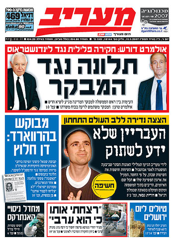
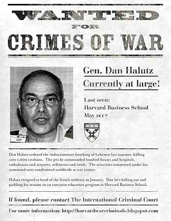
A flyer I designed appears on the front page of today’s edition of the Ma’ariv, the second largest newspaper in Israel.

Here’s a close up:

The flyer is for a campaign by Alliance for Justice in the Middle East, a student group at Harvard University.
The text calls attention to the enrollment of former Israeli general Dan Halutz in the Advanced Management Program at Harvard Business School. Halutz oversaw the bombing of Lebanon in the summer of 2006. See his dossier here.
And he’s not the first accused war criminal enrolled by Harvard. See a short list of bios on the AJME site. The AJME is campaigning to establish a set of practices to screen for war criminals and serious human rights abusers as part of its admissions and hiring policies.
The campaign was relatively modest to achieve such front page coverage. The group set up a free web site on blogspot. They printed up the flyer and handed it out on campus. They also sent out a press release about the campaign, which resulted in front page coverage.
Here’s the full article in Hebrew on the Ma’ariv web site and AJME’s English translation of it.
Click below for a larger version of the flyer:

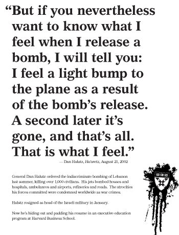
For contrast, see another iteration below. I think it’s a little more evocative, but maybe less direct.

Update: The flyer is featured online at Time and Al Jazeera. See other coverage of the campaign.
Architecture students build 'hub' for disaster relief. “The prototype, called a ‘clean hub,’ is made from an old, 20-foot-long storage container and houses a bathroom complete with a composting toilet and a solar shower, a 4,400-gallon water tank, a foot pump-powered sink, and water collection and filtration systems. Running on two solar panels and a 1500-watt battery, the hub also provides sufficient electricity to power itself, with enough left over to run a small appliance, such as a laptop.
‘It’s completely off-grid.... If you look at the cost of a FEMA trailer, it’s ridiculously expensive and has a very short lifetime.... This is something that can provide a lot of the things a FEMA trailer doesn’t, like power and self-contained sanitation, and be substantially cheaper.’”
For more about the project see articles on
Minnesota Public Radio,
Shelter Architecture, and the
Activist Architect blog.
(Thanks, ravenmn!)
What Makes a Place Great?. “Over the past 30 years Project for Public Spaces has evaluated more than 1,000 public spaces, and informally investigated tens of thousands more. From all this we have discovered that most great places—whether a grand downtown plaza or humble neighborhood park—share four key qualities....”
Design for the Other 90%. Opening at the Cooper-Hewitt, this exhibition features “30 humanitarian design projects, all addressing basic needs in the areas of shelter, health, water, education, energy and transport.” The focus on economical, “low-tech” projects addressing such fundamental needs is a (self-consciously) stark contrast to the ultra-techy buzz fest of the recent design Triennial (though the
One Laptop per Child appears in the current show.) So does this mark a fundamental shift in priorities? Will the values expressed here affect the way the Cooper-Hewitt evaluates design? From here it seems more like more a cabinet of curiosities than a paradigm shift. I’m also wary of how “The Other” is addressed, but see for yourself: a slideshow of a
few examples.
Update: Mark Vallen has a
critical writeup here. The
exhibition site is up now, too.
On to June.
Back to April.
