September 2004
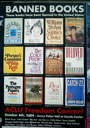
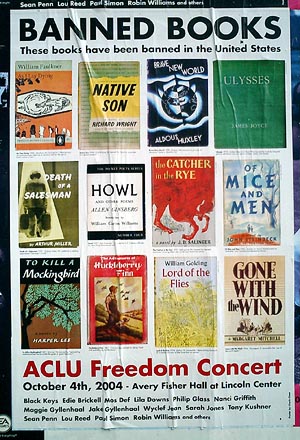
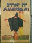
Banned in the U.S.A.
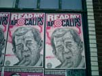
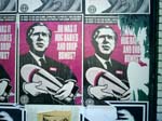
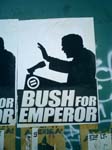
Classic book cover design on display in the streets in New York City.
The posters were designed by the artist Chuck Close. You can download high resolution PDFs here and here.
See the American Library Association’s list of 100 most frequently banned books.
Read more about Banned Books campaigns by the ACLU and the ALA, and about the ACLU’s concert event.
Design and the Federal Government
by Neil Kleinman, from Print, July/August 1973:
“Some events attract us because they promise so much of what we want, while making it all seem relatively easy to get. We would like to live in buildings that do not breed slums we would like to live in cities that have parks, promenades, and quiet open spaces; we would like to read forms, applications and booklets regulations and be able to make sense of them. We would like to drive down roads and know where we are, where we are going, and where to turn off. Such needs seem reasonable.
To most of us, it has been clear that the general performance of the government in these areas of design, architecture and planning has been unsatisfactory. Each of us can think of his own favorite monstrosity. Some of the things designed by the federal government, like the income tax forms or the brochures explaining Social Security benefits, simply baffle us. Some of them, like the Sam Rayburn building, are so ugly that they have achieved an almost mythic universality virtually becoming archetypes for what ugly is.
The First Federal Design Assembly held in Washington last April 2nd and 3rd [1973] was an attempt to set some of these federal sins aright... The purpose of the Assembly was to begin the process of showing federal administrators that ‘good design is good government’ — a rather pleasant truism if a bit unsettling in these times of political PR and managed news.”
Manifesto del Sindicato de Obreros Tecnicos, Pintores y Escultores, 1922
Manifesto issued by the Union of Technical Workers, Painters, and Sculptors, 1922
“Social, Political, and Aesthetic Declaration from the Union of Technical Workers, Painters, and Sculptors to the indigenous races humiliated through centuries; to the soldiers converted into hangmen by their chiefs; to the workers and peasants who are oppressed by the rich; and to the intellectuals who are not servile to the bourgeoisie:
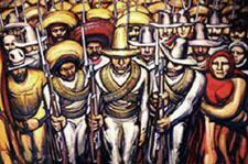 We are with those who seek to overthrow of an old and inhuman system within which you, worker of the soil, produce riches for the overseer and politician, while you starve. Within which you, worker in the city, move the wheels of industries, weave the cloth, and create with your hands the modern comforts enjoyed by the parasites and prostitutes, while your own body is numb and cold. Within which you, Indian soldier, heroically abandon your land and give your life in the eternal hope of liberating your race from the degradations and misery of centuries.
Not only the noble labor but even the smallest manifestations of the material and spiritual vitality of our race spring from our native midst. Its admirable, exceptional, and peculiar ability to create beauty — the art of the Mexican people — is the highest and greatest spiritual expression of the world-tradition which constitutes our most valued heritage. It is great because it surges from the people; it is collective, and our own aesthetic aim is to socialize artistic expression, to destroy bourgeois individualism.
We repudiate the so-called easel art and all such art which springs from ultra-intellectual circles, for it is essentially aristocratic.
We hail the monumental expression of art because such art is public property.
We proclaim that this being the moment of social transformation from a decrepit to a new order, the makers of beauty must invest their greatest efforts in the aim of materializing an art valuable to the people, and our supreme objective in art, which is today an expression for individual pleasure, is to create beauty for all, beauty that enlightens and stirs to struggle.”
David Siqueiros, et al., originally published as a broadside in Mexico City, 1922. Published again in El Machete, no. 7 (Barcelona, June 1924).
English translation from Laurence E. Schmeckebier Modern Mexican Art (Minneapolis: University of Minnesota, 1939), p. 31.
Richard Nixon, Art Director
“There should be no doubt that the federal government has an appropriate role to play in encouraging better design.” [source]
— President Nixon in his “Federal Design Improvement Message,” delivered at the first Federal Design Assembly in 1973, The Design Necessity.
The 1970’s saw a number of seminal graphic design projects sponsored by the U.S. government: Massimo Vignelli’s graphic standards for the National Park Service; Danne & Blackburn’s NASA “worm” logo; and Chermayeff and Geismar’s logos for the Park Service, Environmental Protection Agency, the National Aquarium, and U.S. Bicentennial, as well as traveling exhibits for the Smithsonian and Library of Congress.
Trying to find out why, I found this:
184 Memorandum About the Federal Government and the Arts. May 26, 1971
“To the Heads of Departments and Agencies:
 Americans in all walks of life are becoming increasingly aware of the importance of the arts as a key factor in the quality of the Nation’s life, and of their individual lives—whether in terms of the availability of great cultural resources, the accessibility of exhibits and performances, or simply the aesthetic enjoyment of good design.
As you know, direct Federal assistance to the arts is being sharply increased, and I have asked the Congress for full funding of the budget authorizations for the National Endowments for the Arts and the Humanities for fiscal 1972 — which would roughly double their present funding levels, and raise them to more than three times what they were just two years ago. But the Endowment programs are by no means the only Federal programs that affect, employ or contribute to the arts. In architecture, graphics, school programs, and many other activities, Federal agencies are daily involved deeply with the arts in one form or another.
It is my urgent desire that the growing partnership between Government and the arts continue to be developed to the benefit of both, and more particularly to the benefit of the people of America.
To contribute to this development, I ask each of you to direct your attention to two questions: first, how, as a part of its various programs, your agency can most vigorously assist the arts and artists; second, and perhaps more important, how the arts and artists can be of help to your agency and to its programs.
By focusing consciously, creatively and in a concerted way on these two questions, I believe that we all can find that the arts have a great deal more to contribute to what we in government are seeking to accomplish—and that this will be good for the arts and good for the country.
I am asking Nancy Hanks, Chairman of the National Endowment for the Arts, to coordinate responses on this, and I would appreciate your letting her know by September 20, what ideas and suggestions you may have, and also what new actions your agency may already be taking toward this same objective.”
— President Richard M. Nixon
More, from a Chronology of the NEA (1.9Mb PDF):
“President Nixon, acting on the responses to the 1971 survey of Federal agencies and executive departments and on the advice of the National Council on the Arts, announces government initiatives in design. The Arts Endowment is the lead agency for the Federal Design Improvement Program, to help upgrade Federal architecture, design and graphics.”
Republicans funding the arts? Astonishing! After all, in the 80’s it was Reagan and Co. who cut arts funding and waged their culture war against “indecent” public art.
So then why? Was it a public relations move? If it was, it would not have been very necessary. Despite public opposition to the war in Southeast Asia, Nixon was comfortably in the lead heading into the 1972 election — an election he won won by a landslide. The Pentagon papers were published a month after the memo in June 1971. And the Watergate burglary took place a year later in June 1972.
What’s the deal?
See this related post from February 2004 about public arts funding in the 1960’s and 70’s.
Free as in Voice Mail
Here’s a happy story of humanitarian gadgetry. From CNN:
Free voice mail helps the homeless
“The nonprofit Community Voice Mail project provides homeless people with a way for potential employers, social service agencies and relatives to contact them. It also enables them to apply for a job without having to tell a prospective employer they are living on the streets....
Hilary Terlouw, a 45-year-old woman from Bellingham, Washington, said she was living in an abandoned trailer with no electricity when she learned about Community Voice Mail three summers ago. She lives in subsidized low-income housing and has a service dog and even a computer, she said.
‘It just saved my life,’ said Terlouw, who battles mental illnesses and physical disabilities. ‘It really did. If I didn’t have a telephone number to have doctors’ offices or clinics call me back, I don’t know what I would have done. I was truly at the end of my rope at that time.’...
Larry Sykes, Community Voice Mail director at The Stewpot, which hopes to offer more than 2,500 voice mail lines in Dallas within three years, [notes] ‘Unless they tell somebody they’re eating at The Stewpot or sleeping under a bridge, nobody knows it.’”
RNC Recap
A friend has graciously permitted me to post his recap of RNC week:
“My dears Al and Mrs. S., ever the social workers, were eager to join me on Friday night’s Critical Mass bike ride. At Union Square, several of the farm vendors decided, perhaps in leu of the overwhelming crowds, to give away their end-of-day produce and baked goods. So, as the numbers of cyclists grew exponentially, we enjoyed watching the kids, who looked more at home on an Earth First commune than in front of Republic, as they heartily chomped on the raw sweet corn and warily sniffed the fresh muffins for signs of dairy.
As we peddled off (reminding me of the gnarled-metal cycle-density of Shanghai biking), we received applause from plenty of 14th street bystanders. By the time we got to Houston, the sun had set, and the bike ranks had ribboned along Broadway so we had to be wary of cabs darting past and around us. But as we began to again amass up Sixth Ave, tensions (which i’ve known too well as an ACT UP marshall for so many years) from snarled and snarling motorists inconvenienced by the rally grew ugly. Clearly, no police arrangements had been made, making this a potentially dangerous action, further worsened by inexperienced young cyclists who were aggressively flinging their bikes (and only pair of legs) into the paths of vehicles. Enraged drivers bolted out of their vehicles, one block after another, and we elders intervened in several separate potentially violent confrontations. Fortunately serious violence was assuaged, but not without seeing the cyclists, in a number of incidents, being uglier and more aggressive than the SUV drivers. By the time we got to 23rd street, the random arrests had begun. The event had successfully vilified cyclists to many drivers and police
I missed NOW’s CODE RED March over the Bridge — the photos of my beloveds, the CHURCH LADIES FOR CHOICE looked great. I made it to City Hall for the end of the Rally; the most stunning rally sound-bite take-away for me was learning that 40 million women who were eligible to vote in 2000 didn’t.
As the NYC Sanitation trucks moved in, i could not fathom why the organizers didn’t insist that the many, many thousands of people at the rally take the many thousands of expensive printed protests signs, fold them into their bags and make damn sure they were visible up all over town the entire week, and in windows through November.
Saturday evening brought thousands of bells and their owners to “the socket” and the utter bewilderment of puzzled Ground Zero pilgrim/tourists and vendors [photos]. The Calatrava “temporary” entrance to the PATH trains became a pagoda for the bells, where volunteers gave us programs that looked like LIRR train schedules. intending to ‘orchestrate’ the event, with the occasional hissing of Buddhists who were angered by gentle nearby conversation, created a soundscape only defiled later by a guy who worked the city the whole week with a big Freddy Phelps-like scroll of a sign quoting some scripture confirming why we must vote for Bush. Upon his arrival, the press was no longer interested in Pauline Oliveros’s ambitious memorial: the jingle bells, Tibetan bells chimes, and at least one industrial lampshade being thumped like a muffled gong.
The THOUSAND COFFINS affinity group at the big march was in need of help. So we helped, finishing a few pre-fab die-cut cardboard coffins, draping them with flags (black bunting for unknown soldiers), then committing to the intense heat of the next six hours. It doesn’t take much crowd-estimation expertise to conclude that a mere 100,000 people would have taken over six hours to march the 42 block route. I yearned for a rally, chock-full of speakers (many with issues that, while unrelated to the war, would still not be even voiced if the Republicans had their way), But the gigantic rally was amazing, in it’s disjointed groups; and you couldn’t help but marvel at the thoughtully engineered, underestimated march attendee counts from the press ‘n’ state.. But silently walking the coffins was a meditative way to participate. No Central Park picnic for our procession, we got to Union Square around 6 p.m., quietly dissembling the coffins and folding the flags, looking more saddened than defiant.
Although looking out my window Tuesday night I couldn’t tell if anyone else intentionally illuminated their windows, I struggled to sleep under a “What’s My Line” airline sleep-visor in my brilliantly illuminated bedroom. I had dutifully followed Milton Glaser’s request and put a ‘light’ in my window. Having recently acquired one of the ubiquitous rainbow WE THE PEOPLE flags, I taped it up in my window over Broadway, with my art projector aimed at it all night : Spent Nuclear Fuel Rods for Peace...
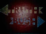
Throughout the week, every time i ventured outside, i wore a 8.5” x 11” repro of the great Plaza Hotel TRUTH -> <- BUSH banner mounted to foamcore and gold cord around my neck. I tended to avoid eye contact and wore a tie most days. Many people approached me all week, as inspired by the banner as i was.
Due to a work commitment, on Thursday, I was on the uptown (2) train pretty-much directly under Madison Square Garden while W was speaking: after all the overtime, there was zero security on the subway or platforms; people on the train laughing — having clearly just heard or participated in shouting “FUGEDDABOUTIT!” as Al Franken had proposed.
Friday morning, off to the GM building plaza, with an enlarged poster of the great Plaza TRUTH -> <- BUSH banner. CNN was interviewing what appeared to be high-school boys in tee shirts with “one-eyed pirates” for a liquor company. As i was manhandled off the property, they kept growling “No politics HERE, No politics HERE.” And I foolishly shrieked about how having young kids advertising booze was Highly Political.
During the week, the event that got the least press was the media march from the CBS building to FOX [photos]. I printed out a long tall (conventioneer’s) sign that read BAN 527’s / BEGIN WITH FOX. People laughed, but it was too cryptic to make the evening news. In fact, the only press i saw for the event was of Miss Understood and Lady Bunny who stormed the rally in Grand Drag... good for them! Motherfuckers.
Then, in a blink of the shutter, the RNC circus left town.
Jamie Leo, reporting.”
Dear John...
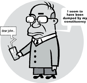
A collective of communication designers in Melbourne, Australia are working to defeat the current conservative government of Prime Minister John Howard.
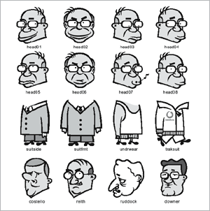
The site dearjohn.org targets the youth vote, inviting them to download free T-shirt transfers, screen savers, badges, posters, and stickers.
Although united by a common agenda to defeat Howard, the designers do not highlight a specific issue or push an alternative party to vote for. This is left for the audience to fill in blanks.
Literally. In addition to readymade downloads, the site hosts a variety of do-it-yourself materials, including instructions on making your own collage posters or gaffers tape T-shirts, and downloadable political clipart and “dingbats” — image fragments and caricatures you can use to assemble your political messages and media.
If You Build It
jude sent me this link a while back. The page is part of a Frontline documentary on the life and death of “maverick humanitarian aid expert” Fred Cuny:
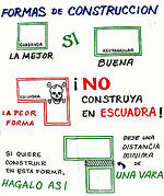
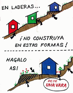
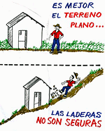
“These ‘Housing Pictographs’ are another example of how Fred Cuny was always looking for ways to use a calamity as a catalyst to improve people’s lives.
After Guatemala’s 1976 earthquake, Cuny went to the devastated central highlands to see what he could do. Working with two organizations, OxFam (U.K.) and World Neighbors, he posed a key question to both the NGO staff and the peasants whose adobe homes had been reduced to rubble:
‘How do you make safe a poor person’s house in the rural countryside?’
Fred set out to improve the design and construction of the local housing as it was about to be rebuilt. Mary McKay, the head of the World Neighbor’s Housing Education Office in Guatemala, explained to FRONTLINE how the new building program worked. The ideas were all Fred’s, she said, but ‘the local builders took those ideas and figured out what you actually did when you are out there with a hammer in your hand. Fred wasn’t a mason or a carpenter,’ but he could talk with those who were, and he loved doing that ‘especially with the guys in the sandals who really did the work.’
Cuny would draw pictures which a World Neighbor’s staff member then turned into artwork. The drawings then were silk-screened onto the backs of empty flour sacks, stitched together, rolled up and put on the back of a master carpenter’s moped. The skilled craftsmen, who had worked with Fred in developing these new building techniques, would then drive from village to village throughout the region using the ‘flip charts’ to spread the word.
Although many of those master carpenters were later killed or fled Guatemala as a result of the government’s crack down on people they thought might challenge their authority, many of the houses using Fred Cuny’s techniques are still standing. Guatemala has not yet suffered another earthquake the magnitude of the 1976 quake.”
The project sounds like a great example of design in the public interest, a low-tech, simple way to improve people’s lives for years to come — and a small note of hope within the brutality of the U.S.-backed military dictatorship.
But that last sentence is chilling. Particularly, within the context of the page’s patronizing tone.
Were the carpenters targeted because of their work with Cuny and the World Neighbors NGO?
One friend who works on Guatemala tells me:
“Often local ‘authorities’ (including non-elected community leaders) used the conflict as an excuse to settle scores. So maybe [the carpenters] were gaining too much authority in the community, and then were taken out by local thugs who may have been connected to the government, but were acting on their own in this. Or not. Hard to tell.”
Another tells me:
“One category of people who were killed are those who worked with foreigners.”
From here it’s hard to know exactly why the carpenters were killed, but it seems possibile that they were indeed a casualty of the naivete of humanitarian intervention that attempts to remain neutral or indifferent to the complexity of local political relationships and history.
Don’t Let the Door Hit You On the Way Out
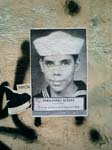
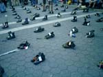
The convention is over, but the traces remain — the stories emerge and the protests continue.
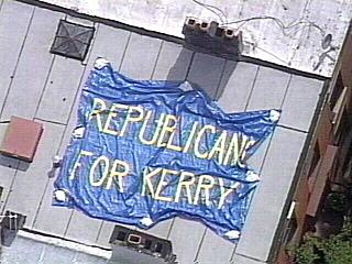
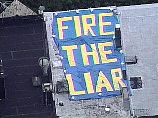
Click on an image below to view a larger version.
On the Inside
Via Reuters:
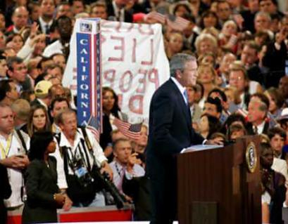
“A protest sign is held up behind U.S. President George W. Bush as he delivers his speech to the delegation during the final night of the 2004 Republican National Convention at Madison Square Garden in New York City on September 2, 2004. The protester was removed from the convention hall by authorities. Photo by Rick Wilking/Reuters”


