war
I Heart Iraq
While the New York Times generally doesn’t publish pictures of U.S. casualties in its own reporting, it can publish them when the photos themselves are the story (particularly on a Saturday.) The commander of the U.S. Marines in Iraq is seeking to bar photographer Zoriah Miller from all U.S. military facilities around the world for publishing photos on his web site of U.S. Marines (oh, and Iraqi civilians) killed in a June 26, 2008 suicide attack in Garma, Iraq. “Disembedding” journalists and otherwise “managing” them for publishing unfavorable coverage is nothing new. The Committee to Protect Journalists has chronicled ongoing harassment and deaths of journalists in Iraq and BAGnewsNotes has done an excellent job of unpacking the photographs that do make it out.
Looking into Miller’s own portfolio site this image caught my attention:
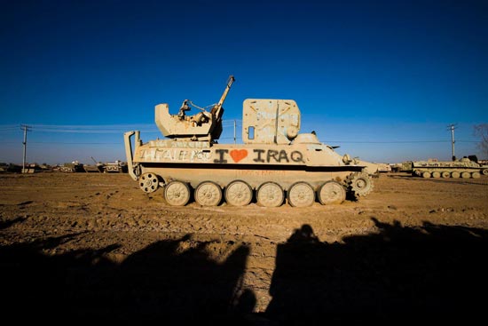
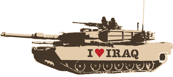
It has a Banksy-like irony to it: juxtaposing tools of authoritarian force with the values they are rhetorically professed to deliver — and with a faint whiff of commercialism. The vehicle above is a Iraqi Soviet-model MT-LB multi-purpose armored personnel carrier, most likely tagged, I suspect, by a U.S. soldier. But paint that slogan on an U.S. Abrams, and it makes a good stencil idea. Click below to download a PDF.
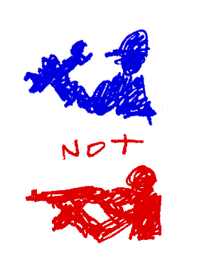
Work! Not War!
Mission Accomplished
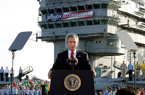
The May 2003 image of President Bush on the deck of the aircraft carrier in front of the “Mission Accomplished” banner is, I think, one of the more memorable images from the war in Iraq. Primarily, of course, because no weapons of mass destruction were ever found (our mission, right?), the war rages on and US and Iraqi lives continue to be lost. Every day.
But there’s another story behind the image and Bush’s statement about the end of “major combat operations in Iraq.”
Below, a quote from Philip Gourevitch in conversation with Errol Morris at the 2007 New Yorker festival:
“One of the legal fictions of this period, you may think that the May 1st declaration by the President on the aircraft carrier that major combat operations had ended was merely a campaign period photo op. But in fact, it’s a redefinition of the theater of war.
During a war, you’re fighting against an enemy power and if you capture their people they’re enemy POWs and there are all kinds of rules that apply, but they’re never going to be charged with a crime. They’re simply treated as enemy combatants, enemy assets that you’re neutralizing, you remove them to the rear and as soon as combat’s over you release them. And believe it or not, May 1 of 2003 a lot of them were released. And a lot of them were kept as ‘security detainees,’ this fictitious word for prisoners. It’s a euphemism.
And the reason they were able to keep them in Abu Ghraib was because, of course, you can’t have a combat zone in a non-combat zone. And you can’t have enemy prisoners of war to whom you apply prisoner of war doctrine in a place where there is no enemy power and where there is no alternate army. So you can’t say to whom they belong and so they must be ‘insurgents.’ Insurgents against what? There isn’t an Iraqi government. So it’s a very complicated legal status, and its these loopholes that are being exploited for simply rounding people up and tossing them in there.”
And Abu Ghraib is, of course, where some of those other memorable photos were taken.
Art Workers’ Coalition
From Wikipedia:
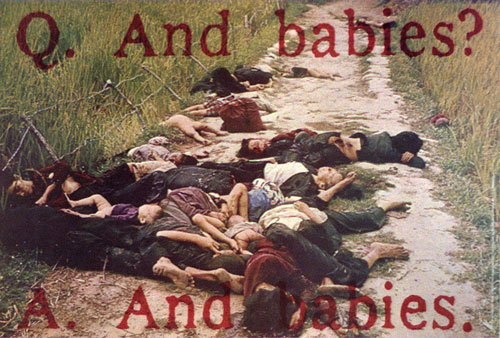
“The Art Workers’ Coalition (AWC) was an open coalition of artists, filmmakers, writers, critics, and museum staff that formed in New York City in January 1969. Its principal aim was to pressure the city’s museums – notably the Museum of Modern Art – into implementing various reforms. These included a more open and less exclusive exhibition policy concerning the artists they exhibited and promoted: the absence of women artists and artists of color was a principal issue of contention; free public access: the coalition successfully pressured the MoMA and other museums into implementing a free admission day that still exists to this day. It also pressured and picketed museums into taking a moral stance on the Vietnam War which resulted in its famous My Lai poster, one of the most important works of political art of the early 1970s. The poster was displayed during demonstrations in front of Pablo Picasso’s Guernica at the MoMA in 1970.”
From Victor Margolin, “Rebellion, Reform, and Revolution: American Graphic Design for Social Change:”
“The Museum of Modem Art had promised to help distribute the poster but the trustees withdrew the agreement, going against the wishes of the staff. Member of the Art Workers’ Coalition picketed the museum in protest and stamped some of the 50,000 copies they distributed with the message, ‘This poster was originally co-sponsored by the Museum of Modem Art. On December 18, 1969, trustee William S. Paley forbad the museum to associate its name with it.’”
War
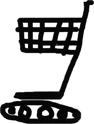
By Polish poster designer Paweł Synowiec. I found this on Flickr while searching for something else. It stopped me cold.
Knit-in for Peace
On March 19, the Granny Peace Brigade met in the rain in front of the military recruiting station in Times Square to mark the 5th anniversary of the U.S. invasion of Iraq, “knitting ‘stump socks’ for amputee veterans, baby blankets and other items for Iraqi families.” There were a lot of great protest actions Wednesday, but the forceful assertion of care here is striking. Grannies vs. generals; slow, manual creation vs. fast, technological destruction — this is not just non-violence, but perhaps an opposite of violence. Here’s another short video.
Every Wednesday from 4:30 to 5:30 pm Grandmothers Against the War holds a vigil at Rockefeller Center. All are welcome.
Sloganeering
A year ago, I received an email from “Tony:”
“I have looked all over the web, and just can’t find the simple themes that can be posted to the back of poster board or foam board and used at street vigils. I just need simple stuff for 11 by 17 AND 8 1/2 BY 11 COPYING.
Can you help? The power of one or two people in public holding simple antiwar protest messages is great. I just can’t find anything on the net that isn’t too artsy-fartsy, or too damn pacifist-wimpy.”
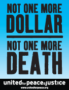
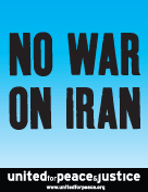
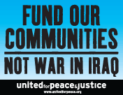
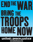
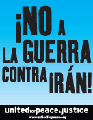
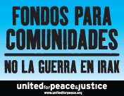
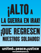
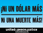
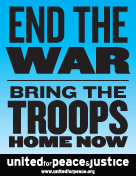
I smacked into this “artsy-fartsy” factor again a few weeks ago when United for Peace and Justice asked if I could turn out some poster designs on short notice. They sent their final copy and I set to thinking about how to represent things iconographically in a beautiful, compelling way. I rummaged through the usual toolbox (coffins, dollars, boots, ribbons, etc.) as well as play with color and typographic notes (big X’s, oversized punctuation, etc.) One slogan in particular raised an interesting problem: how to graphically represent “community” for marches in eleven very different cities.
Nevertheless, over the weekend’s iteration the org requested the gradual removal of all imagery, iconography, and embellishment. I was trying to do something graphically interesting to myself, but the group had a very specific use case in mind. The posters were not intended for pasting on the street, to attract passersby with flourish, humor, or imagery. They wanted something to be carried high and read from a distance, particularly when reproduced in photos, newspaper clippings, or seconds-long TV news highlights. As such, these were props to represent the march in memory as much as in person, to disappear and punch the message through network editing and newspaper cropping. The simpler and bolder the better.
With a little more time I would have refined these further, but here are the results below. Click on a thumbnail to download a printable PDF.
