war
Commodify Your Dissent
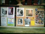
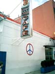
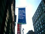
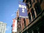
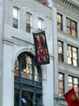
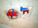
Walking around downtown, I’m noticing a number of businesses flaunting their politics. Below are a few random snapshots.
In New York City, where registered Democrats outnumber registered Republicans by 5 to 1 it probably does not harm your business much to wave a Democratic flag.
But what’s notable is that these banners do not seem to be branding or trying to create a niche. I don’t think these businesses are trying to position themselves as responsible corporate citizens. It seems more like someone wearing a political pin, though for each the context is a bit different.
Click on a thumbnail to view a larger image.
On a related note, a year ago a handful of lefty bloggers were abuzz about this:
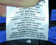
a label from a bag designed by Tom Bihn, an American company located in Port Angeles, Washington. The French repeats the English care and handling instructions, with an additional two lines:
Wash with warm water.
Use mild soap.
Dry flat.
Do not use bleach.
Do not dry in the dryer.
Do not iron.
We are sorry that Our President is an idiot.
We did not vote for him.
Few bloggers followed up to point out that the grassroots buzz actually produced record sales for the company.
From AFP, April 26, 2003:
Handbags insulting “president” in French sell like hot cakes in US
“There is no doubt that sales are hot for handbags bearing an insult — in French — aimed at ‘our president.’ The question is: Which president?
The bag’s designer Tom Bihn never guessed that purses with the message, ‘We’re sorry our president is an idiot. We didn’t vote for him’ — inscribed in French — would be blowing out of the stores.
‘It is a mystery, but since we launched the bags with the label sewn, sales have doubled,’ said Bihn, 43. ‘It is a record in the history of the company.’
He denies the message is targeting US President George W. Bush.
‘It depends on either your nationality, or the president you think is an idiot; you choose.’
Clients throughout the United States have flooded his offices in Seattle and Port Angeles with calls and e-mails to order for the bags, he said.
The company received ‘varied reactions’ including ‘hate mail from a French citizen who thought the label was addressed to (French President) Jacques Chirac.’
But 80 percent of the Americans think it is an amusing message, he said.
On his company’s website, he said: ‘Everyone seems to have a ‘president’ that they think is an idiot. Take your pick: Jacques Chirac, Bill Clinton, George Bush.’
Neither Bihn nor his 10 employees have yet taken the situation seriously, but have launched a series of T-shirts, selling at 20 dollars each, with the same message, with funds to go to a war veterans’ center in Seattle.”
Richard Nixon, Art Director
“There should be no doubt that the federal government has an appropriate role to play in encouraging better design.” [source]
— President Nixon in his “Federal Design Improvement Message,” delivered at the first Federal Design Assembly in 1973, The Design Necessity.
The 1970’s saw a number of seminal graphic design projects sponsored by the U.S. government: Massimo Vignelli’s graphic standards for the National Park Service; Danne & Blackburn’s NASA “worm” logo; and Chermayeff and Geismar’s logos for the Park Service, Environmental Protection Agency, the National Aquarium, and U.S. Bicentennial, as well as traveling exhibits for the Smithsonian and Library of Congress.
Trying to find out why, I found this:
184 Memorandum About the Federal Government and the Arts. May 26, 1971
“To the Heads of Departments and Agencies:
 Americans in all walks of life are becoming increasingly aware of the importance of the arts as a key factor in the quality of the Nation’s life, and of their individual lives—whether in terms of the availability of great cultural resources, the accessibility of exhibits and performances, or simply the aesthetic enjoyment of good design.
As you know, direct Federal assistance to the arts is being sharply increased, and I have asked the Congress for full funding of the budget authorizations for the National Endowments for the Arts and the Humanities for fiscal 1972 — which would roughly double their present funding levels, and raise them to more than three times what they were just two years ago. But the Endowment programs are by no means the only Federal programs that affect, employ or contribute to the arts. In architecture, graphics, school programs, and many other activities, Federal agencies are daily involved deeply with the arts in one form or another.
It is my urgent desire that the growing partnership between Government and the arts continue to be developed to the benefit of both, and more particularly to the benefit of the people of America.
To contribute to this development, I ask each of you to direct your attention to two questions: first, how, as a part of its various programs, your agency can most vigorously assist the arts and artists; second, and perhaps more important, how the arts and artists can be of help to your agency and to its programs.
By focusing consciously, creatively and in a concerted way on these two questions, I believe that we all can find that the arts have a great deal more to contribute to what we in government are seeking to accomplish—and that this will be good for the arts and good for the country.
I am asking Nancy Hanks, Chairman of the National Endowment for the Arts, to coordinate responses on this, and I would appreciate your letting her know by September 20, what ideas and suggestions you may have, and also what new actions your agency may already be taking toward this same objective.”
— President Richard M. Nixon
More, from a Chronology of the NEA (1.9Mb PDF):
“President Nixon, acting on the responses to the 1971 survey of Federal agencies and executive departments and on the advice of the National Council on the Arts, announces government initiatives in design. The Arts Endowment is the lead agency for the Federal Design Improvement Program, to help upgrade Federal architecture, design and graphics.”
Republicans funding the arts? Astonishing! After all, in the 80’s it was Reagan and Co. who cut arts funding and waged their culture war against “indecent” public art.
So then why? Was it a public relations move? If it was, it would not have been very necessary. Despite public opposition to the war in Southeast Asia, Nixon was comfortably in the lead heading into the 1972 election — an election he won won by a landslide. The Pentagon papers were published a month after the memo in June 1971. And the Watergate burglary took place a year later in June 1972.
What’s the deal?
See this related post from February 2004 about public arts funding in the 1960’s and 70’s.
RNC Recap
A friend has graciously permitted me to post his recap of RNC week:
“My dears Al and Mrs. S., ever the social workers, were eager to join me on Friday night’s Critical Mass bike ride. At Union Square, several of the farm vendors decided, perhaps in leu of the overwhelming crowds, to give away their end-of-day produce and baked goods. So, as the numbers of cyclists grew exponentially, we enjoyed watching the kids, who looked more at home on an Earth First commune than in front of Republic, as they heartily chomped on the raw sweet corn and warily sniffed the fresh muffins for signs of dairy.
As we peddled off (reminding me of the gnarled-metal cycle-density of Shanghai biking), we received applause from plenty of 14th street bystanders. By the time we got to Houston, the sun had set, and the bike ranks had ribboned along Broadway so we had to be wary of cabs darting past and around us. But as we began to again amass up Sixth Ave, tensions (which i’ve known too well as an ACT UP marshall for so many years) from snarled and snarling motorists inconvenienced by the rally grew ugly. Clearly, no police arrangements had been made, making this a potentially dangerous action, further worsened by inexperienced young cyclists who were aggressively flinging their bikes (and only pair of legs) into the paths of vehicles. Enraged drivers bolted out of their vehicles, one block after another, and we elders intervened in several separate potentially violent confrontations. Fortunately serious violence was assuaged, but not without seeing the cyclists, in a number of incidents, being uglier and more aggressive than the SUV drivers. By the time we got to 23rd street, the random arrests had begun. The event had successfully vilified cyclists to many drivers and police
I missed NOW’s CODE RED March over the Bridge — the photos of my beloveds, the CHURCH LADIES FOR CHOICE looked great. I made it to City Hall for the end of the Rally; the most stunning rally sound-bite take-away for me was learning that 40 million women who were eligible to vote in 2000 didn’t.
As the NYC Sanitation trucks moved in, i could not fathom why the organizers didn’t insist that the many, many thousands of people at the rally take the many thousands of expensive printed protests signs, fold them into their bags and make damn sure they were visible up all over town the entire week, and in windows through November.
Saturday evening brought thousands of bells and their owners to “the socket” and the utter bewilderment of puzzled Ground Zero pilgrim/tourists and vendors [photos]. The Calatrava “temporary” entrance to the PATH trains became a pagoda for the bells, where volunteers gave us programs that looked like LIRR train schedules. intending to ‘orchestrate’ the event, with the occasional hissing of Buddhists who were angered by gentle nearby conversation, created a soundscape only defiled later by a guy who worked the city the whole week with a big Freddy Phelps-like scroll of a sign quoting some scripture confirming why we must vote for Bush. Upon his arrival, the press was no longer interested in Pauline Oliveros’s ambitious memorial: the jingle bells, Tibetan bells chimes, and at least one industrial lampshade being thumped like a muffled gong.
The THOUSAND COFFINS affinity group at the big march was in need of help. So we helped, finishing a few pre-fab die-cut cardboard coffins, draping them with flags (black bunting for unknown soldiers), then committing to the intense heat of the next six hours. It doesn’t take much crowd-estimation expertise to conclude that a mere 100,000 people would have taken over six hours to march the 42 block route. I yearned for a rally, chock-full of speakers (many with issues that, while unrelated to the war, would still not be even voiced if the Republicans had their way), But the gigantic rally was amazing, in it’s disjointed groups; and you couldn’t help but marvel at the thoughtully engineered, underestimated march attendee counts from the press ‘n’ state.. But silently walking the coffins was a meditative way to participate. No Central Park picnic for our procession, we got to Union Square around 6 p.m., quietly dissembling the coffins and folding the flags, looking more saddened than defiant.
Although looking out my window Tuesday night I couldn’t tell if anyone else intentionally illuminated their windows, I struggled to sleep under a “What’s My Line” airline sleep-visor in my brilliantly illuminated bedroom. I had dutifully followed Milton Glaser’s request and put a ‘light’ in my window. Having recently acquired one of the ubiquitous rainbow WE THE PEOPLE flags, I taped it up in my window over Broadway, with my art projector aimed at it all night : Spent Nuclear Fuel Rods for Peace...
Throughout the week, every time i ventured outside, i wore a 8.5” x 11” repro of the great Plaza Hotel TRUTH -> <- BUSH banner mounted to foamcore and gold cord around my neck. I tended to avoid eye contact and wore a tie most days. Many people approached me all week, as inspired by the banner as i was.
Due to a work commitment, on Thursday, I was on the uptown (2) train pretty-much directly under Madison Square Garden while W was speaking: after all the overtime, there was zero security on the subway or platforms; people on the train laughing — having clearly just heard or participated in shouting “FUGEDDABOUTIT!” as Al Franken had proposed.
Friday morning, off to the GM building plaza, with an enlarged poster of the great Plaza TRUTH -> <- BUSH banner. CNN was interviewing what appeared to be high-school boys in tee shirts with “one-eyed pirates” for a liquor company. As i was manhandled off the property, they kept growling “No politics HERE, No politics HERE.” And I foolishly shrieked about how having young kids advertising booze was Highly Political.
During the week, the event that got the least press was the media march from the CBS building to FOX [photos]. I printed out a long tall (conventioneer’s) sign that read BAN 527’s / BEGIN WITH FOX. People laughed, but it was too cryptic to make the evening news. In fact, the only press i saw for the event was of Miss Understood and Lady Bunny who stormed the rally in Grand Drag... good for them! Motherfuckers.
Then, in a blink of the shutter, the RNC circus left town.
Jamie Leo, reporting.”
People’s Map of NYC
Several grassroots groups are publishing maps of the New York City to guide visitors and residents who want to participate in the protests and events around the Republican National Convention next week.
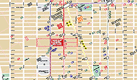
From a co-editor of, Peace Signs, a big book of anti-Bush, anti-war posters, comes The People’s Guide to the RNC
 Cited in The New York Times on August 9, 2004:
“Included is information of the sort that could be of use to any traveler: a street map of Manhattan south of 59th Street and addresses of restaurants, bookstores, libraries and places to rent bicycles.
Other elements are specific to the convention: hotels where various state delegations will be staying, sites of official convention events, and times and locations of planned demonstrations. There are also the words of the First Amendment, phone numbers for the New York Civil Liberties Union and information about bail bondsmen.
The three creators said they spent $6,000 of their own money to print the guides, but are distributing them free.
‘The main reason we made the guide is so that people have enough information to get in the way or out of the way,’ Mr. Chan said.
On Thursday, he and his friends began distributing 25,000 copies to bookstores, community groups, churches and other places.”
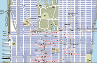 You can order or download the map here.
...
The 2004 RNC Protesters Map is more up-to-date, and features a large list of protest, art, and RNC related events, convergence spaces, and trainings. Icons on the map indicate hotels, police stations, navigation landmarks, parks (both active and passive), and the march route and rallying points. Updated on August 20, the map can be download here (792 Kb PDF).
...
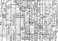 First published in March 2003, the Map of War Profiteers in New York City showed the beneficiaries in our midst, plotting the locations of government and military agencies, corporations, media profiting from the war. At the meeting of the M27 Coalition, the map helped locate the discussion determining a place for the March 27, 2003 action. Rockefeller Center ultimately was chosen for its proximity to several points on the map.
Unlike the other two color multi-page maps, the War Profiteers map has a distinctly low-tech, underground, DIY aesthetic. It is designed to be reproduced in black-and-white on the front and back of an 11"x17" piece of paper. The icons are composed of cut paper, arranged on a found map. The map was available at progressive bookstores around town, and was distributed at organizing meetings for various protest events.
A Place to Live, Breathe, and Work
The Center for the Study of Political Graphics has posted three new online exhibitions of posters from their archives. The collections are organized thematically, around a dozen posters per theme, spanning several decades, countries, and struggles.
Notice the tiny “next” links at the bottom of some of the pages. They’re very easy to miss.
Earth, Wind & Solar
International Ecology Posters
From the site:
 “Global Warming. Arsenic in drinking water. Pesticide Poisoning. Environmental Racism. Nuclear Waste Disposal. Irradiated and Genetically Modified Food. The list is endless. Where pollution is concerned, the world is a global village where no continent, country, or neighborhood is safe. Multinational corporations’ insatiable need for new markets and greater profits consistently overrides environmental concerns, and few governments oppose them. But these posters convey an increasing sense of urgency, as international artists continue to use the power of graphics to organize a frontline of defense against rapidly escalating pollution.”
The posters are organized as follows:
- Early Environmental Awareness
- Global Warming
- Water Pollution
- Air Pollution
- Deforestation
- Pesticides And G.M.O.s
- Nuclear Power And Waste
- Environmental Disasters
- Environmental Racism
- Martyrs
- Green Alternatives
- Visions For The Future
We Shall Not Be Moved
International Graphics on Gentrification and Homelessness
From the site:
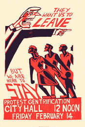 “A missed paycheck, a health crisis, or an unpaid bill are all that separate many people from homelessness. As America’s income gap widens, renters worry if they can ever buy homes of their own—or keep their rentals through retirement. The lack of affordable housing is not just a U.S. problem. We Shall Not Be Moved uses domestic and international posters to show that homelessness and gentrification are major issues throughout the world—and from the U.S. to Europe to Australia, posters remain the resisters’ tools of choice. Posters announce demonstrations to oppose demolitions, support squatters’ rights to move into abandoned buildings, and organize tenants’ unions. They document victories, defeats, and ongoing confrontations. Posters both record these struggles, and are central to them. They show that victory does not happen overnight—it can take years—but it is possible to fight city hall and the developers and win.”
The posters are organized as follows:
- Introduction
- Development & Speculation
- Homelessness & Poverty
- Organizing Resistance
- War & Displacement
- Conclusion
Solidarity Forever!
Graphics of the International Labor Movement
From the site:
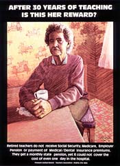 “Organized labor has consistently produced more political graphics than any other domestic movement for social change. Labor posters are often produced in the midst of a strike or boycott and convey the urgency of the times. Others are commemoratives, marking the anniversary of a victory or a martyred labor leader. They remind viewers of a too often hidden history, rally against dangerous conditions in the workplace, and warn that such injustices still occur. Although many of the posters are historical, the issues are not. The eight-hour day is no longer sacrosanct. More and more children are entering the workforce. Pesticides threaten farm workers and consumers. Sweatshops are proliferating domestically and internationally. These graphic expressions of international solidarity are a powerful combination of art and politics, crossing borders of time and place.”
The posters are organized as follows:
Call to Arms!
Rene Wanner has maintained his Poster Page on the Web continuously since August 21, 1997. In May, he started a blog. Yesterday, he noted:
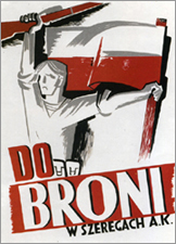
“[August 1] is the 60th anniversary of the Warsaw Uprising against the German occupation in World War II, during which more than 250,000 people were killed and the city was largely destroyed. Some posters made by the insurgents have survived, among them the famous “Call to Arms!” (Do Broni!) by Mieczyslaw Jurgielewicz. A year before, in 1943, the Warsaw Ghetto Uprising which also failed, extinguished the lives of the jewish population of Warsaw, which was about 375,000 before the war.”
...
Also on August 1, 1944, four thousand Roma were gassed and incinerated at Auschwitz-Birkenau. By the end of the war, between 70% and 80% of the Romani population had been annihilated by Nazis. In Romani it is called “the Devouring.”
After the war, no Roma were called to testify at the Nuremberg Trials, and no one came forth to testify on their behalf. No war crimes reparations have been paid to the Roma as a people. And no posters of resistance are known. [source]
Was that March?
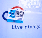
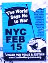
On a couple of occasions I’ve noted my admiriation for the design used by United for Peace and Justice to publicize anti-war events in New York City. The simple flag and globe motif on a bright blue ground and its bold sans-serif type are eye-catching, clear, and instantly recognizable.
However, the consistency and repetition of such a strong image in the same context (via stickers and flyers) over nearly three years may be diminishing its impact. As one UPfJ organizer notes:
“We love the blue flag standard, but have heard feedback that the design has been the same for too long... folks think it’s for an old demo.”
To the Streets
I wrote the essay below for the Design Issues column in the May/June 2004 issue of Communication Arts. I profile a couple of folks using graphic design for advocacy. I didn’t call it out explicitly in the text, but it’s of some relevance that the projects here are generally not pro-bono projects “for charity,” but are organizations started by designers generally working with broader communities. Check it out.
Taking it to the Streets
Graphic design for advocacy
Walking the streets of New York City in February 2003, one couldn’t help but notice all these little blue stickers. Stuck to walls, phone booths, bus stops, scaffolding, mail boxes — they popped up everywhere to announce the February 15 march against President Bush’s invasion of Iraq.
The blue stickers were just one of the many anti-war graphics circulating at the time. Around the Web, activists were posting free, easy-to-print designs using a variety of techniques: clever slogans, typographic play, dramatic photos and the ironic use of vintage propaganda imagery.
But the February 15 stickers on the streets of New York were different — simple and bold, a little blue banner announcing the time and place of the march. They did not make an emotional appeal with pictures of scarred and armless Iraqi children or U.S. soldiers, nor was there any argument about why the war was wrong.
The February 15 posters were not intended to change people’s minds in a direct way, but to notify the public about the upcoming protest — and to make dissent visible. The mainstream media had entirely avoided covering the anti-war movement prior to February 15. In the face of this de facto censorship and police obstruction over the route of the march, the stickers acted as thousands of little acts of civil disobedience. And with the urban landscape as a medium, the stickers set the stage for even larger acts of defiance.
Women Set Type!
Being a historical account of women in printing, publishing, and typographical compositing in these United States of America and Western Europe.
The text below is assembled from Unseen Hands, Women Printers, Binders & Book Designers (Princeton University Library, 2003), Women in Printing & Publishing in California, 1850-1940 (California Historical Society, 1998), and Epochal History of the International Typographical Union (I.T.U., 1925.) Other sources are indicated where used.
“Women have been involved in printing and the making of books ever since these crafts were first developed. Even before the advent of movable type, there was a strong tradition of women producing manuscripts in western European religious houses. In the Convent of San Jacopo di Ripoli in Florence, we find the first documented evidence, in 1476, of women working as printers. Girls and women were often trained by their fathers or husbands to assist in printing businesses, and there are many instances from the fifteenth to the eighteenth centuries of women taking over and managing these enterprises upon the early demise of their male relatives.... Many, certainly, only managed the business, while others were more directly involved. Estellina, wife of the printer Abraham Conant, proudly stated in a Hebrew book, Behinat `olam (Mantua, ca. 1477) that ‘she, together with one man, did the typesetting.’ [source]
In the 19th century, a limited number of occupations were open to women — teaching, needlework, domestic service, etc. Male-only unions ruled the printing business. Women, where employed at all, were relegated to certain low-paying jobs considered best suited for the weaker sex, such as dressing (polishing imperfections) from metal type, folding printed sheets, and sewing bindings. Yet there were exceptions — a few women were also employed in typesetting. Women who were widows or daughters of printers often learned typesetting out of necessity.
James Franklin, brother of Benjamin Franklin, taught something of the art to his two daughters prior to his death in 1835, and when he died he left his printing plan at Newport, R.I. to his widow and family. They operated it successfully for many years.
A woman’s typographical union was formed in France with a journal entitled La Compositrice, and the first major woman’s journal edited by a woman, Godey’s Lady’s Book, was published in Philadelphia from 1830-1858, edited by Sarah Josepha Buell Hale. [source]
...
Women were employed in the Day Book office in New York in 1853, while a strike was in progress against that office. This inspired a determined campaign against women printers. Union leaders inveighed against employment of women and urged the National Typographical Union to do something about it. The National wisely disclaimed any desire to interfere in treatment of the issue by local unions. Horace Greely, celebrated editor of the New York Tribune and a former president of Typographical Union No. 6 of New York, took up his redoubtable pen....
‘Your fears that women will supplant you, or seriously reduce your wages, Messrs. Compositors, are neither wise nor manly. The girls who marry and have families to look after will stop setting type — never doubt that — unless they are so luckless as to get drunken, loafing, good-for-nothing husbands, who will do nothing to keep the pot boiling, and then they must work, and you ought not to be mean enough to stop them, or drive them back to making shirts or binding shoes at three or four shillings a day.
If you find yourselves troubled with too strong a competition from female workers just prove yourselves worthy to be their husbands; marry them, provide good homes and earn the means of living comfortably, and we’ll warrant them never to annoy you thereafter by insisting on spending their days at the printing office setting type. But waxing theologic and pious, you tell us of the sphere of action God designed women to occupy —of her ‘purity’ and of the ‘immorality and vice’ she must inevitably sink into, should she be admitted into the composing room to set type beside you. We feel the force of these suggestions — we admit the badness of the company into which unregulated typesetting would sometimes thro her — but did it ever occur to you that this is her lookout rather than yours? It is perfectly fair of you to apprise her beforehand of the moral atmosphere to which promiscuous typesetting would expose her, but when you virtually say she shan’t set type because if she did your society and conversation would corrupt her you carry the joke a little too far.’
By 1864, due in large part to the depletion of the male work force during the Civil War, additional workers were needed in trades which were previously thought of as ‘male’ trades — one of these being typesetting. The number of newspapers and the demand for printed materials was on the increase, and women began to step into jobs in both the printing and publishing fields.
The National Typographical Union permitted women to form unions and to join existing unions in 1869, the same year it was renamed the International Typographical Union. Augusta Lewis Troup, journalist and typesetter for Susan B. Anthony’s newspaper The Revolution, was elected corresponding secretary of the International Typographical Union in 1870. She became the first woman to hold any national union office. [source]
...
 After hearing of the role of women in the 15th century printing industry, Emily Faithful decided to set up her own firm in Edinburgh in 1857 employing women only. In 1859 she founded the Victoria Press in London and employed men to do the heavy work. This met with a lot of hostility with the print unions which said that it encouraged immorality. In 1862 she earned the title of Printer and Publisher in Ordinary to the Queen, moved to an office in Farringdon Street and then to Praed Street, Paddington, where she remained until 1881. She was also a writer and poet and was involved in some of the publications produced by her firm such as the feminist English Woman’s Journal and the Victoria Magazine. [source] While her journal was established as a general literary magazine it provided a strong feminist emphasis on suffrage, married women’s property, education, employment and all of the other feminist/women’s concerns of the day. [source]
During the late 19th century, women writers often moved into positions as editors of newspapers or small journals. At this same time, the Woman’s Suffrage Movement was gaining momentum and the women-edited journals were the obvious choices in which to further their cause. Spiritualism was also a popular movement at the turn of the century among women — largely because it did not discriminate by gender or ethnic background — and the women publishers felt a kinship because of this non-discriminatory nature. Journals such as The Carrier Dove, The Spiritualist, and The Golden Dawn were all journals edited by women and devoted to not only Spiritualism but in some cases, also to the Suffrage Movement.
Other women publishers and editors followed a more literary angle, publishing journals which featured articles on a wider variety of topics. In 1863, Lisle Lester took charge of the Pacific Monthly, a woman’s literary magazine previously known as the Hesperian. It had a rocky career as was the career of Ms. Lester — who was widely known for her strong opinions on many topics and her tussles with the male typographical unions. Another woman, Emily Pitts Stevens, gained prominence when she transformed the Sunday Evening Mercury — which was known as ‘a Journal of Romance and Literature’ — into the premier voice for woman’s suffrage in the West. She hired women to set type for her newspaper and in 1869 changed its name to The Pioneer — as ‘a name that more nearly covers our thought and tells the nature of our object and ambition.’ She became a major force in the founding of the California Woman Suffrage Association on January 28, 1870.
...
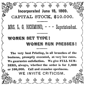
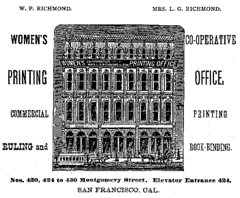 In San Francisco, which was becoming a center for printing and publishing in the West, women-run printing offices appeared in the 1870s and 1880s. The Women’s Union Job Printing Co., the Woman’s Publishing Company, Amanda B. Slocum and Jennie Patrick were a few either woman-run and/or -staffed printing offices of this period. The most prominent and prolific was The Women’s Co-Operative Printing Union, established in 1868 on Clay Street by Mrs. Agnes Peterson, followed in 1873 by Mrs. Lizzie G. Richmond. Early 1870 billheads produced by the WCPU proudly proclaimed, ‘Women set type! Women run presses!’ So confident was Lizzie Richmond that her billheads and advertisements often stated, ’We invite criticism.’ These printing offices produced a variety of printed materials for the public — books, commercial catalogs, corporate annual reports, legal briefs, [as well as] invitations, broadside advertisements, and handbills.
The many journals, newspapers, books, and even billheads that were printed during the late 19th and early 20th centuries used mainly one method of illustration — that of the wood engraving.... Leila S. Curtis and Eleanor P. Gibbons were two women who started up and ran successful engraving businesses in San Francisco. Both were trained in engraving and design. Their designs were found on billheads, business cards, and stationery, as well as in book illustrations, commercial catalogs, and innumerable other small printed items. Magazines published during this period often used the technique of the woodcut — rather than a wood engraving — to illustrate their pages. The technique used in producing a woodcut allowed for larger more fluid compositions. Lucia Mathews cut the designs for Philopolis (1906-1919) — a magazine published by Arthur, her husband, and herself during the early part of the 20th century. Florence Lundborg, an artist influenced by both Art Nouveau and the Arts and Crafts movement of the early part of this century, produced woodcut images for The Lark, the San Francisco literary magazine published by Bruce Porter and Gelett Burgess from 1895-1897. [source]
...
The turn of the century saw an increased interest in the aesthetic aspects of printing — now that women were an accepted part of the work force — and many fine presses sprang up throughout the state [of California]. A fine or ‘private press’ is generally understood to be a small printing house which issues for public sale limited editions of books which have been carefully made on the premises.
By the 1920s a tradition of fine printing was well under way in San Francisco, with Taylor and Taylor, John Henry Nash and the Grabhorns already fairly well established. These printing houses encouraged printing by women.... Other women with their own presses were Rosalind Keep of the Eucalyptus Press, Helen Gentry, and Jane Grabhorn at Colt Press, which was founded along with William Matson Roth and Jane Swinerton. In southern California, private presses were often a husband and wife team. The Saunders Studio Press of Claremont was founded in 1927 by Lynne and Ruth Thompson Saunders. The Plantin Press in Los Angeles was established in 1931 by Saul and Lillian Marks, Saul being in charge of design and layout and Lillian responsible for composition. Women such as Virginia Woolf and Elizabeth Yeats also founded private presses that produced handsome limited editions of the work of contemporary authors and artists. [source]
Women were notably successful at bookbinding, both ‘on the line’ — producing factory bindings — and in the creation of splendid examples of hand binding, particularly during the Arts and Crafts Revival of the late nineteenth and early twentieth centuries.
With the dawn of the 20th century and the emergence of women’s rights, women in printing and publishing entered more seamlessly into the work force. Finally, with the advent of fine press printing, the women printers in the 1920s and 1930s emerge as figures who achieved their goals to work at a skilled occupation that offered them not only an honest living but also a chance to use their creative instincts and skills.”
Impressions of Designs on Democracy
From March 26-28, I attended the Designs on Democracy conference on the UC Berekely Campus. I’ve been meaning to write up my impressions but have found it difficult to put words to those three incredible, densely-packed days of presentations, meetings, networking, and solidarity. Where to begin?
From the Bay Area Indymedia center:
“Designs on Democracy was a three day conference on design, advertising, public relations and marketing for social change.... The conference was organized by a crew of eight activists. Forty volunteers did the work that made it happen for the 350 who attended. Designs on Democracy, said Favianna Rodriguez, one of the organizers: ‘is not just for designers, it’s for people who are in the business of doing marketing and selling the image of the Left, to take it to a broader audience and make it more appealing.’”
 They’ve already posted two pages of notes and several audio files of the conference sessions in Ogg Vorbis format. More audio, video, and documentation is on the way.
The organizers from Tumi’s Design, the Ruckus Society, the Design Action collective, and Change the Game did an amazing job, clocking in months of preparation. The speakers, attendees, and volunteer tech crew were also incredibly flexible and generous.
The sumptuous, donated food also merits special mention, particularly from the Sankofa Kitchen Project, a black, vegan cooking collective in Oakland. The project is part of the East Side Arts Alliance and works with youth to build community gardens, teaches them how to grow and cook their own food, and promotes traditional cuisine, community spirit, and good nutrition — in part a response to the cheap, corporate, fast food crap showered on poor, urban neighborhoods.
Participants arrived from a range of organizations and backgrounds. Some were designers, organizers, techies, printers, media workers. Some from unions, others working on prisons, environmental justice, or genetically modified foods. Some worked in advertising, others on access, training, media justice, or getting out the vote. Some were just designers looking for a way to do more.
Some were veterans, active since the 1960’s, others just fresh out of school. Some owned their own businesses, some worked in collectives or in non-profits, and still others were freelance.
And, where other events of its kind might have fractured into quarrelling ideological factions, here there was common cause: Bush must go.
Many of the conference sessions focused on messaging, narrative, and framing to communicate effectively, move “the middle,” and build a stronger movement for social justice. The list of sessions and speakers makes for interesting reading.
I gravitated towards the more practical sessions, on fund raising and organizational structures. I won’t go into detail about individual sessions — will post more of my notes here soon — but here are a few other impressions and tidbits:
- Several speakers addressed the importance of focus groups and research, and within that the notion of using different messages for different cultural groups. An easy way to recruit for focus groups is to advertise on craigslist. (Offering pizza helps.)
- Favianna and the staff of Tumi’s see themselves within a tradition of radical graphic work in the Americas and on the West Coast: Siquieros, Rivera and the muralists of the Mexican revolution, artists and writers in Chile who created culture of resistance, the independent publishing of the Black Panther Party, the Chicano movement of the 70’s and their work with the United Farmworkers. Like the Young Lords, the Native American Movement, and the BPP, Tumi’s program is to serve the people. “Without the movement, without the grass roots, graphics work is not revolutionary.”
- Only one member of Congress has a child serving in the war.
- In the U.S., you can buy voter registration lists. It’s not cheap, but it is public information. You can cross reference the data with your membership list or demographic information to more effectively market to voters.
- If you’re an unaffiliated designer with a project idea and you want to raise funds, consider finding a non-profit organization willing to act as a fiscal sponsor. You can arrange for tax-deductible donations or foundation support through them, in exchange for a small percentage of the proceeds.
One topic of discussion that was missing from the conference was information design and mapping. This is not just marketing, but using design for analysis and making data accessible. See, for instance, the 2000 Palm Beach County ballot design.
In addition to meeting many new people, I had the chance to meet several people I’d previously known only online including Jason Justice, founder of the Graphic Alliance, an electronic network of progressive designers, and Alex Steffen of the community Web log worldchanging.com. It was also great to reconnect with a couple of folks I’d met at the Ruckus Tech Tools Action Camp in 2002.
Overall, the air crackled with excitement and energy. It was nice to recharge, to find out everyone was doing, and to find among them a progressive community of designers. Many, including myself, didn’t want this to end with the conference itself.
So what’s next? Another one in a couple of years? Perhaps local or regional conferences? An international federation of progressive designers? For now, a database of resources is in the works and will eventually be posted on the site. Watch this space for more.


