war
Shoots & Leaves
While one may be tempted to use all manner of exclamatory marks to further amplify the message of one's posters, proper punctuation almost always enhances clarity. Consider the difference in the following:
No War on Iran!
Versus
No! War on Iran!
Or even
No! War! On Iran!
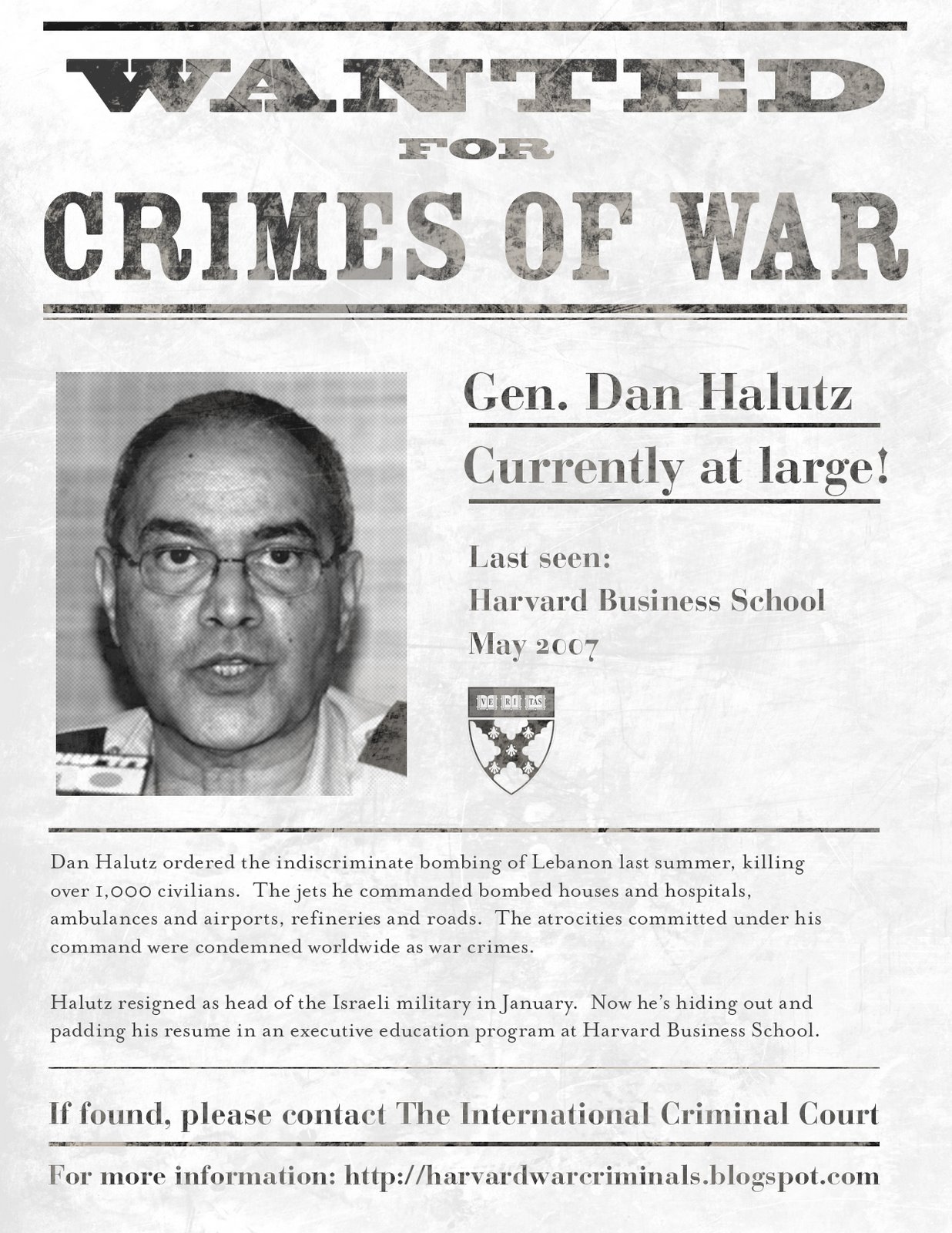
Wanted at Harvard
A flyer I designed appears on the front page of today’s edition of the Ma’ariv, the second largest newspaper in Israel.
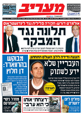
Here’s a close up:
The flyer is for a campaign by Alliance for Justice in the Middle East, a student group at Harvard University.
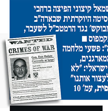
The text calls attention to the enrollment of former Israeli general Dan Halutz in the Advanced Management Program at Harvard Business School. Halutz oversaw the bombing of Lebanon in the summer of 2006. See his dossier here.
And he’s not the first accused war criminal enrolled by Harvard. See a short list of bios on the AJME site. The AJME is campaigning to establish a set of practices to screen for war criminals and serious human rights abusers as part of its admissions and hiring policies.
The campaign was relatively modest to achieve such front page coverage. The group set up a free web site on blogspot. They printed up the flyer and handed it out on campus. They also sent out a press release about the campaign, which resulted in front page coverage.
Here’s the full article in Hebrew on the Ma’ariv web site and AJME’s English translation of it.
Click below for a larger version of the flyer:
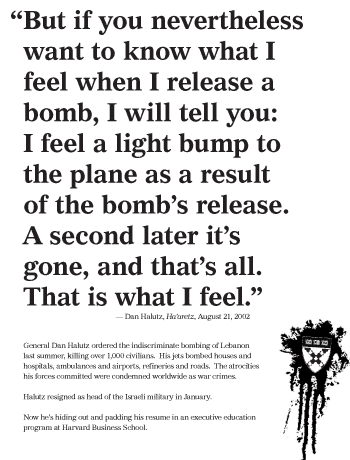
For contrast, see another iteration below. I think it’s a little more evocative, but maybe less direct.
Update: The flyer is featured online at Time and Al Jazeera. See other coverage of the campaign.
Helvetica
On Friday, I caught a screening Helvetica, the film at the New School.
The film is a breezy valentine to type, typography, graphic design, and designers. The editing puts a nice leisurely pace to it, and I thought the sound design, which could have been disastrous in other hands, was suitably sensitive. It’s not a bad first film.
It consists mostly of two types of shots: interviews with bold-face name designers and scenes of type on the street — interspersed with occasional animated renderings of famous posters. The designers talk about the type, its use and origin, and their relationship to it, love or hate. It certainly helps to know who the players are, though most of the personalities sparkle through regardless.
On top of the brief historical survey, the broader question raised by the film seems to be, “How does this typeface come to dominate our visual environment? How did it come to be seen as so ‘neutral’?”
The answer provided by the parade of talking heads is of mostly a matter of taste, period fashion, and eventually a response to the momentum of a critical mass of usage.
But a look at counter-examples might have been illustrative: why does Gil Sans dominate in the UK? Why does a more condensed gothic sans seem so popular in France? I think a clue is in the usage by the state and the power of its projection. This is alluded to by many shots of the Helvetica-like sans serif on New York City subway signage, and by Paula Scher’s association between the powers that use Helvetica and the powers behind the Viet Nam war.
But mentioned only in passing is, I think, the most important point: bundling. Before desktop publishing, the font was widely available for linotype, as presstype, and for other printing methods. But now the font (and its twisted cousin Arial) comes pre-installed on every new computer sold. The film never really investigates why or how this came to be, or the consequences of it. It’s just assumed that Helvetica was a sufficiently “classic” and popular face. I think this is another case of designers ignoring systemic and structural forces. Its power is invisible, and well, what’s “normal” is just taken for granted. Further evidence of this systemic short sightedness is the fact that of the 21 designers interviewed on screen, nineteen are white men and two are white women.
War and Peas
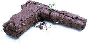
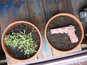
Along the lines of this NY Times infographic on the enormous opportunity cost of the Iraq war (say... universal health care in the U.S. — twice over), my friend Noah has packaged a more experiential approach: plantable firearms made of clay, compost, and a mix of seeds. Walk through the manufacturing process at this Flash photo gallery or order one of your own. (via, via)
3,000
FAQ
OK, here goes. I’ve never intended this blog to be about me personally, but whenever I talk to a group of design students they often ask the same questions. This time one of them made a transcript. Many thanks to Stephanie Diederich at Virginia Commonwealth University. I’ve edited the text a little and fleshed it out in some places.
SD: How’d you get into your line of work?
JE: In the late 80’s and early 90’s I became increasingly aware of events in the news: riots in my home town, in Miami, Florida, the first Gulf War, genocides in Rwanda and the Balkans. I had a pretty privileged, middle-class background and when I went to art school in New York City in 1991, I was suddenly faced daily with poverty and homelessness. By the time I got to grad school, I was making increasingly politicized artwork. I decided that I didn’t want to make big abstract oil paintings or decorative objects for rich people. I started playing with cheap, reproducible work — multimedia, works on paper, tiny paintings to give away. My work was increasingly populist and my peers and faculty were increasingly defensive about the fact that I wasn’t “buying in.” I dropped out after a semester and decided that rather than use my politics in my art, I would use my art for my politics. I decided to become an activist designer.
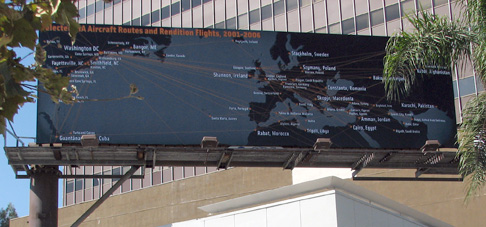
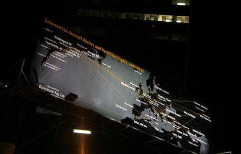
Mapping the “War on Terror,” 3
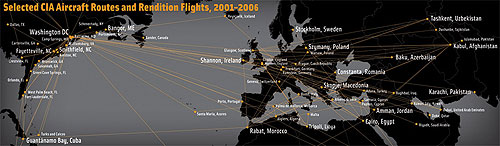
A billboard I designed is up on display in Los Angeles. It’s part of a series of public art installations about the war, and will be on view until October 8, 2006.
The image is a map of Selected CIA Aircraft Routes and Rendition Flights 2001-2006, some of which transported prisoners to foreign countries to be interrogated and tortured. After years of silence and denial, the administration publicly acknowledged the flights in the last few weeks.
I worked with artist and geographer Trevor Paglen who provided the data. Trevor spent several years tracking down the flight information, and has a book out this month on his investigations, Torture Taxi: On the Trail of the CIA’s Rendition Flights. See this interview with him on Democracy Now! with co-author, journalist A.C. Thompson.
The billboard is located at 6150 Wilshire Boulevard, near South Fairfax Ave, between Beverly Hills and West Hollywood. Here’s a Google Map.
Clockshop, a public arts organization in Los Angeles, funded the display. You can read more about the project at http://clockshop.org/here.php
A few images, below:
Mapping the “War on Terror,” 2

The Privatization of War: Colombia as Laboratory and Iraq as Large-Scale Application is a mapping project by artist Lize Mogel and writer Dario Azzellini, on display at the Gwangju Bienniale in South Korea.
The 50 foot long mural diagrams the relationships between the United States and private military contractors and their activities in Colombia and Iraq. These corporations are less accountable to Congress and the public, and provide “products” and services including:
“risk advisory, training of local forces, armed site security, cash transport, intelligence services, workplace and building security, war zone security needs, weapons procurement, personnel and budget vetting, armed support, air support, logistical support, maritime security, cyber security, weapons destruction, prisons, surveillance, psychological warfare, propaganda tactics, covert operations, close protection and investigations.” [source]
Read more about the project and see a larger image of the map here.
Mapping the “War on Terror,” 1
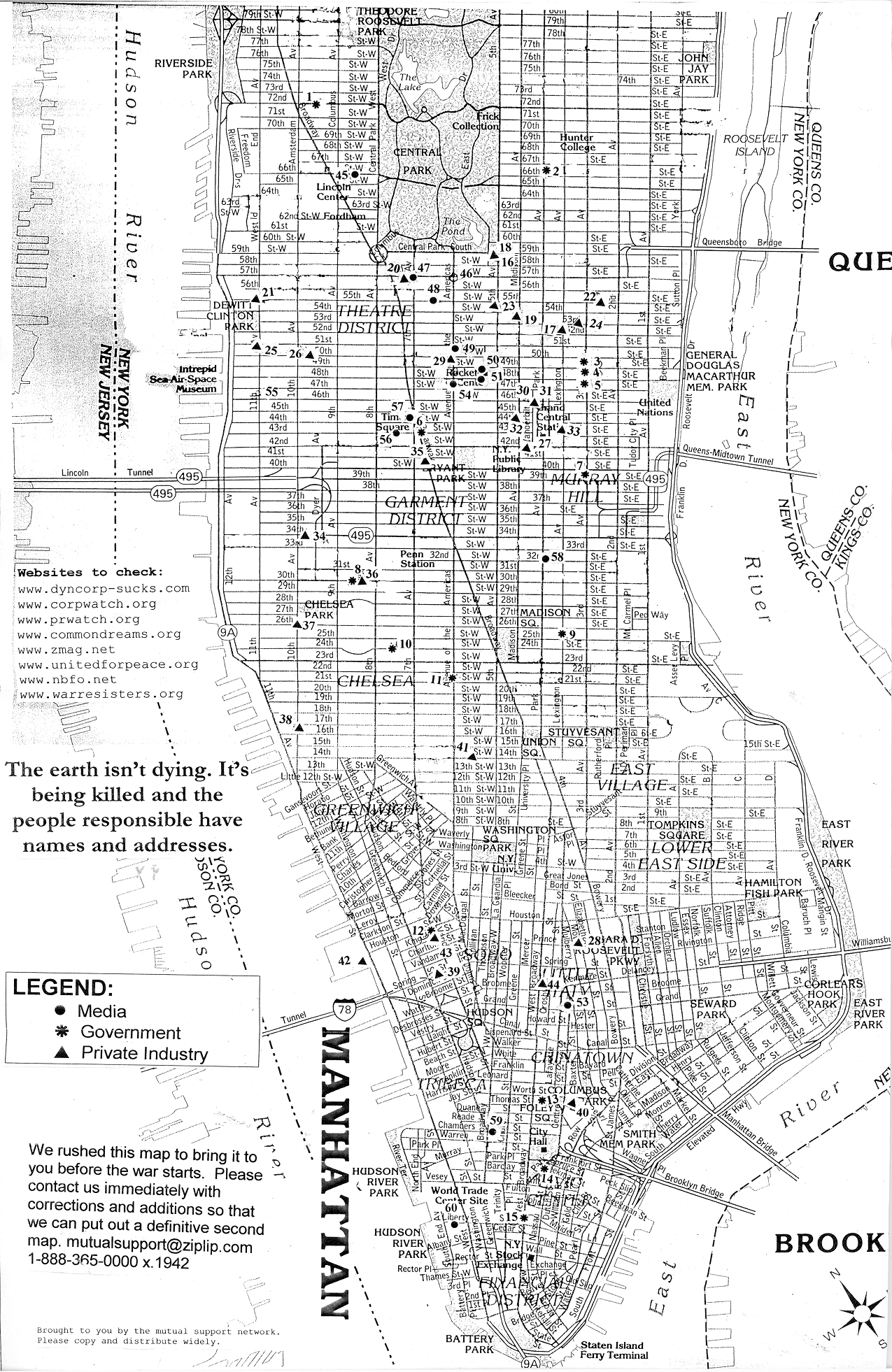
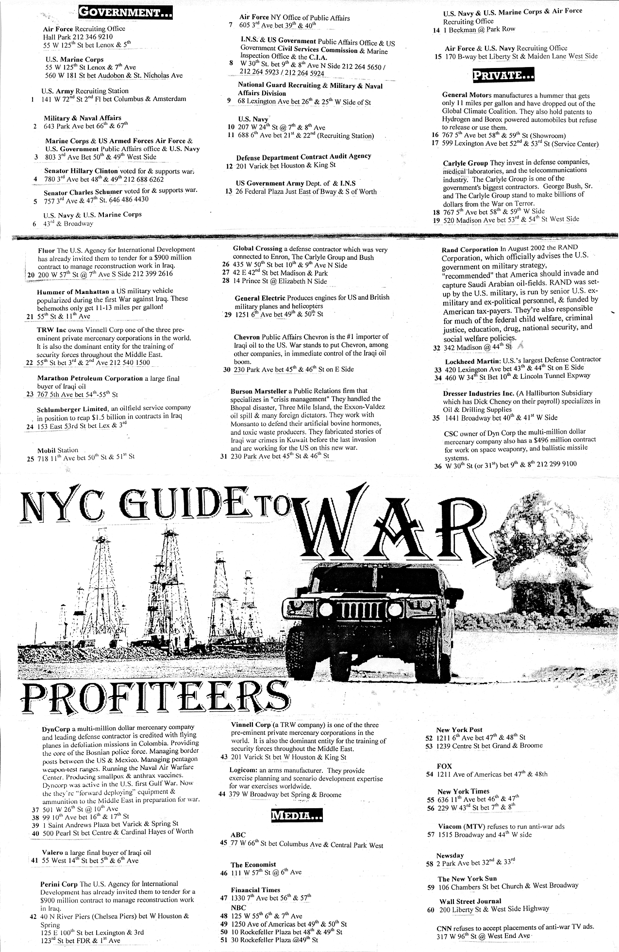
The NYC Guide to War Profiteers
First blogged here in August 2004, the NYC Guide to War Profiteers has fallen off the Web. The site of the March 27 Coalition that quckly came together in 2003 has since lapsed into the hands of domain squatters.
A friend recently inquired about the map, so I scanned my hard copy and am posting it here.
 Front, 787 Kb PNG, 150 dpi |
 Back, 681 Kb PNG, 150 dpi |
The map was assembled by the “mutual support network” and rushed to press just before the invasion of Iraq in March 2003.
The map has a low-tech, DIY aesthetic, designed to be reproduced by photocopy on the front and back of a standard sheet paper. The icons are composed of cut paper, arranged on a found map. The map was available at progressive bookstores around town, and was distributed at organizing meetings for various protest events.
The list of weapons makers, media companies, and military recruiters helped locate the discussion around the March 27, 2003 direct action. Rockefeller Center ultimately was chosen for its proximity to several points on the map.
Three years later, the map has not lost its relevance.
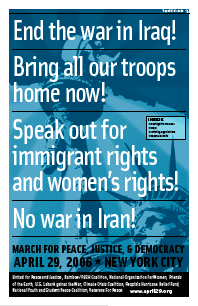
March in April
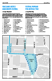
This Saturday, April 29, we take to the streets to end the war in Iraq, support immigrant rights and women’s rights, and to oppose war against Iran. I designed a broadsheet that the organizing coalition will distribute. It’s a two-color, tabloid-sized, eight-page booklet in English and Spanish with statements by the organizers, emergency contact info, and maps of the affinity group assembly areas, march route, and peace festival.
It was a challenge giving the different messages equal weight without flattening out the design. Because of the politics of the coalition, this was a big requirement. It was also my first chance to play with the City’s official NYCMAP data, which was fun. The cover image extends the Statue of Liberty image used in the existing flyers, but pushes it back to make it a little more ambient and less iconographic. It was a rush job and stepping back, some of the type treatment feels a little heavy-handed. But I’m otherwise pleased with it. We’ll see how it works on newsprint. Maybe the heaviness is appropriate.