21 April 2003
Design Against the War
Over a year ago I attended a lecture on design at the Cooper Union. The speaker projected a series of slides illustrating his minimalist design philosophy. One of the images was of the B-2 bomber. I was shocked and disturbed that a design philosophy would fail to take into account social, political, and economic contexts. Particularly of an object which, when used as intended, delivers massive death and destruction.
It prompted me to dig deeper into design and the public interest. And to start this Web log.
On evening of April 16, I arranged a panel discussion at Cooper titled “Design in the Public Interest / Design Against the War.” I invited three panelists to speak about their work as designers involved in the anti-war movement.
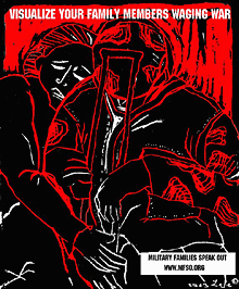
 First up was Lee Gough, a printmaker, anti-war activist, and graphic artist based in Brooklyn, NY. She showed a series of prints from a portfolio-in-progress on the Iraq invasion and the war at home, called “The War Went Well.” Some of the images have been used in posters on the Web site Who Dies for Bush Lies“ and for Military Families Speak Out, an organization of people who are opposed to war in Iraq and who have relatives or loved ones in the military.
One image “Fight the War at Home” was inspired by a subway ride home from lower manhattan on September 11. Even as the towers had just been destroyed, there were still, as there had been for many years, homeless persons on the subway appealing to cityfolk to remember them, and to give. The image is a graphic reminder that some have been under domestic attack in our country for a long time, and that funds for the war on poverty pale in comparison to our “defense” budget. Another image, “Visualize Your Family Members Waging War” depicts a despondent soldier with a crutch being embraced by a woman. Lee’s expressive linocut style brings a gravity to the subject matter.
Lee commented on the challenges of choosing one’s message, for instance, noting the different context of “Bring the Troops Home” for troops that have been drafted vs. those who enlisted voluntarily.
One member of the audience raised the question of why U.S. flags and “being American” were the province of the pro-war movement, when large numbers of U.S. citizens were opposed to the war. I noted that I’d seen many anti-war demonstrators holding up flags and patriotism at rallies. On the Web, Who Dies for Bush Lies? effectively tackles effect of the war on U.S. soldiers and U.S. civilians, in addition to Iraqi soldiers and civilians. The danger was raised, though, of the rhetorical trap: the argument over who is “more American” can go back and forth forever, and quickly turning attention away from the crisis at hand.
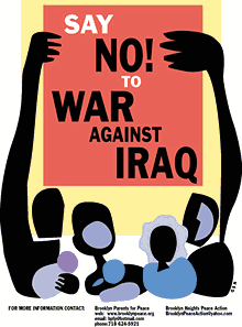
 Nancy Doniger has worked as an illustrator for almost 20 years, producing art work for newspapers, magazines, books, posters and T-shirts for both for-profit clients and not-for-profit groups. She is currently a member of Brooklyn Parents for Peace, for whom she created the “Say No to War Against Iraq” poster.
She also helped organize a community/family oriented workshop that gave kids and parents an opportunity to make anti-war art for protest marches. Adults and kids made signs and worked with a puppeteer to create a large paper mache dove, and lots of little doves held aloft on cardboard tubes.
Nancy showed some earlier examples of her work, including a forceful image against the FTAA, a stark two-color poster for a conference on the conflict in Israel and Palestine, and a bright, celebratory “Welcome Back to Brooklyn” poster.
She also showed a couple of iterations of the “Say No to War” poster. One implied the damage of war with flames, but the final version ultimately centered on the mass mobilization. She noted that, in contrast to other illustrations, her work on this piece progressed from representation to geometric abstraction to make the poster more inclusive, using large blocks of color instead of specific depictions of race and gender. She is currently working on a “Hate Free Zone” poster.
Nancy noted the effect of the “Say No to War” poster on her block. The block appeared to be a very pro-war, where “the flags are quick to come out.” But over time, the “Say No to War” poster began to appear in windows and doorways. I certainly noticed it up and down the block where my step-sister lives.
Nancy is also involved in upcoming anti-war event “WEARNICA.” Sponsored by Brooklyn Parents for Peace, on May 3, 2003 a group of artists will present original anti-war art executed on the backs of white cotton dress shirts. The shirts will be worn in public spaces around New York and the world. The event was conceived by Works on Shirts Project whose inspiration for the event came after Colin Powell insisted upon covering the tapestry of Picasso’s Guernica during his warmongering speech to the General Assembly of the United Nations on February 5, 2003.
L.A. Kauffman is a staff organizer for United for Peace and Justice and designer of materials to promote the February 15 and March 22 marches in New York City. Her sticker and poster designs United for Peace and Justice can been seen on the streets across the New York City.
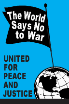
Leslie arrived at design through her work as editor of a progressive journal. She was inspired by the bold, clear graphics of Gran Fury and ACT-UP, and the use of those graphics on the street and at demonstrations, stage managing the events to push its imagery into the mainstream media. She claims she can not draw, so uses clip art in her graphics. The image of the blue pennant flag and black group have become a ubiquitous the city streets.
The idea behind a worldwide day of anti-war marches came out of the European Social Forum held in Florence this past November. At the Forum, the date February 15 was chosen as a date for anti-war demonstrations “in every capital.” What transpired was unexpected and unprecedented.
United for Peace and Justice had only just formed in the November of 2002, but it wasn’t January the group started working on the February 15 march.  “The World Says No” was the headline of the February 15 flyer design, accompanied by a list of cities taking part in the event. As news of the event travelled across the Internet, marches were planned in more and more cities. Leslie held up various versions of her February 15 design with more and more cities added. Ultimately, marches were held in 793 cities around the world on February 15. Of particular note is virtual absence of communication or coordination between the participating cities.
Leslie spoke of the focused purpose of the posters produced for the event: not to educated, but to mobilize. The flyers lack all superfluous text or argument, just the headline, time and place. The posters and stickers were not trying to change people’s minds, instead to reach out to people who were already against the war but had not yet taken action.
In addition to sticker and flyers, palm cards cut from 1/4 page xerox copies on blue paper were popular and successful. They are both cheaper and more effective — easier to stuff in your pocket, less burdensome on the counter tops of sympathetic shopkeepers.
For the February 15 march, 200,000 stickers were distributed in 5 weeks. For the March 22 march, 200,000 stickers were distributed in 3 weeks. Astonishing numbers, posted around town by a continual flow of volunteers through the office. It’s also a useful bench mark: this is how many it takes to spread the message. A month later, I’m still finding remnants of UPfJ stickers on walls and phone booths. Leslie noted the effect of thousands of little acts of civil disobedience for the spirit of protestors, slowly bolstering a spirit of resistance around in the City and specifically, against the police department ban on marching past the U.N. on February 15.
In total, 1.1 Million pieces of literature distributed. Almost all of the printed materials were bilingual: English on one side, Spanish on the other. However, materials were also produced in Korean, Spanish, French, Creole, and Chinese. Quite a few donations for all these production expenses came online via paypal.
The question was raised about the environmental impact of producing all those printed materials. Her response: it’s also better for the environment if the war is prevented.
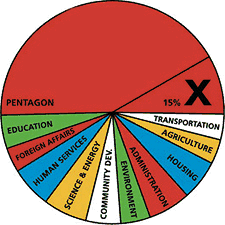
 Other examples of design projects were raised by members of the audience: a “Do Not Bomb Iraq” sticker to replace the “Do Not Lean On Doors” sticker in NYC subway cars; colorful logos, charts and imagery designed by Stefan Sagmeister for “Move Our Money,” a campaign to reallocate 15% of the U.S. military budget for education; and flyers handed out to tourists at ground zero with a graphic representation of the number of teachers aides that will be cut from City’s budget. The image leaves it to the viewer to make to the connection to the military expense of a war in Iraq.
Many spoke of the importance of New Yorkers being seen as against the war. September 11 was an attack on New York, and the war is being waged in our name. Others spoke of the urgency of independent media, and the challenge of reaching out beyond “preaching to the converted.”
Overall, I was struck by how spontaneous the designers’ actions were. In almost every case, the designers simply stepped forward and got involved: signs made for a rally were eagerly snapped up; hundreds of thousands of stickers eagerly taken and distributed; and, “Say No to War” posters popped up on an otherwise apparently pro-war street. It seems that one doesn’t necessarily have to change everyone’s minds. There are more “converted” than you think. They just don’t have the graphic materials to display yet.
About 50 people came to the event, a decent turnout despite the announcement from the Pentagon the previous day that “the major fighting” in Iraq was over... and the fact that I’d scheduled the event on the first night of Passover. (Such a Jew am I.) The arc of the event could have used a better closing at the end, as well as a better transition between panelists. I also noted the lack of diversity in the audience. I think next time, I should hold it at different time and place. I’m also quite pleased with the invite design. Peel off the event description and you’re left with an anti-war sticker. Many thanks to Photobition for helping hammer this out in time.
One purpose of the event was to connect artists, designers, and activists. I’m disappointed more Cooper students didn’t show, but after the event quite a few people milled around having these intense little conversations until I kicked everyone out to close the room and return the lights. And quite a few people asked me what was next. Perhaps the start of a new Committee to Unsell the War?

