

February 2004
Nonprofit Online Mapping in New York City
Steven Romalewski sends this growing list of nonprofit online mapping Web sites in New York City:
“We’ve noticed a kind of a critical mass of these mapping and data services recently.
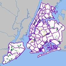 Most of these have been created by my project, NYPIRG’s Community Mapping Assistance Project (a team of six people, part of a nonprofit organization, that uses GIS to help other nonprofits achieve their missions). They’re all part and parcel of an effort to ‘democratize’ data and provide powerful new tools with a community-based focus. Each site uses GIS technologies that few other nonprofits have tapped into, but that government agencies and the private sector have used to great effect. The websites use government data in in new and innovative ways, often to provide services that most government agencies would never provide. And they give local neighborhoods and individuals a window on their world that would’ve been daunting, at best, and maybe impossible for the average citizen or block association to obtain. The sites have helped level the ‘playing field’ in New York to a great extent, so public agencies and large companies don’t have a monopoly on information.
Here are the links:
- http://www.MyCITI.org — the Community Information Technology Initiative (CITI) website that puts mapping tools in the hands of New York City’s local planning boards, in a way that they can avoid the need to spend limited resources and duplication if all 59 boards had to buy the software and invest in the data creation themselves;
- http://www.oasisnyc.net — a wealth of information about parks, wetlands, gardens, and other open spaces across New York, reaching across all levels of government and developed for all different aspects of the city’s ‘greening community’. This site was spearheaded and funded by the US Forest Service, and involves a steering committee of more than 40 nonprofits, government agencies, academics, and businesses;
- http://www.nonprofitmaps.org/netmaps/bedc/bedc.htm — the Brooklyn Economic Development Corp’s. ‘Destination Brooklyn’ service that offers detailed real estate and demographic information for every property and neighborhood in Brooklyn, geared toward small business owners and community development organizations;
- http://www.straphangers.org/cmap.php — the Straphangers Campaign’s ‘Get Where You’re Going’ site, providing precise location information about the subway stops closest to any street address in NYC (which the MTA’s maps can’t do, since they’re geographically distorted to fit on a printed page);
- http://www.MyGovernmentNYC.org — allows anyone with a New York City address to easily find and contact the public officials who represent them at all levels of government, and is used by thousands of people each month, regularly praising it for its simplicity and comprehensiveness;
- http://www.nonprofitmaps.org/netmaps/lac/lac.htm — how to locate family literacy programs based on a survey by the Literacy Assistance Center, mapped by category, borough, or ZIP Code. The site also shows nearby subway stops and public libraries;
- http://www.nonprofitmaps.org/nycnonprofits — the NYC Nonprofits Project Service Atlas. It extends a 3-year study of the nonprofit sector that was released in June 2002, by enabling you to locate any of more than 6,000 nonprofit groups in the city by ZIP Code, neighborhood, Community Board, or City Council district. Groups are listed in 17 major categories and lots of sub-categories. CMAP created the Atlas for the Nonprofits Project; and
- http://www.LowerManhattanMap.com — helping with the recovery and rebuilding efforts of lower Manhattan small businesses, tourist destinations, and cultural organizations. The site includes information maintained by 3 business improvement districts on almost 2,000 local businesses, retail stores, restaurants, community services, cultural sites, and tourist attractions.”
Design Insurgency
With reference to this discussion, I’ve posted this condensed translation of the lecture notes presented by graphic designer Neville Brody and historian Stuart Ewen at the AIGA conference in San Antonio, September 1989. It appeared in the January/February 1990 issue of Print.
Design Insurgency
In its enthusiastic youth, design was invested with vision. Awestruck by futurism, swept by currents of modernity, design, it was claimed, could communicate new ideas about society, light the way to new and democratic ways of seeing.
Designers took part in great public debates over the fate of civilization. Design, they believed, could transform reality; it could help to deliver humanity from the social inequities of the past and give rise to a utopian future. Without such commitments — we were warned — design would merely lay a gloss across the face of barbarism.
These hopes have gone unrealized; the gloss is everywhere. Design is shackled by historical amnesia. The sense of social vision that once inspired it is but a dim memory. Obedient to the orders of corporate clients, designers are cogs in the wheels of commerce. They serve as pastry chefs in glorified soup kitchens, doling out mass-produced visual gruel.
 Design has little recollection that it once saw its role as one of creative communication; of exploding false outlooks and turning the world upside down. Instead, design is employed to discourage ideas, to bury thought. Design has become just a profession, an instruments of commercial guile, of calculated deceptions.
Empires were first based on a trade in raw goods; populations were dominated by the sword.
Empires were then built on manufactured goods; populations were disciplined by the clock.
Today’s empire is an Empire of Images; populations are led by their line of sight.
Design and Typography are the ways by which invisible goods are made visible.
In the rush for gold, design groups serve as armies of occupation in the battle for our minds; shock troops for the triumph of the superficial.
The impulse to mask the terms of social experience — or to offer images as a surrogate for experience — is reiterated again and again across the consumer culture.
Consumer society is mentally and culturally programmed to accept image manipulation. The packaging of abbreviated ideas jeopardizes actual thinking... critical thinking... common sense. Human subjectivity is cultivated as a resource for economic exploitation.
Life issues — social, material, environmental, spiritual — disappear from consideration amid a blur of disembodied representations. Within the dazzle of the spectacle, the real problems, needs and hopes of millions are made invisible.
In their lives, in the vernacular regions of popular expressions, people struggle to break through the din... to be seen... to be heard.
The trajectory of design follows the logic of an economy constructed of thin air. The manufacture of goods has given way to the manufacture of information. A “symbolic economy” — inflated by finance, credit and a global trade in abstract value — diminishes the notion of production for use. As one more negotiable currency, design decorates the acceleration toward catastrophe, transforming it into a persuasive conception of beauty before our eyes.
Design is propelled by the priorities of commercial gain. Wherever one turns, the capture of the eye is the preferred strategy of merchandising. All information is distorted by the means by which it is made appealing. “Good design” is defined as that which sells. Packaging overwhelms content. Our vistas are cluttered with images, yet — more and more — there is the unsettling realization that nothing is there.
In the uninterrupted flutter of changing appearances that characterizes the consumer culture, almost every form of representation bears a tenuous connection to matter, assuming — with increasing rapidity — the character of expendable currency.
One hundred thirty years ago, Oliver Wendell Holmes prophesied a culture of bodiless images about to take hold. “Every conceivable object of Nature and Art,” he wrote, “will soon scale off its surface for us. Men,” he predicted, “will hunt all curious beautiful grand objects, as they hunt cattle in South America, for their skills, and leave the carcasses [behind] as of little worth.”
This describes the practices of today’s style industries. Design is now the hunter. Fuelled by an economy predicated on planned obsolescence, design — like all commercial media — consumes every vision in its path. To create the impression of progress, of change, and of an “ever-evolving new,” predators of style prowl the terrains of human expression and creativity, desperately seeking surfaces to appropriate and sell.
The terrain of vernacular expression becomes contested ground; commercial colonizers and local populations struggle over the locus of meaning.
Design hijacks and recycles culture. Style is ripped from any source, and turns up in a place where it is least expected. Colliding world views are translated into design, images to be purchased. All faces are seen; few are given voice.
 Design no longer envisions, it advertises. Design no longer informs or educates, it blindly promotes the accumulation of wealth and power; it aestheticizers corporate greed and commercially motivated waste. Design is something to be used up. Its primary significance is that it will lose significance.
Whatever the “skin,” or its origin, its meaning is compromised — or lost — when it enters the realm of the style market. Within an ever-shifting tableau of design, all images send the same message: consume, use up, replace.
How a distributed message is communicated determines how it will be received, and how a message is received determines its form and structure.
Conforming to the logic of disposability, the most fundamental truth underlying an image is that it will soon cease to exist. While changes is design depict a charade of progress, the cultural garbage grows deeper and deeper. The perpetual waste of goods, the destruction of the earth’s environment, become acceptable norms. A trust in the promise of “the good life” requires an ever growing leap of faith.
Design is a hungry animal that constantly needs feeding, but it is using up its sources of reference. Culture is not a bottomless pit that can be endlessly ransacked. Design is in fact now eating itself through the last resort of self-reference.
Content can be dangerous. It can undermine the design message, the message that:
- packaging is all important;
- the image of the content is the content;
- there are no “goods anymore... only advertisements.”
We are no longer expected to read; only to recognize... respond... buy. Interpretation is stifled. Ideas are muted. Meaning gives way to presentation. Presentation creates a need; promises a fulfillment; closes the deal. Those that evoke the desire promise us the means of satisfaction. Packaging is the tool of a seduction.
Packaging seduces through a process of codification. Information and culture are delivered pre-codified, pre-digested, pre-packaged, ready-to-wear. Little is left to the imagination. Imagination is dangerous. It can imagine things not for sale. All power to the imagination!
At the heart of design lies an ethic of deliberate swindling. Images without bottom offer us fantasies of freedom: the freedom to be lifted out of the dreariness of necessity; the freedom to be who and what we wish; the dream of wholeness. According to the endless chain of visual ideas, satisfaction can be purchased across a retail counter... or from a catalog. Shopping replaces citizenship in the practice of democracy, and buying becomes the only remaining means of expression.
In the Empire of Image, typography, too, vies on the battleground of perception, seeking to shape and limit the vistas of possibility.
In the beginning there was the Word. In the end there was Typography. Words contain the power to persuade. Commercial uses of typography have hyper extended this eloquence. At the summit of this power stands the corporate logo: the ultimate exercise of typographical authority.
It is not the words we use, but how we display them. The initial message of written communication is its type style. The choice of typeface, weight, size and position dictates the emotional response to any piece of information or disinformation. Typography commands our attention. It lays claim to Truth. It propels the word past the barrier of reason... massaging, tantalizing, or alarming the psyche.
If you approach design purely as a solution to a problem, all you can ever hope to communicate is the problem itself.
In the world of advertising and design, a toxic society is daily rendered desirable. Tear it up!
The need for art and imagination to break free from the market has never been greater. It is a matter of survival. What is critically needed is a fresh approach to visual communication — a design insurgency — freed from the fetters of the “bottom line.”
Somehow, we must find a route towards the idea that design can be a meaningful response to people’s needs; more than an answer derived from a marketing question, more than a recycled skin.
Designers must assess the consequences of their work. The practice of design must be motivated by ongoing social concern. Designers must move beyond their drawing tables, step outside their Macs, reconnect their concerns to contours of popular experience and aspiration and establish a means for dialog.
Design today is approached as if selecting from a supermarket shelf. This reduces any element used to the meaningless, and leads to a state of pure ornament and gesture. Decoration is not a substitute for a good idea, and most design today works in the belief that the more you add, the better it is.
 Against the deluge of commercial icons, we must nurture voices of resistance, reopen the question of who has a say.
We are still using a typographic language that was created for a different society with different thoughts and ideals which it needed to communicate in a different way to ourselves.
We must find new languages; and rethink the world according to the needs of individual human communities. The dominance of surface over substance must be overcome. There needs to be a reconciliation of image and meaning.... A design insurgency.
Typography and design can be removed from the confidence games of consumer engineers, and become part of an organic process: affirming free thought, free expression, new social relations.
This can not be left to the wiles of “experts” or “specialists.” As long as design is defined as a profession — an insulated commercial priesthood — the public will be seen as little more than fodder for the market.
The requirements of community, the preservation of human and material resources, the liberating powers of education — not indoctrination — should stand at the center of the design process, guide its development.
True education must encourage social criticism, vision, creative self-expression, questioning, dangerous ideas... even subversion, where necessary.
If — like reading, writing, arithmetic — social and environmental awareness, visual literacy and critical design were elevated and encouraged in schools from an early age, more and more children would begin to master the means of visual communication.
Such education can then be carried on into the arenas and practices of everyday life.
On that day, people will move beyond consuming images. In the ensuing visual dialog, more voices will be heard, alternative possibilities will be acknowledged. The realm of public expression will step beyond the boundaries of commercial inducement, representing, and responding to, social, environmental and spiritual needs.
A democracy of expression will begin to nullify the power of packaged illusions.
Many of these themes appear a decade later in the 2000 re-issue of the First Things First Manifesto, an update to the 1964 declaration. The emphasis on individual, creative resistance reminds me of Adbusters, which began publishing the same year this speech was delivered. A compendium of Brody’s graphic design, The Graphic Language of Neville Brody was published a year earlier in 1988, as was Stuart Ewen’s work of cultural criticism All Consuming Images.
It’s interesting to compare the ideas expressed here with the work currently displayed on one author’s Web site. Plenty of exhuberent and expressive work, but I can’t find much social criticism or design in the public interest.
Whose Streets?
Drapetomaniac sends a link to this video clip of an interview with Casey Blake. Professor Blake is
“currently working on three book-length projects: Public Art and the Civic Imagination in Contemporary America... an edited volume titled The Arts of Democracy: Art, Civic Culture, and The State... and a collection of essays on the culture and politics of the 1970s.”
I’ve transcribed the clip below.
“In the early and mid-1960’s, the Federal Government initiated two significant programs for funding public art in the United States, and these programs in effect became the leaders in the public art field in this country during the 60’s and 70’s and in some ways beyond.
The first of these was the Art and Architecture Program of the General Services Administration which sponsors public art installations inside and outside federal office buildings and courthouses. And, the second is the Art in Public Places Program of the National Endowment for the Arts which was founded in 1965.
Both of these programs were very much the creation of liberals in the Kennedy administration and after that in the Johnson administration, and also within the Rockefeller wing of the Republican party. And, I think that the architects of these programs were all men who were steeped in European culture. They were knowledgeable about the history of European art and European Modernism in particular, and they wanted to see the United States — now a military and economic power — come of age as a kind of artistic power in the world and produce artwork that could bear comparison to the great works of high European Modernism.
 These were also anti-Communists and they believed that federally sponsored public art programs, and arts programs generally, could play a role in furthering the mission of the United States in its global campaign against the Soviet bloc, in large part by holding up the artistic achievements of the United States as an example of what a civilization devoted to individual freedom was capable of producing, and then, finally, a program that attempted to remake American cities along modernist lines.
I think that when you look at the federal programs that sponsored public art installations in the United States beginning in the mid-1960’s, and then developing further in the late 60’s and early 70’s, you see that these programs were all inspired by a set of assumptions and by a notion of cultural authority that came under attack almost immediately after these programs were put into place. In particular, the notion that artistic decisions and decisions about the uses and design of public spaces should be best left to experts, in particular experts in the visual arts, came under attack almost immediately first from the political left, in many cases from the political right, but I think more broadly from a kind of popular revolt at the local level. I think that on the whole, those people who were angry about public art in this period, in the 70’s and 80’s were asking a vitally important question, namely, ‘What was “public” about them? Who was the public that was going to decide what public art was going to appear in public spaces?’
I think that beyond the question of ‘who decides what art should appear in public spaces?’ and ‘what makes it public?’, the protests of the 1970’s had to do with questions about the fate of the American city in this period. In the 1960’s public art was very explicitly linked to a program of urban renewal that promised a kind of modernist revitalization and redesign of American cities. By the mid-1970’s with the fiscal crisis of American cities setting in in earnest, I think it became very difficult to believe that public art on its own could somehow remake urban culture. More to the point that you see beginning in the 70’s and certainly continuing through the 80’s, a kind of backlash against the idea of urban renewal that had been promulgated after World War II that relied so heavily on the bulldozing of traditional neighborhoods and their replacement by modernist forms of planning and architecture. So in many ways, by the mid-to-late 1970’s public art installations no longer seem like these vehicles of urban revitalization, but rather seem like the most visible symbols of a liberal urban project that had gone terribly wrong.”
Protest and New Media, 1787
Building on this blog post, more on globalization, graphic agitation, and public relations.
From “Against All Odds,” by Adam Hochschild, Mother Jones, January/February 2004
“The superbly organized anti-slavery committee also pioneered several techniques used ever since. For example, they periodically printed copies of ‘a Letter to our Friends in the Country, to inform them of the state of the Business’ — the ancestor of many a newsletter, print or electronic, published by activist groups today. They also agreed on a piece of text delivered to every donor in greater London appealing for another contribution, at least as big as the last. This may have been history’s first direct-mail fundraising letter.
When the famous one-legged pottery entrepreneur Josiah Wedgwood joined the committee, he had one of his craftsmen make a bas-relief of a kneeling slave, in chains, encircled by the legend ‘Am I Not a Man and a Brother?’ American anti-slavery sympathizer Benjamin Franklin, impressed, declared that the image had an impact ‘equal to that of the best written Pamphlet.’ Clarkson gave out 500 of these medallions on his organizing trips. ‘Of the ladies, several wore them in bracelets, and others had them fitted up in an ornamental manner as pins for their hair.’ The equivalent of the lapel buttons we wear for an electoral campaign, this was probably the first widespread use of a logo designed for a political cause. It was the 18th century’s ‘new media.’
Within a few years, another tactic arose from the grassroots. Throughout the length and breadth of the British Isles, people stopped eating the major product harvested by British slaves: sugar. Clarkson was delighted to find a ‘remedy, which the people were... taking into their own hands.... Rich and poor, churchmen and dissenters.... By the best computation I was able to make from notes taken down in my journey, no fewer than three hundred thousand persons had abandoned the use of sugar.’ Almost like ‘fair trade’ food labeling today, advertisements quickly filled the press: ‘BENJAMIN TRAVERS, Sugar-Refiner, acquaints the Publick that he has now an assortment of Loaves, Lumps, Powder Sugar, and Syrup, ready for sale... produced by the labour of FREEMEN.’ Then, as now, the full workings of a globalized economy were largely invisible. The boycott caught people’s imagination because it brought these hidden ties to light. The poet Robert Southey spoke of tea as ‘the blood-sweetened beverage."
Slavery advocates were horrified. One rushed out a counterpamphlet claiming that ‘sugar is not a luxury; but... a necessary of life; and great injury have many persons done to their constitutions by totally abstaining from it.’
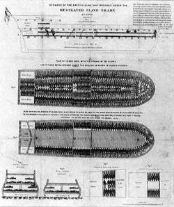 The abolitionists pioneered another key organizing tool as well, and you have seen it. Rare is the TV program or illustrated book about slavery that does not show a detailed, diagramlike top-down view of rows of slaves’ bodies packed like sardines into a ship. The ship is a specific one, the Brookes, of Liverpool, and Clarkson and his colleagues swiftly printed 8,700 copies of the diagram, and it was soon hung on the walls of homes and pubs throughout the country. Part of its brilliance was that it was unanswerable: What could the slave interests do, make a painting of happy slaves on shipboard? Precise, understated, and eloquent in its starkness, it was the first widely reproduced political poster....
Meanwhile, something else feeding the country’s growing antislavery fervor was Olaudah Equiano’s autobiography, a vivid account of his life in slavery and freedom. At seven shillings a copy, it became a best-seller. For an extraordinary five years, he promoted his book throughout the kingdom, winning a particularly friendly reception in Ireland, whose people felt that they, too, knew something about oppression by the British. Equiano’s was the first great political book tour....
The slave interests’ tactics bore a fascinating resemblance to the way industries under assault try to defend themselves today. When, for instance, there were moves in Parliament to try to regulate the treatment of slaves, the planters hastily drew up a lofty-sounding code of conduct of their own and insisted no government interference was necessary. They considered other P.R. techniques as well. ‘The vulgar are influenced by names and titles,’ suggested one pro-slavery writer in 1789. ‘Instead of SLAVES, let the Negroes be called ASSISTANT-PLANTERS; and we shall not then hear such violent outcries against the slave-trade.’”
If, as the author suggests, so many of these grassroots tactics were pioneered here, what was it that made the tactics suddenly possible? Might it have something to do with the increasing availability of cheap paper and printing? A sea change in popular mood and political will fueled by access to decentralized publishing, and direct action in the fields?
Popular Delusions and The Madness of Cows
Since we know exactly how mad cow disease is spread, it should be pretty easy to identify which meat to buy just by finding out how the cows are raised. Free range? Grass fed? Organic? It’s all labeled there on the package, right?
You might be surprised to find out just what falls into the gap between “Grass Fed” and “100% Grass Fed.”
 In steps the Consumers Union to provide the story behind the cypher:
“Consumers Union (CU), the independent nonprofit publisher of Consumer Reports magazine, is providing consumers with important information about which meat labels can and cannot help consumers wanting to reduce their the risk from mad cow disease.
Mad cow disease is known to pass from one animal to another through the use of animal by-products in animal feed. Certain labels indicate that animal by-products are not used in the feed that produced the meat. Therefore, meat carrying these labels is very low risk in terms of mad cow disease.
The information is posted at eco-labels.org which lists the the most helpful labels (“Organic” and “Biodynamic”) somewhat helpful labels (like “100% Grass Fed”), and labels that should not be relied upon to reduce the risk of exposure to mad cow disease (like “Free Range”).
In addition to meat labes, the site lists terms and labels from other food, household, and personal care products, and clearly states which terms do or do not have official definitions and organizations who verify compliance.
From eco-labels.org:
“CU launched www.eco-labels.org in the spring of 2001 to help educate consumers about these labels. Consumers Union believes that the best eco-labels are seals or logos indicating that an independent organization has verified that a product meets a set of meaningful and consistent standards for environmental protection and/or social justice....
The purpose of this site is to provide information to consumers regarding eco-labels, products that carry eco-labels, the organizations that produce eco-labels, and government and private standards for ‘green’ products. Our goal is to help consumers make more informed choices in the marketplace, and participate more effectively as citizens in important decisions that affect the environment.”