built
The Consumption of Space
 In November 2003, I blogged Edward Mazria’s analysis of the environmental impact of architecture in the U.S. Namely, that buildings are responsible for a whopping 46 percent of carbon dioxide production in the U.S.
Yesterday, Mazria and company launched a Web site to spread the word and promote a response. From the press release:
“www.architecture2030.org is part of an ongoing effort, initiated by architect Edward Mazria, to provide information and innovative solutions in the fields of architecture and planning, in an effort to address and reverse the destructive trend toward global climate change.
The website clearly illustrates, using the latest research, that the Building sector is currently responsible for about half of all U.S. and global emissions annually and that this sector’s emissions are increasing at an alarming rate. Architecture2030.org outlines the steps necessary to address this situation. As part of this effort, the website includes a variety of resources to help professionals, government officials, and those in the building sector, plan and design for a carbon-neutral future....
The website will report on the activities and progress in the building sector around the globe and critical information will be updated regularly.”
In particular, I liked the case studies.
Also of particular note is the organizing work of the American Institute of Architects, a professional association:
“The American Institute of Architects, representing 74,000 prefessionals, recently announced a bold initiative to reverse the environmental impact and greenhouse gas emissions of the U.S. building sector. The AIA... set a goal of reducing the fossil fuel consumption of buildings by 50 percent in four years, with additional 10-percent reductions every five years thereafter. The implications of this initiative are considerable and when implemented will transform the built environment in a way we have not seen since the time of the industrial revolution.”
Mobil

Parody of the old Mobil Oil logo seen along Silverlake Blvd in Los Angeles.
Made

Manhole cover seen on the Venice Beach boardwalk.
Who’s the Illegal Alien, Pilgrim?
Beware of the God
Like the U.S., Australia has a growing problem of fundamentalists in politics.
In response, graphic designer, artist, and activist Deborah Kelly has undertaken a large scale public art project in the streets (skies and train stations) of Sydney. From bewareofthegod.com:
“This site intends to be a resource of diverse material documenting, analyzing, and musing upon the impacts and aspirations of religious literalists in the public sphere. It is being produced in Australia, in 2005, so that is its first focus. However, you will also find here information, ideas and reportage from other places, because even though context is everything, a global phenomenon is also something.”
The project incorporates multiple media, including:
A 30 second film shown every ten minutes on 42 billboard screens in Sydney train stations, viewable in miniature here [Quicktime 874 Kb]
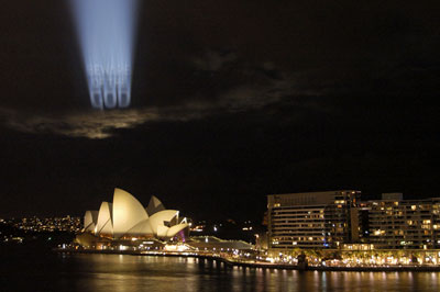
Projections onto clouds over Sydney Harbor:
Distribution of 40,000 free postcard/stickers (you can mail or peel the front off and stick to your door.)

And essays and analysis posted on the project Web site. On the site is an open call for further cultural and analytical material.
The effort is backed by the Museum of Contemporary Art in Sydney as part of their biennial Contemporary Australian Art show, this year called Interesting Times.
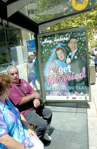
Related projects from Kelly include a series of posters designed with Tina Fiveash satirizing the right wing regime of “compulsory heterosexuality”.
And a series of illustrated matchboxes satirizing the Christian right push in Australia to have muslim women and girls banned from wearing hijab “because they might be hiding bombs.” Kelly and friends made thousands of satirical matchboxes and left them lying around.

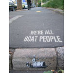
Kelly is also involved in a collective challenging the rhetoric of politicians calling refugees ‘boat people.’ See more at http://www.boat-people.org/
Though not aligned with a specific organizing campaign, I think such cultural work is important in the battle for hearts and minds.
A Brief History of Peru
From Inca to conquest to liberation, in a mural.
Guernica, USA
John T. Unger writes in about his campaign:
“I thought you might be interested in helping spread the word about a call for participation. I’m looking for artists/activists who can help get billboard sized reproductions of Picasso’s Guernica installed in as many US locations as possible.”
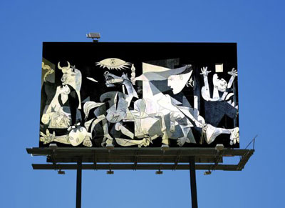
From his blog:
“Ideally, the work would stand without any text or headlines or additional commentary: if the painting is all that’s seen, it forces the viewer to make an interpretation instead of being told what to think. Being told what to think is exactly what got Americans in trouble in the first place, no?
In terms of how the project is carried out, I don’t really think it matters whether billboards are rented, plastered over in dark of night (see: BLF, the Billboard Liberation Front) or created just for this purpose. Obviously not everyone has the budget to actually rent billboard space, though it seems like this might be an option for funded activist groups. Now that most billboards are made to hold printed tarps rather than pasted up sheets of paper, it would certainly be easier and faster for guerrilla Guernicas to be painted on canvas and installed at whim. For those who do take the guerrilla approach, it might help to read this basic primer on how to appropriate billboards. Also check out the Wooster Collective for ideas and techniques.
I don’t think it matters whether the images are photos, stencils, handpainted, collaged or what. If the project really took off, part of the excitement would be seeing the results of many different people interpreting a well know work in their own way. I will happily publish any photos sent in by participants of the project.”
The project is, in part, a test of his idea of “open-sourcing art projects” to involve as many participants as possible.
NYPD v. FDNY
One of the failures of the emergency response on September 11, 2001 was the inability of the New York Police Department and Fire Department to coordinate their activities.
So as a new policy for emergency response was debated, I’d assumed the battle for control in a disaster was one of power between two muscular (mostly) white, male institutions* (mostly) immune from external accountability. Or to put it to a kinder scenario, one of two long-standing, insular city bureaucracies unwilling to bend to the other.
Who would you want in control? One has experience with hazardous materials, the other with crowd control. One carries axes, the other guns.
So what does this have to do with design?
A friend who works for the city put it differently. She cast the dispute in terms of the departments’ relationships to the built environment:
The first response of the NYPD is to quarantine and preserve the evidence at the scene of the crime.
The response of FDNY is to enter forcefully and tear up the scene looking for survivors and hidden fire.
How exactly should they work together?
* As of 2005, FDNY was 92% white and only 28 of the department’s 8,700 firefighters were women. [source] As of 1999, NYPD was 67.4% white and in 2001, 17 percent of sworn personnel were women. [source, source]
Architecture and Development
Via the National Design Awards I discovered the work of Sergio A. Palleroni:
“Sergio A. Palleroni, research fellow at the Center for Sustainable Development at the University of Texas, Austin, runs 10-week-long design/build studios around the world in marginalized communities. Participants learn to use hands-on construction and design skills, maximize locally available, recycled, and inexpensive materials, and implement lighting and energy systems that help to reduce energy costs and promote conservation. In turn, communities mobilize indigenous resources and develop long-term practices that sustain cultural identity, dignity, and stability.”
How rare to find a development program that actually seems to engage with the local community and context. Not just ‘humanitarian’ aid, but actual education and collaboration.
Add this to my growing list of architecture and development programs:
- Architecture for Humanity
- Architects Without Borders
- Association for Community Design
- Barefoot Architects
- DesignCorps
- Over the Rhine
- Habitat for Humanity
- Rural Studio
- Sustainable South Bronx
- Voluntary Architects Network
I’m sure there are others I’m leaving out. It’d be instructive to do a closer comparison of the methodologies, politics, and assumptions of various architecture-based anti-poverty programs.
Quite apart from Planner’s Network who work for more fundamental change.
Post These Bills
Christopher DeWolf has a nice little editorial on posters and the political struggles around them in a couple of Canadian cities:
“Posters are the city. For community groups, musicians, activists, small businesses, and hell, even people who’ve lost their cat, they’re often the only way to get a message out. They cover lampposts, service doors, construction hoardings and blank walls, livening up grey and depressing winters and turning underused spaces into interactive bulletin boards where the city’s goings-on are announced to anyone who might be interested. Despite their importance to civic and cultural life however, posters are an all-too-easy target for municipal politicians and bureaucrats who want their city streets as bland and orderly as a Lego metropolis. Posters might seem innocuous, but they are in fact a sign of a city’s vitality and diversity — how municipalities deal with postering is a measure of just how willing they are to accommodate that vibrancy.”
DeWolf privileges “freedom of expression” and a “diversity” of voices but I would take it further and say that this is a matter of democracy itself — of ownership of the means of communication and the of the physical space of our communities, of building community and political power.
Wall of Respect
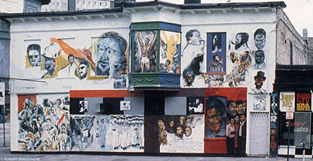
The Wall of Respect was an outdoor mural created in 1967 on the South Side of Chicago by a group of visual artists from the Organization of Black American Culture. It was a time when African Americans were virtually absent from the mainstream media. The initial theme of the mural was ‘Black Heros.’ Some sections of the Wall were later repainted by artists with scenes that responded to current events in the Civil Rights Movement.
As a focal point within its community, the Wall became a catalyst of the redevelopment of Chicago’s South Side and of the Black Power Movement. It became a place to meet and rally, notably of two large gatherings: the August 1967 rally organized by the Student Nonviolent Coordinating Committee and the October 1967 “black festival of creativity” organized by the 43rd Street Community Organization.
The Wall quickly drew national attention and inspired the Community Mural Movement. The Wall inspired black pride murals in Detroit, Boston, St. Louis, and Philadelphia, as well as Latino/a and Asian American community murals.
It also drew the attention of the FBI’s COINTELPRO which sent anonymous threats to the Organization of Black American Culture and participating artists. The organization disbanded shortly after the completion of the wall.
In 1971, the building was damaged by fire and subsequently demolished.
Northwestern’s Wall of Respect Web site features photos and essays about the Wall, Quicktime interviews, lesson plans, and poems about the Wall by Gwendolyn Brooks and Don L. Lee.
page 20 19 18 17 16 15 14 13 12 11 10 9 8 7 6 5 4 3 2 1 Older »


