

built
Pedestrians have been ignored by urban planners who come up with fancy mega road projects that never include a decent pavement where people can walk freely and safely.… The organisation demands that pedestrians be provided a six-foot-wide walkway along the middle of the roads.”
The Vision Thing
An article of mine is running in the Design Issues column of the January/February 2008
Communication Arts. It started out as a piece about design education outside of traditional design schools, but then turned into something more — about grassroots engagement with public space and the power of design to envision change. Thanks Nicolas, Kim, Chris, David, and DK for their insight.
The Vision Thing
Seeing and creating change through design
It’s is not just in design schools. It’s not just in mentorship programs at top shelf firms. Design and education meet in the streets.
Most graphic design education points to a career as a design professional. But the same tools we use to undertake user research, solve problems, and satisfy clients can be used by young people to voice their opinions and meet the needs of their neighborhoods and communities.
The stories below are shining examples of design as populism. The designers of these projects – amateurs and professionals – have moved beyond a passive relationship to the world, beyond the daily pattern of serving clients, responding to assignments, and deadlines.
By taking it outside, they are asserting a positive vision and owning the spaces they live in – and in the process are making these places better for us all.
Human Traffic
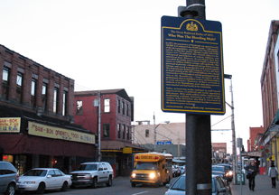
Memorials shape our collective memory. They are a tangible, public stake against forgetting, a manifesto to the present and a reminder of the past as a warning for the future. Put forth by loved ones after a tragedy, grassroots memorials are at once both personal and public – often filling a void where government-funded memorials leave off. Some are subtle collections of flowers and personal items, occupying quiet corners of common space. Others scream out for attention. Rendered three-stories tall on the side of a building, the memorial mural on Butler Street and Third Avenue in Brooklyn is hard to ignore.
The design is a tribute to 28 pedestrians killed by cars between 1995 and 2007 in the streets of Brooklyn’s Gowanus neighborhood. The mural depicts three young boys, fifth-graders Victor Flores and Juan Estrada, and 4-year-old James Rice. All three were killed by cars speeding around corners – Rice was struck down just a block from the spot where the mural now stands. The driver who hit Rice got a ticket for failure to yield. Represented as towering figures painted in ghostly blue, the boys hold up redesigned streetsigns with traffic-related symbols urging respect for pedestrians. The three boys are accompanied by a blank silhouette holding up an unambiguous red stop sign declaring: “Not one more death.” The effect is chilling.
It’s not just rising costs or a lack of funds: “Infrastructure repairs simply aren’t as sexy as ribbon-cuttings. The public and politicians are more likely to support new construction, leaving existing structures wanting.”
Open Terminal
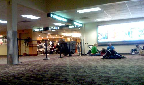
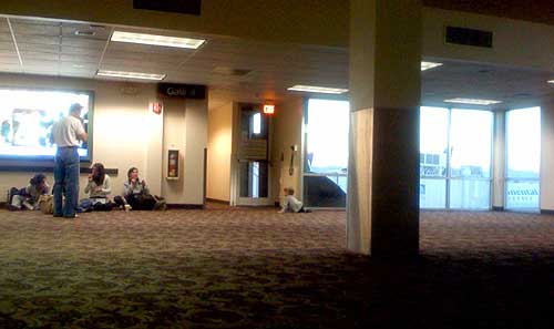
Gate 4 in Terminal 2 of Sky Harbor International Airport in Phoenix, AZ is not meant to be used.
Behind the black stanchions, the roughly 50 x 50 foot space has no TV, no gift stand, no seats; just a row of outlets, a few windows, and a single column supporting the mostly uninterrupted, open space. Which of course makes it a perfect space for kids to wrestle and run, for strollers to park, and for bloggers to plugin their laptops and cellphones and lounge on the floor for a few restful minutes. It’s just a big, empty playroom — and a breath of fresh air, particularly after standing in line for an hour, when your departure gate is crammed, and you’re about to spend the next 5½ hours of your life hunched over your knees in steerage.
I suppose it only works because the space was relatively uncrowded — the black ropes keeping most out, but having no affect on those who toddle right under them, or the rest whose craving for free electricty overrides the risk of a stern talking to. The space probably would not have worked if this were an actual functioning departure gate. I suppose all the rigid rows of plastic seats are a good way of making sure luggage and bodies don’t collide.
But it seems like a fine idea — a sort of indoor, public park. I wish more places had uninterrupted, unstructured, uncommercialized open space. More airports should do this.
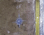
To Where, From Whom
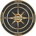
 Folks reading my most recent post about the New York City’s implementation of the compass rose by subway exits may have thought the Department of Transportation took its inspiration from my blog. Not so.
I came up with the idea in conversation with out-of-towner Micah Anderson over dinner with the folks from Eggplant Active Media back on March 4, 2006 and later posted it to this blog.
Graffiti roses showed up near downtown exits three weeks later, though I was never sure if my post inspired this. After kottke.org picked up my link, I received this email:
hey man,
i am NOMAD, I have been doing the compass rose graffiti, someone just showed me your post on it,
great minds think alike....
However, while this was all in March 2006, last week’s New York Times article on the DoT’s 2007 implementation of the compass, cites the new transportation commissioner who says she got the idea from “an Upper East Side man who was among about 20 New Yorkers quoted in The New York Times in January 2006 in an article about practical ways to improve the city.”
 But wait, there’s more!
After my post about the official NYC rose was picked up by a couple of blogs, I received an email from Mary Ciuffitelli who says she proposed the idea publicly back in 1992:
Hey John,
I like your website and design, but I have some news for you.
In 1992, I received an award from The Municipal Art Society for this compass rose idea. MAS ran a big competition called Design New York. There were seven winners out of 1500 entries, followed by an exhibit, an awards ceremony, a lot of press (including the New York Times), NBC TV News interviews, etc. I have my original sketch, award letter, ceremony program, tape of the TV interview, all the documents.
Fifteen years ago, there was talk of the city implementing the idea. In the meantime, friends and I talked about going guerrilla and just spray-painting compasses all over the subway system. I wish we had. I was working at a design studio back then, and there was plenty of enthusiasm. We designed a stencil for our plan based on the floor compass in the subway at Grand Central Station. If I keep digging through my stuff, I’ll find that drawing as well.
There were some pretty great ideas that came out of that contest. (Including a submission very close to mine.) Time to look back before setting down the history. This NY Times article boils down my idea to one sentence, but my submission included slightly more elaborate suggestions to reflect neighborhood character and landmarks.
Designing a Better New York, September 24, 1992 http://query.nytimes.com/gst/fullpage.html?res=9E0CE7DA1F3BF937A1575AC0A964958260
Since it looks like the idea is on the brink of becoming a permanent part of New York City design, I would like to set the record straight. Maybe you’d like to help me.Yours in brilliant ideas,
Mary
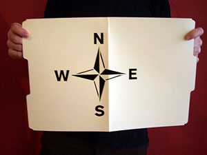
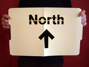
In the meantime, the folks at the Eyebeam OpenLab and Graffitti Research Lab generously let me use their laser cutter to produce a couple of stencils. I have 20 compass roses and 20 North arrows. Want to help put this up?
Send your postal address and PayPal me $2.00 for first class postage and I’ll send you one.
page 20 19 18 17 16 15 14 13 12 11 10 9 8 7 6 5 4 3 2 1 Older »