gov
CarnivorePE
“CarnivorePE (Personal Edition) turns your computer into a personal data surveillance tool. Use CarnivorePE to run Carnivore clients from your own desktop, or use it to make your own clients. Read the FAQ, or view a screenshot of CarnivorePE in action with Mark Napier’s ‘Black and White’ client.”
 CarnivorePE is a packet sniffer designed by the “Radical Software Group” to emulate Carnivore one of the FBI’s email wiretapping systems (at least according to what we know about it.) CarnivorePE allows artists to translate traffic on a computer network into abstract visuals based on customizable filters.
While CarnivorePE does call attention to Federal wiretapping and, to a degree, how insecure networks can be, I find it utterly complacent. The project actually makes no comment about data insecurity or FBI surveillence. Instead it takes it as a departure point, as a given, makes it pretty, and even wins cash and props (see the praise of the art press and the list of funders at the bottom of the page.) The project does practically nothing to educate users about Internet security or to encourage better security habits. The project does nothing to push for greater disclosure of government surveillence or greater restrictions. In fact, the equation seems to be that more surveillence means more pretty art.
Whether you go for the technical fix or the political one, there are more constructive ways to apply your technical and creative talents. Why not develop entertaining and easy to understand materials to teach about computer and Internet security, privacy, anonymity? Encourage the use of encryption? Take action in the campaign against the FBI’s use of Carnivore? Or join Project Vegan, an anti-Carnivore set of Free Software tools in much need of contributers?
Camp
While browsing the DefenseLINK site looking for some good public domain photos, I found a bunch the Pentagon had recently released of the new U.S. detention center at Guantanamo Bay.
The United States was harshly criticized for the brutal, crude design of Camp X-Ray. Photos were widely circulated of prisoners at squatting in their chain-link cells in the blazing Cuban sun.
Five miles down the road, Camp Delta is now open for business. Photos of a detention block and spotless
cells make it seem like an improvement. (Even the name “Camp Delta” reads like a hokey PR move.) Camp Delta has indoor plumbing, each unit its own flush toilet, metal bed-frame and a sink with running water. None of this was available at Camp X-Ray where buckets and portable toilets were used. No detainees in any of  the new photos, though.
The $9.7 million dollar contract for the construction of the camps went to Brown and Root, a subsidiary of Halliburton. The contract could eventually total as much as $300 million if additional options are exercised. Vice President Dick Cheney is the former chief executive officer of Halliburton.
In addition to the new cells, Camp Delta has its own recreation and exercise area, library, outdoor shower, hospital and ward. “Comfort items” distributed to detainees including a prayer mat, cap, flip flops and two-piece suit.
And, dental care is provided at the detainee hospital.
Free dental care? It’s more then most Americans get.
But then another look at that chair and the skin starts to crawl. One suspects the U.S. isn’t terribly concerned with the beautiful smiles of its “enemy combatants.”
Indeed, this morning’s Washington Post describes secret overseas CIA interrogation facilities where detainees are
being tortured. The same torture techniques are of course denounced by the U.S. State Department in its annual survey of human rights violations in other countries. In fact its in some of those very countries where the CIA is setting up shop. Says one U.S. official, “If you don’t violate someone’s human rights some of the time, you probably aren’t doing your job.”
Says Human Rights Watch:
“Direct involvement or complicity in torture, as well as the failure to prevent torture by subordinates, may subject U.S. officials to prosecution under international law. Such acts are ‘grave breaches,’ or war crimes, under the 1949 Geneva Conventions. In addition, the Convention against Torture [which the U.S. has ratified] obligates all countries to prosecute persons within their jurisdiction who are implicated or complicit in acts of torture. Any competent court anywhere in the world is required to prosecute violations of the prohibition against torture.”
According to U.S. officials, nearly 3,000 suspected al Qaeda members and their supporters have been detained worldwide since September 11, 2001.
American Concentration Camps
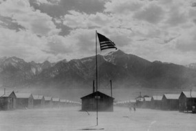
Blamed for an attack on America, non-white Americans and residents of foreign descent had become so hated that in February 1942 the President ordered their arrest and detention at “relocation centers” around the country. 110,000 men, women, and children were removed from their homes, rounded up at gun point, and locked up for the next three years.
From a Web site on Owens Valley History, the site of the Manzanar detention center:
“Two-thirds were first-generation American citizens. They lived in American cities, attended American schools, and thought of themselves as Americans... They were removed from their homes, schools, and businesses, and brought to Manzanar and nine other camps like it.... A few were second-generation Americans.... Neither they nor their parents had ever known any other life than their life in the United States.
Almost a third of the prisoners were Japanese citizens, resident aliens by definition of the U.S. immigration law.... All of this group had lived in the United States at least eighteen years, since American borders were closed to Japanese immigrants in 1924. All had been specifically barred from applying for American citizenship. The right to become an American citizen was not allowed to the Japanese until 1952, when quotas were introduced.”
The Library of Congress Web site features a collection of 244 photographs of Japanese-American internment at Manzanar taken by reknown landscape photographer Ansel Adams. Depicted are scenes of daily life, agricultural scenes, sports and leisure activities, and portraits of the detainees. Browse via the subject index or the thumbnail view.
From the Library page about the collection:
“In 1943, Ansel Adams photographed the Manzanar War Relocation Center at the suggestion of its director, his good friend and fellow Sierra Club member, Ralph Merritt. Adams wanted to contribute to the war effort while at the same time show the loyalty of the Japanese-Americans interned at Manzanar... In 1944, some of these images were published in Adams’ book Born Free and Equal. The book had a limited circulation, perhaps due to the political climate of war-time America. When offering the collection to the Library, Adams said in a letter, ‘All in all, I think this Manzanar Collection is an important historical document, and I trust it can be put to good use...The purpose of my work was to show how these people, suffering under a great injustice, and loss of property, businesses and professions, had overcome the sense of defeat and despair by building for themselves a vital community in an arid (but magnificent) environment.’”
The internment camps were small planned communities built with volunteer, contract, and forced labor on the site of a ghost town.
“The center was located at the former farm and orchard community of Manzanar. Founded in 1910, the town was abandoned when the city of Los Angeles purchased the land in the late 1920s for its water rights. The Los Angeles aqueduct, which carries Owens Valley water to Los Angeles, is a mile east of Manzanar.”
In addition to vital necessities of food and shelter, the camp had its own school, church, factories, hospital, and even a local paper. See this essay for details on the design and operations of the camp.
 40 years after the closing of the camps, the United States government conceded that the relocation was based on racial bias rather than on any true threat to national security. 50 years later in 1992, President Bush offered reperations and an apology.
Congress established the Manzanar National Historic Site, containing 550 acres, on March 3, 1992. It is currently administered by the National Park Service, under the U.S. Department of Interior. See the Park Service Web site.
Nearly 60 years after the war, Yoshie Hagiya, age 77, Oxnard High class of 1942, received her school’s valedictorian honors.
Murals and Anti-Murals in Nicaragua
Two years ago I spent my birthday in Nicaragua. I was traveling with a delegation organized by Peaceworks, meeting with local groups and learning about the country and its struggles. As the eight of us bounded along the dusty roads in the back of a white pickup truck, one could periodically spot these odd abstract murals along walls and fences. They were vertical, horizontal, and diagonal stripes in pastel colors. It turns out the stripes had been painted over Sandinista slogans and murals under orders from right-wing President Arnoldo Aléman. See Nicaraguan Murals 1930-2000 on the Stanford site for a hint of what was lost.
The painted stripes reminded me of Sol LeWitt and Sean Scully. A fizzy gallery world rhetoric of geometry instead of engagement with the world at large. And that’s just the way the CIA likes it. From the Monthly Review:
“[The] CIA and its allies in the Museum of Modern Art (MOMA) poured vast sums of money into promoting Abstract Expressionist painting and painters... What the CIA saw in Abstract Expressionism was an ‘anti-Communist ideology, the ideology of freedom, of free enterprise. Non-figurative and politically silent it was the very antithesis of socialist realism’. They viewed Abstract Expressionism as the true expression of the national will. To bypass right-wing criticism, the CIA turned to the private sector (namely MOMA and its co-founder, Nelson Rockefeller, who referred to Abstract Expressionism as ‘free enterprise painting.’)”
See also articles in Salon and the New York Times.
Needless to say, the CIA also poured of money, weapons, and comics into toppling the Sandinistas.
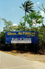
 We rode through the streets paved with hexagonal ‘Somoza bricks’ crumbling from the wear and tear. The Somoza government had laid the bricks, having purchased them from factories he also owned.
These stark blue billboards were everywhere. “Obras No Palabras” painted in the same yellow italic sans serif and listing some local government financed project. “Works not Words,” a kind of anti-propaganda propaganda promoting the good will of the State and attempting to short-circuit debate.
And indeed, Aléman’s works have spoken loudly. This past September, Nicaragua’s Attorney General charged Aléman and 13 members of his family and former administration “with money laundering, fraud and other crimes.”
I bet he never saw that coming from his own former vice-president.
Design for Democracy
Misleading ads, voter intimidation, malfunctioning and confusing ballots... problems continue to plague U.S. elections. And designers are starting to step up.
Design for Democracy is an non-profit organization in Illinois . It’s mission is to:
“Improve the informational and physical systems involved in the American voting experience through education and user-centered research, evaluation, strategic design, and implementation, in order to support an environment in which every voter counts.”
 From the about page:
“The team is national. Our focus is local. We approach election issues with a unique perspective: as designers. To do that we have specialists in graphic design, industrial design, interface design, Web site development, anthropology, and usability, all of whom understand the human factors in the voting.
We are objective and independent, and we are valued for our ability to consider all possible solutions without preference to a particular technology, ideology or organization. Our commitment is to the public good and we adhere to standards and practices that preserve our client-focused point of view. Our recommendations and the materials we create will be based on meeting election code requirements and understanding what will be easily implementable by those who operate elections.
Design for Democracy... is not aligned or associated with any corporations, organizations or entities that advocate a specific voting product or service.
Design for Democracy works directly with election officials in both large and small jurisdictions to maximize their resources and achieve specific goals.
For large jurisdictions, we can comprehensively study singular issues and determine areas for improvement in processes, procedures and materials. Then we can apply our knowledge and experience to recommend and implement those improvements.
With smaller jurisdictions, we can apply proven strategies and solutions, including templates that can be easily adapted to a particular need. These templates have already been used successfully in two Cook County, Illinois elections.”
Affiliated organizations include the Industrial Designers Society of America, the American Institute of Graphic Artists, the Usability Professionals Association, and the University of Illinois at Chicago.
Thus far they’re primarily active in Chicago, with a project in Oregon. After a proposed redesign of Chicago’s butterfly ballot, the group then worked to change the Illinois Election Code to implement the redesign and legally allow the use of lowercase letters in candidate names. Student projects include the design of a more universally accessible voting booth and a more efficient document handling system.
Also, the nod to “user-centered research” in the mission statement refers mainly to field research and documentation rather than actual participation by voters and poll workers in the design process. At minimum, the usability professionals should be able to incorporate user feedback and testing into the process rather than just at the initial data gathering phase.
Once the voting process is redesigned, a hard look at how design can facilitate public participation in other processes (such as candidate making, ballot initiatives, campaign financing, city planning, etc.) would be much welcome.
Otherwise, this seems like a good first step towards engaging designers in civic affairs.
A follow up to this brief blog item on ballot design from May 2002.
Posters for Workers (and the People Who Employ Them)
“Some of the statutes and regulations enforced by agencies within the [U.S.] Department of Labor require that notices be posted in the workplace. The Department provides electronic copies of the required posters. Some of the Department of Labor’s posters are available in languages other than English. They are also available in electronic form.”
More are not very beautiful and seem designed by bureaucrats, but they must be posted in a conspicuous place as a notice to employees and a warning to employers. The posters implicitly call on employees to monitor the complience of their employers, and some even provide phone numbers and contact info. They are designed in a no-nonsense institutional non-style, that speaks of authority and bureaucratic indifference.
Are you a confused employer? The Department of Labor even has an online an electronic walkthrough of the poster requirements and laws.
Many states have their own posters and requirements, too. The posters generally fall into the following areas: minimum wage and age, job safety and health, information about emergency family medical leave, worker’s compensation, and polygraph and equal opportunity protection.
None of the posters I found address your federally protected right to organize and form a union in your workplace — though South Carolina, a “right-to-work” state, describes this right in their big labor law poster.
Below are a sampling of posters produced by the states.
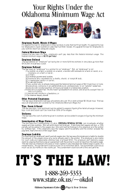
In addition to their statutory language version, Oklahoma provides a plain language version (shown), complete with color photos and clear subject headings.

Tennessee’s poster for employees offers a loud warning for those would forget their rights.

Child labor law == happy kids. Just like in the clip art of this Kansas poster.
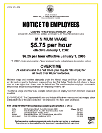
Hawaii’s posted is clear and direct, with a splash of color.
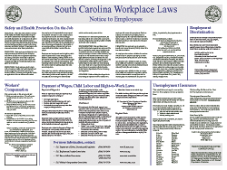
Because the information on this South Carolina poster is so organized, I don’t think the poster was consciously designed to be obscure. But what employee would read such a dense poster in the kitchen?
There are also companies who market compliance, selling laminated, redesigned, all-in-one versions of the posters.
Antiimperialistisch Solidaritat
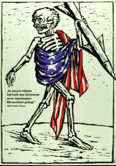
Like the international solidarity work of Cuba, the government of East Germany
“strongly advocated for anti-imperialism and declared general freedom and solidarity with numerous countries including Chile, Uruguay, Vietnam, Laos, Angola and Palestine among others up until the fall of the Berlin Wall in 1989.”
Transnational Poster Art: International Solidarity and East German Poster Art is an online exibit of over 30 posters
“all of which were designed in the former German Democratic Republic (GDR), and whose production was funded and encouraged by the East German government. The viewer will also encounter some posters produced in Nicaragua and Chile which compliment the East German ones in terms of content, and other types of artwork created by Germans as well as Latin American citizens. Our purpose is to show the GDR’s foreign policy towards developing countries during the 1970’s and 80’s, a foreign policy which the East German government strove to reinforce and legitimize through this popular art form.”
 The introductory essay proposes that in addition to this legitimation, the posters fostered an awareness of international political situations, reminded the East German population of communist movements around the world, reinforced the idea of the U.S. as a common enemy to those movements, and that the foreign policy (and its promotion) were also an effort to “one up” West Germany and to gain approval and clout from the Soviet government.
The posters are organized as follows:
- History: GDR Poster Art
- GDR Poster Art and Chile
- GDR Poster Art and Nicaragua
- GDR Poster Art and other Latin American Countries
- GDR Poster Art and other Developing Nations
- Anti-USA Posters
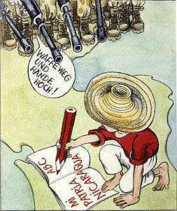
The poster up top is by Alexander Schiel, titled “‘In our hands, God has put the destiny of a troubled humanity.’ — US President Reagan,” 1983. The poster on the right is “Untitled (Literacy),” 1984, by Barbara Henninger. The American troops are saying “Drop your weapons and put your hands up high!” to the Nicaraguan boy, learning to write, spells out “Nicaragua my mother country.”
Other East German poster art and propaganda can be found at the German Propaganda Archive, see
- Caricatures from Eulenspiegel, the GDR’s weekly humor magazine, 1953
- Posters from the 30th anniversary of the GDR in 1979
- Eulenspiegel cartoons, 1985-1989
- Labor related propaganda from workplace Wandzeitungen — bulletin boards or “wall newspapers,” 1988 and 1989
Roofless in Tokyo

Since the collapse of the bubble economy, the number of homeless in Japan has risen from 1,000 in 1992 to over 30,000 in 2002. The long recession means a severe shortage of unskilled day labor in construction and manufacturing. The average age of the homeless here is 55 and they are almost entirely men. What little day labor there is usually goes to younger men. With no work, no money, and no where to go, the men buid their own shelter on public land along the boardwalk by the river and along the edges of the few public parks near the employment brokers (both legal and illegal). The houses are neat and trim, built to fight the weather and cold and to provide some basic comfort. They are also collapsible. Once a month the government comes and sweeps the houses off the boardwalk. It’s usually the same day every month, so the guys dismantle their houses and haul the materials over the wall... to rebuild them later that afternoon.
The houses are tucked away behind fences and under bridges to be less visible, and are kept neat in a conscious effort not to disturb passersby. Unlike in the States, I’ve not encountered any panhandling. They may be hungry, they may be desperate, but some things are just not done.
 Almost all the structures use the same blue vinyl tarp. The tents in the parks are looser and less constructed than along the river, presumably because the sweeps in the parks take place weekly.
The situation is utterly absurd... but not unlike that of my own neighborhood. There’s no place to go, says the City, you just can’t stay here.
After a mass eviction in 1993, the “Coalition of the Homeless in Shinjuku” was formed to provide mutual support, to seek livelihood and employment guarantees, and to stop the evictions, referred to by the government as “environmental cleaning.” After years of denying the problem, the national government passed a controversial law in August 2002 to provide some relief. Still, the evictions continue and the additional shelter has not yet been built. It remains to be seen how the new measures will proceed. The guys don’t want handouts, they just want work, affordable housing, and to be treated with respect.
Read more about the Movement of the Coalition of the Homeless on the Web site of the Resource Center for Homeless Rights.
The Art of the FBI
The FBI’s “counter intelliegence” program COINTELPRO was created in 1956 to neutralize political dissidents in the United States. Although the FBI’s COINTELPRO’s officially ended in 1971, there have been many examples of counterintelligence-type operations against political dissidents since. The 1976 investigation led by Senator Frank Church officially brought COINTELPRO’s mission to light:
“‘to expose, disrupt, misdirect, discredit, or otherwise neutralize’ such groups and their ‘leadership, spokesmen, members, and supporters.’ The larger objectives were to ‘counter’ their ‘propensity for violence’ and to ‘frustrate’ their efforts to ‘consolidate their forces’ or to ‘recruit new or youthful adherents.’ Field offices were instructed to exploit conflicts within and between groups; to use news media contacts ridicule and otherwise discredit groups; to prevent ‘rabble rousers’ from spreading their ‘philosophy’ publicly; and to gather information on the ‘unsavory backgrounds’ of group leaders.
One of their techniques was the use of “black propaganda,” bogus information that conceals or fakes its source. This included faked letters, poems, and satirical comic books to pit activists against one another.
Stay Free Magazine’s article “Fake Letters and Bad Poetry: Highlights from the FBI’s Secret War on Dissent” lists several examples:
Coloring Books
Previously mentioned here, the Black Panther Coloring Book was designed by the FBI to appear as if created by the Panthers. The books contained inflamatory pictures, some of which featured young black kids shooting pigs dressed as policemen. From the Church report:
 “One of the Bureau’s prime targets was the BPP’s free ”Breakfast for Children” program, which FBI headquarters feared might be a potentially successful effort by the BPP to teach children to hate police and to spread ‘anti-white propaganda.’ In an admitted attempt ‘to impede their contributions to the BPP Breakfast Program,’ the FBI sent anonymous letters and copies of an inflammatory Black Panther Coloring Book for children to contributors, including Safeway Stores, Inc., Mayfair Markets, and the Jack-In-The-Box Corporation.
On April 8, 1976 in Executive Testimony a former member of the BPP Central Steering Committee stated that when the coloring book came to the attention of the Panther’s national leadership, Bobby Seale ordered it destroyed because the book ‘did not correctly reflect the ideology of the Black Panther Party.’”
Posters and Flyers
Paul Krassner writes in “The FBI and Me — An American Story”:
“In 1969, the FBI attempt to assassinate my character escalated to a more literal approach. I discovered this, not in the file kept by Cointelpro, the FBI’s counterintelligence program, but as part of a separate project calculated to cause rifts between the Jewish and black communities.
The FBI produced a ‘WANTED’ poster featuring a large swastika. In the four square spaces of the swastika were photos of Yippie leaders Abbie Hoffman and Jerry Rubin, SDS leader Mark Rudd, and myself. Under the headline ‘Lampshades! Lampshades! Lampshades! Lampshades!’ the copy referred to ‘the only solution to Negro problems in America’ as being ‘the elimination of the Jews,’ listed in the following order: ‘All Jews connected with the Establishment. All Jews connected with Jews connected with the Establishment. All Jews connected with those immediately above. All Jews except those in the Movement. All Jews in the Movement except those who dye their skins black. All Jews. (Look out, Abbie, Jerry, Mark and Paul!)’
The flyer was approved, once again, by [Kartha] DeLoach and [William] Sullivan [J. Edgar Hoover’s top two assistants]: ‘Authority is granted to prepare and distribute on an anonymous basis to selected individuals and organizations in the New Left the leaflet submitted..,. Assure that all necessary precautions are taken to protect the Bureau as the source of these leaflets [which] suggest facetiously the elimination of these leaders [to] create further ill feeling between the New Left and the black nationalist movement....’
And if some overly militant African American had obtained that flyer and ‘eliminated’ one of those ‘New Left leaders who are Jewish,’ the FBI’s bureaucratic behind would be covered: ‘We said it was a facetious suggestion, didn’t we?’”
Cartoons
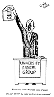 In their chapter on COINTELPRO and the New Left in The COINTELPRO Papers: Documents from the FBI’s Secret Wars Against Dissent in the United States, Ward Churchill and Jim Vander Wall reproduce an FBI memo [pages 1, 2] which lays out the Bureau’s plan to disrupt the New Left:
“Consider the use of cartoons, photographs, and anonymous letters which will have the effect of ridiculing the New Left. Ridicule is one of the most potent weapons which we can use against it.”
A further memo [pages 1, 2] details the plan to disrupt Students for a Democratic Society at Temple University through the use of cartoons, pamphlets and anonymous letters.
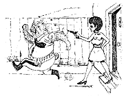
The cartoon displayed here was produced and distributed by the Philadelphia FBI office as part its plan to subvert SDS at Temple University. The caption, in a parody of the rhetoric of Sen. Joseph McCarthy reads, “I have in my hand a list of 200 names of people who don’t advocate the violent overthrow of the government.”
Mail Art
From Stay Free:
 “The FBI believed that many New Left leaders had a weakness for spiritualist mumbo-jumbo, so a 1968 memo suggested mailing them anonymous cartoons such as the one pictured here. Subsequent mailings (from increasingly closer locations) could say ‘The Siberian Beetle is Black’ or ‘The Siberian Beetle Can Talk.’ Other proposed characters included ‘The Chinese Scorpion’ and ‘The Egyptian Cobra’ — anything with a sinister meaning open to mystical interpretation. According to FBI documents, the messages were intended to cause concern, mental anguish, suspicion, and distrust among their recipients.”
Poetry
From Stay Free:
“Socialist Workers Party leader George Weissman became the first subject of an FBI poem in 1964, shortly after being framed for stealing from a civil rights leader. According to an internal memo dated 4/10/64, the FBI mailed out an anonymous letter, along with this verse, to radical publications. The purpose was ‘to discredit the Party in the Negroe civil rights field.’”

Spoken Word
From Stay Free:
“In a 1963 internal memo, counterintelligence specialist Charles D. Brennan stated that civil rights agitation represented a clear threat to ‘the established order’ of the U.S. and that ‘King is growing in stature daily as the leader among leaders of the Negro movement.’ COINTELPRO head William C. Sullivan responded in a letter: ‘We must mark [King] now, if we have not before, as the most dangerous Negro in the future of this Nation from the standpoint of communism, the Negro, and national security... it may be unrealistic to limit [our actions against King] to legalistic proofs that would stand up in court or before Congressional Committees.’
Instead of sticking to the law, then, the FBI aimed to discredit King by any means necessary. Agents tapped his phone, bugged his rooms, trumpeted his supposed commie connections, and his sexual proclivities, and sicced the Internal Revenue Service on him. When it was announced in 1964 that King would receive a Nobel Peace Prize, the FBI grew desperate. Hoping to prevent King from accepting the award, the Bureau mailed him a package containing a tape of phone calls documenting King’s extramarital affairs and an anonymous, threatening letter (shown here in censored form). In barely concealed language, King was told to commit suicide before the award ceremony or risk seeing his ‘filthy, abnormal fraudulent self’ exposed to the nation. Fortunately, King ignored the FBI’s advice. He accepted the award and lived four more years until his assassination.”
Read more in Ward Churchill’s The COINTELPRO Papers: Documents from the FBI’s Secret Wars Against Dissent in the United States.
Universal Design New York
“New York City has a long history of protecting the rights and enhancing the opportunities of the disabled. In fact, our Human Rights Law contains provisions for the disabled that go above and beyond the Americans with Disabilities Act. I am proud that our City is continuing its leadership role by becoming the first in the Nation to release a book to help architects, designers, urban planners, and developers make their structures equally accessible to all.
Universal Design New York was created by the Mayor’s Office for People with Disabilities and the Department of Design and Construction, in cooperation with the New York City Chapter of the American Institute of Architects. It describes the concept of universal design and illustrates many useful examples of this innovative design philosophy. This guide also addresses myths associated with the cost of this approach and provides a model for other municipalities to follow.
From a letter by former Mayor Rudolph Giuliani in the introduction to Universal Design New York. Kind words of support from the Mayor, unless of course you need a public toilet or are disabled and poor, in which case Mr. Giuliani would deny you social security, housing or shelter.
In the preface to the book, Catherine Paradiso, Executive Director of the Mayor’s Office for People with Disabilities and Kenneth R. Holden, Commissioner of the NYC Department of Design and Construction, write:
This book was developed to help the community of people who develop the City’s real estate and infrastructure learn about universal design. When implemented properly it removes many of the problems associated with trying to meet requirements of both the NYC building code and the Federal Americans with Disabilities Act. In fact, when designing from this paradigm, some regulations are met with ease. For example, a pedestrian pathway that is gradually sloped from the curb to the entrance eliminates the need for a ramp. Another example would be installing automatic doors instead of manual doors. Distributing and integrating accessible seats throughout a theater is yet another. These examples demonstrate how access and regulations come together to create a better environment for everyone when using universal design criteria.
This book contains many examples that make accessibility easier for the general population. When all aspects of designing in a space are universal, everything becomes easier for everyone. Children, people who have learning/cognitive, vision or hearing impairments, people who use wheeled mobility devices, senior citizens, people of short stature, parents carrying children or packages - we all benefit from universal design.
Universal Design New York is intended for two audiences. Public agencies and environmental design and construction professionals hired by the City make up the first group. They can use it to design sidewalks and street crossings, parks, community centers, shelters, museums, and any of the many other types of buildings and facilities that the City builds. The second audience consists of developers and designers of privately constructed facilities in the City. These include hotels, office buildings, restaurants and theaters, to name just a few. Any designer can apply the principles of universal design to any project....
Information in this book demonstrates how demographic trends will increase demand for universal design. Looking to get ahead of that trend, the Mayor’s Office for People with Disabilities and the Department of Design and Construction believe that now is the time to implement universal design practices. Many of the products the City buys and virtually all of the buildings the City builds today are going to be here for a long time. We should be planning today for the time when the need for universal design will be obvious to all.
Check out the table of contents. As stated above, the site is chock full of examples with photos.
This guidebook purposely avoids recommending prescriptive design standards for the universal design of buildings. Instead, it provides general guidelines designed to broaden and enhance the usability of buildings for everyone.
This guidebook’s visual illustrations of successful applications of certain universal design guidelines are not meant to be copied or imitated. Rather, they are provided to promote a general understanding of the concept - i.e., to stimulate extension of the principles to other building applications.
Many thanks to the Inclusive Design and Environmental Access School of Architecture and Planning at University at Buffalo for posting the book online.


