

gov
Post These Bills
Christopher DeWolf has a nice little editorial on posters and the political struggles around them in a couple of Canadian cities:
“Posters are the city. For community groups, musicians, activists, small businesses, and hell, even people who’ve lost their cat, they’re often the only way to get a message out. They cover lampposts, service doors, construction hoardings and blank walls, livening up grey and depressing winters and turning underused spaces into interactive bulletin boards where the city’s goings-on are announced to anyone who might be interested. Despite their importance to civic and cultural life however, posters are an all-too-easy target for municipal politicians and bureaucrats who want their city streets as bland and orderly as a Lego metropolis. Posters might seem innocuous, but they are in fact a sign of a city’s vitality and diversity — how municipalities deal with postering is a measure of just how willing they are to accommodate that vibrancy.”
DeWolf privileges “freedom of expression” and a “diversity” of voices but I would take it further and say that this is a matter of democracy itself — of ownership of the means of communication and the of the physical space of our communities, of building community and political power.
Must See TV
After this weekend’s massacre in Uzbekistan, the government has sealed off the roads into Andijan.  Journalists were forcibly removed from the city and unable to return. Along with the news. The government is blocking Web sites and broadcasts into the country by foreign news channels including BBC World, CNN and Russian network NTV. The state run television has replaced domestic news broadcasts in the region with art movies, music clips, and nature photos.
It’s not the first time we’ve seen the arts used as a deliberate means of stifling political engagement.
It won’t be the last.
From the New York Times, May 15:
“Executives at National Public Radio are increasingly at odds with the Bush appointees who lead the Corporation for Public Broadcasting.
In one of several points of conflict in recent months, the chairman of the Corporation for Public Broadcasting, which allocates federal funds for public radio and television, is considering a plan to monitor Middle East coverage on NPR news programs for evidence of bias, a corporation spokesman said on Friday.
The corporation’s board has told its staff that it should consider redirecting money away from national newscasts and toward music programs produced by NPR stations.”
Electronics Recycling in NYC
If there are regular readers of this site out there, you might be interested in the results of the NYC electronics recycling events I blogged about in October.
 Andriana Kontovrakis, Project Manager at the NYC Department of Sanitation writes:
“We collected 52 tons (104,000 pounds) of obsolete computer materials from more than 1,000 people this past Fall. The material was collected through 8 one-day collection events held between October and December.
We are happy with the turnout and tonnage. This was the first time DSNY held electronics recycling events, so we did not have a pre-set goal. We are assessing how and when we might possibly hold such events in the future, but we do not currently have any events planned.”
Independent of city sponsorship, grassroots groups continue to hold electronics collection events around town.
I just missed yesterday’s Recycle This! and Per Scholas event at Grand Army Plaza in Brooklyn.
On April 17, 2005 from 9 am to 5 pm, the Lower East Side Ecology Center will collect electronics in the North Plaza of Union Square Park.
Guns, Butter, and Ballots
An article of mine is running in January/February 2005 issue of Communication Arts.
If any of you were wondering what all that Nixon bit on the Federal Design Assembly was about, it was background research for this.
Guns, Butter and Ballots
Citizens take charge by designing for better government
What did the President know and when did he know it? In April 2004, the White House declassified one of the President’s daily intelligence briefs issued just a month before September 11, 2001. The brief specifically states that Al-Qaeda and Bin Laden were planning attacks on the United States with hijacked airplanes.
Graphic designer Greg Storey was horrified. Not just because the information was all right there, but by the design. It’s no wonder the information could be ignored. The document is an uninflected, grey mash of sans serif type. Might thousands have been saved if the information design had been better?
“Nothing in the text is emphasized, making it difficult to scan,” Storey noted on his Weblog. “It would be much better if keywords, names and places were in bold and/or in a different color. Make it so that within seconds the President can see how serious of a threat it is.” Mouse in hand, Storey created a redesigned brief of his own (below right), adding a larger headline, highlighted key terms and, most prominently, a large colored number indicating the level of the threat.
Though no one in government ever contacted Storey, readers of Storey’s blog clamored for a document template they could use themselves. He dutifully responded. (Visit http://airbagindustries.com/archives/002868.php.) “My intentions were nothing more than to rant about what I saw to be a problem with how our government works day to day,” he wrote. “I thought I would spend a few minutes in front of Photoshop to see what I could come up with.”
Alas, President Bush does not actually read the daily briefs, the Director of Intelligence summarizes them to him out loud. Nonetheless, Storey’s redesign is a dramatic example of how information design might affect the government and the public.
But the truth is, graphic designers across the country are already hard at work collaborating with local, state and national government officials to harness the power of design in the public interest. Their work affects the lives of millions of Americans by improving public safety, promoting public health and facilitating democracy on a massive scale — often at the initiative of the designers themselves.
That government agencies use graphic design is nothing new. From posters to packaging, identity and, of course, forms, the federal government is one of the largest purchasers of design services in the world. But much of this work is less than inspiring — even obscure or downright misleading. For a variety of reasons, government designers may be stifled by bureaucrats and lawyers. And sometimes it seems like the lawyers and bureaucrats do the designing themselves.
The late 1960s and 1970s, however, saw a number of seminal graphic design projects sponsored by the U.S. Government. To name just a few: Vignelli Associates’s graphic standards for National Park Service publications; Danne & Blackburn’s NASA “worm” logo; and Chermayeff & Geismar’s logos for the Park Service, Environmental Protection Agency and U.S. Bicentennial.
Continuing a wave of public art initiatives at the time, Richard Nixon even asked Congress to triple the budget of the National Endowment for the Arts and created the Federal Design Improvement Program to help upgrade government architecture and graphics.
But by the end of the 1970s, faced with an energy crisis and an economic recession, the new leadership shifted the government’s priorities. By the 1980s, a backlash raged against public arts funding. Budgets were cut and interest in public design projects waned.
Still, during this period, two masterpieces of modern infor- mation design were developed, both of which have had a demonstrable impact on public safety.
Burkey Belser’s company usually designs communications materials for law firms and other services companies. But in 1978, he was asked to design the EnergyGuide label for the Federal Trade Commission. The frustrated regulators had become desperate after a top-shelf New York design firm had failed — and submitted a hefty bill in the process. The EnergyGuide that Belser designed is a bright yellow informational sticker that must be displayed by retailers on all major appliances (like air conditioners, refrigerators and washing machines). The Guide shows the estimated yearly operating cost and energy consumption on a scale from least to most efficient. Consumers actually used it to consider not just purchase price, but cost over the life of the appliance. The success of the label convinced government regulators that you could modify consumer behavior through clear, friendly information design, gently pushing them towards more environmentally friendly, if slightly more expensive, purchases. Multiplied by millions of refrigerators, the energy savings have been enormous.
Belser’s 1994 redesign of the Nutrition Facts label also attempts to influence consumer decisions. But the label, the most widely reproduced graphic in the world, very nearly had no designer at all.
In 1991, Congress mandated that the science behind the label be revisited. Originally developed in the 1960s, the previous label was based on a culture of famine during the Great Depression and two World Wars. Hunger was an epidemic. Food was scarce and the country lacked an interstate highway system to move fresh fruits and vegetables to market. The government’s priority in the first label design was to fend off malnutrition, rickets and scurvy, and so the label highlighted essential vitamins and minerals. In 1991, Congress realized we were living in a different culture — a culture of plenty...and of fat. They tasked the Food and Drug Administration (FDA) to develop a new labeling scheme to fend off an epidemic of obesity.
The Center for Food Safety and Applied Nutrition at the FDA was well equipped with top scientists, nutritionists and epidemiologists, but lacked experience in public communication. The Center had hired another big New York design firm, but was dissatisfied with the results. And so they prepared to go it alone.
Sharon Natanblut had a background in marketing and public relations, and had just started at the FDA as advisor to the Commissioner for strategic initiatives. When she found out that the scientists were designing the label themselves, she intervened. “The scientists saw graphic design as a trivial thing,” she recalls. “They thought more information is better. But ultimately, it is the design that helps you understand it.”
Natanblut knew Belser from his work on the EnergyGuide and knew he could communicate with both scientists and government officials, and would ensure that the design reflected the goals of the project.
Belser offered to do the job for free (though was able to charge for some expenses.) “If ever there was a call for pro-bono work,” says Natanblut, “this was it.” Belser comments, “Designers should really take on public projects as a part of citizenship. That’s why we did it. How often do you get a chance to affect so many people? Anyway, I didn’t want to mess with the government procurement process at the time.”
Belser and his staff put in countless hours and, after designing 30 variations, learned there is no such thing as a universal symbol. They found that literacy is more complex than they had imagined. The label had to be accessible to both poor and fluent readers. They found that poor readers stumbled over commas, dashes and semicolons, and that graphs, icons, pie charts are more sophisticated than they’d thought, requiring a relatively high degree of visual literacy. In focus groups and in public comment, designs that used these elements were slaughtered.
Eventually Belser and his team developed the current layout. The generic and anonymous looking design is anything but. The placement and grouping of information and the use of boldface create a visual hierarchy. To combat increasing obesity, the new design highlights calories, fat and cholesterol. And the resulting label is used by health-conscious shoppers to count calories and monitor their cholesterol intake. As former FDA Commissioner David A. Kessler recalled, “The nutrition facts label has within the space of a few years become a standard that many Americans use to make basic decisions about their diet and nutrition.”
The apparent lack of “marketing devices” is also misleading. The space is branded with a kind of “look of truth” — neutral, scientific, institutional and authoritative.
Nonetheless, obesity continues to rise at a dangerous rate — fast becoming the number one cause of death in the United States. In response, Belser is currently working with concerned advisors to government to further modify the design.
One might argue that it’s not the government’s place to interfere with people’s behavior or engage in “social engineering.” Belser responds, “I don’t think that there’s any government, corporation, or anybody that is not trying to influence somebody else. We have a Constitution and body of laws that say certain areas are off limits...But what the government is willing to do, and what, I believe, has a perfect right to do is to manage issues of public health and safety.”
Citizen action
The Nutrition Facts and EnergyGuide labels show the reach of government sponsored information design. Recently, however, the design process seems to be shifting.
Whether designers are tired of commercialism or were awakened by the 2000 butterfly ballot fiasco, there seems to be increasing interest in civic engagement. As portrayed in the 2000 reissue of the First Things First Manifesto and the AIGA’s recent Voice conference, designers are increasingly thinking about social responsibility and looking for ways to get involved.
In fact, several recent government design projects have been driven from the bottom up rather than the top down. Redesigns of the 2000 census, voting materials, New York City’s ubiquitous choking victim poster and the 1040 tax form were all initiated by designers themselves. In some cases starting out as class projects.
Election Design, Afghanistan
The United Nations Office for Project Services currently seeks a graphic designer and cartoonist to facillitate elections in Kabul, Afghanistan.
“The Afghan Government has announced the holding of elections for Parliament in July 2005. The Joint Electoral Management Body (JEMB) consists of Afghan Electoral Commissioners, UN appointees, and the Secretariat of the JEMB supported by UNOPS who are responsible for the electoral process.�
“Under the supervision of the Chief of Public Outreach and the Senior Designer the incumbent will be expected to work with the team to conceptualize, design and produce nation wide print campaigns for civic education, voter registration, training and elections. These materials will be produced in English, Dari and Pashto. The materials will include posters, brochures, flip charts, manuals and other printed materials. Specific tasks include: �
- Working with Public Outreach officers, training and procurement officers and senior designers to conceptualize the print campaigns.
- Design and layout print materials in Quark Xpress, Photoshop, Illustrator and Word.
- Design and layout Dari and Pashto versions of printed materials.
- Provide illustrations for designs where needed.
- Assist in providing direction and assistance to local artists/illustrators.
- Prepare materials for printing.”
Cartoonist:
“In close consultation with the Chief of Public Outreach, Civic educators and the Senior Designer from the Graphic Design Unit and the National Illustrators the incumbent will be expected to undertake the following tasks:
- To work as a team member to develop the concepts of print materials for Civic Education, Public Information and Training.
- To execute initial cartoons/illustrations and revise for flip charts, posters, leaflets, newspaper cartoon strips and inserts, booklets and other print materials as needed.
- To attend National focus groups and meetings to ensure the intended message is easily understood.
- To work with the National Illustrators in developing these cartoons/illustrations into final art.
- To provide direction and assistance to local artists/illustrators.
- To work with Graphic designers when creating final art to ensure the illustrations work with the intended print materials.”
The deadline for applications is January 7, 2005.
Funny, I wonder why the UN can’t find local a designer willing to support the election.
Avant Garde
David Alfaro Siquieros, in a lecture delivered at the Museum of Fine Art, Caracas, Venezuela, January 11, 1960:
“Of late the Mexican government, under pressure from ourselves, has been obliged to censure the use which the Organisation of American States, with its official seat in Washington, has made of the money which it receives from the countries of America it has used these funds to propagate the abstract trends in art and to combat the public art of the Mexican art movement. What right has it to do this? If it were to use its money to propagate realist art, the Abstract painters would have full rights to complain. The OAS has no right to interfere in our aesthetic affairs, or in our national politics. It is very significant that at this time no figurative artist of the social revolutionary trend has been invited to exhibit his works in the United States. Is it not extraordinary that the Museum of Modern Art in New York has seen fit to eliminate these painters from their publications? It is obvious that imperialism prefers an art which is deaf and dumb, an art which says nothing, hears nothing, and even sees nothing. But this does not mean that we deny the right of any painter to experiment in any way he likes. He has the right to do this and the right to defend his principles and his point of view in public; but he does not have the right to help the forces of reaction to drown out the voices of those of us who do want to say something with out painting, or to join those forces in shutting our mouths by taking away our liberties. What are we fighting for at this present time? Are the abstract artists, the non-figurative artists, fighting for the freedom of expression? It is we, the figurative artists who have ideological links with our people, who are fighting for this.”
I knew the
CIA had touted abstract art over social realism in the U.S. and Europe, but I didn’t know the OAS was involved.
Update: Reader Pilar notes that Siquieros was jailed after delivering this speech. He spent four years in a prison in Lecumberri. It was his longest sentence and also his last.
Two related blog posts:
Silicon in the Naked City
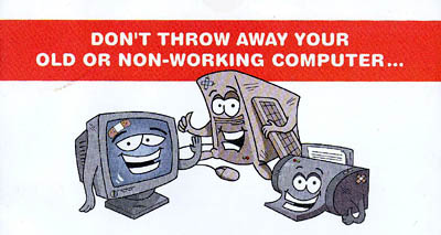
Last week, I was delighted to receive a piece of mail from the New York City Department of Sanitation.
The flyer announced a series of events around the city to collect, refurbish, and recycle old electronics in an environmentally responsible manner.
Electronic devices constitute less than one percent of the NYC waste stream, but the materials are extremely toxic if not disposed of properly.
I know non-profit and volunteer groups hold collection events from time to time, but I almost always find out about them after the fact. The refurbished computers are usually donated or sold to low-income families, schools, and community groups for a nominal fee.
This time, however, the Department of Sanitation itself is sponsoring events in the five boroughs to collect e-waste. Working cell phones are being donated to Collective Good.
The events are jointly funded by Dell and Lexmark and the National Recycling Coalition. The Lower East Side Ecology Center and other community groups are coordinating.
I asked Robert Lange, New York City’s Director of Recycling and Waste Prevention about the events:
SDN: Was this started at the initiative of the City, local groups, or manufacturers?
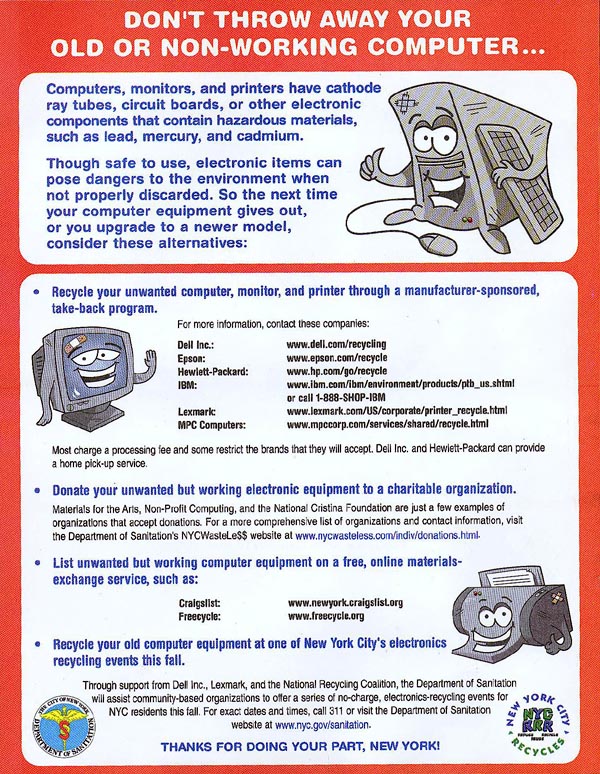 Click to view a larger version |
I usually find out these things after the fact. What kind of outreach are you doing?
We sent out the flyer well in advance to every residence in the city, and posted the information on our Web site.
Is this aimed primarily at consumers or businesses or both?
It is aimed at city residences.
Will there be a similar push directed at businesses?
It’s possible.
In things like this, it depends on who picks up the tab. Does the tab get picked up by the businesses that profit from the manufacture and sale of these items? Is the tab picked up by consumers? Is some ways, ultimately, the tab is always picked up by the consumer, either directly associated as a charge with the item when they by it, or indirectly through a tax, to run a municipal program, for example.
In my own estimation, because there is an infrastructure for producing these things and delivering the products to people, it makes sense to use the same distribution network to take them back if possible.
And to some extent, Dell and other manufacturers are doing that. If you look at the flyer or the Web site, there are services currently provided by these companies for taking back computers. In some cases, there’s a nominal charge, in other cases there’s no charge, but it’s services they provide to directly take back computers from consumers after their useful life.
Given the toxicity of materials, is there a chance that the disposal may be regulated legislatively?
There are materials like this in the waste stream that are increasing in volume and they need to be addressed. Whether they need to be addressed by a municipal program or not is something that is still in question.
There are a variety of proposed pieces of legislation, both in our area and in other parts of the country to require that this material be handled in a more responsible manner. Different legislators have different perspectives on who picks up the tab.
My own opinion is that this is something that manufacturers should really be required to deal with. And to some extent they are stepping up to the plate because the funds for these drop-off programs that we are running through community-based organizations are being provided by Dell and Lexmark.
I don’t know if you are familiar with an organization called RBRC which is for taking back batteries — particularly Nickel Cadmium batteries. It is funded and run by the battery industry. A few years ago, when the industry was facing the potential of severe regulation governing how batteries could be disposed of, all the manufacturers got together set up an informal network to receive batteries from the public. All the Radio Shacks, Staples, and organizations like that take back batteries from the public as part of the network they established. And they did that try to avoid the kind of regulation that was coming down.
I think the computer industry has an even greater incentive to do that, so I expect that what is now fairly informal will become a more formal network in the future. Either that or there will be legislation passed.
What are your future plans?
This is something of an experiment. As I said, the funds are being provided by Dell and Lexmark. Whether they will continue to provide funding... they have not made a long range commitment to that effect.
The collections will run through the fall. How we go forward will depend on the amount success we have. Events like this have been run in the City before and the average tonnage of computers and electronics received per event is approximately 10 tons. We hope to see exponentially higher numbers because this mailing is going to every household in the City.
For more information, visit the NYC Wasteless Web site.
...
And while we’re talking trash, big up to the Mayor for his plan to ship waste from Manhattan’s 59th Street pier instead of trucking it to Brooklyn and the South Bronx.This should relieve some of the burden from low-income neighborhoods who overwhelming suffer the traffic of the City’s trash.
Design and the Federal Government
by Neil Kleinman, from Print, July/August 1973:
“Some events attract us because they promise so much of what we want, while making it all seem relatively easy to get. We would like to live in buildings that do not breed slums we would like to live in cities that have parks, promenades, and quiet open spaces; we would like to read forms, applications and booklets regulations and be able to make sense of them. We would like to drive down roads and know where we are, where we are going, and where to turn off. Such needs seem reasonable.
To most of us, it has been clear that the general performance of the government in these areas of design, architecture and planning has been unsatisfactory. Each of us can think of his own favorite monstrosity. Some of the things designed by the federal government, like the income tax forms or the brochures explaining Social Security benefits, simply baffle us. Some of them, like the Sam Rayburn building, are so ugly that they have achieved an almost mythic universality virtually becoming archetypes for what ugly is.
The First Federal Design Assembly held in Washington last April 2nd and 3rd [1973] was an attempt to set some of these federal sins aright... The purpose of the Assembly was to begin the process of showing federal administrators that ‘good design is good government’ — a rather pleasant truism if a bit unsettling in these times of political PR and managed news.”
Richard Nixon, Art Director
“There should be no doubt that the federal government has an appropriate role to play in encouraging better design.” [source]
— President Nixon in his “Federal Design Improvement Message,” delivered at the first Federal Design Assembly in 1973, The Design Necessity.
The 1970’s saw a number of seminal graphic design projects sponsored by the U.S. government: Massimo Vignelli’s graphic standards for the National Park Service; Danne & Blackburn’s NASA “worm” logo; and Chermayeff and Geismar’s logos for the Park Service, Environmental Protection Agency, the National Aquarium, and U.S. Bicentennial, as well as traveling exhibits for the Smithsonian and Library of Congress.
Trying to find out why, I found this:
184 Memorandum About the Federal Government and the Arts. May 26, 1971
“To the Heads of Departments and Agencies:
 Americans in all walks of life are becoming increasingly aware of the importance of the arts as a key factor in the quality of the Nation’s life, and of their individual lives—whether in terms of the availability of great cultural resources, the accessibility of exhibits and performances, or simply the aesthetic enjoyment of good design.
As you know, direct Federal assistance to the arts is being sharply increased, and I have asked the Congress for full funding of the budget authorizations for the National Endowments for the Arts and the Humanities for fiscal 1972 — which would roughly double their present funding levels, and raise them to more than three times what they were just two years ago. But the Endowment programs are by no means the only Federal programs that affect, employ or contribute to the arts. In architecture, graphics, school programs, and many other activities, Federal agencies are daily involved deeply with the arts in one form or another.
It is my urgent desire that the growing partnership between Government and the arts continue to be developed to the benefit of both, and more particularly to the benefit of the people of America.
To contribute to this development, I ask each of you to direct your attention to two questions: first, how, as a part of its various programs, your agency can most vigorously assist the arts and artists; second, and perhaps more important, how the arts and artists can be of help to your agency and to its programs.
By focusing consciously, creatively and in a concerted way on these two questions, I believe that we all can find that the arts have a great deal more to contribute to what we in government are seeking to accomplish—and that this will be good for the arts and good for the country.
I am asking Nancy Hanks, Chairman of the National Endowment for the Arts, to coordinate responses on this, and I would appreciate your letting her know by September 20, what ideas and suggestions you may have, and also what new actions your agency may already be taking toward this same objective.”
— President Richard M. Nixon
More, from a Chronology of the NEA (1.9Mb PDF):
“President Nixon, acting on the responses to the 1971 survey of Federal agencies and executive departments and on the advice of the National Council on the Arts, announces government initiatives in design. The Arts Endowment is the lead agency for the Federal Design Improvement Program, to help upgrade Federal architecture, design and graphics.”
Republicans funding the arts? Astonishing! After all, in the 80’s it was Reagan and Co. who cut arts funding and waged their culture war against “indecent” public art.
So then why? Was it a public relations move? If it was, it would not have been very necessary. Despite public opposition to the war in Southeast Asia, Nixon was comfortably in the lead heading into the 1972 election — an election he won won by a landslide. The Pentagon papers were published a month after the memo in June 1971. And the Watergate burglary took place a year later in June 1972.
What’s the deal?
See this related post from February 2004 about public arts funding in the 1960’s and 70’s.
Crosswalk Usability
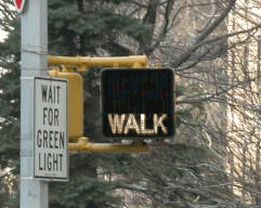
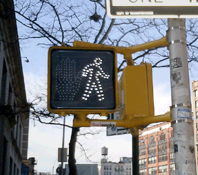
Everyone knows that New Yorkers pay attention to crosswalk signals... right?
So if you live in New York City, you may or may not have noticed that all the old crosswalk signals are gone. Instead of the spelling out WALK and DON’T WALK in type, the new signals use pictograms of a big red hand and walking person in a dotted outline of bright LED’s.
The new signal displays fit into the old, existing signal housing. And, by switching from incandescent bulbs to light-emitting diodes, the City notes, the new signals will both last longer and use less energy.
This piece in the New Yorker provides some hard numbers:
“The city is changing all eighty-five-thousand signs, at a cost of $28.2 million. The job started in 2000, in Queens; by February [2004] the [job] should be complete....
The idea is that the new ones, which rely on dozens of light-emitting diodes, or LEDs, will last six times longer than the old ones, which relied on two bulbs, and will save two million dollars a year in maintenance and electricity costs....
The brighter signs should be more visible to persons with partial sight. But, the author notes, the signals do have detractors:
“Among them many children, who sense that there is something patronizing about the hieroglyphs....
‘First of all, they’re really bright,’ Jacob said. ‘They hurt my eyes, even from, like, a block away. They make my eyes water. And, also, the first thing my sister could read was Walk/Don’t Walk.’ The three of them came to a corner: across the street, an upraised hand. They took a look, then crossed anyway. ‘The old one is just more original,’ Jacob went on. ‘Almost every other place has the Man and the Hand. Whenever I go anywhere else, it’s the Man and the Hand. Italy, France—they always have that. It’s un-unique. So I don’t really like it. Actually, most of my friends don’t like it.’”
The NYC page also claims that switching to “internationally recognized symbols” will make the signs “easily recognized by non-English speaking pedestrians.” I applaud the recognition and accomodation of non-English speakers in such a massive, city-wide initiative, but while the symbols may be “internationally recognized” in Western Europe, an open palm has different meanings in different cultures. For instance:
- In Japan an open palm in front of one’s face means “I don’t know,” “I don’t understand,” or “I am undeserving,” [source]
- In Greece, “extending the arm and hand (palm open) as if pushing something away from you is an age-old form of insult. In wars, Greeks would humiliate their prisoners by rubbing mud or fecal matter into their faces.” [source]
- And in Nigeria, pushing the palm of the hand forward with fingers spread is a vulgar gesture. [source]
 With closs-cropped hair and boot-cut pants, the figure in white resembles other symbols used around here to indicate “male.”
The NYC page doesn’t mention it, but new crosswalk symbols are nationally mandated in the Manual of Uniform Control Devices published by the U.S. Department of Transportation. The Manual sets forth detailed design standards for traffic signage around the United States.
Recently, in San Francisco I discovered another variation I’d never seen before. In addition to the white man and red hand, the signals there feature a red countdown indicating the number of seconds remaining to cross the street. It turns out the countdown option was added to the Manual in 2000, and is slowly gaining popularity across the country. I was struck by the simple brilliance of it. The additional information is much more useful than the simple flashing hand or DON’T WALK. The latter always seemed to start flashing when one was halfway across the road. This calls to mind the scene from Rain Main when the austistic character stops walking in the middle of the road.
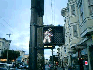
But that, apparently, is exactly when it is supposed to start flashing. The period of the countdown, flashing hand, and flashing DON’T WALK is known as the “pedestrian clearance interval”, the time for pedestrians to finish crossing, not to start crossing.
Local studies around the U.S. are finding that the countdown signals come at a price. While the countdown reduces the number of pedestrians who start running when the flashing DON’T WALK signal appears, the countdown seems to be interpreted to mean that it is OK to cross the street if there are enough seconds on the clock. Pedestrians are more likely to start crossing the street during the countdown than during the flashing DON’T WALK. This is contrary to the intent of the designers, and of the law.
Significant data has not yet been gathered on the countdown signal’s effect on the overall number of pedestrian fatalities.