nyc
Idealist.org Nonprofit Design Contest
Found via kottke.org:
“Enter your work in the First Annual Idealist Nonprofit Design Contest. Winning entries will be showcased in an online gallery on the Idealist.org website and in an exhibition in New York City. In addition, winning entries—gold, silver, bronze, and student in each category—will receive prizes donated by our sponsors.
Gold winning entries will receive Apple laptop computers donated by Aladdin Knowledge Systems. Silver winning entries will receive 15GB iPods donated by Tekserve and other sponsors.
This competition seeks to promote excellence in design in the nonprofit sector and to reward and acknowledge those designers who move beyond limitations to create works that are functional and aesthetically powerful while also promoting social impact.
Any work implemented for a nonprofit that fits in the categories of web, print, or multimedia and was completed between January 1, 2003 to August 31, 2004 can be submitted. Each work MUST be accompanied by its client’s information, including the organization’s name, mission, a copy of the organization’s tax exempt certification or its latest newsletter or brochure, and contact information for a person from the organization.
The entry fee is $25 per entry for those located in the United States. Submissions mailed from outside the U.S. do not require a fee. The deadline is August 31, 2004. Please make your check payable to Action Without Borders and include it with your entry. Entries from the U.S. that are received without payment will not be considered in the contest. Entry fees are nonrefundable.
The jury is being finalized, but will ultimately include both nonprofit and design professionals.
Was that March?
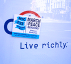
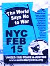
On a couple of occasions I’ve noted my admiriation for the design used by United for Peace and Justice to publicize anti-war events in New York City. The simple flag and globe motif on a bright blue ground and its bold sans-serif type are eye-catching, clear, and instantly recognizable.
However, the consistency and repetition of such a strong image in the same context (via stickers and flyers) over nearly three years may be diminishing its impact. As one UPfJ organizer notes:
“We love the blue flag standard, but have heard feedback that the design has been the same for too long... folks think it’s for an old demo.”
To the Streets
I wrote the essay below for the Design Issues column in the May/June 2004 issue of Communication Arts. I profile a couple of folks using graphic design for advocacy. I didn’t call it out explicitly in the text, but it’s of some relevance that the projects here are generally not pro-bono projects “for charity,” but are organizations started by designers generally working with broader communities. Check it out.
Taking it to the Streets
Graphic design for advocacy
Walking the streets of New York City in February 2003, one couldn’t help but notice all these little blue stickers. Stuck to walls, phone booths, bus stops, scaffolding, mail boxes — they popped up everywhere to announce the February 15 march against President Bush’s invasion of Iraq.
The blue stickers were just one of the many anti-war graphics circulating at the time. Around the Web, activists were posting free, easy-to-print designs using a variety of techniques: clever slogans, typographic play, dramatic photos and the ironic use of vintage propaganda imagery.
But the February 15 stickers on the streets of New York were different — simple and bold, a little blue banner announcing the time and place of the march. They did not make an emotional appeal with pictures of scarred and armless Iraqi children or U.S. soldiers, nor was there any argument about why the war was wrong.
The February 15 posters were not intended to change people’s minds in a direct way, but to notify the public about the upcoming protest — and to make dissent visible. The mainstream media had entirely avoided covering the anti-war movement prior to February 15. In the face of this de facto censorship and police obstruction over the route of the march, the stickers acted as thousands of little acts of civil disobedience. And with the urban landscape as a medium, the stickers set the stage for even larger acts of defiance.
Contesting Power
In recent months, there have been several open calls to designers to help stir up the electorate.
Designs On The White House
![]() “Designs On The White House is a grassroots fund-raising organization in support of the John Kerry 2004 Presidential campaign. We aim to mobilize the creative community through an online design contest, judged by designers, celebrities, and activists. Winning designs will be available for resale on T-shirts and other products, and all proceeds after expenses will benefit the John Kerry Presidential campaign. Designs on the White House Organization (DOTWHO) is an independent political committee and is not authorized by any candidate or candidate’s committee.
“Designs On The White House is a grassroots fund-raising organization in support of the John Kerry 2004 Presidential campaign. We aim to mobilize the creative community through an online design contest, judged by designers, celebrities, and activists. Winning designs will be available for resale on T-shirts and other products, and all proceeds after expenses will benefit the John Kerry Presidential campaign. Designs on the White House Organization (DOTWHO) is an independent political committee and is not authorized by any candidate or candidate’s committee.
The Categories
- Best Pro-Kerry Shirt (positive spin, no mention of Bush)
- Best Anti-Bush Shirt (negative spin, must mention Bush)
- Best Issue Shirt - Domestic
- Best Issue Shirt - Foreign
- Funniest Shirt
- Best Retro Shirt
- Best Get Out The Vote Shirt
- Most stylish / Most likely to be featured on Queer Eye
Each design will be entered in only one category.”
Anyone with a valid email address can register with the site and cast their votes on the contributed designs.
The site also features blogs about the DOTWH campaign and the Kerry campaign. A recent entry encourages non-designers with design or slogan ideas to post them.
The deadline for entries is May 22, 2004.
Let Down By Labour
![]() “Want to see your film on national television? Want your poster idea on High Street billboards? Want to tell everyone how labour have let you down? We can make it happen for you.
“Want to see your film on national television? Want your poster idea on High Street billboards? Want to tell everyone how labour have let you down? We can make it happen for you.
‘Labour isn’t Working’ fast became one of the most famous posters in advertising history. Imagine if you had been able to have a crack at that brief? Just as in 1979 when Labour wasn’t working, today swathes of the population feel let down by Labour.”
The final date for submissions was April 23, 2004.
“We have received a massive response from the people of Great Britain and we would like to thank all of you for your contributions. We will be displaying the best ideas in a gallery so that everyone can see how let down by Labour the British people feel. The large number of submissions we have received means that it will take some time for us to sort through the ideas. But as soon as they are ready to be unveiled to the public we will be presenting a selection of them here. Once again thank you for your support.”
And from the comments of VoxPop:
One thing CCO isn’t shouting from the rooftops is that they opened this competition to the "creative industries" (i.e. trendy spec-wearing ripped jeans fans) the week before they opened it to the public.
Also, there’s absolutely no guarantee that they’ll use any of the entries.
Honestly, this scheme could not have been met by more incredulous stares had it been announced on April 1st - Saatchi coming up with a scheme whereby members of the public do his job for him? Shurely shome mishtake.”
Blogged here previously, that famous poster also turns out to be a fake.
AIGA Get Out the Vote
 From the AIGA Atlanta Web site:
“AIGA will again mount a campaign to demonstrate the power of design in the public arena by encouraging designers to contribute to a coordinated get-out-the-vote campaign for national elections in the fall of 2004. The objective is to demonstrate the value of design to the public, public officials and business by providing a clear call to action for an activity that is important to everyone.
The campaign will have two elements to it. The first will be a selection of designers who will be asked to create nonpartisan calls to action that will bear a national AIGA campaign identity. AIGA’s national coordinator will select six designers and each AIGA chapter will be encouraged to select a designer to develop a design, for a potential total of 53 different designs.
The second element will be an open gallery of member designs that will be posted on the website and available for local printing, specifically by our members and also available to any visitor to the website. Any member will be entitled to post a design in the open gallery. This will become the largest gallery of available designs in support of this critical civic function. Some of the unsolicited submissions may be selected to be included among the collection of posters that AIGA will print and will distribute to all chapters for posting locally.
After careful consideration of the success of the previous campaign, this year we are proposing a slightly smaller-scaled window card format rather than posters, since the potential for actual posting in public places increases substantially if the designs are of a scale that can be placed in small shop windows and on public bulletin boards (places where a larger poster would not be posted). The scale also allows for printing out on local color printers as well as commercial printing. Our intention is to demonstrate the strength of our communication design, regardless of the production values of the print. This is in the spirit of civic postings since Revolutionary times....
The purpose of this campaign is to encourage voter turnout. There is no single message, although the intent is a call to action, motivating people to register and to turn out to vote. The visuals and the text of the message must be nonpartisan—we are supporting the basic democratic premise of citizen participation, not a partisan position on candidates or issues. Messages or images that are likely to offend substantial numbers of citizens will not be selected nor included on the site, since they would be counter to our intention of developing messages that encourage voter participation through effective use of images, text and ideas.”
The deadline for submissions was April 1, 2004. You can view or download the posters here.
I also note that the designs must include the AIGA logo:
“All posters must incorporate the required branded band (this will be embedded in the supplied template). The band will include the AIGA logo and the tagline ‘Good design makes choices clear’ along with sponsor information.”
No RNC Poster Collective
 “No RNC Poster Collective is a small collective of friends with experience in graphic design and independent media. We came together with the goal of facilitating visual resistance for the anti-RNC activities in NYC this summer. We want to make protest beautiful and connect artists with organizations working against the RNC.
Our goal for the project is to create a visual blitz in New York City against Bush and the Convention, and to blend art with politics in the finest New York style.
We are putting together in a free book of posters relating to the Republican National Convention in New York City, August 29th -September 4th. We are mass producing these posters on newsprint for distribution across New York City and the country in bookstores, apartment windows, picket signs and pasted up on the street.
We are looking for artists who can make posters with themes anywhere in the range from anti-Republican to anti-RNC-being-held-in-NYC to anti-Bush to antiwar to anything else you think is relevant. The plan is to have some posters about specific marches and actions and others that communicate a general anti-RNC message.
We are printing the posters in early June so that we can circulate them all summer. Submissions should be in black and white. Dimensions are 14" x 21" (that’s 15" x 22" with a half inch border). Deadline for submissions is May 30th. If you are at all interested, please e-mail us at: [email protected].
In mid-June, we’ll head to the printers with the best designs we get, and then set up a distribution network to get thousands of them up on the streets, in storefronts, in apartment windows, on picket signs.... everywhere there’s room.
We’re also setting up an online gallery to display all the great work that people are sending in. In addition to that, we’re working on a gallery show-style event where we can show everything together, which will hopefully also act as a small fundraiser for the project.
We’ll also be doing stickers, stencils, pins, and more over the course of the summer, so please keep in touch if you have other designs or ideas.
Also, one of our goals in starting this project was to hook up artists with organizations — if you think you might be interested in designing a poster for a specific group or event, let us know, it’d definitely help. Info on all the events and groups is here: http://rncnotwelcome.org/logistics.html. Check it out and see if anything leaps out at you.
We hold regular meetings in Brooklyn every Wednesday night, which people are welcome to come to — e-mail us if you have any interest. We’re currently working on fundraising and other logistics,
We’re working closely with the fantastic folks at Arts in Action, who are planning all sorts of fun, creative, and challenging work in the city this summer. Check them out at http://www.thechangeyouwanttosee.org for more info on what they’re up to.”
The budgetary and printing limitations will also give the No RNC posters a consistent, low-tech aesthetic despite the variety of designs and designers.
You can view the final posters here.
...
Though the projects follow much the same format, the politics differ considerably. And though each is an open call for entries, distributed primarily through email and the Web, each seems to target participants much like the organizers themselves, though each in the end aspires to influence a broader public.
Designs On The White House is a grassroots initiative endorsing a major political party. They are rallying a younger crowd seeking to inject a sense of style and hipness into the stodgy, elitist political machine.
Let Down By Labour is a top-down initiative, probably financed by the political party. As noted by the commentor, they seem to be looking for free labor, particularly from other advertising professionals.
The AIGA, a national professional association of dues-paying designers, while explicitly non-partisan, is encouraging participation in the electoral process. The competition was only open to members, and is as much about promoting the AIGA and the public value of design as it is about getting out the vote.
The No RNC Poster Collective, an a grassroots, open, volunteer collective is explicitly partisan, and while challenging the Republican convention, is tied to the protest and civil disobedience to take place around the convention. They are accepting contributions from anyone.
Judging for Let Down By Labour is secret and closed. The judges are unknown. Judging for the AIGA and Designs on the White House are via celebrity panelists, though Designs on the White House does open some voting to the public through the Web. Judging for the No RNC Poster Collective project is open, though one has to physically travel to Brooklyn.
The motivation pitched by each also varies: Let Down By Labour promotes pure self-interest and the prospect of fame for oneself; The AIGA sells the high ideals of civic engagement; Designs on the White House pitches the fun of it; while the No RNC Poster Collective provides a place to focus one’s outrage.
I also note how the choice of media plays into the politics.
Designs On The White House focuses on T-shirt design, seem to implicitly target an audience in their 20’s and 30’s that would wear cheeky political T-Shirts. T-shirts with the winning designs will be put on sale for anyone to purhcase.
Let Down By Labour focuses on advertising, specifically national television and billboards, expensive media generally only accessible to wealthy corporations, advertising agencies, and the big political parties themselves. While this might seem to be an opportunity to the grassroots to gain access, it is still corporate spaces purchase by corporations in the service of a conservative, corporatist party.
The AIGA Get Out the Vote initiative and the No RNC Poster Collective both focus on poster design. Both will have open distribution via the Web, and printed posters will be distributed on an ad-hoc basis. The AIGA posters will probably have perennial use for future election campaigns, though the RNC posters are specifically located towards the convention in New York City, the walls and public surfaces of the City, setting the stage for the massive civil disobedience.
Rogue State
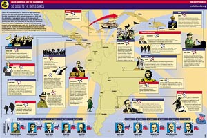
“An understanding of the current crisis requires a sense of Haiti’s history,” notes Paul Farmer, situating the recent coup squarely into the long, brutal history of U.S. economic and military intervention.
The latest Indypendent expands the story to the rest of Latin America and the Caribbean, and does so graphically with this map of U.S. military intervention in the region from 1950 through 2004. Download the PDF here.
The Indypendent, is the biweekly paper of the New York City Independent Media Center. The map is designed by ILC.iNK.
“ILC.iNK develops pages and up-to-date content specifically directed towards the Hispanic community, designed and illustrated with photographs, illustrations and infographics to captivate readers, and always customized to the general format of your publication and the needs of your advertisers. ILC.iNK is the ideal solution to develop special supplements, features, or regularly appearing sections such as Health, Sports, Children, Travel, Food, Music, etc.”
Crosswalk Usability
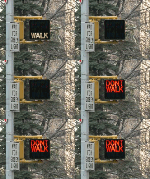
Everyone knows that New Yorkers pay attention to crosswalk signals... right?
So if you live in New York City, you may or may not have noticed that all the old crosswalk signals are gone. Instead of the spelling out WALK and DON’T WALK in type, the new signals use pictograms of a big red hand and walking person in a dotted outline of bright LED’s.
The new signal displays fit into the old, existing signal housing. And, by switching from incandescent bulbs to light-emitting diodes, the City notes, the new signals will both last longer and use less energy.
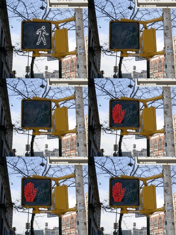
This piece in the New Yorker provides some hard numbers:
“The city is changing all eighty-five-thousand signs, at a cost of $28.2 million. The job started in 2000, in Queens; by February [2004] the [job] should be complete....
The idea is that the new ones, which rely on dozens of light-emitting diodes, or LEDs, will last six times longer than the old ones, which relied on two bulbs, and will save two million dollars a year in maintenance and electricity costs....
The brighter signs should be more visible to persons with partial sight. But, the author notes, the signals do have detractors:
“Among them many children, who sense that there is something patronizing about the hieroglyphs....
‘First of all, they’re really bright,’ Jacob said. ‘They hurt my eyes, even from, like, a block away. They make my eyes water. And, also, the first thing my sister could read was Walk/Don’t Walk.’ The three of them came to a corner: across the street, an upraised hand. They took a look, then crossed anyway. ‘The old one is just more original,’ Jacob went on. ‘Almost every other place has the Man and the Hand. Whenever I go anywhere else, it’s the Man and the Hand. Italy, France—they always have that. It’s un-unique. So I don’t really like it. Actually, most of my friends don’t like it.’”
The NYC page also claims that switching to “internationally recognized symbols” will make the signs “easily recognized by non-English speaking pedestrians.” I applaud the recognition and accomodation of non-English speakers in such a massive, city-wide initiative, but while the symbols may be “internationally recognized” in Western Europe, an open palm has different meanings in different cultures. For instance:
- In Japan an open palm in front of one’s face means “I don’t know,” “I don’t understand,” or “I am undeserving,” [source]
- In Greece, “extending the arm and hand (palm open) as if pushing something away from you is an age-old form of insult. In wars, Greeks would humiliate their prisoners by rubbing mud or fecal matter into their faces.” [source]
- And in Nigeria, pushing the palm of the hand forward with fingers spread is a vulgar gesture. [source]
 With closs-cropped hair and boot-cut pants, the figure in white resembles other symbols used around here to indicate “male.”
The NYC page doesn’t mention it, but new crosswalk symbols are nationally mandated in the Manual of Uniform Control Devices published by the U.S. Department of Transportation. The Manual sets forth detailed design standards for traffic signage around the United States.
Recently, in San Francisco I discovered another variation I’d never seen before. In addition to the white man and red hand, the signals there feature a red countdown indicating the number of seconds remaining to cross the street. It turns out the countdown option was added to the Manual in 2000, and is slowly gaining popularity across the country. I was struck by the simple brilliance of it. The additional information is much more useful than the simple flashing hand or DON’T WALK. The latter always seemed to start flashing when one was halfway across the road. This calls to mind the scene from Rain Main when the austistic character stops walking in the middle of the road.
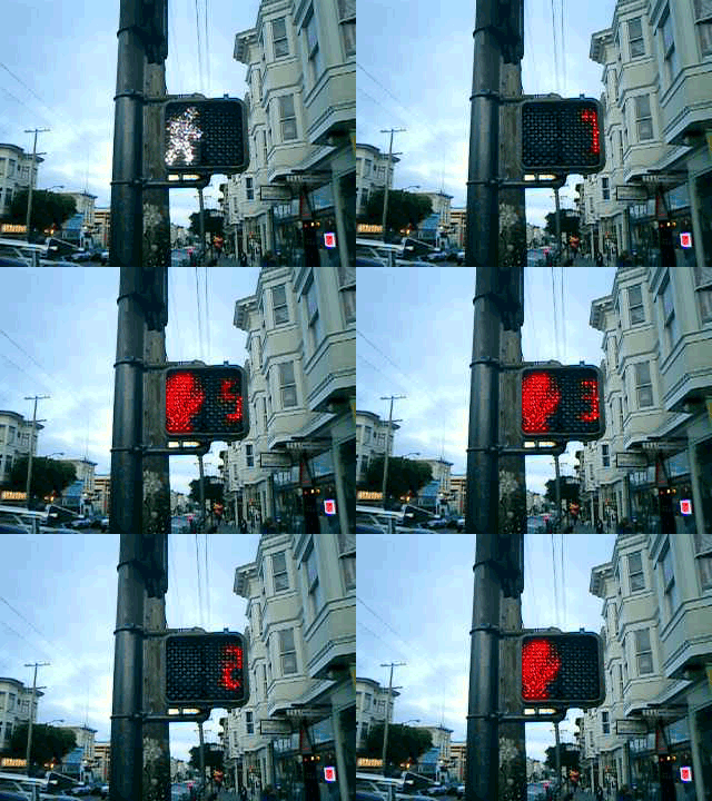
But that, apparently, is exactly when it is supposed to start flashing. The period of the countdown, flashing hand, and flashing DON’T WALK is known as the “pedestrian clearance interval”, the time for pedestrians to finish crossing, not to start crossing.
Local studies around the U.S. are finding that the countdown signals come at a price. While the countdown reduces the number of pedestrians who start running when the flashing DON’T WALK signal appears, the countdown seems to be interpreted to mean that it is OK to cross the street if there are enough seconds on the clock. Pedestrians are more likely to start crossing the street during the countdown than during the flashing DON’T WALK. This is contrary to the intent of the designers, and of the law.
Significant data has not yet been gathered on the countdown signal’s effect on the overall number of pedestrian fatalities.
GIS and the City
On February 6th, 2004, Al Leidner, former head of New York City’s Department of Information Technology and Telecommunications GIS Program, spoke to members of GISMO about the future of geographic information systems in New York City.
A version of this program was originally presented to the Municipal Data Processing Council. I’ve combined my own notes below with those taken by James Labate.
The GIS Utility: Key Integration of IT
- GIS marries information technology with the science of geography.
- The value of information has become the center point of the industry: the quality, amount, and how integrated it is.
- The technology is there, but the data is lacking. The more combinable data is, the more valuable it becomes. To that effect, the “stove piping” of information is a massive problem.
- From Data to Wisdom: Increasing the value of data should be the goal of the GIS Community.
- The “Where Field” - Geography as an ancient science vs. IT as a new industry. GIS people need to bring geography to IT people.
- We’re still in the early stages of understanding the integration of data. But all data is spatially enabled and therefore can be combined. For example, an automated mapping application can plot a database of 500,000 tree locations off of building and other feature locations.
- Five basic fields on NYCmap, the City government-maintained basemap, are: postal address, latitude and longitude, street segment, parcel, and building. These are all related and identified with a unique ID.
How Do We Create Value?
- With a “critical mass” of data support to NYCmap.
- The Department of Health used a “critical mass” of West Nile identifiers (e.g. infected birds) to created a predictive model of West Nile Disease. (A series of maps were shown depicting the spread of the virus.) Using the maps, they could quickly spray selected areas. Human cases are preempted. Predict death and stop it. GIS can save lives.
- In 9/11, the NYC Office of Emergency Management lost its office and data when the towers collapsed. Responders to the disaster needed combinations of data. GISMO volunteers and others provided data to responders from an ad-hoc office at Pier 92. Speed and ability to deal with complex interactions were key features.
- City’s 311 non-emergency hotline uses a GIS engine which geocodes all data that is taken in. With this, can look for patterns and trends in neighborhoods. (Do trash dumping complaints predict a rise in crime?) The City recently mapped cell phone outages using survey info from 311 and the DoITT Web site.
- My Neighborhood Statistics at nyc.gov, and CMAP’s myCiti expand the knowledge of GIS among non-GIS professionals.
- 40 City, 35 State Agencies create knowledge from GIS data. (See notes on Al’s GIS Coordination Program).
New Developments
- Massive sewer and water system mapping project underway.
- Dept. of City Planning releases geosupport desktop application.
- COGIS - developing better property tax lot outlines.
- Homeland security driving Federal, Local GIS integration.
- FDNY, EMS, NYPD integrating exchange of data for emergency response, sharing with State, FBI.
- Modeling building and subway systems for emergency response. 468 stations in MTA. PATH and Amtrak next.
- Aerial photos, from Pictometry, show all sides of every building in NYC. Free to City agencies.
Opposing the Future - Roadblocks to Progress
- Underfunded IT and GIS.
- Little understanding of the transformative process of IT.
- Contempt for Planning - Outmoded stereotyping.
Cultural Evolution
- What are the combinations of data across service and agency barriers that produce results?
- What are the analytic and predictive tools that can do it?
- Combine all capital projects - see where there are synergies, opportunities to overcome problems.
Benefits
- Revenue: better use of geography will create a higher level of billing accuracy, increasing City revenues.
Public Safety
- Develop an integrated 911. Fire Dept. and Police should be working off the best geocoding system possible to improve response time, plot fastest routes to sites.
- CompSTAT - Police Dept. Application - GIS saving lives. Info and analysis brought together with new way of organizing. (See this BBC article on mapping crime.)
- Hazardous materials and combustibles: combination of previously uncombined data to give firefighters more information before entering a building.
Predictions
- Every City agency will have GIS. Wireless connections to data applications from sites.
- 500% staffing increase in City GIS Personnel.
- Federal Govt. will need and seek out state and local data as it is more accurate and of a higher quality.
- Spatially enabled information will be the foundation of a 35% increase in productivity and 2% increase in revenues.
- All City strategic data will be available and the increase of shared valuable information will increase social cohesion and collaboration.
- Construction time will be reduced 10% and construction costs reduced 5%.
- Predictive models will reduce violent crime by another 50%.
Al noted that more and more City data is available online, though many in audience noted felt that the City does not share enough of its data. NYCMap is not available to the public for “security reasons,” but is licensed to a couple of Universities and corporations under strict terms.
See also “City Governments Map Trends” from Wired, February 1, 2004, and this 2002 interview with Al about GIS and the emergency response on September 11, 2001.
Nonprofit Online Mapping in New York City
Steven Romalewski sends this growing list of nonprofit online mapping Web sites in New York City:
“We’ve noticed a kind of a critical mass of these mapping and data services recently.
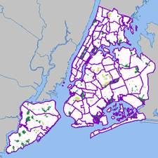 Most of these have been created by my project, NYPIRG’s Community Mapping Assistance Project (a team of six people, part of a nonprofit organization, that uses GIS to help other nonprofits achieve their missions). They’re all part and parcel of an effort to ‘democratize’ data and provide powerful new tools with a community-based focus. Each site uses GIS technologies that few other nonprofits have tapped into, but that government agencies and the private sector have used to great effect. The websites use government data in in new and innovative ways, often to provide services that most government agencies would never provide. And they give local neighborhoods and individuals a window on their world that would’ve been daunting, at best, and maybe impossible for the average citizen or block association to obtain. The sites have helped level the ‘playing field’ in New York to a great extent, so public agencies and large companies don’t have a monopoly on information.
Here are the links:
- http://www.MyCITI.org — the Community Information Technology Initiative (CITI) website that puts mapping tools in the hands of New York City’s local planning boards, in a way that they can avoid the need to spend limited resources and duplication if all 59 boards had to buy the software and invest in the data creation themselves;
- http://www.oasisnyc.net — a wealth of information about parks, wetlands, gardens, and other open spaces across New York, reaching across all levels of government and developed for all different aspects of the city’s ‘greening community’. This site was spearheaded and funded by the US Forest Service, and involves a steering committee of more than 40 nonprofits, government agencies, academics, and businesses;
- http://www.nonprofitmaps.org/netmaps/bedc/bedc.htm — the Brooklyn Economic Development Corp’s. ‘Destination Brooklyn’ service that offers detailed real estate and demographic information for every property and neighborhood in Brooklyn, geared toward small business owners and community development organizations;
- http://www.straphangers.org/cmap.php — the Straphangers Campaign’s ‘Get Where You’re Going’ site, providing precise location information about the subway stops closest to any street address in NYC (which the MTA’s maps can’t do, since they’re geographically distorted to fit on a printed page);
- http://www.MyGovernmentNYC.org — allows anyone with a New York City address to easily find and contact the public officials who represent them at all levels of government, and is used by thousands of people each month, regularly praising it for its simplicity and comprehensiveness;
- http://www.nonprofitmaps.org/netmaps/lac/lac.htm — how to locate family literacy programs based on a survey by the Literacy Assistance Center, mapped by category, borough, or ZIP Code. The site also shows nearby subway stops and public libraries;
- http://www.nonprofitmaps.org/nycnonprofits — the NYC Nonprofits Project Service Atlas. It extends a 3-year study of the nonprofit sector that was released in June 2002, by enabling you to locate any of more than 6,000 nonprofit groups in the city by ZIP Code, neighborhood, Community Board, or City Council district. Groups are listed in 17 major categories and lots of sub-categories. CMAP created the Atlas for the Nonprofits Project; and
- http://www.LowerManhattanMap.com — helping with the recovery and rebuilding efforts of lower Manhattan small businesses, tourist destinations, and cultural organizations. The site includes information maintained by 3 business improvement districts on almost 2,000 local businesses, retail stores, restaurants, community services, cultural sites, and tourist attractions.”
Toll
Reading the catalog for Me, Myself, and Infrastructure, I stumble onto this:
“The corporations with the highest revenues in the U.S. are Wal-Mart, Exxon Mobil, General Motors, and Ford. They base their business on the supremacy of the road in American life.”
Wow! Incredulous, I consult Google. It’s true. Sometimes, living blissfully without a car in New York City, one forgets how the rest of this enormous country lives.
But then, via Planetizen my revelation is adjusted again. Sprawl is not propelled simply by consumer demand, but by lobbyists and politics that protect and promote the interests of those same companies.
Bronx Community Paper Company
In the Internet Archive, the javascript ticker still scrolls “Recycling Community Improvement Water Conservation Job Creation Economic Development Brownfield Reclamation,” beneath the former Web site:
“The Bronx Community Paper Company (BCPC) — a joint project of the Bronx-based Banana Kelly Community Improvement Association and the Natural Resources Defense Council is an innovative effort to harness New York City’s ‘urban forest,’ which includes the 1.2 million tons of paper the city throws out every year, by building a paper de-inking and newsprint production facility in the city....
The end result will achieve several important objectives: creation of hundreds of long-term jobs; reduction of the City of New York’s costs for disposing of wastepaper; revitalization of an abandoned industrial tract in the inner city; and protection of forests....
Throughout the development process, the BCPC kept the public continually informed on the project’s progress. In fact, during the environmental licensing process, the BCPC held over 120 public meetings with members of the South Bronx community, although by law a developer is only required to hold one...
 With all legal, political and environmental issues behind them, only two major tasks for the BCPC remain — securing a deal with a paper company to operate the plant, and, of course, building the mill.”
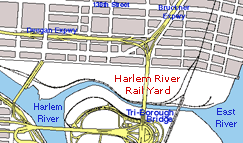
Facilities for the BCPC were to be built on the Harlem River Rail Yard, a brownfield site requiring environmental remediation. The mill was to produce 2,200 jobs during construction and more than 600 permanent full-time jobs during operation.
In 1997, the Department of Energy posted a glowing review of the project as a “sustainable business success story”:
- The manufacturing facility will be an integrated recycling paper mill, including a wastepaper de-inking plant, a newsprint paper making machine, a wastepaper sorting plant and a steam boiler.
- The project will advance the market for economically viable recycling of 100% post-consumer, totally chlorine-free paper.
- The mill will serve as a solid waste alternative for a city recently proposing to build seven large waste incinerators.
- The paper mill will enable a major paper-making company to use secondary fibers for the manufacture of its newsprint, a commodity that is now manufactured mostly with virgin timber.
- The Harlem Rail Yard, an abandoned industrial facility in an out-of-use rail yard, will serve as the site of the mill. An additional goal of the project is to redevelop the rails, which will then serve as a transportation corridor for materials to and from the facility.
- The project will pioneer the use of water from a reclaimed sewage wastewater treatment plant, keeping water costs one-third lower than comparable fresh water.
- A comprehensive air study of the South Bronx was initiated to ensure technologies will be implemented to reduce to the greatest extent possible all emissions from the facility.
- The project will incorporate innovative energy-efficient technologies not implemented in any other paper mill in the country.
- The mill will utilize a chlorine-free de-inking technology that produces no air emissions or odors.
- Maya Lin, designer of the National Vietnam Memorial in Washington, DC, will design the facility’s layout and structure.
Banana Kelly was founded in 1977 when thirty residents gathered to stop the demolition of their homes along Kelly Street, a crescent shaped block in the heart of the Longwood/Hunts Point neighborhood of the South Bronx. Without support, tools, money, title to the property, they succeeded in rehabilitating the buildings and in creating 21 units of high-quality affordable housing. The activists formed the Banana Kelly Community Improvement Association, Inc. to continue the work that they had started. Since 1978, the organization has rehabilitated, weatherized, and managed thousands of housing units, provided service referral and housing advocacy, conducted education and job training, and attracted the first new health care clinic in the community in 22 years.
Revenue from the Bronx Community Paper Company was to fund other community development projects in the neighborhood, including:
- The Bronx Dormitory Project. A joint venture between Banana Kelly and Bronx Regional High School that will provide shelter for up to 20 students attending the high school who do not have stable living arrangements.
- The South Bronx Family Learning Center. A proposed 35,000-square-foot center that will include health care, child care, literacy classes, employment and training centers and housing opportunities.
- The Prospect Corridor Commercial Development Project. This project will promote local economic development by connecting existing and planned residences with a retail strip on Prospect Avenue.
- The Library Project. A project to increase the availability of library services in the South Bronx by providing additional equipment, supplies and materials to local libraries.
- Business and Housing Revolving Loan Fund. This project will provide a pool of working capital to be used by small entrepreneurs to purchase inventory, equipment or supplies to meet their contractual obligations and expansion needs. The fund will concentrate its services on housing groups that require basic repairs or replacement of major systems in their buildings.
- The Children’s Endowment Fund. To be administered by Banana Kelly, this fund will enhance and expand the educational and vocational opportunities available to children.
But by 2000 the project had folded.
From The New York Times, August 17, 2003
‘Bronx Ecology’: Green, Rocky Road
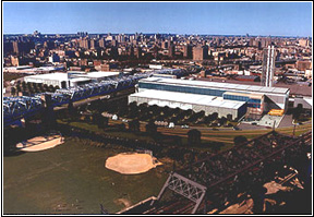 “In 1992, Allen Hershkowitz, a senior scientist with the Natural Resources Defense Council, proposed building a paper mill in the South Bronx. It would harvest the immense amount of wastepaper (used newspapers, junk mail, office detritus) New York City generates each day, recycle it into newsprint using ecologically sound methods and sell the product to local consumers, notably newspapers. Such a mill would address two city woes: the continuing slump, particularly severe in places — like the South Bronx — long dependent on the shrinking manufacturing sector (joblessness there hovered around 20 percent, 50 percent for teenagers); and the loss of traditional outlets for the city’s waste stream (ocean dumping, hauling to putrid landfills and burning in dioxin-spewing plants).
More grandly, Hershkowitz’s Bronx Community Paper Company would serve as a world-class demonstration project. He wanted to prove the viability of green capitalism — a marriage of economic development and environmental remediation+- to a host of unbelievers in the business world and the environmental movement, who were locked (he believed) in unnecessary combat. Hershkowitz knew the city presented a host of special obstacles to eco-industrialists, but if a mill like this could make it here, he reasoned, it could make it anywhere. He came amazingly close to pulling it off, as ‘Bronx Ecology,’ by Hershkowitz himself, and ‘Tilting at Mills,’ by Lis Harris, for many years a staff writer at The New Yorker, show.
To guarantee good relations with the plant’s neighbors, Hershkowitz found a local sponsor in Banana Kelly, one of the community development corporations that had sprung up in the 70’s, and vested ownership in it. Determined to resuscitate urban brownfields (polluted and abandoned industrial sites), the paper company settled on the derelict Harlem River Rail Yard. And to transform what others saw as waste into valuable raw material — a key precept of the sustainable economy movement — he insisted the mill use recycled water from a nearby sewage treatment plant instead of river water.
Hershkowitz found a receptive Swedish paper company, and with a corporate anchor secured, investment bankers came on board, as did construction companies and engineers. He got Maya Lin, the architect of the Vietnam Veterans Memorial, to design a striking complex. The Natural Resources Defense Council put up seed money and helped clear regulatory hurdles. A bevy of foundations gave predevelopment grants. The state offered loan guarantees and helped with cleanup costs, and the city’s economic development arm provided expertise. On paper, it looked like a half-billion dollar enterprise was taking off.
Almost immediately it slammed into problems.
Businessmen’s support proved fickle: from their perspective Hershkowitz had overburdened the project with costly, time-consuming and risky furbelows on behalf of extraneous, if not alien, social and ecological goals. Worse, when the Swedish firm withdrew (new management wanted to concentrate on European ventures) it proved impossible to find another big paper company, the kind Wall Street would approve (one potential replacement declined after calculating it could clear more than 30 percent in the Bronx, but 40 percent in South Korea). Besides, in the 90’s boom, higher profits were available outside the industry altogether, in tech stocks or hedge funds. After 1992, moreover, the supply of newsprint outran demand, so producers began consolidating; the last thing they wanted was a new plant online.
And there were local competitors. In 1995, an Australian company built a recycling mill on Staten Island and won the right to process up to 50 percent of the city’s wastepaper. Though not in direct competition — it produced liner board (used, for example, for shoe boxes), not newsprint — it lobbied hard against any municipal deal with Hershkowitz, just in case one day it might want the remainder. Also opposing the Bronx project were commercial carters linked to the mob, and waste haulers whose profits were linked to exporting the trash, including giant multinational corporations like Waste Management , whose campaign contributions gave them considerable clout at City Hall. Mayor Rudolph Giuliani was already predisposed against the project because the Bronx was the domain of a rival, Fernando Ferrer, though in fact Ferrer too was an opponent, miffed he hadn’t been allowed to pick the participating community groups.
Some of Hershkowitz’s biggest headaches came from his presumed community ally, whose new leadership proved undependable. Other community groups were also on the attack, some because the building trades refused to give construction jobs to neighborhood people, others because they wanted a slice of the development pie. (Once he was told that $70,000 would make his problems go away; when he refused to come across, Hershkowitz says, it was publicly implied that the plant was environmentally genocidal.)
Despite all this, Hershkowitz and the project plowed on, year after year, nimbly escaping one crisis only to tumble into another. Finally, just after having found a large construction company willing to undertake the project, the backers were sued by a rival construction firm (a common way to grab a piece of the action). Now the Natural Resources Defense Council itself wanted out, and its employee off the case. The paper company was handed over to the contractor-developer in 1999 and struggled on one more year before Giuliani pulled the plug....
The real question is how useful his blueprint for a greener future really is. Here, it seems to me, Hershkowitz pulls back from confronting the implications of what he’s laid out, particularly the key question of who exactly might be the agent to make his vision real. It’s clearly not the corporate world: ‘green capitalism’ stands revealed as a patent oxymoron. He urges environmentalists to step forward, but there’s no sign that major environmental groups will soon venture again into eco-industrial waters (certainly not if they read ‘Bronx Ecology’). As for labor, union pension fund managers proved even more conservative than investment bankers.
Hershkowitz comes closest to the mark when he wonders if the state might not expand its role, either building green projects as public works or committing public capital as lead investor. Certainly — pace current free-market pieties — government is capable of ambitious enterprise, viz. the Manhattan Project, the the space program, the Internet and the New Deal. Moreover, putatively private industries (notably pulp and paper, petroleum and highway construction) are, Hershkowitz reminds us, heavily subsidized by various levels of government. Why not be transparent about public investment, and establish a federal development bank like, but better than, the Reconstruction Finance Corporation that underwrote much of the New Deal and World War II? That might yet make Hershkowitz’s bold blueprint a reality.”
The Bronx Community Paper Company may be dead for now, but near by, in Hunt’s Point, a plastics recycling plant is just being planned.


