nyc
To Where, From Whom
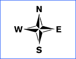 Folks reading my most recent post about the New York City’s implementation of the compass rose by subway exits may have thought the Department of Transportation took its inspiration from my blog. Not so.
I came up with the idea in conversation with out-of-towner Micah Anderson over dinner with the folks from Eggplant Active Media back on March 4, 2006 and later posted it to this blog.
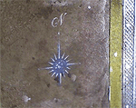
Graffiti roses showed up near downtown exits three weeks later, though I was never sure if my post inspired this. After kottke.org picked up my link, I received this email:
hey man,
i am NOMAD, I have been doing the compass rose graffiti, someone just showed me your post on it,
great minds think alike....
However, while this was all in March 2006, last week’s New York Times article on the DoT’s 2007 implementation of the compass, cites the new transportation commissioner who says she got the idea from “an Upper East Side man who was among about 20 New Yorkers quoted in The New York Times in January 2006 in an article about practical ways to improve the city.”
After my post about the official NYC rose was picked up by a couple of blogs, I received an email from Mary Ciuffitelli who says she proposed the idea publicly back in 1992:
Hey John,
I like your website and design, but I have some news for you.
In 1992, I received an award from The Municipal Art Society for this compass rose idea. MAS ran a big competition called Design New York. There were seven winners out of 1500 entries, followed by an exhibit, an awards ceremony, a lot of press (including the New York Times), NBC TV News interviews, etc. I have my original sketch, award letter, ceremony program, tape of the TV interview, all the documents.
Fifteen years ago, there was talk of the city implementing the idea. In the meantime, friends and I talked about going guerrilla and just spray-painting compasses all over the subway system. I wish we had. I was working at a design studio back then, and there was plenty of enthusiasm. We designed a stencil for our plan based on the floor compass in the subway at Grand Central Station. If I keep digging through my stuff, I’ll find that drawing as well.
There were some pretty great ideas that came out of that contest. (Including a submission very close to mine.) Time to look back before setting down the history. This NY Times article boils down my idea to one sentence, but my submission included slightly more elaborate suggestions to reflect neighborhood character and landmarks.
Designing a Better New York, September 24, 1992 http://query.nytimes.com/gst/fullpage.html?res=9E0CE7DA1F3BF937A1575AC0A964958260
Since it looks like the idea is on the brink of becoming a permanent part of New York City design, I would like to set the record straight. Maybe you’d like to help me.Yours in brilliant ideas,
Mary
In the meantime, the folks at the Eyebeam OpenLab and Graffitti Research Lab generously let me use their laser cutter to produce a couple of stencils. I have 20 compass roses and 20 North arrows. Want to help put this up?
Send your postal address and PayPal me $2.00 for first class postage and I’ll send you one.
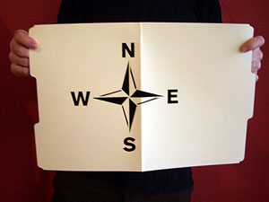
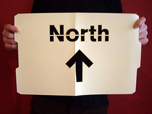
It's Official
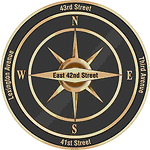
Wow! Back in March 2006, I blogged an idea installing a compass rose at subway exits to help emerging travelers find their way. I posted a stencil design to help inspire action. Three weeks later, graffitti roses appeared in lower manhattan. And now a year-and-a-half later, the New York City Department of Transportation announces a plan to implement it.
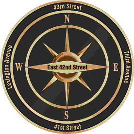
The DoT will test the designs in midtown, around the heavily touristed Grand Central area. The context specific labels are a nice innovation, not just pointing north, but naming the nearest street in each direction.
See the official DoT press release here and a NY Times article here.
Helvetica
On Friday, I caught a screening Helvetica, the film at the New School.
The film is a breezy valentine to type, typography, graphic design, and designers. The editing puts a nice leisurely pace to it, and I thought the sound design, which could have been disastrous in other hands, was suitably sensitive. It’s not a bad first film.
It consists mostly of two types of shots: interviews with bold-face name designers and scenes of type on the street — interspersed with occasional animated renderings of famous posters. The designers talk about the type, its use and origin, and their relationship to it, love or hate. It certainly helps to know who the players are, though most of the personalities sparkle through regardless.
On top of the brief historical survey, the broader question raised by the film seems to be, “How does this typeface come to dominate our visual environment? How did it come to be seen as so ‘neutral’?”
The answer provided by the parade of talking heads is of mostly a matter of taste, period fashion, and eventually a response to the momentum of a critical mass of usage.
But a look at counter-examples might have been illustrative: why does Gil Sans dominate in the UK? Why does a more condensed gothic sans seem so popular in France? I think a clue is in the usage by the state and the power of its projection. This is alluded to by many shots of the Helvetica-like sans serif on New York City subway signage, and by Paula Scher’s association between the powers that use Helvetica and the powers behind the Viet Nam war.
But mentioned only in passing is, I think, the most important point: bundling. Before desktop publishing, the font was widely available for linotype, as presstype, and for other printing methods. But now the font (and its twisted cousin Arial) comes pre-installed on every new computer sold. The film never really investigates why or how this came to be, or the consequences of it. It’s just assumed that Helvetica was a sufficiently “classic” and popular face. I think this is another case of designers ignoring systemic and structural forces. Its power is invisible, and well, what’s “normal” is just taken for granted. Further evidence of this systemic short sightedness is the fact that of the 21 designers interviewed on screen, nineteen are white men and two are white women.
Ghost Bikes
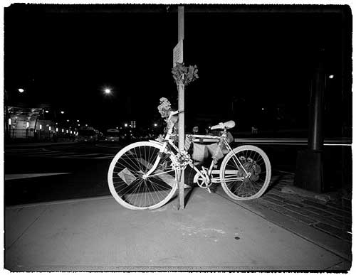
Last week, the New York Times ran a sober photo essay on the ghost bikes that Visual Resistance and Time’s Up! have been installing around New York City since June 2005. The bikes are public interventions, a grassroots action in the spirit of graffiti memorial walls. The bikes are painted white and chained near the site where a cyclist was killed by an automobile, along with a plaque with their name and the date they were killed. Several are plotted on this map.
The bikes were inspired by a similar project in St. Louis, and have since appeared in cities across the U.S. and the U.K.
A 2005 report on bicycle fatalities from the New York City police, parks, health, and transportation departments reports that between 1996 and 2005, 225 bicyclists were killed in crashes with motor vehicles. Between 1996 and 2003, 3,462 NYC bicyclists were seriously injured in crashes.While the annual number of serious injuries has decreased, deaths remained steady during the 10-year period.
The statistics show a failure of urban design and policy — 89% of crashes occurred at or near intersections, 92% of bicyclist fatalities resulted from crashes with motor vehicles — as well as the absence of personal equipment: 97% of the bicyclists who died were not wearing a helmet. 74% of the fatal crashes involved a head injury.
While it’s clear that helmets save lives, something else is broken in NYC: of the 3,964 transportation-related deaths in New York City between 1996 and 2005, only 6% were cyclists. Almost half the deaths (49%) were pedestrians.
FAQ
OK, here goes. I’ve never intended this blog to be about me personally, but whenever I talk to a group of design students they often ask the same questions. This time one of them made a transcript. Many thanks to Stephanie Diederich at Virginia Commonwealth University. I’ve edited the text a little and fleshed it out in some places.
SD: How’d you get into your line of work?
JE: In the late 80’s and early 90’s I became increasingly aware of events in the news: riots in my home town, in Miami, Florida, the first Gulf War, genocides in Rwanda and the Balkans. I had a pretty privileged, middle-class background and when I went to art school in New York City in 1991, I was suddenly faced daily with poverty and homelessness. By the time I got to grad school, I was making increasingly politicized artwork. I decided that I didn’t want to make big abstract oil paintings or decorative objects for rich people. I started playing with cheap, reproducible work — multimedia, works on paper, tiny paintings to give away. My work was increasingly populist and my peers and faculty were increasingly defensive about the fact that I wasn’t “buying in.” I dropped out after a semester and decided that rather than use my politics in my art, I would use my art for my politics. I decided to become an activist designer.
Redacted
Around 3,500 antiwar protesters rallied outside the United Nations in New York City today while President Bush delivered his speech inside. A decent turnout for a business hours on a weekday, and a very last minute call to action.
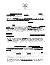
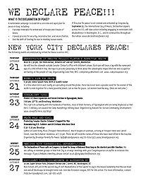
The organizers asked me to design a flyer to hand out at the march. I took it as an opportunity to do something a little different from a typical flyer. The goal here was not to grab the viewer and turn them out to the event, but to make something interesting for them to read while attending the event itself. The front is a statement by the organizers, the back lists upcoming events.
In the end UfPJ wanted something simpler — and something more like a typical flyer — which I delivered. But I like the way this version came out. The text is styled in the form of a redacted government document. It creates a parallel text that plays on themes of secrecy, coverup, and suppression of dissent, as well as seeing through the lies and reading what is erased.
 |  |
| Download 200 Kb PDF | |
Guerilla Wayfinding
Last night, a friend from out of town commented on his disorientation when exiting subway stations in New York City. Which way is North? It always takes a minute or two (or more) to find a street sign, landmark, or other orienting information. In some cases it means walking a whole city block to find out you’re heading in the wrong direction. I’ve lived here for 15 years and I’m still disoriented at far-flung exits where the streets all have names and no numbers.
In midtown they have do little kiosks at street level with maps to nearby landmarks. But this seems like overkill for mostly mixed and residential neighborhoods. So how hard would it be for the MTA to paint a little direction indicator on the pavement near each subway exit?
Hell, how hard would it be to take matters into our own hands? To start a guerilla wayfinding campaign?
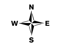
To that end, I’ve posted a few free stencils here. I’ve tried to keep it in the MTA style — with the exception of the compass rose. (But then who doesn’t love a compass rose?)
Click the thumbnails below to download a 20KB PDF.
Update 3/7/06: I’ve deprecated the uptown and downtown stencils, since it occurs to me that this could cause some confusion with the subway lines themselves often referred to uptown or downtown lines.
Update 3/28/06: Using their own fancy, two-color stencil, someone’s taken it on!.
Workers of the World Play Ball, 2
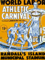 With regards to this post, reader ryan sent me this bit from NYU’s Robert F. Wagner Labor Archives about another labor-driven counter-olympics event. This one hosted by the Jewish Labor Committee in New York City as part of its anti-Nazi campaign:
“When the American Olympics Committee declined to heed widespread protests against United States participation in the Berlin Olympics of 1936, the [Jewish Labor Committee] held a World Labor Athletic Carnival (also known as the Counter-Olympics) at Randall’s Island in New York City during August 1936. Dozens of teams representing New York union locals competed, and the main events featured outstanding amateur athletes from across the country. Governor Herbert Lehman presented the prizes. The Carnival received extensive nationwide press coverage, and the JLC repeated the event in the summer of 1937.”
The site has a few images from the movement.
Nothing Like the Sun
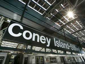
On October 28, Wired ran this bit on NYC’s new solar powered subway station:
“On a sunny day, 60,000 square feet of integrated solar paneling on its roof can generate 210 kilowatts of power, enough to meet two-thirds of the station’s energy requirements. The solar energy doesn’t run the trains, but is expected to contribute approximately 250,000 solar kilowatt hours per year to the station’s other energy needs — primarily lighting and air conditioning in the station and its attached offices and retail stores....
In addition to the Stillwell station, photovoltaic, or PV, cells help power a bus terminal and rail yard in Queens, as well as the Whitehall Ferry Terminal at the southern tip of Manhattan.”
OK, pretty cool. (But are we subsidizing those retail stores? Or are they paying the MTA for the juice?)
And of note is this little factoid:
“Total renovation costs approached $300 million, though it’s not clear how much of that came from expenses related to the solar roof.”
OK, pricey, but these things stick around a while. And of course, there’s the MTA’s $1 billion dollar surplus this year.
But it all puts into further context the MTA’s last minute demand that pushed the union to strike.
From today’s NY Times we learn that in the final minutes before the midnight deadline for negotations, the MTA changed their “final offer”, and pushed a demand to cut the wages of new workers by 4 percent. The plan would have the union win current benefits at the expense of future members (a classic tactic of employers negotiating with unions) and save less than $20 million over three years:
“less over the next three years than what the New York City Police Department will spend on extra overtime during the first two days of the strike.”
Get Out the Vote
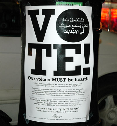
It’s election day today in NYC. I spotted this in Bay Ridge Brooklyn this weekend.
The bilingual poster does not endorse a particular candidate or ballot initiative, simply the vote itself. It’s not trying to sell anything but political power.
The poster reads:
“There are many local races in NYC, including the run for Mayor. It is important for Arab-Americans to organize a visible community presence on Election Day. Let’s organize a visible effort that lets political leaders know that Arab-Americans are serious about their civic participation and that their concerns need to be addressed.”
Political power in New York City can often be drawn among community lines. This often becomes a game of numbers, and graphics in community spaces play a small but important part.


