nyc
Quickies
Danish anti-war posters hit Iraq:
“On Friday, Iraqis started hanging over 1000 posters created by the artists in the most populous and important quarters of the capital, including the diplomatic Green Zone in the very heart of the city. Artist Claus Rohland, 50, explained to Aljazeera.net why he and fellow artist Jan Egesborg, 40, had got involved and what message they hoped to send to ordinary Iraqis.... ‘We as Danes are part of this so-called coalition and are taking part in this war. But Denmark is a very small country that has not been at war for many years. We need to question what we are doing and what is happening,’ Rohland said. ‘None of the warring parties — neither US-led forces nor Iraqi rebels — present a solution to this war. The ultimate solution needs to come from ordinary people. It may sound naive, but we would encourage people to keep faith in themselves that a final solution rests with them.’”
---
North Dakota has no plans to alter Sioux logo:
“The NCAA considers the logo and nickname ‘hostile and abusive,’ and has ordered the school to cover up all Fighting Sioux references for the NCAA playoffs. The arena, which operates separately from the school, is holding the West Regional hockey tournament in March. [Jody Hodgson, arena manager,] said there are no plans to alter any logos, which can be found on floors, walls, seats and railings. Eliminating them would be too expensive, he said.”
---
Electronics industry urges federal e-waste action:
“A nine-member panel appearing before the U.S. House of Representatives subcommittee on environment and hazardous materials expressed concern that the current trend of varied state and local laws targeting e-waste management would breed inefficiency, confusion and higher prices for consumers.... The best approach, [Renee St. Denis of Hewlett-Packard] said, is for federal lawmakers to create a system in which the manufacturers themselves set up recycling programs and bear the necessary costs.”
---
Deal for Public Toilets in New York City. Only 20 toilets, but it’s a start. The winning company will rebuild all city newsstands and bus shelters, too — and sell the ad space. Not sure how I feel about a private corporation owning all that public space — but then the NYC gov pays nothing. More on the the long history of trying to build public toilets in NYC here and here.
---
Alcaldía favorece proyecto de biogas. Nicaragua’s biggest garbage dump in the Barrio La Chureca in Managua could be used to create enough electricity to illuminate the nearby municipality of Ciudad Sandino. The joint U.S.-Nicaraguan company Conjuris says they can create four megawatts of electrical energy from the gases emitted by burning the garbage. The company is willing to invest US$5.25 million in the project in return for a twenty year contract.
---
It’s great to see graphic designers come together at displaceddesigner.com, the AIGA, and Design Observer to help other graphic designers affected by Hurricane Katrina. I’m all for community and solidarity. But then it’s really not the professional designers that are hurting the most, no?
---
Only one more month until the October 31 deadline to submit your radical graphics to Reproduce & Revolt. And it looks like Favianna has joined the project!
Central Heating
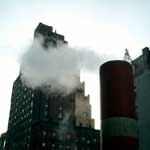 One of the few redeeming qualities of winter in New York City are those beautiful columns of steam that rise from the streets. Walking along, you catch these great clouds of vapor churning and billowing — particularly at twilight, through the headlights and street lights.
So what’s it all about?
Under the streets of New York City is the largest steam distribution system in the world.
On March 3, 1882, the first steam distribution plant of importance in the U.S. made its first distribution of steam from a central plant at to the United Bank Building on Broadway, sending steam to heat buildings in lower Manhattan.
The New York Steam Corporation, formed July 26, 1880, consolidated with the Steam Heating and Power Company of New York in September 1881. The company was sold in 1915, but when the parent company went bankrupt two years later it was reorganized as the New York Steam Corporation. It was merged into the Consolidated Edison system in the 1930s.
This article from the Gotham Gazette’s infrastructure series draws the broad contours of the current steam system.
Seven steam plants, five in Manhattan and one each in Queens and Brooklyn generate the millions of pounds steam that run under the city’s streets. The steam heats housing, offices, a few churches, and NYC landmarks like the Empire State Building, the Metropolitan Museum of Art, and the United Nations. It is used to press your shirts and in the central sterilization unit St. Vincent’s Hospital. I also note that the system stops south of 96th street.
 Those plumes in the street may be releasing pressure or perhaps just a leak. The system moves steam at high pressures to maintain the temperature and push it through the system.
Three of the plants simultaneously produce both steam and electricity through a process called co-generation. At the height of winter, the system sends out nearly 10 million pounds of steam per hour. Sales from ConEd’s Steam Business Unit account for about 7 percent of total Con Edison revenues.
And because the steam is mass-produced, it is more economical, efficient, and environmentally friendly than the hundred thousand individual oil or gas boilers it replaces. Centralized steam eliminates the need for boilers in individual buildings along with million gallons of heavy fuel oil and traffic from fuel delivery trucks. The steam plants use low sulfur oil or clean-burning natural gas to produce steam. High tech burners further lower nitrogen oxide emissions.
Update 1/9/2010: Here’s a great piece on Urban Omnibus about the NYC steam system.
Guns, Butter, and Ballots
An article of mine is running in January/February 2005 issue of Communication Arts.
If any of you were wondering what all that Nixon bit on the Federal Design Assembly was about, it was background research for this.
Guns, Butter and Ballots
Citizens take charge by designing for better government
What did the President know and when did he know it? In April 2004, the White House declassified one of the President’s daily intelligence briefs issued just a month before September 11, 2001. The brief specifically states that Al-Qaeda and Bin Laden were planning attacks on the United States with hijacked airplanes.
Graphic designer Greg Storey was horrified. Not just because the information was all right there, but by the design. It’s no wonder the information could be ignored. The document is an uninflected, grey mash of sans serif type. Might thousands have been saved if the information design had been better?
“Nothing in the text is emphasized, making it difficult to scan,” Storey noted on his Weblog. “It would be much better if keywords, names and places were in bold and/or in a different color. Make it so that within seconds the President can see how serious of a threat it is.” Mouse in hand, Storey created a redesigned brief of his own (below right), adding a larger headline, highlighted key terms and, most prominently, a large colored number indicating the level of the threat.
Though no one in government ever contacted Storey, readers of Storey’s blog clamored for a document template they could use themselves. He dutifully responded. (Visit http://airbagindustries.com/archives/002868.php.) “My intentions were nothing more than to rant about what I saw to be a problem with how our government works day to day,” he wrote. “I thought I would spend a few minutes in front of Photoshop to see what I could come up with.”
Alas, President Bush does not actually read the daily briefs, the Director of Intelligence summarizes them to him out loud. Nonetheless, Storey’s redesign is a dramatic example of how information design might affect the government and the public.
But the truth is, graphic designers across the country are already hard at work collaborating with local, state and national government officials to harness the power of design in the public interest. Their work affects the lives of millions of Americans by improving public safety, promoting public health and facilitating democracy on a massive scale — often at the initiative of the designers themselves.
That government agencies use graphic design is nothing new. From posters to packaging, identity and, of course, forms, the federal government is one of the largest purchasers of design services in the world. But much of this work is less than inspiring — even obscure or downright misleading. For a variety of reasons, government designers may be stifled by bureaucrats and lawyers. And sometimes it seems like the lawyers and bureaucrats do the designing themselves.
The late 1960s and 1970s, however, saw a number of seminal graphic design projects sponsored by the U.S. Government. To name just a few: Vignelli Associates’s graphic standards for National Park Service publications; Danne & Blackburn’s NASA “worm” logo; and Chermayeff & Geismar’s logos for the Park Service, Environmental Protection Agency and U.S. Bicentennial.
Continuing a wave of public art initiatives at the time, Richard Nixon even asked Congress to triple the budget of the National Endowment for the Arts and created the Federal Design Improvement Program to help upgrade government architecture and graphics.
But by the end of the 1970s, faced with an energy crisis and an economic recession, the new leadership shifted the government’s priorities. By the 1980s, a backlash raged against public arts funding. Budgets were cut and interest in public design projects waned.
Still, during this period, two masterpieces of modern infor- mation design were developed, both of which have had a demonstrable impact on public safety.
Burkey Belser’s company usually designs communications materials for law firms and other services companies. But in 1978, he was asked to design the EnergyGuide label for the Federal Trade Commission. The frustrated regulators had become desperate after a top-shelf New York design firm had failed — and submitted a hefty bill in the process. The EnergyGuide that Belser designed is a bright yellow informational sticker that must be displayed by retailers on all major appliances (like air conditioners, refrigerators and washing machines). The Guide shows the estimated yearly operating cost and energy consumption on a scale from least to most efficient. Consumers actually used it to consider not just purchase price, but cost over the life of the appliance. The success of the label convinced government regulators that you could modify consumer behavior through clear, friendly information design, gently pushing them towards more environmentally friendly, if slightly more expensive, purchases. Multiplied by millions of refrigerators, the energy savings have been enormous.
Belser’s 1994 redesign of the Nutrition Facts label also attempts to influence consumer decisions. But the label, the most widely reproduced graphic in the world, very nearly had no designer at all.
In 1991, Congress mandated that the science behind the label be revisited. Originally developed in the 1960s, the previous label was based on a culture of famine during the Great Depression and two World Wars. Hunger was an epidemic. Food was scarce and the country lacked an interstate highway system to move fresh fruits and vegetables to market. The government’s priority in the first label design was to fend off malnutrition, rickets and scurvy, and so the label highlighted essential vitamins and minerals. In 1991, Congress realized we were living in a different culture — a culture of plenty...and of fat. They tasked the Food and Drug Administration (FDA) to develop a new labeling scheme to fend off an epidemic of obesity.
The Center for Food Safety and Applied Nutrition at the FDA was well equipped with top scientists, nutritionists and epidemiologists, but lacked experience in public communication. The Center had hired another big New York design firm, but was dissatisfied with the results. And so they prepared to go it alone.
Sharon Natanblut had a background in marketing and public relations, and had just started at the FDA as advisor to the Commissioner for strategic initiatives. When she found out that the scientists were designing the label themselves, she intervened. “The scientists saw graphic design as a trivial thing,” she recalls. “They thought more information is better. But ultimately, it is the design that helps you understand it.”
Natanblut knew Belser from his work on the EnergyGuide and knew he could communicate with both scientists and government officials, and would ensure that the design reflected the goals of the project.
Belser offered to do the job for free (though was able to charge for some expenses.) “If ever there was a call for pro-bono work,” says Natanblut, “this was it.” Belser comments, “Designers should really take on public projects as a part of citizenship. That’s why we did it. How often do you get a chance to affect so many people? Anyway, I didn’t want to mess with the government procurement process at the time.”
Belser and his staff put in countless hours and, after designing 30 variations, learned there is no such thing as a universal symbol. They found that literacy is more complex than they had imagined. The label had to be accessible to both poor and fluent readers. They found that poor readers stumbled over commas, dashes and semicolons, and that graphs, icons, pie charts are more sophisticated than they’d thought, requiring a relatively high degree of visual literacy. In focus groups and in public comment, designs that used these elements were slaughtered.
Eventually Belser and his team developed the current layout. The generic and anonymous looking design is anything but. The placement and grouping of information and the use of boldface create a visual hierarchy. To combat increasing obesity, the new design highlights calories, fat and cholesterol. And the resulting label is used by health-conscious shoppers to count calories and monitor their cholesterol intake. As former FDA Commissioner David A. Kessler recalled, “The nutrition facts label has within the space of a few years become a standard that many Americans use to make basic decisions about their diet and nutrition.”
The apparent lack of “marketing devices” is also misleading. The space is branded with a kind of “look of truth” — neutral, scientific, institutional and authoritative.
Nonetheless, obesity continues to rise at a dangerous rate — fast becoming the number one cause of death in the United States. In response, Belser is currently working with concerned advisors to government to further modify the design.
One might argue that it’s not the government’s place to interfere with people’s behavior or engage in “social engineering.” Belser responds, “I don’t think that there’s any government, corporation, or anybody that is not trying to influence somebody else. We have a Constitution and body of laws that say certain areas are off limits...But what the government is willing to do, and what, I believe, has a perfect right to do is to manage issues of public health and safety.”
Citizen action
The Nutrition Facts and EnergyGuide labels show the reach of government sponsored information design. Recently, however, the design process seems to be shifting.
Whether designers are tired of commercialism or were awakened by the 2000 butterfly ballot fiasco, there seems to be increasing interest in civic engagement. As portrayed in the 2000 reissue of the First Things First Manifesto and the AIGA’s recent Voice conference, designers are increasingly thinking about social responsibility and looking for ways to get involved.
In fact, several recent government design projects have been driven from the bottom up rather than the top down. Redesigns of the 2000 census, voting materials, New York City’s ubiquitous choking victim poster and the 1040 tax form were all initiated by designers themselves. In some cases starting out as class projects.
Silicon in the Naked City
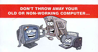
Last week, I was delighted to receive a piece of mail from the New York City Department of Sanitation.
The flyer announced a series of events around the city to collect, refurbish, and recycle old electronics in an environmentally responsible manner.
Electronic devices constitute less than one percent of the NYC waste stream, but the materials are extremely toxic if not disposed of properly.
I know non-profit and volunteer groups hold collection events from time to time, but I almost always find out about them after the fact. The refurbished computers are usually donated or sold to low-income families, schools, and community groups for a nominal fee.
This time, however, the Department of Sanitation itself is sponsoring events in the five boroughs to collect e-waste. Working cell phones are being donated to Collective Good.
The events are jointly funded by Dell and Lexmark and the National Recycling Coalition. The Lower East Side Ecology Center and other community groups are coordinating.
I asked Robert Lange, New York City’s Director of Recycling and Waste Prevention about the events:
SDN: Was this started at the initiative of the City, local groups, or manufacturers?
 Click to view a larger version |
I usually find out these things after the fact. What kind of outreach are you doing?
We sent out the flyer well in advance to every residence in the city, and posted the information on our Web site.
Is this aimed primarily at consumers or businesses or both?
It is aimed at city residences.
Will there be a similar push directed at businesses?
It’s possible.
In things like this, it depends on who picks up the tab. Does the tab get picked up by the businesses that profit from the manufacture and sale of these items? Is the tab picked up by consumers? Is some ways, ultimately, the tab is always picked up by the consumer, either directly associated as a charge with the item when they by it, or indirectly through a tax, to run a municipal program, for example.
In my own estimation, because there is an infrastructure for producing these things and delivering the products to people, it makes sense to use the same distribution network to take them back if possible.
And to some extent, Dell and other manufacturers are doing that. If you look at the flyer or the Web site, there are services currently provided by these companies for taking back computers. In some cases, there’s a nominal charge, in other cases there’s no charge, but it’s services they provide to directly take back computers from consumers after their useful life.
Given the toxicity of materials, is there a chance that the disposal may be regulated legislatively?
There are materials like this in the waste stream that are increasing in volume and they need to be addressed. Whether they need to be addressed by a municipal program or not is something that is still in question.
There are a variety of proposed pieces of legislation, both in our area and in other parts of the country to require that this material be handled in a more responsible manner. Different legislators have different perspectives on who picks up the tab.
My own opinion is that this is something that manufacturers should really be required to deal with. And to some extent they are stepping up to the plate because the funds for these drop-off programs that we are running through community-based organizations are being provided by Dell and Lexmark.
 I don’t know if you are familiar with an organization called RBRC which is for taking back batteries — particularly Nickel Cadmium batteries. It is funded and run by the battery industry. A few years ago, when the industry was facing the potential of severe regulation governing how batteries could be disposed of, all the manufacturers got together set up an informal network to receive batteries from the public. All the Radio Shacks, Staples, and organizations like that take back batteries from the public as part of the network they established. And they did that try to avoid the kind of regulation that was coming down.
I think the computer industry has an even greater incentive to do that, so I expect that what is now fairly informal will become a more formal network in the future. Either that or there will be legislation passed.
What are your future plans?
This is something of an experiment. As I said, the funds are being provided by Dell and Lexmark. Whether they will continue to provide funding... they have not made a long range commitment to that effect.
The collections will run through the fall. How we go forward will depend on the amount success we have. Events like this have been run in the City before and the average tonnage of computers and electronics received per event is approximately 10 tons. We hope to see exponentially higher numbers because this mailing is going to every household in the City.
For more information, visit the NYC Wasteless Web site.
...
And while we’re talking trash, big up to the Mayor for his plan to ship waste from Manhattan’s 59th Street pier instead of trucking it to Brooklyn and the South Bronx.This should relieve some of the burden from low-income neighborhoods who overwhelming suffer the traffic of the City’s trash.
Commodify Your Dissent
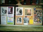
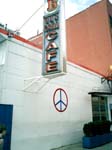
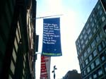
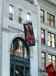
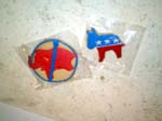
Walking around downtown, I’m noticing a number of businesses flaunting their politics. Below are a few random snapshots.
In New York City, where registered Democrats outnumber registered Republicans by 5 to 1 it probably does not harm your business much to wave a Democratic flag.
But what’s notable is that these banners do not seem to be branding or trying to create a niche. I don’t think these businesses are trying to position themselves as responsible corporate citizens. It seems more like someone wearing a political pin, though for each the context is a bit different.
Click on a thumbnail to view a larger image.
On a related note, a year ago a handful of lefty bloggers were abuzz about this:
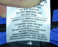
a label from a bag designed by Tom Bihn, an American company located in Port Angeles, Washington. The French repeats the English care and handling instructions, with an additional two lines:
Wash with warm water.
Use mild soap.
Dry flat.
Do not use bleach.
Do not dry in the dryer.
Do not iron.
We are sorry that Our President is an idiot.
We did not vote for him.
Few bloggers followed up to point out that the grassroots buzz actually produced record sales for the company.
From AFP, April 26, 2003:
Handbags insulting “president” in French sell like hot cakes in US
“There is no doubt that sales are hot for handbags bearing an insult — in French — aimed at ‘our president.’ The question is: Which president?
The bag’s designer Tom Bihn never guessed that purses with the message, ‘We’re sorry our president is an idiot. We didn’t vote for him’ — inscribed in French — would be blowing out of the stores.
‘It is a mystery, but since we launched the bags with the label sewn, sales have doubled,’ said Bihn, 43. ‘It is a record in the history of the company.’
He denies the message is targeting US President George W. Bush.
‘It depends on either your nationality, or the president you think is an idiot; you choose.’
Clients throughout the United States have flooded his offices in Seattle and Port Angeles with calls and e-mails to order for the bags, he said.
The company received ‘varied reactions’ including ‘hate mail from a French citizen who thought the label was addressed to (French President) Jacques Chirac.’
But 80 percent of the Americans think it is an amusing message, he said.
On his company’s website, he said: ‘Everyone seems to have a ‘president’ that they think is an idiot. Take your pick: Jacques Chirac, Bill Clinton, George Bush.’
Neither Bihn nor his 10 employees have yet taken the situation seriously, but have launched a series of T-shirts, selling at 20 dollars each, with the same message, with funds to go to a war veterans’ center in Seattle.”
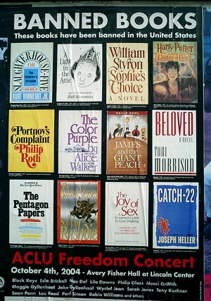
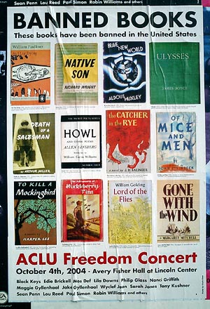
Banned in the U.S.A.
Classic book cover design on display in the streets in New York City.
The posters were designed by the artist Chuck Close. You can download high resolution PDFs here and here.
See the American Library Association’s list of 100 most frequently banned books.
Read more about Banned Books campaigns by the ACLU and the ALA, and about the ACLU’s concert event.
On the Inside
Via Reuters:
“A protest sign is held up behind U.S. President George W. Bush as he delivers his speech to the delegation during the final night of the 2004 Republican National Convention at Madison Square Garden in New York City on September 2, 2004. The protester was removed from the convention hall by authorities. Photo by Rick Wilking/Reuters”
People’s Map of NYC
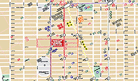
Several grassroots groups are publishing maps of the New York City to guide visitors and residents who want to participate in the protests and events around the Republican National Convention next week.
From a co-editor of, Peace Signs, a big book of anti-Bush, anti-war posters, comes The People’s Guide to the RNC
 Cited in The New York Times on August 9, 2004:
“Included is information of the sort that could be of use to any traveler: a street map of Manhattan south of 59th Street and addresses of restaurants, bookstores, libraries and places to rent bicycles.
Other elements are specific to the convention: hotels where various state delegations will be staying, sites of official convention events, and times and locations of planned demonstrations. There are also the words of the First Amendment, phone numbers for the New York Civil Liberties Union and information about bail bondsmen.
The three creators said they spent $6,000 of their own money to print the guides, but are distributing them free.
‘The main reason we made the guide is so that people have enough information to get in the way or out of the way,’ Mr. Chan said.
On Thursday, he and his friends began distributing 25,000 copies to bookstores, community groups, churches and other places.”
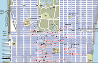 You can order or download the map here.
...
The 2004 RNC Protesters Map is more up-to-date, and features a large list of protest, art, and RNC related events, convergence spaces, and trainings. Icons on the map indicate hotels, police stations, navigation landmarks, parks (both active and passive), and the march route and rallying points. Updated on August 20, the map can be download here (792 Kb PDF).
...
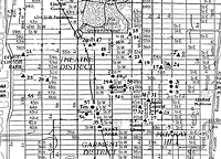 First published in March 2003, the Map of War Profiteers in New York City showed the beneficiaries in our midst, plotting the locations of government and military agencies, corporations, media profiting from the war. At the meeting of the M27 Coalition, the map helped locate the discussion determining a place for the March 27, 2003 action. Rockefeller Center ultimately was chosen for its proximity to several points on the map.
Unlike the other two color multi-page maps, the War Profiteers map has a distinctly low-tech, underground, DIY aesthetic. It is designed to be reproduced in black-and-white on the front and back of an 11"x17" piece of paper. The icons are composed of cut paper, arranged on a found map. The map was available at progressive bookstores around town, and was distributed at organizing meetings for various protest events.
Green Map Systems
Graphic designer Wendy Brawer produced her first Green Map in 1991. The Green Apple Map of New York City charted 143 ecologically and culturally significant sites: community gardens, parks, greenmarkets, eco-centers, green businesses and buildings, transportation options, and toxic hot spots. It was well received and quickly inspired a second edition. Wendy writes:
“This Map encourages people to explore and understand out city — helping expand our community of environmental stewards who understand the interconnections between the natural and built environments. It can help build a network of links among people of different ages and backgrounds by highlighting places that are important to our common future. It promotes and fosters replication of successful projects. Moreover, it challenges the assumption that this intensely urban setting has little redeeming ecological value.”
 Activists and designers in other cities, particularly colleagues in the o2 Global Network, were eager to make their own Green Maps.
Green Map Systems was born in 1995 and became a U.S. registered not-for-profit organization in 2000.
Wendy and her team produced a shared set of icons, and a Mapmakers’ Agreement which sets some parameters and includes small royalty based on the proceeds — 1% to 3% depending on if the project is all volunteers or has paid staff, and 1% of printed maps. Some “scholarships” are available where needed.
After that, the projects are fairly autonomous. Each Green Map is locally organized and designed, and independently produced. The maps may highlight parks and green spaces, bike paths, gay and lesbian resources, notes on wheelchair accessibility, recycling centers, or sites of energy production and consumption.
“Printed and digital Green Maps identify, promote and link eco and social resources. Each merges the ancient art of map making and new media in creating a fresh perspective that helps hometown residents discover great ways to get involved with the urban environment, and guides tourists (especially virtual ones) to special places and successful greening initiatives they can experience, and then replicate back home.
The maps are generated with a wide range of techniques, from GIS to Illustrator, to simple drawings by hand.
As of this writing, there are now there are now 241 Green Map projects, including 45 by youth. 151 different Green Maps have been completed in 39 countries. The maps are listed here.
Map makers can also develop local variations on global set of Green Map Icons (a shrine icon for Japan, a Capoira icon for Brazil.) After a global discussion on the Green Map email list, several of these have been incorporated into the global set. The set of 125 icons and 50 youth icons have been released as digital fonts for easy placement.
Launched on February 29, 2004, the Green Map Atlas highlights the ten map making projects in Asia and North America. With the goal of promoting sustainability and greener living worldwide, the Green Map Atlas showcases the work of diverse Mapmakers in Tokyo, Toronto, Jakarta, Pune (India), Kyoto, Hiroshima and Hakodate (Japan), Robeson County, NC, Milwaukee, and New York City.
Would You Like to Super Size That?
My own personal economic indicator is the number of vacant storefronts I pass on my way through New York City. Lately it seems worse than ever. Many of the stores that have been in my neighborhood since I moved here 13 years ago have closed in the last year or so.
But this turns out to have one unexpected benefit: vacant storefronts aplenty, available for short-term lease... to progressive groups during the Republican National Convention:
NYCLU Unveils Protecting Protest Storefront
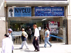 “The New York Civil Liberties Union today formally opens its Protecting Protest Storefront just two blocks from Madison Square Garden. The Storefront, at 520 Eighth Avenue (between 36th and 37th Streets) will serve as the NYCLU base of operations for monitoring protest activity during the Republican National Convention.
‘This location will be important for those who will witness democracy in action outside the Garden,’ said Donna Lieberman, Executive Director of the NYCLU. ‘As thousands of demonstrators take to the streets in peaceful protest, the NYCLU will be in constant negotiation with police to ensure that all problems are immediately resolved.’
In addition to housing the NYCLU Protecting Protest office, the Storefront will serve as a meeting place for our volunteers. The NYCLU will also host ‘Know Your Rights’ trainings and press briefings at the Storefront. Leaflets detailing the rights of protesters also will be distributed. The Storefront will also serve as the location for participants to submit information about policing tactics at the demonstrations.
‘We will be watching the NYPD night and day doing our very best to protect the right to protest,’ said Christopher Dunn, Associate Legal Director. ‘The NYCLU Storefront is the First Amendment’s beachhead to the Convention.’
During the week of the convention, the NYCLU will provide resources at the location for the media to file reports. The organization asks that those who are considering using the Storefront for this purpose contact the NYCLU at your earliest convenience. Overseeing all Storefront activities directly will be Steve Theberge, the NYCLU’s Protecting Protest Coordinator.
The NYCLU Protecting Protest Storefront is operated by the New York Civil Liberties Union, which is the New York State Affiliate of the American Civil Liberties Union (ACLU). The Storefront will serve many purposes between now and the end of the Republican National Convention (RNC):
- Source of printed information about the legal rights of groups and individuals planning to protest during the Convention;
- Location of ‘know your rights’ trainings for groups and individuals planning to protest during the Convention;
- Base of operations for NYCLU lawyers, staff, and volunteers who will be monitoring police activity leading up to and during the Convention;
- Place for people to file complaints or provide reports about police activity before and during the Convention;
- Location for approved members of the media to file stories during the Convention.
In the weeks leading up to the Convention, the NYCLU Protecting Protest Storefront generally will be open 10:00 a.m. to 6:00 p.m., Monday through Saturday. Starting on Thursday, August 26, the Storefront will be open daily from 8:00 a.m. to 10:00 p.m.”
The route for the big August 29th protest actually turns west on 34th Street so the Storefront is not directly on the march route, but two blocks from the Garden is pretty damn close. I just hope the NYPD doesn’t close off the street.


