

April 2003
Incarcerated America
“More than two million men and women are now behind bars in the United States. The country that holds itself out as the ‘land of freedom’ incarcerates a higher percentage of its people than any other country....
Perhaps the single greatest force behind the growth of the prison population has been the national ‘war on drugs.’ The number of incarcerated drug offenders has increased twelvefold since 1980. In 2000, 22 percent of those in federal and state prisons were convicted on drug charges.
Even more troubling than the absolute number of persons in jail or prison is the extent to which those men and women are African-American. Although blacks account for only 12 percent of the U.S. population, 44 percent of all prisoners in the United States are black.
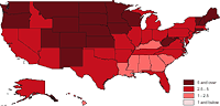 Census data for 2000, which included a count of the number and race of all individuals incarcerated in the United States, reveals the dramatic racial disproportion of the incarcerated population in each state: the proportion of blacks in prison populations exceeds the proportion among state residents in every single state. In twenty states, the percent of blacks incarcerated is at least five times greater than their share of resident population.”
Some experiments with GIS turned into a redesign of this Human Rights Watch backgrounder. Interesting to note the regional clusters that emerged from dumping various metrics into a spatial layout. Download the PDF here (192 Kb).
Toppling
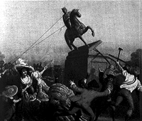 King George III
|
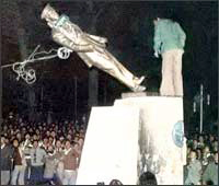 The Shah of Iran
|
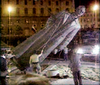
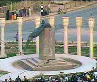
Unable to anticipate a clear surrender by the Iraqi government, on April 4 the Bush administration announced it’s vision of a “rolling victory,” “a strategy to declare victory in Iraq even if Saddam Hussein or key lieutenants remain at large and fighting continues in parts of the country.” Days later, the media run images of a statue of Hussein being toppled by U.S. marines and jubilant Iraqi’s.
...
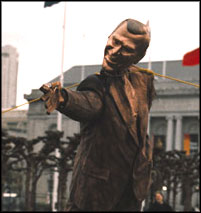
A week later, protestors in San Francisco stage their own toppling of their own. A popular protest mimicking the Marines mimicking a popular protest, the protestors pull down a makeshift statue of President Bush in the style of Saddam Hussein’s.
...
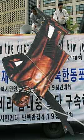
And a week after that, protestors in South Korea topple a cardboard cutout of a statue of Kim Il-Sung.
...
Update: On July 3, 2004 the Los Angeles Times confirmed that it was Army psy-ops that toppled the statue of Saddam Hussein, not the Iraqi civilians shown on television.
Call for Submissions: Sappi Ideas The Matter
“Ideas that Matter is an initiative by [paper company] Sappi that provides funding to support creative design for social good. Your talent and skills could benefit the many institutions working for change: non-profit organisations that are involved in scientific, environmental, educational, cultural or relief programmes.
Sappi is ready to award financial grants of up to €50,000 to pay your out-of-pocket expenses and the full implementation of a print campaign. This includes the cost of the photography, illustration, films, paper, printing, mailing, etc...
Select the non-profit organisation that would benefit from your ideas and ask them to agree to your ideas and application for a grant. Then prepare your creative print campaign proposal and submit it to Sappi. Remember your campaign must exploit the effectiveness of ideas on paper, maximising the potential of posters, direct mail, brochures or print advertising - or something new. Of course, you can submit more than one application if you have more than one idea.”
Check some of the previous winners. The org seems inclined (though not necessarily limited) to funding projects that promote charities that promote children’s rights and humanitarian health and development projects. Get your application here. Entries must be postmarked by May 31, 2003.
When picking a paper stock, you might also consider some of their fine woodfree products.
Design Against the War
Over a year ago I attended a lecture on design at the Cooper Union. The speaker projected a series of slides illustrating his minimalist design philosophy. One of the images was of the B-2 bomber. I was shocked and disturbed that a design philosophy would fail to take into account social, political, and economic contexts. Particularly of an object which, when used as intended, delivers massive death and destruction.
It prompted me to dig deeper into design and the public interest. And to start this Web log.
On evening of April 16, I arranged a panel discussion at Cooper titled “Design in the Public Interest / Design Against the War.” I invited three panelists to speak about their work as designers involved in the anti-war movement.
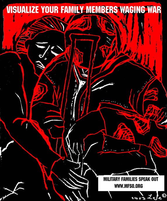 First up was Lee Gough, a printmaker, anti-war activist, and graphic artist based in Brooklyn, NY. She showed a series of prints from a portfolio-in-progress on the Iraq invasion and the war at home, called “The War Went Well.” Some of the images have been used in posters on the Web site Who Dies for Bush Lies“ and for Military Families Speak Out, an organization of people who are opposed to war in Iraq and who have relatives or loved ones in the military.
One image “Fight the War at Home” was inspired by a subway ride home from lower manhattan on September 11. Even as the towers had just been destroyed, there were still, as there had been for many years, homeless persons on the subway appealing to cityfolk to remember them, and to give. The image is a graphic reminder that some have been under domestic attack in our country for a long time, and that funds for the war on poverty pale in comparison to our “defense” budget. Another image, “Visualize Your Family Members Waging War” depicts a despondent soldier with a crutch being embraced by a woman. Lee’s expressive linocut style brings a gravity to the subject matter.
Lee commented on the challenges of choosing one’s message, for instance, noting the different context of “Bring the Troops Home” for troops that have been drafted vs. those who enlisted voluntarily.
One member of the audience raised the question of why U.S. flags and “being American” were the province of the pro-war movement, when large numbers of U.S. citizens were opposed to the war. I noted that I’d seen many anti-war demonstrators holding up flags and patriotism at rallies. On the Web, Who Dies for Bush Lies? effectively tackles effect of the war on U.S. soldiers and U.S. civilians, in addition to Iraqi soldiers and civilians. The danger was raised, though, of the rhetorical trap: the argument over who is “more American” can go back and forth forever, and quickly turning attention away from the crisis at hand.
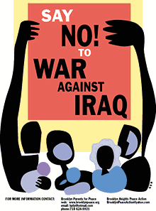 Nancy Doniger has worked as an illustrator for almost 20 years, producing art work for newspapers, magazines, books, posters and T-shirts for both for-profit clients and not-for-profit groups. She is currently a member of Brooklyn Parents for Peace, for whom she created the “Say No to War Against Iraq” poster.
She also helped organize a community/family oriented workshop that gave kids and parents an opportunity to make anti-war art for protest marches. Adults and kids made signs and worked with a puppeteer to create a large paper mache dove, and lots of little doves held aloft on cardboard tubes.
Nancy showed some earlier examples of her work, including a forceful image against the FTAA, a stark two-color poster for a conference on the conflict in Israel and Palestine, and a bright, celebratory “Welcome Back to Brooklyn” poster.
She also showed a couple of iterations of the “Say No to War” poster. One implied the damage of war with flames, but the final version ultimately centered on the mass mobilization. She noted that, in contrast to other illustrations, her work on this piece progressed from representation to geometric abstraction to make the poster more inclusive, using large blocks of color instead of specific depictions of race and gender. She is currently working on a “Hate Free Zone” poster.
Nancy noted the effect of the “Say No to War” poster on her block. The block appeared to be a very pro-war, where “the flags are quick to come out.” But over time, the “Say No to War” poster began to appear in windows and doorways. I certainly noticed it up and down the block where my step-sister lives.
Nancy is also involved in upcoming anti-war event “WEARNICA.” Sponsored by Brooklyn Parents for Peace, on May 3, 2003 a group of artists will present original anti-war art executed on the backs of white cotton dress shirts. The shirts will be worn in public spaces around New York and the world. The event was conceived by Works on Shirts Project whose inspiration for the event came after Colin Powell insisted upon covering the tapestry of Picasso’s Guernica during his warmongering speech to the General Assembly of the United Nations on February 5, 2003.
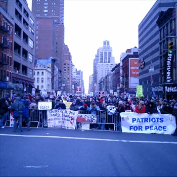
L.A. Kauffman is a staff organizer for United for Peace and Justice and designer of materials to promote the February 15 and March 22 marches in New York City. Her sticker and poster designs United for Peace and Justice can been seen on the streets across the New York City.
Leslie arrived at design through her work as editor of a progressive journal. She was inspired by the bold, clear graphics of Gran Fury and ACT-UP, and the use of those graphics on the street and at demonstrations, stage managing the events to push its imagery into the mainstream media. She claims she can not draw, so uses clip art in her graphics. The image of the blue pennant flag and black group have become a ubiquitous the city streets.
The idea behind a worldwide day of anti-war marches came out of the European Social Forum held in Florence this past November. At the Forum, the date February 15 was chosen as a date for anti-war demonstrations “in every capital.” What transpired was unexpected and unprecedented.
United for Peace and Justice had only just formed in the November of 2002, but it wasn’t January the group started working on the February 15 march. 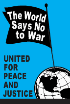 “The World Says No” was the headline of the February 15 flyer design, accompanied by a list of cities taking part in the event. As news of the event travelled across the Internet, marches were planned in more and more cities. Leslie held up various versions of her February 15 design with more and more cities added. Ultimately, marches were held in 793 cities around the world on February 15. Of particular note is virtual absence of communication or coordination between the participating cities.
Leslie spoke of the focused purpose of the posters produced for the event: not to educated, but to mobilize. The flyers lack all superfluous text or argument, just the headline, time and place. The posters and stickers were not trying to change people’s minds, instead to reach out to people who were already against the war but had not yet taken action.
In addition to sticker and flyers, palm cards cut from 1/4 page xerox copies on blue paper were popular and successful. They are both cheaper and more effective — easier to stuff in your pocket, less burdensome on the counter tops of sympathetic shopkeepers.
For the February 15 march, 200,000 stickers were distributed in 5 weeks. For the March 22 march, 200,000 stickers were distributed in 3 weeks. Astonishing numbers, posted around town by a continual flow of volunteers through the office. It’s also a useful bench mark: this is how many it takes to spread the message. A month later, I’m still finding remnants of UPfJ stickers on walls and phone booths. Leslie noted the effect of thousands of little acts of civil disobedience for the spirit of protestors, slowly bolstering a spirit of resistance around in the City and specifically, against the police department ban on marching past the U.N. on February 15.
In total, 1.1 Million pieces of literature distributed. Almost all of the printed materials were bilingual: English on one side, Spanish on the other. However, materials were also produced in Korean, Spanish, French, Creole, and Chinese. Quite a few donations for all these production expenses came online via paypal.
The question was raised about the environmental impact of producing all those printed materials. Her response: it’s also better for the environment if the war is prevented.
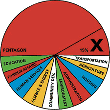 Other examples of design projects were raised by members of the audience: a “Do Not Bomb Iraq” sticker to replace the “Do Not Lean On Doors” sticker in NYC subway cars; colorful logos, charts and imagery designed by Stefan Sagmeister for “Move Our Money,” a campaign to reallocate 15% of the U.S. military budget for education; and flyers handed out to tourists at ground zero with a graphic representation of the number of teachers aides that will be cut from City’s budget. The image leaves it to the viewer to make to the connection to the military expense of a war in Iraq.
Many spoke of the importance of New Yorkers being seen as against the war. September 11 was an attack on New York, and the war is being waged in our name. Others spoke of the urgency of independent media, and the challenge of reaching out beyond “preaching to the converted.”
Overall, I was struck by how spontaneous the designers’ actions were. In almost every case, the designers simply stepped forward and got involved: signs made for a rally were eagerly snapped up; hundreds of thousands of stickers eagerly taken and distributed; and, “Say No to War” posters popped up on an otherwise apparently pro-war street. It seems that one doesn’t necessarily have to change everyone’s minds. There are more “converted” than you think. They just don’t have the graphic materials to display yet.
About 50 people came to the event, a decent turnout despite the announcement from the Pentagon the previous day that “the major fighting” in Iraq was over... and the fact that I’d scheduled the event on the first night of Passover. (Such a Jew am I.) The arc of the event could have used a better closing at the end, as well as a better transition between panelists. I also noted the lack of diversity in the audience. I think next time, I should hold it at different time and place. I’m also quite pleased with the invite design. Peel off the event description and you’re left with an anti-war sticker. Many thanks to Photobition for helping hammer this out in time.
One purpose of the event was to connect artists, designers, and activists. I’m disappointed more Cooper students didn’t show, but after the event quite a few people milled around having these intense little conversations until I kicked everyone out to close the room and return the lights. And quite a few people asked me what was next. Perhaps the start of a new Committee to Unsell the War?
Call for Submissions: Prison Families Community Forum
Prison Families Community Forum Launches Campaign to Fight Inmate Telecom Injustices In New York State
 The Prison Families Community Forum needs visual art work! Prison Families Community Forum is a growing network of families directly affected by incarceration in New York State. We are part of a Brooklyn-based non-profit community development organization and are mobilizing families of NYS prisoners to fight the exploitative and dehumanizing practices of New York State, the Department of Corrections and MCI. To keep in contact with loved ones inside, families are forced to absorb charges up to 68% more than anyone else in NYS pays for a collect phone call, a kickback to the state.
We are looking for intense, compelling and even graphic visuals that speak to the hardships faced by families and communities of the incarcerated. Your work will be used for public education, direct action campaign materials, and other forms of print and electronic media, and will help our families more effectively communicate our calls for justice.
Please call for specific details on images which would be most useful. Any visuals representing the injustices of prison are welcome. Artwork may be submitted as JPEGs, prints, or slides and may be sent via email as an attached file and/or via snail mail to the address below.
Please submit art to:
Kym Clark
Criminal Justice Organizer
Developing Justice
c/o Fifth Avenue Committee
141 Fifth Avenue
Brooklyn, NY 11217
718/857 -2990 x41
kclark -at- fifthave -dot- org
I Do Not Consent to this Search
Some pocket reference for troubled times:
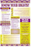 “Know Your Rights,” pamphlets and posters from the National Lawyer’s Guild on your rights of political protest intended to assist people who have already independently decided to engage in civil disobedience. Available in English, Spanish, Arabic, Farsi, Punjabi, and Portugeuse.
- “Know Your Rights: What to Do If You’re Stopped by the Police, the FBI, the INS or the Customs Service” is published by the ACLU in English, Arabic, Spanish, Punjabi, Hindi, Urdu, Farsi, and Somali.
- From the Just Law Collective, legal handbooks for protestors, legal observers, and those on trial for political protest.
- From the Asian American Legal Defense and Education Fund, a small pamphlet on your rights and “special registration” with the INS for men who live in the U.S., are not citizens, and are of North Korean, Indonesian, Bangladeshi and Pakistani origin. In English, Korean, Indonesian.
- At May Day Books I picked up a free copy of “Fight the Man and Get Away Safely,” street tactics and pointers on how to safely survive situations created by police violence and confrontation, once such a situation has occurred. The online version is less designed than the paper one, but the text is all there.
- From the Black Cross Health Collective, comes “First Aid for Radicals and Activists”, how to prepare, what to wear, what not to do, and notes on medical care if arrested or assaulted by police. Also check out their training guide for an introduction to health care at protests, and the gear list for a first aid kit for the streets.
If you know of other useful pamphlets on street tactics and the law, please .
Promises
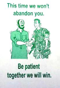
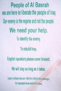
Yeah... um... we believe you. But, um... actually, we really don’t want you here.
More promises and warnings, more images here and here of the millions of U.S. and U.K. leaflets dropped over Iraq.
Lost in Translation
“Much has already been made of the thumbs-up gesture that British and American soldiers have received from ‘welcoming’ Iraqis. Unlike in many western cultures, in the Middle East the thumbs-up can be an insult, roughly translating as ‘up yours’. But the US Army’s Defense Language Institute says that after the first Gulf War, the gesture was adopted by some Iraqis, along with the ok sign, as a ‘symbol of co-operation and freedom’.” (BBC)
Stop Bankrolling Bulldozers
Undermining labor, devastating the envrionment, preying on inner cities, profiting from prisons, and backing biotech companies like Monsanto, Citibank is the target of a new TV spot and campaign by the Rainforest Action Network.
In the commercial, Ali MacGraw, Ed Asner, Darryl Hannah and Susan Sarandon read the names of some of the of thousands of people who have cut up their Citi cards to protest the financial giant’s practice of using its customers’ dollars to fund the world’s most environmentally destructive projects.
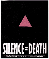
SILENCE = DEATH
 From the Encyclopedia of AIDS:
“The pink triangle was established as a pro-gay symbol by activists in the United States during the 1970s. Its precedent lay in World War II, when known homosexuals in Nazi concentration camps were forced to wear inverted pink triangle badges as identifiers, much in the same manner that Jews were forced to wear the yellow Star of David. Wearers of the pink triangle were considered at the bottom of the camp social system and subjected to particularly harsh maltreatment and degradation. Thus, the appropriation of the symbol of the pink triangle, usually turned upright rather than inverted, was a conscious attempt to transform a symbol of humiliation into one of solidarity and resistance. By the outset of the AIDS epidemic, it was well-entrenched as a symbol of gay pride and liberation.
In 1987, six gay activists in New York formed the Silence = Death Project and began plastering posters around the city featuring a pink triangle on a black background stating simply ‘SILENCE = DEATH.’ In its manifesto, the Silence = Death Project drew parallels between the Nazi period and the AIDS crisis, declaring that ‘silence about the oppression and annihilation of gay people, then and now, must be broken as a matter of our survival.’ The slogan thus protested both taboos around discussion of safer sex and the unwillingness of some to resist societal injustice and governmental indifference. The six men who created the project later joined the protest group ACT UP and offered the logo to the group, with which it remains closely identified.
Since its introduction, the ‘SILENCE = DEATH’ logo has appeared in a variety of manifestations, including in neon as part of an art display and on a widely worn button. It was also the forerunner of a range of parallel slogans such as ‘ACTION = LIFE’ and ‘IGNORANCE = FEAR’ and an entire genre of protest graphics, most notably including a bloodstained hand on a poster proclaiming that ‘the government has blood on its hands.’ Owing in part to its increasing identification with AIDS, the pink triangle was supplanted in the early 1990s by the rainbow as the dominant image of ‘gay pride.’ By force of analogy, however, the rainbow itself has, in some countries, become an image associated with AIDS.”
via ACT UP NY:
“There was also the SILENCE=DEATH Project, which was a group of men who had started meeting a year and half before [ACT UP was started], including Avram Finklestein, Oliver Smith, and Chris Lione. They were a whole group of men who needed to talk to each other and others about what the fuck were they going to do, being gay men in the age of AIDS?! Several of them were designers of various sorts—graphic designers—and they ended up deciding that they had to start doing wheat-pasting on the streets, to get the message out to people: ‘Why aren’t you doing something?’ So they created the SILENCE=DEATH logo well before ACT UP ever existed, and they made posters before ACT UP ever existed, and the posters at the bottom said something like, ‘What’s really happening in Washington? What’s happening with Reagan and Bush and the Food and Drug Administration?’ It ended with this statement: ‘Turn anger, fear, grief into action.’ Several of these graphic designers were at that first evening that Larry spoke.”
Big ’up to v-2.
Hoodies
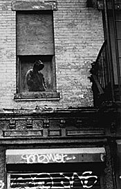 “Last summer I postered the Lower East Side where I live with a series of faceless sweatshirt-hooded grim reaper figures. Lately heroin trafficing down here has reached epidemic proportions. Several of my close friends and colleagues have died from overdoses or HIV infections from dirty needles. Late at night, in an operation resembling a guerilla raid, I installed the Hoody posters on the perimeters of the drug copping zones. Besides the ominous ‘pause’ given passersby, I intended the Hoody posters as warning signs, promoting awareness about a deepening problem in my own neighborhood.”
Dan Witz, “Sending a message through Hummingbirds and Hoodies,” Public Art Review Spring/Summer 1995
Media Lies. News at 11.
“On Monday, March 31, the Los Angeles Times published a front-page photograph that had been altered in violation of Times policy.
The primary subject of the photo was a British soldier directing Iraqi civilians to take cover from Iraqi fire on the outskirts of Basra. After publication, it was noticed that several civilians in the background appear twice. The photographer, Brian Walski, reached by telephone in southern Iraq, acknowledged that he had used his computer to combine elements of two photographs, taken moments apart, in order to improve the composition.”
Bloggers are all abuzz about this. You can see the photo and its sources here. The improved composition shows the soldier slightly enlarged, both feet planted, and made to look as if his gun is pointing at the Iraqi.
I hope that such high-profile corrections will inspire skepticism, but worry that they lend the appearance of objectivity and diligence to the rest of the coverage. And thoroughness at the expense of the stories that are not being told.
“Times policy forbids altering the content of news photographs. Because of the violation, Walski, a Times photographer since 1998, has been dismissed from the staff.”
Sucks for Mr. Walski to lose his job, but I’m sure an experienced war photographer with an eye for composition won’t have too much trouble finding a market for his images. Perhaps he could try the Brits?
Otherwise, I look forward reading the Times’s call for Colin Powell to be fired for his misrepresentations. And Bush for his many lies.
See also Underxposed, on photographs and lies in the media.
Gráficos y El Movimiento
From poster designer Mark Vallen:
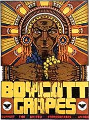 Just Another Poster? Chicano Graphic Arts in California, is the first exhibition and book that explores the Poster Art created by dozens of Chicano Artists in California from the late 1960’s to the present... Graphic art has played a key role in El Movimiento (the Chicano Civil Rights movement), and the poster has been used to educate, agitate, and organize Americans of Mexican descent...
The posters frequently use Mexican icons reworked to express a unique Chicano perspective.
Chicano Poster Art became a means to help preserve and promote a culture largely ignored by the dominant Eurocentric society of the United States. Artists glorified Aztec Gods, Mexican Revolutionaries, the Virgin de Guadalupe, Immigrant Farm Workers, and the experiences of everyday Raza (people)...
Most of the work in the exhibit was produced in association with one of six major Chicano art centers and cooperatives: Royal Chicano Air Force (Sacramento), Galería de la Raza (San Francisco) and La Raza Silkscreen Center/La Raza Graphics (San Francisco), Self-Help Graphics and Art (Los Angeles) and the Mechicano Art Center (Los Angeles), and Centro Cultural de la Raza (San Diego). All but the Galería de La Raza were centers of poster production.
Boycott grapes poster by Xavier Viramontes, 1973, offset lithograph, printed by striking farm workers.