

24 November 2008
Underground Typography.
1957: “It’s a big job. But for the sake of the subway itself and for the sake of the city it serves and for the people of that city it must be done soon.” For all the urban type spotters, typographer and historian Paul Shaw turns out an epic history on the evolution of type and wayfinding design in the NYC (and a few other) subway systems. Of particular interest is the push and pull of internal and external influences, and the spread of good ideas from one transit system to another across the Atlantic.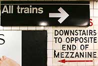
Previously from Shaw on this blog: typography and fascist architecture in Rome.
![]() 24 November 2008, 4:59 PM | LINK | Filed in
infrastructure, nyc, subway, transport, typography
24 November 2008, 4:59 PM | LINK | Filed in
infrastructure, nyc, subway, transport, typography
Read more items related by tag: