June 2007
Understanding the Farm Bill
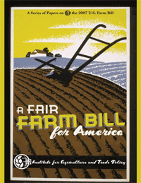
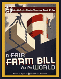
In response to this previous post, Matthew Foster sends this great link to a series of publications dissecting the 2007 Farm Bill. Check the right hand column of the page under “Understanding the Farm Bill.” Matthew is a graphic designer at the Institute for Agriculture and Trade Policy and has done a fantastic job. The bold WPA-inspired graphics and typography make me want to pick up these reports. They evoke an nostalgic image of the American farmer back before it was big Agribusiness. The reports provide overviews of the Farm Bill and its implications as well as IATP’s policy recommendations to make the Bill fairer for the U.S. and the world. A beautiful and compelling way to spread the word on an often overlooked and vitally central policy matter.
Yeah, my current blog design uses WPA imagery, too. What can I say. :-)
Picking up on this success, Mayor Bloomberg has proposed opening 290 city schoolyards to the public during non-school hours as part of his PlaNYC 2030. But “simply unlocking the gates,” could spell disaster without learning from Sunset Park. The Center for New York City Affairs tells a brief history of the program and makes its own recommendations.
Designs on Democracy at the US Social Forum
Via email:
“What is the history of graphic communication in the social justice movement? What is our role now?
How can we effectively use graphic communication to get our messages out in a way that reaches the hearts and minds of our communities and society at large?
What choices do we make in representation in our designs? What images and language do we use? How do we help in creating a message of diversity and positivity?
Join Favianna Rodriguez of Tumis Design, and Nadia Khastagir and Sabiha Basrai of Design Action Collective in a colorful presentation and discussion of the pressing topics facing progressive visual communicators.
This workshop is for emerging and experienced graphic designers, communications specialists, students and artists who work with social justice organizing efforts.
Saturday, June 30, 2007 — please check schedule for exact time and place.”
The 2004 Designs for Democracy conference was fantastic. If you’re in Atlanta, don’t miss this workshop.

The Institute suspended operations in 1942, the official reason being that “the approach utilized by the Institute might serve to disturb the unity needed for the war effort.” [source]


