

posters
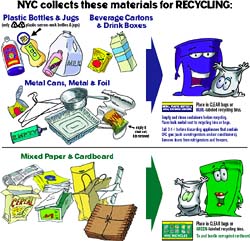
NYC Recycles Again
 Apologies for the lack of updates lately. I’m just back in town from travels and have a whole stack of notes to write up.
In the meantime, I’m very happy to announce that New York City has started recycling again. Plastic recycling resumed on July 1. Glass recycling will resume in April 2004. Here’s the Department of Sanitation press release and poster.
Recycling was suspended last year as part of Mayor Michael Bloomberg’s plan to cut costs and fend off a projected $5 billion deficit. A year later, at a recent City Council budget hearing, Sanitation Commissioner John Doherty conceded that the projected savings from cuts to recycling never actually appeared. [source]
The City Council worked out the deal with the Mayor to resume recycling in a recent budget agreement.
The city will pay Hugo Neu Schnitzer East $51 per ton to handle the material, making the cost of processing the city’s recycling less expensive than processing its trash. According to HNSE, the city currently pays an estimated $105 per ton for the transportation and disposal of plastic and glass in the solid waste stream.
“[With the acceptance of the bid,] HNSE will build a multi-million dollar, state-of-the-art recycling facility in the Hunts Point section of the Bronx that will bring more than 40 high-paying, unionized jobs and numerous economic benefits to an impoverished area of New York City. Moreover, since HNSE operates one of the metropolitan area’s largest barge fleets, the development of the new recycling facility would create little additional truck traffic—indeed, the new facility would actually remove truck traffic from city roads and highways.” [source]
Building an recycling infrastructure in NYC is a wonderful thing, but I wonder about the environmental impact of the recycling plant itself. Residents of the South Bronx already endure much of the City’s waste transfer and incineration. Children living in East Harlem are three times more likely to have asthma than children living on the Upper West Side, and 25% of children from the South Bronx have asthma. As plans for the new recycling facility was just announced, the South Bronx Clean Air Coalition is seeking further information in order to evaluate the impact on health and traffic in the area.
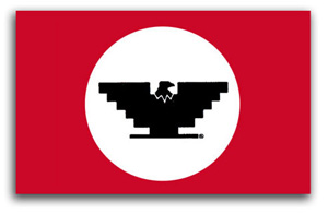
United Farm Workers Logo
From Just Another Poster? Chicano Graphic Art in California:
In 1962, Cesar Chávez and his cousin Manuel conceived of the U.F.W. logo as a way to ‘get some color into the movement, to give people something they could identify with.’ they chose the Aztec eagle on the Mexican flag as the logo’s main symbol and created a stylized version of it that was easy to reproduce. The U.F.W. logo became a highly recognizable icon in the union’s boycott efforts, legislative, proposition campaigns, and a victorious symbol of its successful contract negotiations.
The symbol and flag were unveiled at the first mass meeting of the newly formed union.
From Aztlannet:
 The evolution of Chicano poster art began in 1965 with the production of graphic images to support the organizing and boycotting efforts of the United Farm Workers. The U.F.W. logo — a black stylized eagle with wings shaped like an inverted Aztec pyramid — became a key symbol of the Chicano movement. It appeared prominently on all official U.F.W. graphics, and its inclusion on unrelated posters made by Chicano artists signaled support for the union. Posters also were utilized to promote other Chicano political causes, such as the 1968 Coors beer boycott in protest of the company’s discriminatory hiring practices.
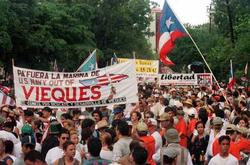
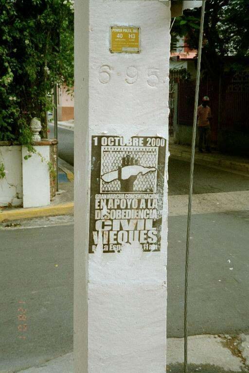
Viéques Libre!
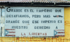
“Great is the empire that we defied, but greater than this empire is our right to freedom.”
Happy May Day and saludos to the people of Puerto Rico and all who struggled to push the U.S. Navy out of Viéques. At midnight last night, the Navy formally turned over its territory on the island to the U.S. Department of the Interior who will turn the bombing range and base into a wildlife refuge.
|
|

Tomorrow morning the people of Viéques will place a large cross on the former bombing range to commemorate those who have died as a result of illnesses related to the contamination of the site.
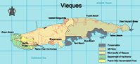
This 2000 UCLA map shows the geographic extent of the Navy’s territory on the island. Much of the west end of the island was transferred to the Viéques Municipality and the U.S. Fish and Wildlife Service in 2001, though this 2003 Navy map still minimizes their apparent footprint. “Live impact” in a “conservation area”?
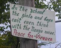
Some images of resistance from around the Web:

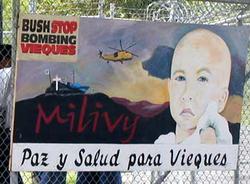
Mural of Milivy Adams Calderón, a boy from Viéques whose death of cancer is widely seen as a result of the military’s contamination of the water.
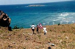
View of crosses and sea from Monte David.

Mural at the University of Puerto Rico-Mayaguez. Photo by Javier Gonzalez Rivera.
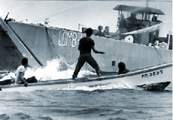
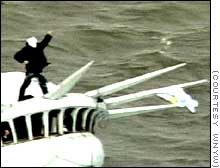
Fishermen blocking US Navy military maneuvers off of Viéques.
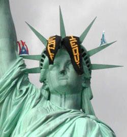
Protestors hang banners from the Statue of Liberty, November 6, 2000.
March for the release of political prisoners, September 29, 1999.
Design Against the War
Over a year ago I attended a lecture on design at the Cooper Union. The speaker projected a series of slides illustrating his minimalist design philosophy. One of the images was of the B-2 bomber. I was shocked and disturbed that a design philosophy would fail to take into account social, political, and economic contexts. Particularly of an object which, when used as intended, delivers massive death and destruction.
It prompted me to dig deeper into design and the public interest. And to start this Web log.
On evening of April 16, I arranged a panel discussion at Cooper titled “Design in the Public Interest / Design Against the War.” I invited three panelists to speak about their work as designers involved in the anti-war movement.
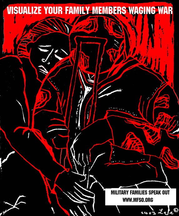 First up was Lee Gough, a printmaker, anti-war activist, and graphic artist based in Brooklyn, NY. She showed a series of prints from a portfolio-in-progress on the Iraq invasion and the war at home, called “The War Went Well.” Some of the images have been used in posters on the Web site Who Dies for Bush Lies“ and for Military Families Speak Out, an organization of people who are opposed to war in Iraq and who have relatives or loved ones in the military.
One image “Fight the War at Home” was inspired by a subway ride home from lower manhattan on September 11. Even as the towers had just been destroyed, there were still, as there had been for many years, homeless persons on the subway appealing to cityfolk to remember them, and to give. The image is a graphic reminder that some have been under domestic attack in our country for a long time, and that funds for the war on poverty pale in comparison to our “defense” budget. Another image, “Visualize Your Family Members Waging War” depicts a despondent soldier with a crutch being embraced by a woman. Lee’s expressive linocut style brings a gravity to the subject matter.
Lee commented on the challenges of choosing one’s message, for instance, noting the different context of “Bring the Troops Home” for troops that have been drafted vs. those who enlisted voluntarily.
One member of the audience raised the question of why U.S. flags and “being American” were the province of the pro-war movement, when large numbers of U.S. citizens were opposed to the war. I noted that I’d seen many anti-war demonstrators holding up flags and patriotism at rallies. On the Web, Who Dies for Bush Lies? effectively tackles effect of the war on U.S. soldiers and U.S. civilians, in addition to Iraqi soldiers and civilians. The danger was raised, though, of the rhetorical trap: the argument over who is “more American” can go back and forth forever, and quickly turning attention away from the crisis at hand.
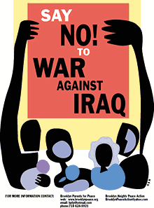 Nancy Doniger has worked as an illustrator for almost 20 years, producing art work for newspapers, magazines, books, posters and T-shirts for both for-profit clients and not-for-profit groups. She is currently a member of Brooklyn Parents for Peace, for whom she created the “Say No to War Against Iraq” poster.
She also helped organize a community/family oriented workshop that gave kids and parents an opportunity to make anti-war art for protest marches. Adults and kids made signs and worked with a puppeteer to create a large paper mache dove, and lots of little doves held aloft on cardboard tubes.
Nancy showed some earlier examples of her work, including a forceful image against the FTAA, a stark two-color poster for a conference on the conflict in Israel and Palestine, and a bright, celebratory “Welcome Back to Brooklyn” poster.
She also showed a couple of iterations of the “Say No to War” poster. One implied the damage of war with flames, but the final version ultimately centered on the mass mobilization. She noted that, in contrast to other illustrations, her work on this piece progressed from representation to geometric abstraction to make the poster more inclusive, using large blocks of color instead of specific depictions of race and gender. She is currently working on a “Hate Free Zone” poster.
Nancy noted the effect of the “Say No to War” poster on her block. The block appeared to be a very pro-war, where “the flags are quick to come out.” But over time, the “Say No to War” poster began to appear in windows and doorways. I certainly noticed it up and down the block where my step-sister lives.
Nancy is also involved in upcoming anti-war event “WEARNICA.” Sponsored by Brooklyn Parents for Peace, on May 3, 2003 a group of artists will present original anti-war art executed on the backs of white cotton dress shirts. The shirts will be worn in public spaces around New York and the world. The event was conceived by Works on Shirts Project whose inspiration for the event came after Colin Powell insisted upon covering the tapestry of Picasso’s Guernica during his warmongering speech to the General Assembly of the United Nations on February 5, 2003.
L.A. Kauffman is a staff organizer for United for Peace and Justice and designer of materials to promote the February 15 and March 22 marches in New York City. Her sticker and poster designs United for Peace and Justice can been seen on the streets across the New York City.
Leslie arrived at design through her work as editor of a progressive journal. She was inspired by the bold, clear graphics of Gran Fury and ACT-UP, and the use of those graphics on the street and at demonstrations, stage managing the events to push its imagery into the mainstream media. She claims she can not draw, so uses clip art in her graphics. The image of the blue pennant flag and black group have become a ubiquitous the city streets.
The idea behind a worldwide day of anti-war marches came out of the European Social Forum held in Florence this past November. At the Forum, the date February 15 was chosen as a date for anti-war demonstrations “in every capital.” What transpired was unexpected and unprecedented.
United for Peace and Justice had only just formed in the November of 2002, but it wasn’t January the group started working on the February 15 march. 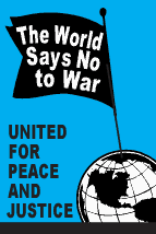 “The World Says No” was the headline of the February 15 flyer design, accompanied by a list of cities taking part in the event. As news of the event travelled across the Internet, marches were planned in more and more cities. Leslie held up various versions of her February 15 design with more and more cities added. Ultimately, marches were held in 793 cities around the world on February 15. Of particular note is virtual absence of communication or coordination between the participating cities.
Leslie spoke of the focused purpose of the posters produced for the event: not to educated, but to mobilize. The flyers lack all superfluous text or argument, just the headline, time and place. The posters and stickers were not trying to change people’s minds, instead to reach out to people who were already against the war but had not yet taken action.
In addition to sticker and flyers, palm cards cut from 1/4 page xerox copies on blue paper were popular and successful. They are both cheaper and more effective — easier to stuff in your pocket, less burdensome on the counter tops of sympathetic shopkeepers.
For the February 15 march, 200,000 stickers were distributed in 5 weeks. For the March 22 march, 200,000 stickers were distributed in 3 weeks. Astonishing numbers, posted around town by a continual flow of volunteers through the office. It’s also a useful bench mark: this is how many it takes to spread the message. A month later, I’m still finding remnants of UPfJ stickers on walls and phone booths. Leslie noted the effect of thousands of little acts of civil disobedience for the spirit of protestors, slowly bolstering a spirit of resistance around in the City and specifically, against the police department ban on marching past the U.N. on February 15.
In total, 1.1 Million pieces of literature distributed. Almost all of the printed materials were bilingual: English on one side, Spanish on the other. However, materials were also produced in Korean, Spanish, French, Creole, and Chinese. Quite a few donations for all these production expenses came online via paypal.
The question was raised about the environmental impact of producing all those printed materials. Her response: it’s also better for the environment if the war is prevented.
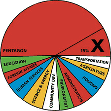 Other examples of design projects were raised by members of the audience: a “Do Not Bomb Iraq” sticker to replace the “Do Not Lean On Doors” sticker in NYC subway cars; colorful logos, charts and imagery designed by Stefan Sagmeister for “Move Our Money,” a campaign to reallocate 15% of the U.S. military budget for education; and flyers handed out to tourists at ground zero with a graphic representation of the number of teachers aides that will be cut from City’s budget. The image leaves it to the viewer to make to the connection to the military expense of a war in Iraq.
Many spoke of the importance of New Yorkers being seen as against the war. September 11 was an attack on New York, and the war is being waged in our name. Others spoke of the urgency of independent media, and the challenge of reaching out beyond “preaching to the converted.”
Overall, I was struck by how spontaneous the designers’ actions were. In almost every case, the designers simply stepped forward and got involved: signs made for a rally were eagerly snapped up; hundreds of thousands of stickers eagerly taken and distributed; and, “Say No to War” posters popped up on an otherwise apparently pro-war street. It seems that one doesn’t necessarily have to change everyone’s minds. There are more “converted” than you think. They just don’t have the graphic materials to display yet.
About 50 people came to the event, a decent turnout despite the announcement from the Pentagon the previous day that “the major fighting” in Iraq was over... and the fact that I’d scheduled the event on the first night of Passover. (Such a Jew am I.) The arc of the event could have used a better closing at the end, as well as a better transition between panelists. I also noted the lack of diversity in the audience. I think next time, I should hold it at different time and place. I’m also quite pleased with the invite design. Peel off the event description and you’re left with an anti-war sticker. Many thanks to Photobition for helping hammer this out in time.
One purpose of the event was to connect artists, designers, and activists. I’m disappointed more Cooper students didn’t show, but after the event quite a few people milled around having these intense little conversations until I kicked everyone out to close the room and return the lights. And quite a few people asked me what was next. Perhaps the start of a new Committee to Unsell the War?
I Do Not Consent to this Search
Some pocket reference for troubled times:
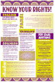 “Know Your Rights,” pamphlets and posters from the National Lawyer’s Guild on your rights of political protest intended to assist people who have already independently decided to engage in civil disobedience. Available in English, Spanish, Arabic, Farsi, Punjabi, and Portugeuse.
- “Know Your Rights: What to Do If You’re Stopped by the Police, the FBI, the INS or the Customs Service” is published by the ACLU in English, Arabic, Spanish, Punjabi, Hindi, Urdu, Farsi, and Somali.
- From the Just Law Collective, legal handbooks for protestors, legal observers, and those on trial for political protest.
- From the Asian American Legal Defense and Education Fund, a small pamphlet on your rights and “special registration” with the INS for men who live in the U.S., are not citizens, and are of North Korean, Indonesian, Bangladeshi and Pakistani origin. In English, Korean, Indonesian.
- At May Day Books I picked up a free copy of “Fight the Man and Get Away Safely,” street tactics and pointers on how to safely survive situations created by police violence and confrontation, once such a situation has occurred. The online version is less designed than the paper one, but the text is all there.
- From the Black Cross Health Collective, comes “First Aid for Radicals and Activists”, how to prepare, what to wear, what not to do, and notes on medical care if arrested or assaulted by police. Also check out their training guide for an introduction to health care at protests, and the gear list for a first aid kit for the streets.
If you know of other useful pamphlets on street tactics and the law, please .
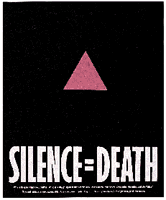
SILENCE = DEATH
 From the Encyclopedia of AIDS:
“The pink triangle was established as a pro-gay symbol by activists in the United States during the 1970s. Its precedent lay in World War II, when known homosexuals in Nazi concentration camps were forced to wear inverted pink triangle badges as identifiers, much in the same manner that Jews were forced to wear the yellow Star of David. Wearers of the pink triangle were considered at the bottom of the camp social system and subjected to particularly harsh maltreatment and degradation. Thus, the appropriation of the symbol of the pink triangle, usually turned upright rather than inverted, was a conscious attempt to transform a symbol of humiliation into one of solidarity and resistance. By the outset of the AIDS epidemic, it was well-entrenched as a symbol of gay pride and liberation.
In 1987, six gay activists in New York formed the Silence = Death Project and began plastering posters around the city featuring a pink triangle on a black background stating simply ‘SILENCE = DEATH.’ In its manifesto, the Silence = Death Project drew parallels between the Nazi period and the AIDS crisis, declaring that ‘silence about the oppression and annihilation of gay people, then and now, must be broken as a matter of our survival.’ The slogan thus protested both taboos around discussion of safer sex and the unwillingness of some to resist societal injustice and governmental indifference. The six men who created the project later joined the protest group ACT UP and offered the logo to the group, with which it remains closely identified.
Since its introduction, the ‘SILENCE = DEATH’ logo has appeared in a variety of manifestations, including in neon as part of an art display and on a widely worn button. It was also the forerunner of a range of parallel slogans such as ‘ACTION = LIFE’ and ‘IGNORANCE = FEAR’ and an entire genre of protest graphics, most notably including a bloodstained hand on a poster proclaiming that ‘the government has blood on its hands.’ Owing in part to its increasing identification with AIDS, the pink triangle was supplanted in the early 1990s by the rainbow as the dominant image of ‘gay pride.’ By force of analogy, however, the rainbow itself has, in some countries, become an image associated with AIDS.”
via ACT UP NY:
“There was also the SILENCE=DEATH Project, which was a group of men who had started meeting a year and half before [ACT UP was started], including Avram Finklestein, Oliver Smith, and Chris Lione. They were a whole group of men who needed to talk to each other and others about what the fuck were they going to do, being gay men in the age of AIDS?! Several of them were designers of various sorts—graphic designers—and they ended up deciding that they had to start doing wheat-pasting on the streets, to get the message out to people: ‘Why aren’t you doing something?’ So they created the SILENCE=DEATH logo well before ACT UP ever existed, and they made posters before ACT UP ever existed, and the posters at the bottom said something like, ‘What’s really happening in Washington? What’s happening with Reagan and Bush and the Food and Drug Administration?’ It ended with this statement: ‘Turn anger, fear, grief into action.’ Several of these graphic designers were at that first evening that Larry spoke.”
Big ’up to v-2.
Hoodies
 “Last summer I postered the Lower East Side where I live with a series of faceless sweatshirt-hooded grim reaper figures. Lately heroin trafficing down here has reached epidemic proportions. Several of my close friends and colleagues have died from overdoses or HIV infections from dirty needles. Late at night, in an operation resembling a guerilla raid, I installed the Hoody posters on the perimeters of the drug copping zones. Besides the ominous ‘pause’ given passersby, I intended the Hoody posters as warning signs, promoting awareness about a deepening problem in my own neighborhood.”
Dan Witz, “Sending a message through Hummingbirds and Hoodies,” Public Art Review Spring/Summer 1995
Gráficos y El Movimiento
From poster designer Mark Vallen:
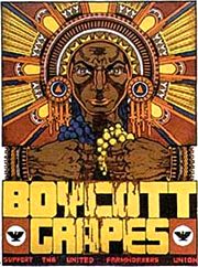 Just Another Poster? Chicano Graphic Arts in California, is the first exhibition and book that explores the Poster Art created by dozens of Chicano Artists in California from the late 1960’s to the present... Graphic art has played a key role in El Movimiento (the Chicano Civil Rights movement), and the poster has been used to educate, agitate, and organize Americans of Mexican descent...
The posters frequently use Mexican icons reworked to express a unique Chicano perspective.
Chicano Poster Art became a means to help preserve and promote a culture largely ignored by the dominant Eurocentric society of the United States. Artists glorified Aztec Gods, Mexican Revolutionaries, the Virgin de Guadalupe, Immigrant Farm Workers, and the experiences of everyday Raza (people)...
Most of the work in the exhibit was produced in association with one of six major Chicano art centers and cooperatives: Royal Chicano Air Force (Sacramento), Galería de la Raza (San Francisco) and La Raza Silkscreen Center/La Raza Graphics (San Francisco), Self-Help Graphics and Art (Los Angeles) and the Mechicano Art Center (Los Angeles), and Centro Cultural de la Raza (San Diego). All but the Galería de La Raza were centers of poster production.
Boycott grapes poster by Xavier Viramontes, 1973, offset lithograph, printed by striking farm workers.
Together for the City We Love
![]() In February 1975, New York City reached the nadir of its financial crisis when underwriters withdrew from a $260 million bond issue, putting the the City on the verge of insolvency. To help generate income, the New York Commerce Commission hired ad agency Wells, Rich and Greene to develop a campaign that would promote New York City and state as a tourist destination. The slogan they came up with: I Love New York. The Commission hired designer Milton Glaser to develop a logo. When the ads came out in 1977, they featured New York celebrities including Frank Sinatra, Morgan Fairchild and Yul Brenner.
In February 1975, New York City reached the nadir of its financial crisis when underwriters withdrew from a $260 million bond issue, putting the the City on the verge of insolvency. To help generate income, the New York Commerce Commission hired ad agency Wells, Rich and Greene to develop a campaign that would promote New York City and state as a tourist destination. The slogan they came up with: I Love New York. The Commission hired designer Milton Glaser to develop a logo. When the ads came out in 1977, they featured New York celebrities including Frank Sinatra, Morgan Fairchild and Yul Brenner.
The campaign was an enormous success, running for 25 years, with no end in sight. (There’s certainly no shortage of fabulous I Love New York merchandise for sale around town.) The logo has become iconic and often imitated.
 In the aftermath of September 11, 2001, Glaser updated his design by adding a smudge to the lower corner of the heart and the words “More Than Ever.” The image must have struck a chord. It seemed to pop up in every shop window in town. Glaser, who’s taught design at the School of Visual Arts for 40 years, worked with the director of the school to print up posters. Students ran around handing out 5,000 posters, and New York’s papers reprinted the image for their readers to clip and post. Personally, I thought the image was corny, but a step up from all the flag waving. I did experience the incredible comradery of the people of New York City. Many, however, experienced incredible animosity and even violence.
At the bottom of the posters is text that specifically notes that the posters are not for sale. Glaser did make one exception, though, when he allowed WNYC, a public radio station, to sell posters to raise money to replace the broadcast tower and antenna that were destroyed when the towers collapsed. The gesture ultimately raised $190,000.
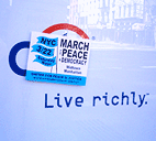
It’s a year and a half later and the city faces another financial crisis. Glaser has designed the third in a continuing series of messages: “Together for the City We Love.”
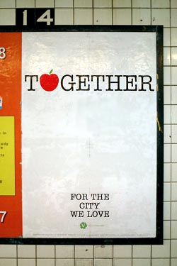 Glaser told the Daily News:
“His new phrase was inspired by the city’s fiscal crisis and the recent threat of a transit strike. Glaser sent City Hall several designs with the slogan, which he says could serve as a ‘rallying cry’ to help New Yorkers bond during tough times.”
When I first saw the new logo in the subway, I was skeptical. As a New Yorker, I will not be bullied into happiness or togetherness. Certainly, when the State sells unity, I wonder who stands to gain. “Community” is often used the gloss over difference and dissent. “You’re either with us, or against us.”
The design, however, is open to interpretation. One could just as easily use it at a block party or mass action. And I’m sure subway riders will note their own impressions on the ad’s generous white space.
As it turns out, the city chose not to use the design. Instead, Glaser and SVA will be publishing it on their own again — the public act of private individual, an educational institution, and its students. SVA also arranged ad space in the subways. The students will distribute the printed posters this weekend.
“The people of NYC seem to be losing that sense of cohesion we felt a year and a half ago,” says Glaser. He hopes the campaign will encourage people to be nicer to each other and may try to use it as a fundraiser for the City to help pay for some of the services being cut. “It’s a drop in the bucket, but it would have symbolic meaning.”
Meanwhile, the city government has plans of its own. Mayor Bloomberg has set up a permanent office and campaign to sell New York to big business and investors and to woo major events. The effort relies less on advertising and more on deals with the private sector and behind-the-scenes lobbying.
It has already brought back Grammy’s and next year’s WNBA All-Star game to New York, but also the Republican National Convention in 2004.
I for one will be out there protesting, together for the city we love.
Under the Asphalt, the Cobblestones
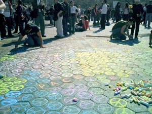
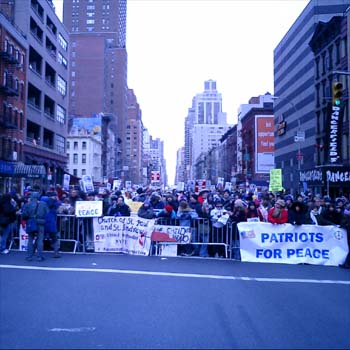
Protestors after the march in New York City yesterday chalked messages around Washington Square Park.
As the U.S. invades Iraq and activists around the world take to the streets, here in New York I’m noticing how the city itself is increasingly used as a medium by the anti-war movement.
 Much of this is nothing new. City streets have always been checkered with posters, graffiti, flyers, and stickers. Subway ads are often annotated with running commentary, sometimes sexual but just as often critical of the ad and advertiser itself (or just blacked out teeth on a too-cheerful model.)
 The anti-war movement has taken advantage of all of this. United for Peace and Justice stickers seem to be everywhere — on pay phones, mailboxes, street lamps, walls, and signage. The letters “STOP BUS” on the street are altered to read “STOP BUSH.” In the Baghdad Snapshot Action activists have simply postered ordinary snapshots from Iraq: “Quiet and casual, the snapshots show a part of Baghdad we rarely see: the part with people in it.”
And then there was the march of over 200,000 people down midtown Manhattan yesterday.
But as the war escalates, so do the protests. And so does the reconfiguring of public space. Activists in San Francisco last week shut down traffic throughout the city with autonomous direct actions coordinated online. Activists hauled newspaper kiosks, cafe chairs and tables, and other street furniture into the streets. [article and photos]
What will be the government’s response? Some communities are all too familiar with locked down, fenced in, and video monitored public spaces. Once considered an invasion of privacy, cameras and other measures are increasingly justified as a legitimate response to terrorism. In the name of anti-terrorism, the City recently sought and won a loosening of the law that restricted on police surveillance of political groups. The restrictions were imposed by the settlement of a 1971 lawsuit over harassment of political advocacy groups by the Police Department’s so-called “Red Squad.”
Public amenities and the details of public life are being reshaped elsewhere in the fight against terrorism. In Israel, seating at bus stops is often bolted to the wall (no chair legs to hide things behind), every turnstile will soon have a metal detector installed, and every trash can on the street will be replaced with see-through plastic and wire receptacle. In Washington, D.C., subway trash cans are being replaced with bomb-resistant models. In the Tokyo subway, there are no trash cans at all anymore.
Not to mention Israel’s wall.
This week New York City announced Operation Atlas, additional security measures to try to protect us against terrorist attack during wartime. I’m not opposed to greater inspection of cargo entering the City, but have no doubt that the NYPD will use their new powers to target activists and political dissent. I also note that the plan, which costs $5 million a week comes at a time of severe budget cuts in NYC — and a deficit of nearly $4 billion. Was factored into the costs of the war?
Literature on cities is replete with the metaphor of public space as the site and the physical embodiment of democracy. In the weeks and months ahead, I wonder how our public space will change.
See NYC IndyMedia and Gotham Gazette’s page on New York City and the War.
page 19 18 17 16 15 14 13 12 11 10 9 8 7 6 5 4 3 2 1 Older »